Did you know that your site visitors make a judgement about your site in one twentieth of a second?
Pretty fast, huh?
That just goes to show you that the design of your site isn’t just kind of important, it’s REALLY important!
In order to keep you on the right track we’re bringing you 5 design tips to spice up your site!
Why is Updating Design Important?
After working long and hard to put together your eCommerce business and get it rolling, I’d bet that the last thing you want to hear is new design trends.
With new trends comes a site redesign, which means saying goodbye to the design you worked so long and hard on and it means some extra work for you.
But, I’d like to take this moment to change your perspective with one simple image – Best Buy circa 1996:

What was acceptable, cool, or effective when you built your site, might not have the same feel a year or so later.
Therefore, it’s important to keep updating your site in order to keep it fresh and sales ready!
And now, for some tips.
1. The Move Towards Simplicity
As the thrills of website animation begin to thaw, designers are shifting towards simplistic yet eye catching designs.
Here are a few ways that you can utilize simplicity in your eCommerce site:
White Space
Now I know you probably already have white space in your site, but I’m not just talking about the plain old regular white space. No. I’m talking about ridiculously exaggerated, but super awesome white space like this!

By making the entire background white, it really pulls into focus the items and text which you do feature on the page.
Flat Design
Another cool way of toning things down is flat design. Basically the idea of flat design is to get rid of all the bells and whistles. No need for shadowing, or 3D effects. All you need is a fun color scheme and a clean cut layout.
Basically the way it works is that you have a solid background with a colorful design layered on top of it.
Think about the Windows 8 design. It’s “flat,” simple, and pleasantly colorful:

By focusing on user friendly colors, white space, and clean cut design you can apply this same idea to an eCommerce site.
For example, check out this site:

Large Dropdown Menus
If you’re running into an issue with clutter, something cool you can try out is creating a large (massive) dropdown menu.
Obviously it should be easy for your customers to navigate your site, but that doesn’t mean your navigation needs to be fully visible at all times.

By creating a dropdown menu like this you can get the best of both worlds – simplistic design and ease of use!
2. Creative Use of Imagery
Just because things are becoming simpler doesn’t mean that imagery has been put aside.
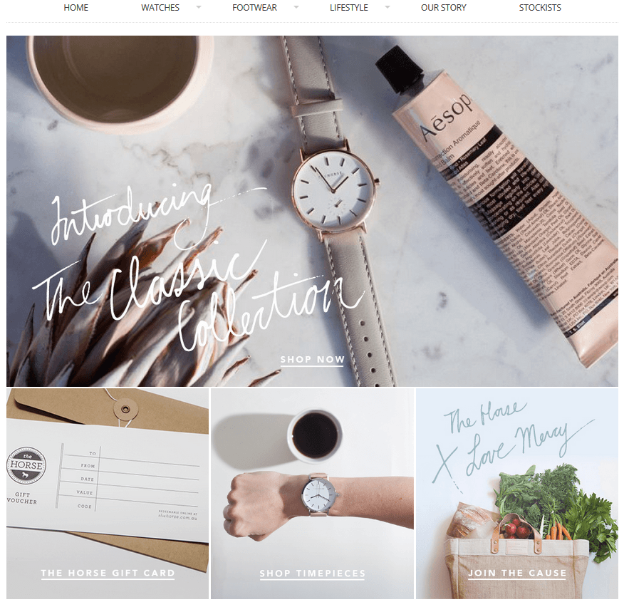
Full Screen Background Images
In fact, if anything the simplicity has led to a higher emphasis on imagery as can be seen by the trend towards large, high quality images acting as the background of so many eCommerce sites!
The beauty of using an image for your background is that it enables you to spend less energy focusing on the distribution of the elements on your page. Instead, you can put the picture in and then simply add in your text and call to action.

A few tips for choosing an image:
- Be sure to use a super high quality picture (you want it looking good no matter what size screen your customers are using).
- You can also add some effects to your photos (like the vintage effect above).
- Obviously your image should fit the overall feel of your brand.
If you can achieve this then the image can really set the tone of who you are for your site visitors.
Use Simplicity and Fun Imagery Together
Like I said before, simplicity doesn’t mean getting rid of imagery, and it also most certainly does not mean that you can’t show off a bit of personality with your imagery.
Feel free to use funny, eye catching imagery (or even cartoons!) to get your point across and make your site look amazing.
Here’s a site that used a super fun and bright full side image as their background, and it absolutely works!

If you really like the simplistic look, then you could try to go for something like the site below. It is very clean, with lots of blank space, BUT it’s also very fun!

Here’s another site that really made use of bright imagery effectively. At first glance this seems like an overly bright and busy design, but upon second glance it was actually designed to be eye catching, and to lead visitors towards the CTA on the bottom of the page.

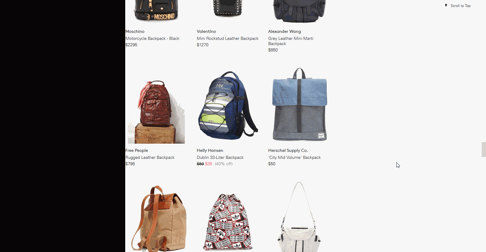
Lay Out Your Products
Of late there has been a very popular trend to do this:

This method of laying out products is actually pretty cool for a number of reasons.
First of all, it looks awesome!
Secondly, and just as importantly, it gives a nice overview of your products to your site visitors all at once.
Here’s a more subtle version of if that you could consider as well:

3. Scrolling Tricks
It’s not just the images themselves that make an impression on your site visitors, it’s how they interact with the site as well!
Infinity Scrolling
Something that many eCommerce sites are coming to realize is that rather than getting users to click on a bunch of different options, getting them to click “next page,” etc. it’s actually potentially more efficient to create a never ending scroll of products!
(Notice how the scroll bar keeps jumping back up, that’s because more and more results keep loading).
It’s fun because it never ends!
Another version of this is the fade in scroll. Basically as the user scrolls down, more and more options fade in (same idea, just a bit fancier — check out the Herschel website for a good example of this).
Straight to the Products Scrolling
This next scrolling feature is actually pretty innovative, because it is a complete change of strategy. Rather than having a homepage and scrolling for options, with this design you just scroll straight into the products:

This site does an amazing job of using straight to product scrolling by really utilizing white space, amazing product photography, and sleek design to show of prices with a scroll over effect.
4. Tiles Everywhere
With the rise of Pinterest, tile design has really taken a foreground in the world of eCommerce.
Obviously, Pinterest-Style Product Searches
Product cards are great because they enable you to clearly present all relevant information for your products in a very clean design.
Take a look at this site below. All the necessary info is already included in the card and it looks great!

Tiles on Your Homepage
It’s not just product pages that are taking to the tile design though, your homepage can also get a nice makeover with tiles!
This design structure will enable you to show a few different things by segmenting your screen into different sections:
5. Text Effects
The text on websites has long been overlooked as unimportant, but it is finally getting the recognition that it deserves. Distinctive text can really make your site stand out from the crowd!
Once Again, Simplistic Text
If you’re going for the clean cut design, then you should look into a nice clean cut font to match it!

This site above utilizes a very sleek background and in keeping with the theme, uses a straight and clear font which adds to the overall feel of the page.
Crazy and Just Plain Big Text
Even if you are going simplistic and clean, you can definitely spice things up with some bold text! Large and creative fonts are definitely in.
Look at the bold script in the site below. It really adds personality and flare to the page!

If unique fonts like the one above aren’t your thing (or don’t really match with your site theme), you can still set your site apart by utilizing font size.
Large text is eye catching, and definitely enables you to get your point across very clearly!

Make Your Text Pop With a Background
If you’re not quite sure how to get your text to stand out against the background of your site, don’t worry because there is a way around that – just create a background specifically for the text:

This design technique looks great, and it is also one of the clearest ways to draw attention to the content that you deem most important.
Get Trendy With Your Design
While these are all certainly trends in design, it doesn’t mean that your site has to look like everyone else’s!
Take what you’ve learned in this post and think about how you can put your own personal spin on it.
I can’t wait to see all of your beautifully designed sites!
P.S. Let us know which tip was your favorite in the poll below!

Zack is a social media enthusiast who loves all things digital. He is the inbound marketing manager at StoreYa where he spends his days searching for the newest social marketing scoop. If you’d like to chat with him, feel free to connect with him on any social platform.
Recommended articles
 Facebook Ads for eCommerce: 16 Strategies, Examples & Tips
 How to Build a Winning eCommerce Ads Strategy
 Google Ads for eCommerce: Everything You Need to Know
 10X Your Traffic with PPC Management Software
Comments
Powered by Facebook Comments


Hi,
Do you have any resources for us to help make good imagery for our website banners and other graphics? Any tools to help with this would be appreciated!
Thanks,
Riad
Hi Riad, in fact we have a tool called the Power Banner which makes it super simple to design website banners, advertisements, Facebook cover photos, etc. You can check it out here >> https://www.storeya.com
Great article post! I agree that distinctive text can really make your site stand out from the crowd!
I love this tip from your blog post. Thanks for this, also please visit or reach me on 0434 925 916 or by email alex@coucoumarketing.com
Thanks Alex!
Thanks for the kind words Alex!
Yes, I agree with your ideas. Simplicity is always the best, regardless of whether you want to create products or theme of a website. When buying products, I tend to focus on some simple but eye-catching ones. Thank for sharing this post with us!
Thank you Henry!
Thanks Henry!