As you probably saw (or did so yourself) over Black Friday and Cyber Monday, modern-day shoppers are buying their items online. As of earlier this year, nearly 30% of consumers were making an online purchase once a week! The growth in eCommerce consumption by consumers has led to an increased amount of competition for merchants. How do you stay ahead of the competition?
One key to staying ahead of the competition is to stay ahead of eCommerce design trends, without falling behind the rapidly changing trends. In this post, we highlight eight eCommerce design trends that we predict will gain popularity in 2016, that are all intended to optimize the user experience, bring products into the spotlight, and convert casual visitors into loyal customers. Read on to check them all out in detail and learn about the awesome benefits you can derive from each one.
Parallax Effect
The parallax effect has been used recently on many types of sites, and online stores are no exception. Introduced to web design in 2011 and popularized by Apple in 2013, this sleek technique is still gaining momentum – and for good reason.
In simple terms, it is a technique that provides a vertical or horizontal motion of website layers at different paces. As a result of this motion, arises a sense of depth or “faux 3D effect.” Thanks to this effect the page is more visually appealing, and also has an improved functionality.
Here are the most striking examples of how eCommerce sites can benefit from the parallax effect.
- Product Presentation in 3D. By means of the parallax effect, you can show a certain item in a 360-degree view and let customers control the viewing by scrolling (now they can see product details before clicking through).
- Unobtrusive Customer Engagement. The parallax effect can set merchants free from employing aggressive selling tactics and instead engage buyers with their merchandise. While dynamism of movable layers enriches the visual side of the layout, it doesn’t compromise the overall usability of the store.
- Call-to-Action Strategy. This nifty technique is also widely used to prompt customers to do what you want.
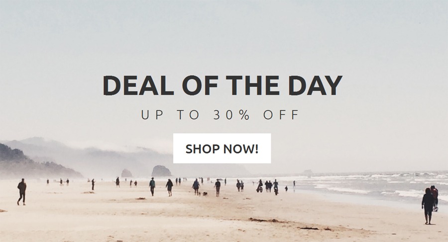
To better understand this, look at the below theme, Styler (PrestaShop fashion theme released by TemplateMonster). In its design, the parallax effect is used in a custom block with a message about a 30% discount on products. Adding more depth to the background image, it makes the forefront captions and CTA button stand out. As a result, the block becomes dynamic and eye-catching, whilst the button feels like an incentive.
Lazy Loading
The next web design trend expected to remain afloat in 2016 is lazy loading. It renders UI elements on the screen only when the user reaches them while scrolling, and provides an opportunity to save visitors from waiting for the entire page to load at once (55% of visitors spend fewer than 15 seconds on a website).
When implementing this technique to your eCommerce store you can expect the following benefits.
- The page loads in sections, and thus products will come into view much faster.
- Faster page loading can increase the customer retention rate at your store.
- In order to increase the CTR from your homepage to your product pages, it’s important to make your store pages richer in content. Thanks to this technique, you can do that while optimizing loading time.
When it comes to optimizing pages for search engine crawlers, you need to provide links to lazy loaded content. According to MaxCDN, such a method can structure a lazy loaded site as efficiently as a site free from this technique.
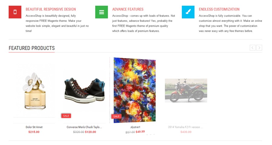
An example of smart utilization of lazy loading is the design AccessShop Lite. Once you proceed to the front page of this free Magento theme, only its upper section with a header and slider are loaded. Scrolling down the page, you can see the loading of carousels with best-sellers and featured items, followed by a block of product characteristics.
Flat Design
“Less is more” is the right motto to follow for decluttering your store and making it user-friendly. This trend is devoid of stylistic elements that give even the slightest illusion of depth to the page, e.g. gradients, drop shadows, bevels, etc. Instead, it is based on grids, bold colors, sans serif typography, iconography, large CTA elements, and ample white space.
Here are the major advantages of flat design for your web store.
- Focus on Products. Flat design can bring products to the forefront through simplicity and clarity. As it makes no use of stylistic enhancements, there will be nothing to distract customers from your merchandise.
- Optimal Store Performance. Simplicity of flat interfaces makes them cross-browser compliant and easily scalable to mobile devices.
- Quick to Load & SEO-Friendly. The absence of unnecessary styling makes pages lightweight and, therefore, quick to load. Search engines reward sites that have faster loading times with higher rankings on the SERP.
Recommended: 5 Free Google SEO Tools Plus Best Practices
Here’s an example of successful flat styling from the OpenCart theme designed using flat design. Bright red color accents, a lot of white space, and grid-based banners emphasize the most important elements in the store and facilitate the site’s navigation.
Split Screens
Another prediction for eCommerce designs for 2016 is the use of split screens. It is the best choice in cases when you want to give prominence to two elements simultaneously.
In addition to promoting two items of equal importance, split screens have another aim. On the one side of the layout, you can display the main product, whereas the opposite one can serve as a destination of some additional info about it including images, video, manufacturer information or any other specific information.
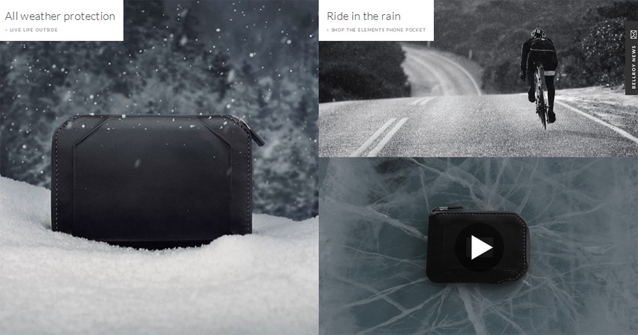
A good example of how skillfully this trend can be implemented is shown at bellroy.com (sells wallets and other accessories). The left side is intended for a passport sleeve, while the right one provides a showcase for a travel wallet. Under the current layout, shoppers can see that the store inventory offers different essentials for their travel needs.
Successful utilization of the split layout is also well-illustrated in the block with items meant for outdoor protection of your valuables. On the left, there is a large picture of a weather-proof wallet, which is complemented with another smaller image and video on the right. So, if you want to give an edgy look to your store and improve the product showcase, consider an option to split its layout.
Recommended: Design Tips for Creating Web Banners that Convert
Hover Effects
In 2016, a lot of eCommerce sites will be spiced up with smooth hover effects, that’s for sure. Hover effect is a CSS-based technique employed to change a certain element or some of its attributes when a mouse arrow reaches it. Used wisely, hover effects can attract buyers’ attention to the most important details of your store, adding zest to its aesthetics.
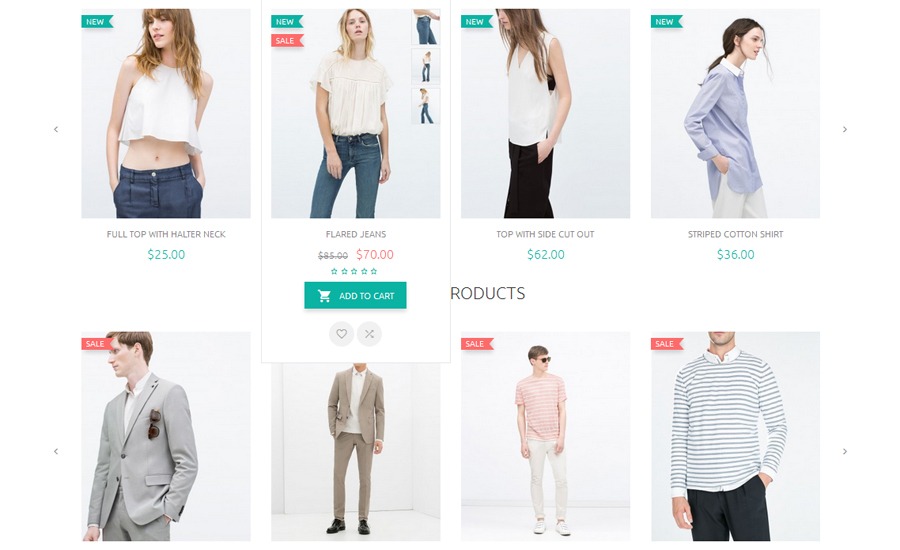
Let’s explore this trend in detail by examining Ketty, an ultramodern clothing Magento theme. As you can see, hover effects are used in its design to change colors and shades of banners and CTA buttons. The attention placed on these elements is crucial for any store trying to improve conversion rates.
The product panel of the theme’s front page also makes use of hover effects, not to catch customers’ attention, but rather to give the visitor more insight into the product. Once you put a mouse cursor over a certain product image, you can see small images displaying that product from different angles.
This technique can keep the layout cleaner by showing some UI elements only when necessary, and also enhance the usability of your store dramatically. Smart merchants are unlikely to go without hover effects next year.
Custom-Drawn Illustrations
Web designers resort to various tricks to make their sites look unique, but none of them is as efficient, or as personal, as custom-drawn illustrations. Whether you use large illustrated backgrounds or small hand-drawn stickers, any of these elements can impart a unique feel to your store.
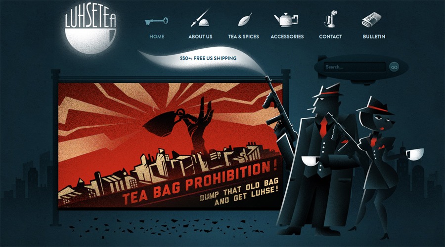
Take a look at the design of Luhse Tea, an online tea shop. Skillfully illustrated elements seem to be in every corner of its layout, e.g. menu icons, shopping cart, logo, search bar, wherever. Illustrations don’t only add an individual tone to the layout, but also deliver the company’s message.
Although the Luhse Tea store makes heavy use of illustrations, they don’t compromise the usability of the site. The navigation is intuitive so visitors can feel comfortable browsing through the inventory.
You are free to use illustrated elements minimally – you don’t have to go as far as Luhse Tea – and if done properly, will bring the desired effect of uniqueness to your eCommerce site.
White Space
Online shoppers naturally prefer stores with simple, easy-to-understand layouts rather than intricate patterns. For that reason, more and more online merchants are expected to utilize white space next year (as well as the other mentioned design trends).
Also known as negative space, “white space” is an area of the page between graphic elements that is left blank. Although it’s called white space, you can, in fact, use any other color for the empty space of your web pages.
So, how can you leverage the power of white space on your eCommerce site? Let’s scan its advantages one by one.
- Product Organization. With empty space, you can separate products or any other portions of content from each other, thus providing a user-friendly product presentation for customers.
- Content Emphasis. A lot of white space emphasizes the hot-spots of your site, particularly offerings, promos and add-to-cart buttons.
- Easier Navigation. Wise use of white space makes it easy for shoppers to navigate your store, helping them find a necessary item more quickly. It is a significant benefit in terms of retaining customers in your marketplace.
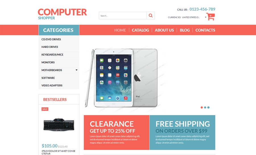
To illustrate this trend, we’ll use the design of a VirtueMart template custom-made for computer stores. Against its clean white background, images, text, buttons and other UI elements look catchy, and easily guide viewers through the page. With their help, no element will escape customers’ attention.
Recommended: 5 eCommerce Design Tips to Spice Up Your Site
Storytelling
Storytelling is one of the more powerful yet underestimated techniques in web design. More recently, a lot of eCommerce designers have started employing it more actively, so it’s likely to turn into a popular trend quite soon. Stories are effective tools to communicate your ideas and actually engage the audience with them. By means of storytelling, merchants can arouse greater interest in their offerings, thus compelling customers to stay longer in their marketplaces and eventually place orders.
If you want to master storytelling, take a look at the design of nike.lidyana.com. It utilizes this technique through a full-screen video in the background. Watching the video, buyers can see the products in action and order them in the meantime. An informative and fun video can provide answers to many customers’ questions without the need to disturb the store team.
Which of these eCommerce design trends are worth following in 2016, in your opinion? Do you have any other predictions for next year? Feel free to share them with us in the comments below. Also, share the post with friends and colleagues in social communities to make sure they won’t miss anything important in the sphere of eCommerce design.
 Visit Website
Over to You
Which of these eCommerce design trends are worth following in 2016, in your opinion? Do you have any other predictions for next year? Feel free to share them with us in the comments below. Also, share the post with friends and colleagues in social communities to make sure they won’t miss anything important in the sphere of eCommerce design.

Nick Campbell, the author of this article, is fond of writing posts on various subjects, particularly web design, e-commerce, social media, marketing, business, and education. He has been involved in the content creation sphere for more than two years. Nick is primarily focused on covering modern trends in a specific industry to help his readers keep abreast of the latest news.
Recommended articles
 Facebook Ads for eCommerce: 16 Strategies, Examples & Tips
 How to Build a Winning eCommerce Ads Strategy
 Google Ads for eCommerce: Everything You Need to Know
 10X Your Traffic with PPC Management Software
Comments
Powered by Facebook Comments