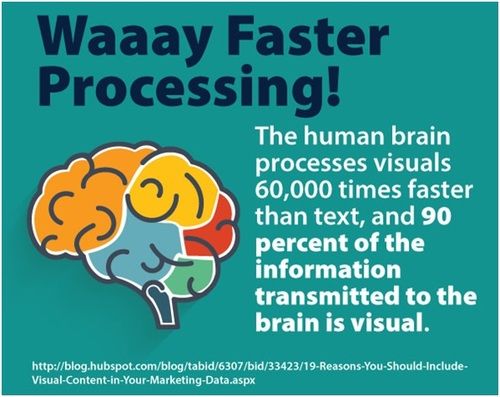
Did you know that the human brain can process images 60,000 times faster than plain text? Since 90% of the information sent to our brain is in form of visuals, the brain is accustomed to processing images faster than text. 50% of the brain is responsible for processing images while 70% of your sensory receptors are found in the eyes. This simply means that visuals are crucial for your online content success. And yes, there are statistics to back that up.
Apparently, tweets accompanied with images attract on average 150% more retweets. On the other hand, content that contains appropriate images gets 94% more views than one without images. What’s more, 64% of social media is made up of images. These stats spell it all clearly–failure to create visual content for your store will hinder your online shop’s success.
Amazing visuals can be a powerful tool for promoting your online store. They keep your audience engaged at various phases of the buying process, as well as help you build your trust and credibility.
8 Tips: Authentic Visuals for Your eCommerce Store
For online shops, the way you present your products can make the difference between driving significant sales and no sales at all. Your product images must wow your potential customers visually so as to drive targeted traffic, increase conversions and generate sales.
With millions of eCommerce websites out there, standing out of the crowd is no walk in the park. So, how can an online store retailer get noticed fast anymore? Well, the answer lies in visual content strategy. A catchy, creative and concise visual content is a must for greater visibility.
Recommended: 9 Tools You Can Use to Edit Your Own Product Photos
Graphics
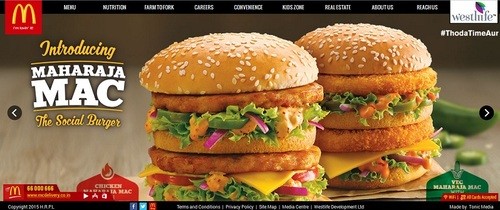
Graphics are a great way of enabling your ecommerce store to give more appealing information to your visitors. Graphics use creative illusions and different colors to present facts or information by making it more eye-catching and fun to look at. Instead of using long phrases of complex information on your online store, try using unique graphics that your customers will find easy to understand.
White Space
A great organization and web layout using whitespace is a key foundation to creating an outstanding website. A jerry-built website design can confuse visitors and cause them to flee from your online store immediately. When incorporated in your web design, whitespace will give your website a clean and professional look that is friendly to viewers and/or site visitors. Without whitespace, your website will look poor, cheap and unattractive. However, when used properly, whitespace will make your website more impressive for a higher conversion rate. Moreover, product images with a white background make more sale than those having a colourful background. Images with white background help enhance the products’ looks & increase the ecommerce conversion & sales.
 Via Treehouse
Large Font
Award-winning websites have this one thing in common, they use large fonts. Large fonts capture your reader’s attention and direct it to the most important message you want them to receive. With a larger font, there will be no room for unnecessary text. In addition, large font sizes will allow your viewers to quickly scan through your pages to get the most important message.
 Elegant, simple use of larger fonts
Arrows
Colored arrows can help your site visitors to navigate through the website with ease. For higher conversion rates, directional arrows with call to action can be used to direct viewers and/or readers to areas you want them to visit. Use of visual cues is crucial if you want to capture the attention of your visitors as they land on your page.
 The use of arrows to guide the visitor onto the right path
Contrast
A great color theme which displays your company’s mood is one of the most important things when designing your website. Your choice of color should therefore portray a given mood, while providing a contrast between elements of your design. You can use just two main colors to achieve a good contrast in your website design.
 The use of differing shades in the background to create a certain mood
The Rule of Three
The rule of three is often used by smart visual merchandisers when creating their ecommerce visuals for a distinct display. This rule involves working in sets of three. Based on your products and how you arrange them, you can choose to have three products side by side, instead of having just one. For instance, if you’re displaying things based on their height, you can arrange them tall, medium, and short or the vice versa.
 Rule of Three in practice
The reason behind this rule is that when we are looking at something asymmetrical, our eyes naturally keep moving around and when they see a balance or symmetrical, they become damn dead within their track.
This theory also echoes that of the “Pyramid Principle” which states that when one item is at the top and the rest of the items are “one step down”, the eye will be drawn to the focal point from where it will work its way down to the rest of the items.
Display, Don’t Tell
Before any of your potential customers can purchase your offers, they will want an idea or visual representation of how the item will look and feel when they use it. To meet this need, ecommerce store owners can showcase their products in a way that their site visitors can identify with and could envision themselves wearing or using the item.
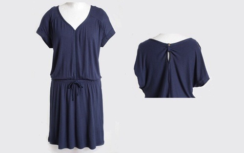 Displaying features and not telling them
For instance, if you are selling apparels (like the above image), you can take various photos in different positions (front, back, and side) of a mannequin or model wearing your collection so as to enable your customers to envision how the attire would look on them. Be sure to style your mannequin according to the latest style and releases. This kind of display gives your prospective customers an instant point of reference and once they picture themselves using your product, you can count it as good as sold.
Always Have Your Target Customer in Mind
One of the most effective ways to create amazing visuals for your ecommerce store is to understand your target customer and have them in mind when designing your online store. Understanding your target market is not just about having familiarity with their demographic data in terms of age, location, income or education level; it also involves digging deeper into their behaviors and psychographics. This simply means that you should not just target individual consumers, but their lifestyles as well.
Recommended: 15 Image Resources to Help Boost Your Social Media Engagement
Using Great Visuals to Reflect Your Brand
There’s more to your brand than just the logo. Visual branding is an effective way for ecommerce entrepreneurs to convey their brand’s personality more consistently and precisely. Making your brand visually striking and familiar to your website visitors as well as social media followers can certainly create an identity and enhance your content/posts, making them stand out as brilliant signals amidst the noise from competitors.
Branding on your website and social media platforms can pay off big time when the right visuals are used to help your content and brand to stand out and look familiar to your target audience.
Your brand’s identity is what your brand communicates to the outside world through visual expression. This consists of the name, mark or logo type, visual appearance, and communications. Generally, your brand identity establishes an emotional connection and also reflects the brand’s image and desired positioning.
The question then begs, how can an online store owner build a powerful visual branding for their ecommerce business? Here are five things you can start with:
- Develop your brand’s filter effects
- Establish your brand’s voice and personality
- Define your color palette
- Create your brand’s templates
- Choose the right fonts for your brand
Here’s a quick breakdown.
Use Brand Filters
Brand fonts and color palettes are commonplace, but did you know you can use photo filters to enhance your brand’s identity or recognition? Creating a consistent look for your brand visuals (images or photos) can make your business page on social media to stand out.
When it comes to Instagram, choosing the right filter can be a daunting task. Do I want to get moody and mysterious with Brannan, or ethereal and bright with Amaro? Do I look russet with Hudson or Sutro? You could spend long hours moving back and forth between choices.
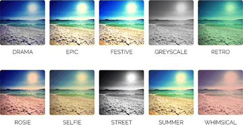
Visual filters to choose from (Social Media Examiner)
As all Instagrammers understand, there are countless filters that are more superior to others. Fortunately, we’ve winnowed down through the many filters and recommend Mayfair.
Apart from being one of the most used filters among the renowned Fortune 500 corporations, Mayfair is one of the most successful filters used by most brands. According to a study by the TrackMaven, on average, Fortune 500 companies that use photos with the Mayfair filter receive on average 23 interactions per image.
The Instagram blog refers to the Mayfair filter as consisting of “a warm pink tone, subtle vignetting that brightens the center of the photograph, and a thin black border.”
Establish your brand’s voice and personality
Your brand incorporates everything that encourages people to relate with your company; and this includes how your brand makes them feel. In this regard, your ecommerce store’s visual branding should convey your:
- Personality
- Culture
- Philosophy
- Specialty
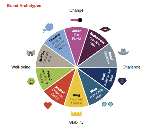
You can also define your store’s voice in no time. Just visualize your brand as a great friend with a unique personality. So, does your ecommerce store’s visual depict your brand’s personality? Would you describe your brand to a friend using any of the personality types? Check out this chart to get an idea of how you want to visually present your brand.
 Via MillwardBrown
Define Your Color Palette
Having determined your store’s personality, your color palette should be the next thing to decide on. Your colors should well-represent your brand on your:
- Website
- Social media posts
- Blog
- Stationery
Create Brand Templates
Templates can help you build a more powerful theme for your website or page and enhance your brand’s recognition when templates are created for:
- Quotes
- Promotions
- Competitions
- Sale products
- Announcements
- Any other campaigns
When you include a watermark or small logo in your templates, your customers will know how to locate you even if your post is removed or posted elsewhere on the Internet.
Carefully Select Your Fonts
Similar to your color palette, your store’s font should reflect your business’ personality. Below are a few fonts to help you choose a design that matches your brand’s personality.
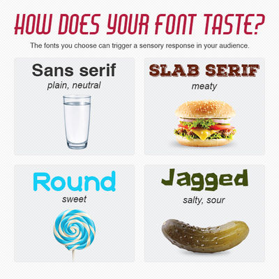 Image via CompanyFolders
Summing it Up
The main aim of using amazing visuals to brand an ecommerce store is to build trust, establish credibility, and maintain consistency by allowing your product, service or company to acquire familiarity in the market.
Note: Your customers can’t see your trust or loyalty, but creating an effective brand strategy will help them make that crucial connection.
It’s as simple as that. Try these tips to ensure your ecommerce store stands out from your competitors’.

John Davis is the marketing director at removebackground.com . Remove Background is a professional product photography & image editing service for online retailers, photographers and designers. We offer the best background removal and image enhancement solutions to internet retailers, bloggers, designers, photographers, and webmasters.
Recommended articles
 Facebook Ads for eCommerce: 16 Strategies, Examples & Tips
 How to Build a Winning eCommerce Ads Strategy
 Google Ads for eCommerce: Everything You Need to Know
 10X Your Traffic with PPC Management Software
Comments
Powered by Facebook Comments