Think about it like this, 98% of your eCommerce store visitors abandon your site and 70% of those will never return. If you could manage to keep some of these potential customers on your site and give them some sort of incentive to make a purchase you could increase your sales tremendously.
But how can you get those visitors to stay? In steps StoreYa’s Exit Pop, an automated tool that is here to save the day for you!
This post will explore a few best practices for using the Exit Pop on your website, so you can start boosting sales today.
What is the Exit Pop?
Exit Pop is an automated customer acquisition tool that uses innovative “Exit-Intent” technology to track your site visitors’ cursor movements in order to determine the exact second that they intend to leave your web store. At that very moment Exit Pop will pop up a screen to the abandoning visitor, offering them a coupon, deal, or discount of your choosing in exchange for their staying on your site.
Exit Pop was designed to be easy to use and effective, which is why:
- It has a simple, 30 second set up that requires no design or coding knowledge
- It provides detailed analytics so you can keep track of your sales
- It has A/B testing capabilities so you can optimize your Exit Pop
Already convinced? Great, you can go get the Exit Pop for your site now. Oh, by the way, it’s free too!
How Can You Customize the Design of Your Exit Pop?
We want you to be able to create the perfect pop up for your store. That’s why we made the Exit Pop easy to create and design. So, let’s go through a few ways you can customize the look of your Exit Pop.
Color
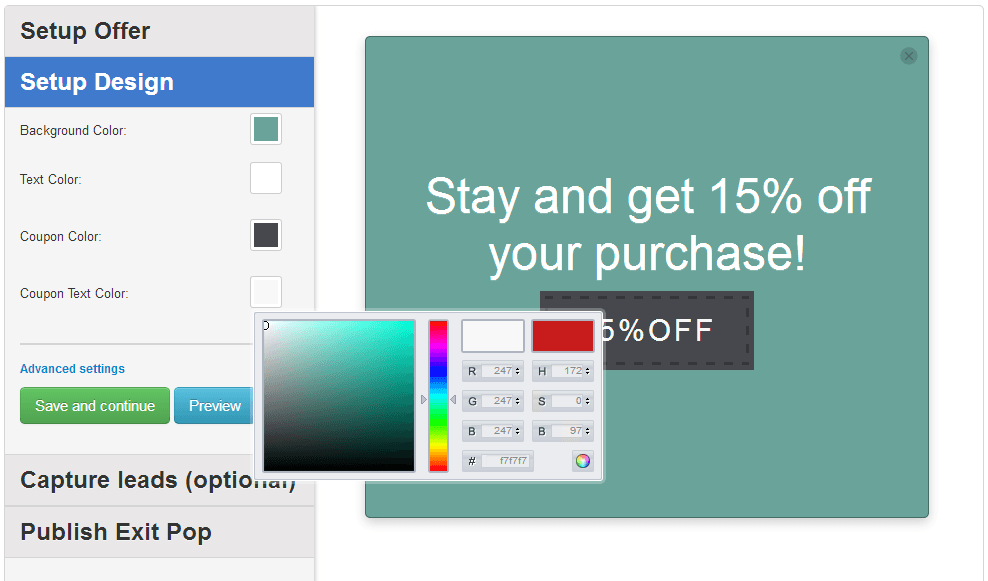
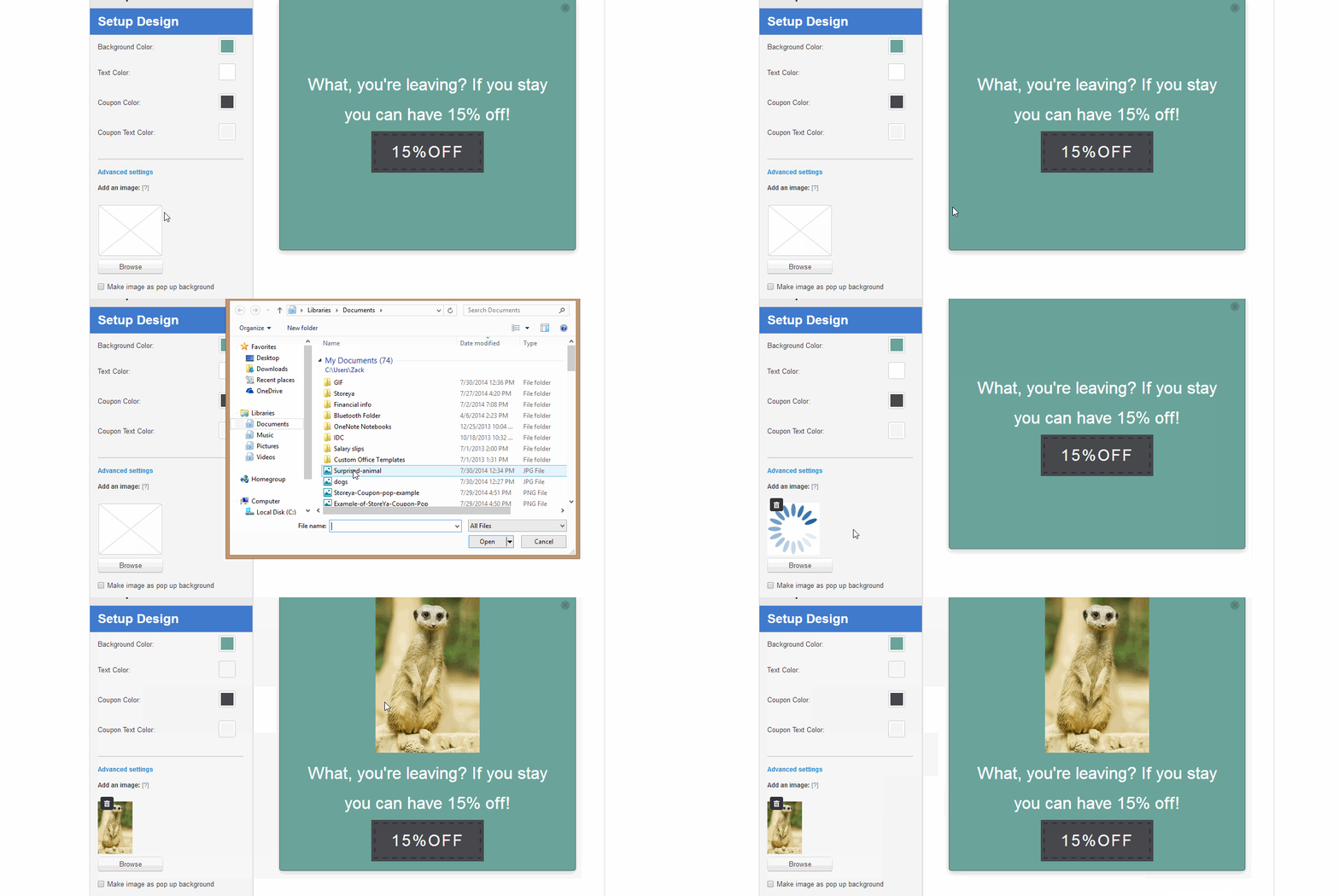
The most obvious thing that you can customize is the color of your pop up. You can change the color of the background, the text, the coupon, and the coupon text:
By using the advanced color settings you can build a pop up that fits the exact color scheme of your website.
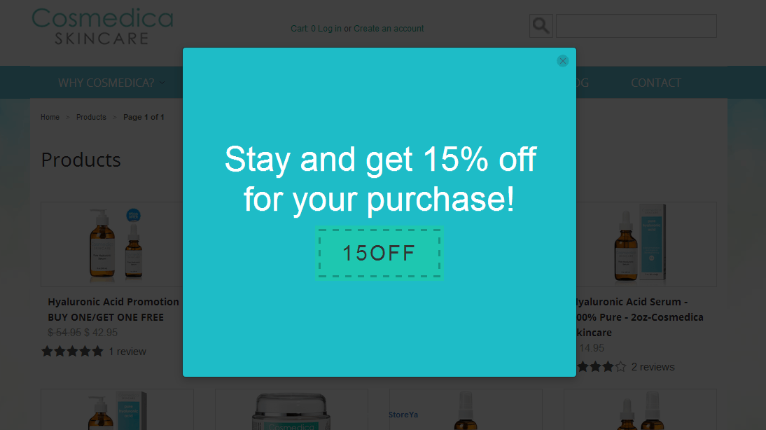
For example, this store matched its Exit Pop with the light blue theme of the website:
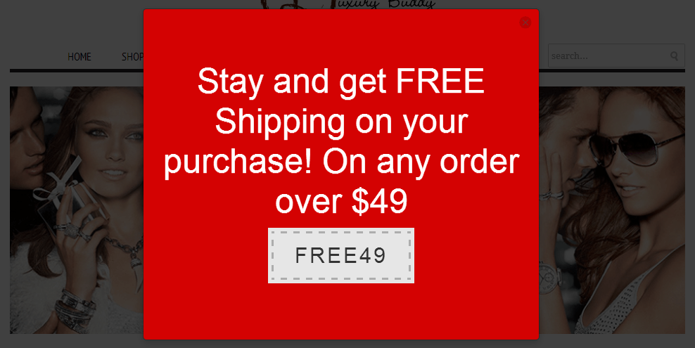
You can also use the color in order to create a pop up that will really grab your site visitors’ attention:
Remember, color is very important in marketing, so make sure you use the right colors.
Note: For more on color in marketing you should read How to Use Color in Marketing.
Images
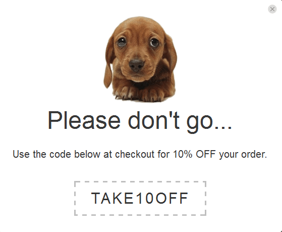
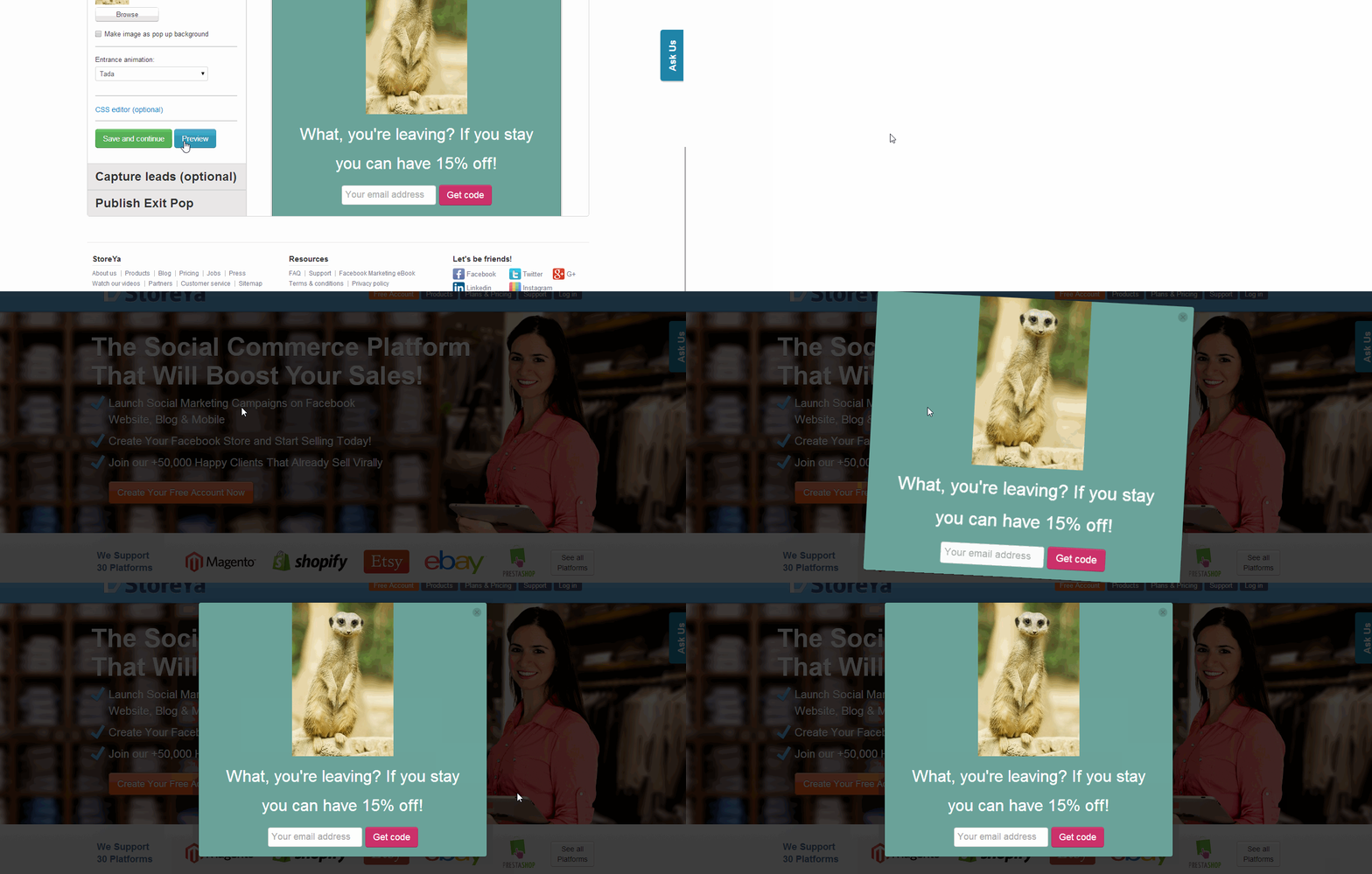
You can actually add images to your pop up as well. Images can be a great way to make your coupon eye catching and convey an emotion. I mean, how can you say no to this?
Added bonus, it’s super easy to add an image:
CSS Editor
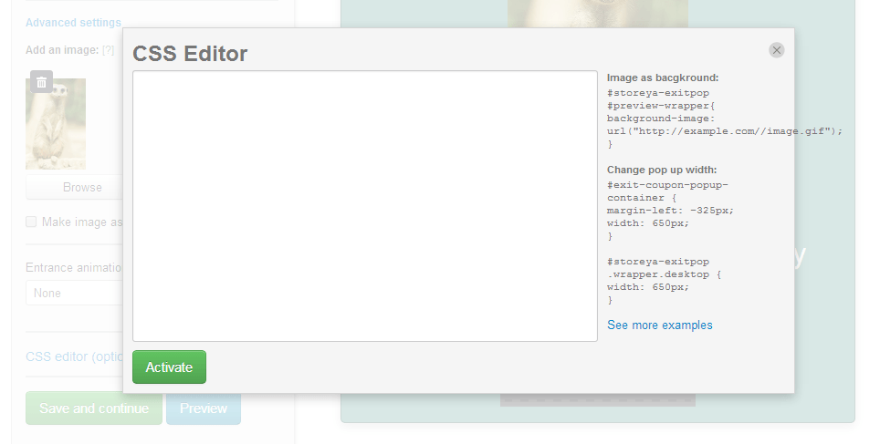
If just adding an image isn’t enough for you – you want to take your Exit Pop to the next level, the CSS Editor is for you. You can use it to add whatever customization that you want!
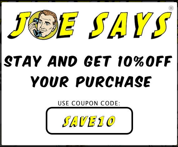
This merchant made a really amazing design for their Exit Pop:
And now for your question – “But what if I don’t know how to use CSS?” No problem! Just for you we created a page with the coding for the most common customizations that people tend to make. All you need to do is copy and paste it and you’re good to go! So go ahead and check out the CSS examples page.
The CSS editor can be found under the advanced settings tab on the left hand side:
Entrance Animation
Give your Exit Pop a grand entrance! With the entrance animation option you can change the way your pop will…pop up. There are a bunch of different choices such as fade in, bounce, appear, wobble, flash and much more! You can also choose the direction your pop up will enter from.
Write Good Copy for Your Exit Pop
In addition to catching your abandoning visitors with your visual masterpiece, you should also try to hook them with your copy. There are a bunch of different ways you can use the copy of your pop up to help your pop up convert.
Be Funny
One great way of appealing to your abandoning visitors is by being funny. Show them that you have a sense of humor, and they may actually be more inclined to stay on your site.
For example:
This merchant used a funny picture and some light hearted text to get their point across.
Or this one:
Stress the Deal
If you’re offering something good to get your site visitors to stay, then you want to make sure that they see what you’re offering. You can highlight the deal in your copy like this:
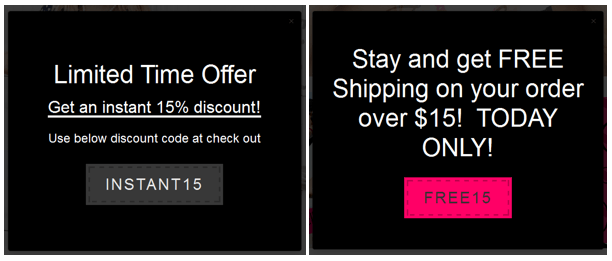
Create a Sense of Urgency
Another great way to encourage action is by creating limited time offers. This sense of urgency often drives people to action. These merchants did a great job of harnessing that:
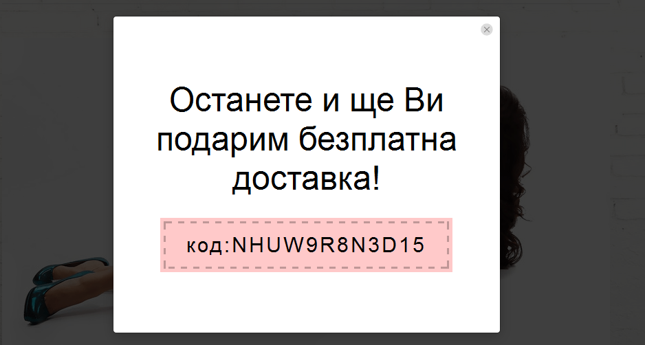
Foreign Languages
StoreYa’s Exit Pop supports foreign languages as well. No matter what language your eCommerce site is in, you can use Exit Pop to boost your sales!
Bonus Feature – Build Your Email List
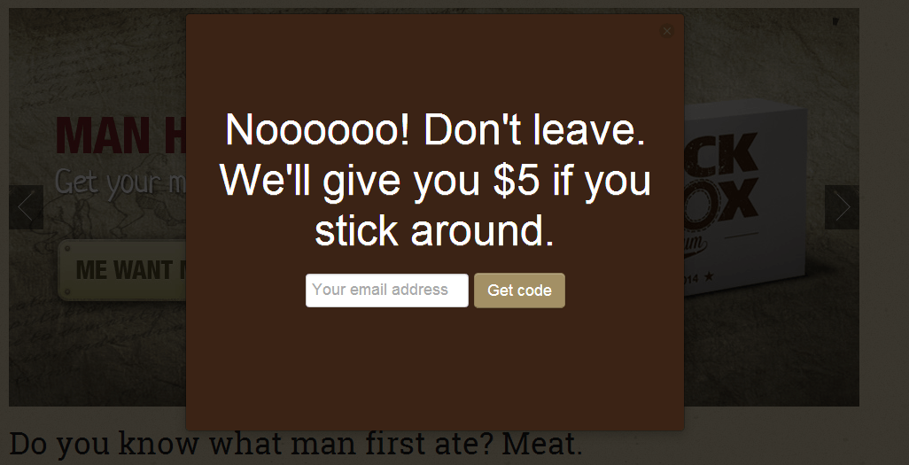
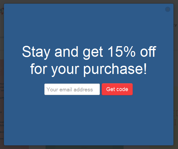
The Exit Pop actually has one more feature that you can use to help increase your sales – you can use it to capture email addresses!
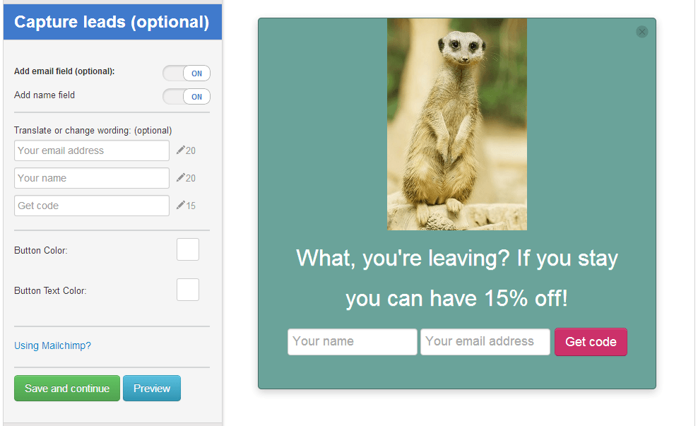
It works in the same way as the regular Exit Pop, the coupon will appear when your site visitor shows intent to leave, but the difference is that the visitor will be asked to leave their email address in exchange for the coupon.
This added feature can really help you to get more repeat customers, because you can then send targeted emails to these visitors encouraging further action.
In order to add the option for the email address simply enter the “Capture Leads” tab and switch the “Add email field” button from off to on. You can also set it to take the visitors’ name by switching the “Add name field” from off to on:
How Will it Look When You’re All Done?
If you want to see how your actual Exit Pop will look on a website, you can click the preview button to see:
So what are you waiting for? Get Exit Pop for free today!

Zack is a social media enthusiast who loves all things digital. He is the inbound marketing manager at StoreYa where he spends his days searching for the newest social marketing scoop. If you’d like to chat with him, feel free to connect with him on any social platform.
Recommended articles
 Facebook Ads for eCommerce: 16 Strategies, Examples & Tips
 How to Build a Winning eCommerce Ads Strategy
 Google Ads for eCommerce: Everything You Need to Know
 10X Your Traffic with PPC Management Software
Comments
Powered by Facebook Comments
