What could possibly be the problem? I mean, you did everything right!
Well, not necessarily. There is another aspect to your Facebook advertising aside from the ad itself, namely the landing page which you direct people to!
If the landing page for your Facebook ad is not optimized, then you won’t see sales from your ad no matter how well it performs.
In this post we will cover 4 ways to optimize your landing page to increase your Facebook ad conversion rate.
Actually Make a Landing Page!
The very first thing that should be made clear is that when running a Facebook ad campaign, it is often necessary to actually create a unique landing page for the campaign.
For example, if you are promoting a sale, then you will want a full landing page dedicated to that sale, rather than simply redirecting users to your product pages.
If done correctly, an optimized landing page for your Facebook ad can help you boost your conversions, by creating a continuity with the ad itself and by guiding the ad viewers in the right direction.
Now that we have that intro out of the way let’s dive into how you can actually optimize your landing page!
1. Use Consistent Imagery
Generally speaking, the first thing people see when they look at an ad on Facebook is not the call to action, or the text of the ad – it’s the image. The image is what catches people’s attention and draws them in to look at the ad.
Because of this, people will associate the ad with that picture.
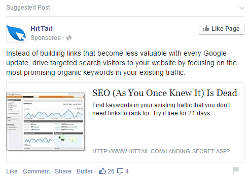
For example, this ad has been showing up on my computer a lot lately, and because of that this guy’s face has become one and the same with the ad in my mind:
What does that mean for your ads?
Well, if people associate the image they see with the ad that they clicked on, then they are going to expect to see something that relates to that image on the landing page that they arrive at.
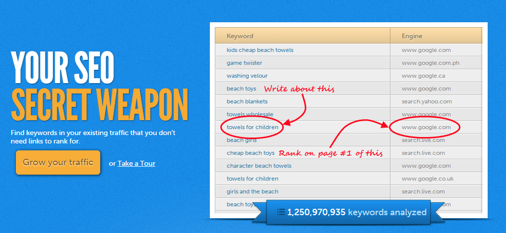
And in fact, when I clicked on the above ad, I was taken to this landing page:
Visual continuity between your ad and your landing page is a crucial factor in the success of your ad, because you want your landing page to seem like a direct extension of the ad. That means you should use the same or similar imagery, and also just as importantly, the same color scheme and fonts!
Notice how the above ad and landing page match in every regard.
Here’s an example of an ad that does not match the landing page (not to mention the fact that the image itself is a thumbnail rather than a full sized image):
The above ad sent me to this landing page:
Sure the landing page itself is good. It’s got a clear call to action and gives some information, but it is not at all related to the ad itself in terms of the imagery or color scheme.
How Should you Apply This?
When creating your ad, think about what you are promoting and determine what the best form of imagery would be for it.
- For product retargeting you should use a picture of the product itself, and then send people to the actual (or optimized) product page.
- For product promotion you can use any kind of image that you think is relevant, but you should then be sure to make a special landing page dedicated to that product. For example, if you are releasing a new line of jeans, you can have an image of someone wearing jeans, then have that same model on the “new jeans” landing page.
- For brand recognition again, you can use any image you see fit, but you should probably not just send people back to your home page, unless it matches with the ad. Otherwise, it could actually be a good idea to create a “special homepage” that these people will be redirected to which will give an overview of your business and include a single call to action like “Shop now” or “Join our mailing list.”
2. Use Consistent Copy
Only after seeing the image do people move along to the copy of the ad, but that being said, it is what the ad says, and not the image, that will generally cause people to click on the ad. For that reason, it is very important to be consistent in terms of your copy as well between your Facebook ad and your landing page.
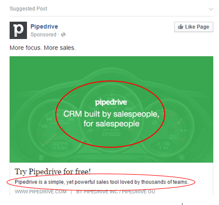
Here’s an ad that came up on my newsfeed. I noticed the copy of the ad, “CRM built by sales people, for salespeople,” and “Pipedrive is a simple, yet powerful sales tool loved by thousands of teams.”
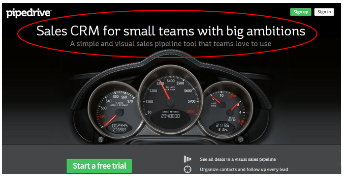
After clicking on the link I was taken to this landing page:
On this landing page I was given the same exact message as was delivered in the ad! Notice the wording, “Sales CRM,” “A simple and visual sales pipeline tool that teams love to use.” The copy is very similar!
Basically the idea is, if someone trusts the copy of your ad enough to click on it, then chances are they will trust the same copy again on your landing page. Whereas, if your ad says one thing and the landing page says something else, you are bound to lose out on some conversions!
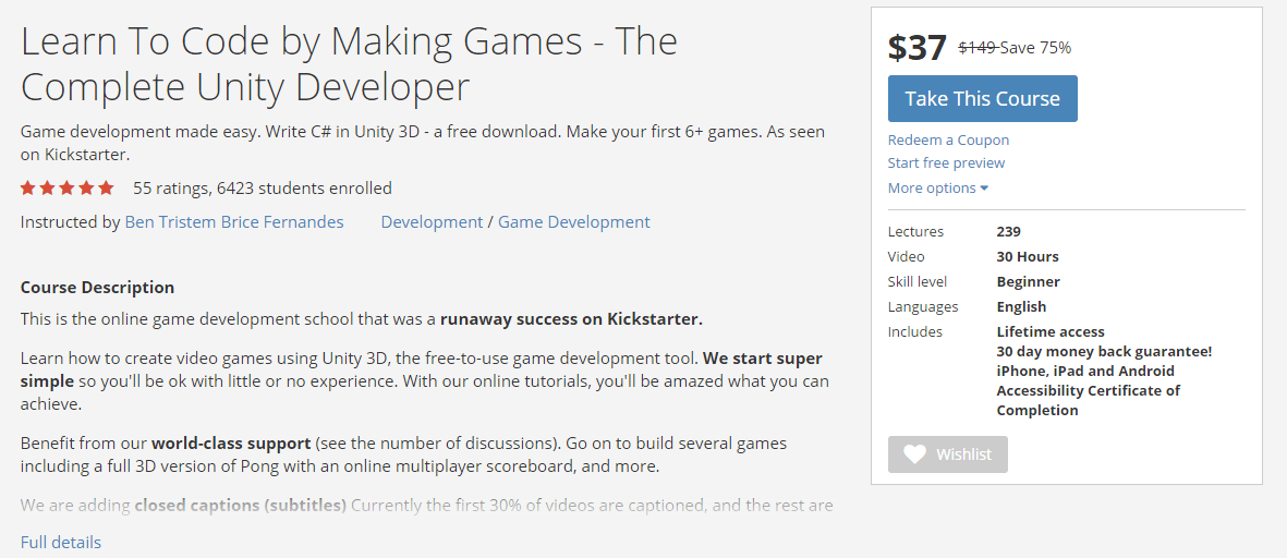
For example, I saw this ad from Udemy, an eCommerce store that sells all sorts of online courses. Notice the copy of the ad, “Build games with Unity3D.” What do I hear when I read that? “Cool! I’m going to learn how to build a game!”
Now take a look at the landing page that this ad lead me to:
The first thing I see now is “Learn to code.” Sure, when I read the rest of the sentence it essentially means exactly the same thing, but a landing page should be clear! It should have the same, or very similar headline as the ad in order to convey the exact same message.
In addition, the ad was all about saving 75% off of the purchase price, whereas on the landing page I had to look quite hard to actually find where it said “save 75%.” The savings should have been in the headline as well.
To further my point from above, notice that the landing page does not have the same visual appearance as the ad either – yet another factor that detracts from the landing page’s potential to convert users. Simply adding the same image from the ad next to the headline could have drastically improved this landing page.
How Should you Apply This?
Obviously when composing your Facebook ad you should be thinking about compelling wording, but you should also be thinking about relevant wording.
What does that mean?
Well, if you are having a sale, don’t simply write, “50% off Sale!” You should include relevant information about the sale, your brand, or the sale products as well.
Why?
First of all, because that will make your ad more trustworthy, but secondly, because that information can then be the focus of your landing page. This will create the textual continuity that you need in your ads!
3. Provide Clear Direction
When someone clicks on your Facebook ad, generally it is because they would like to receive the value that you offered in the ad. For example, if you offer a discount of 25% on a specific product, then when someone clicks on the ad it is because they want that product at the reduced price.
Now wouldn’t it be confusing if you clicked on an ad that offered a 25% discount, but when you got to the landing page for the ad it wasn’t clear how you could purchase the item?
Of course it would be!
So, in order to avoid confusion on the part of the user, and to optimize your conversion rates, you need to match the value proposition of your ad with clear directions for redeeming it on your landing page.
And what is the best way of directing your users you ask?
With a call to action button!
Great, and what does that mean?
A call to action button is essentially the aspect of your landing page that will encourage your users to take action.
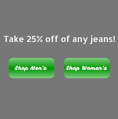
So, for the above example (25% discount), you would create a landing page with the pertinent information, and a call to action button with text like “Buy here,” or “Redeem your coupon.” Any text that would direct your users towards the value would work – for example:
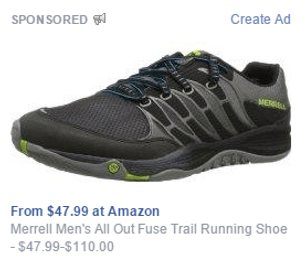
Let’s take a look at this in practice. This ad offers a pair of sneakers starting at $47.99.
The landing page I was taken to after clicking on it looks like this:
This landing page matches the ad perfectly in terms of imagery and copy, and it has a clear call to action which directs the user towards redeeming the proposed value – “Add to cart.”
How Should you Apply This?
When creating your call to action there are three main things to remember:
- Make sure that it stands out from the rest of your page. Use opposite colors in order to create a contrast and draw attention to the button.
- Make sure that it is clearly visible. The best way of doing this is by putting the button in the middle to upper portion of your page, and by centering it.
- Make sure you use compelling language that encourages action. Action words like “Buy,” “Shop,” and “Claim” for example are great for getting people into the “doing” mindset.
If we look back at the landing page from Udemy, although the content and imagery was lacking, the page did have a good call to action – the button itself stands out, it is in the top portion of the page, and it uses strong action words in the copy.
4. Optimize for Loading Speed
People browsing Facebook are generally browsing during their leisure time. What that tends to mean for ads is that if the landing page for the ad does not load quickly enough, many people will just close the tab and go back to reading BuzzFeed articles on Facebook.
Just to prove my point, according to a study conducted by Akamai, 47% of users expect eCommerce sites to load in two seconds or less!
So, as that is the case, the last step to get higher sales from your Facebook ads is to optimize the loading speed of your landing page.
None of the previous steps will help if people are closing your tab before even seeing your landing page.
How Should you Increase Loading Speed?
There are many different factors that go into how fast your page loads, but on a basic level, it depends on how “large and complicated” your page is. Meaning, do you use a lot of images? Do you use large images? Do you use flash?
In order to speed things up you should:
- Cut back on the number of images you use.
- Optimize the size of your image for your landing page by physically changing the size of your image, rather than resizing it within the site.
- DON’T USE FLASH!
- Reduce the amount of tracking, popups, and plugins working on the page.
For more on improving site speed check out this post.
By putting these tips into practice you can definitely speed up the loading time of your landing page, and make sure that people will see it, rather than simply closing it before it loads.
Optimize Your Landing Pages to Boost Your Sales!
With these four tips you are ready to optimize your Facebook ad landing pages, and in turn, boost the sales you make from your Facebook ads!
P.S. We’d love to hear your questions, remarks, experiences, or whatever else you have to say in the comments below!
P.P.S If you want to learn more about marketing your business on eCommerce, check out the free eBook below!

Zack is a social media enthusiast who loves all things digital. He is the inbound marketing manager at StoreYa where he spends his days searching for the newest social marketing scoop. If you’d like to chat with him, feel free to connect with him on any social platform.
Recommended articles
 Facebook Ads for eCommerce: 16 Strategies, Examples & Tips
 How to Build a Winning eCommerce Ads Strategy
 Google Ads for eCommerce: Everything You Need to Know
 10X Your Traffic with PPC Management Software
Comments
Powered by Facebook Comments
