Clearly email marketing is great, and you should be spending your time on it, but before you can do that, you need to build your mailing list. Even if you already have a list, you should always strive to grow it further. The more emails you have, the more potential for sales you have.
So, what is the best way to get new emails?
Research shows that on site email opt in pop ups are actually the most efficient way of gaining new addresses to add to your list! But, not all pop ups are created equal. If you really want to get the most out of your pop up, then you’re going to need to put some effort into it.
In this post we will explore 7 different ways to optimize your email opt in pop ups!
1) Consider Your Buyer Persona
In order to make your opt in forms effective, you’re going to first need to make them relevant. This is important for two reasons, 1st a more relevant opt in will be more likely to appeal to your target audience, and 2nd, because you only want people from your target audience signing up for your mailing list in the first place!
So how do you make an opt in form relevant? Well, the first step is knowing and defining who the opt in form is meant to target – meaning, what is your buyer persona or your “ideal customer”?
Now, if you don’t yet have a buyer persona for your business, I strongly suggest you build one, because it will help you in other ways far beyond just building your mailing list. For a complete guide to creating a buyer persona check out this post.
Here’s a brief overview of how to build a persona (for a more in depth look check out How to Create a Buyer Persona). There are four main aspects of your customers that you need to consider:
Demographics: Age, gender, location, employment, education, etc.
Interests: What is your target customer interested in?
Purchasing motivation: What is the reason that your target audience buys from you, and what do they hope to accomplish with their purchase?
Purchasing deterrents: What things will hold your target customer back from making a purchase at your store?
With this kind of analysis you can get a pretty complete picture of who your ideal customer is. For example, if you sell sporting goods you might have a buyer persona that looks like this:
Demographics: Young men and women, ages 18-30
Interests: Sports, fitness, and health
Purchasing motivation: Needs sporting gear. Wants to be able to use the gear for sports and exercise.
Purchasing deterrents: Price, comparison shopping, quality
So now you have a clear idea of who you want to focus your opt in on – younger people who are interested in sports, but might have some issues in terms of the price, or concerns about the quality of your equipment.
Now it’s time to use this information to create an effective opt in.
2) Design Your Pop Up According to Your Buyer Persona
Customers love personalized messages! If you have a buyer persona then that essentially gives you the ability to target your customers based on their preferences in an effective way.
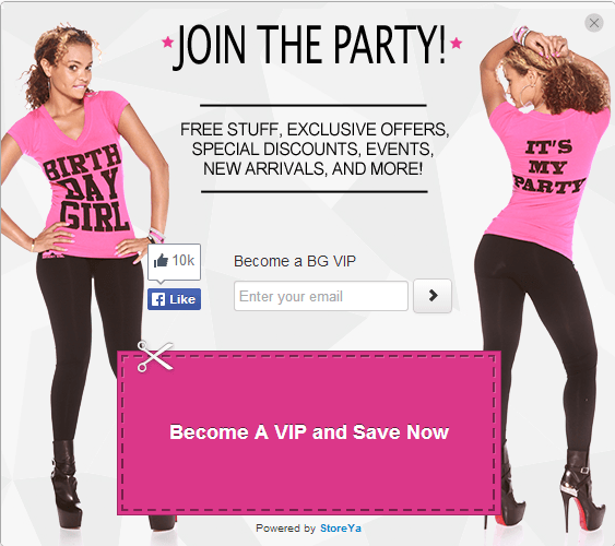
Before we can get into that though there is one thing that needs to be mentioned. This should go without saying, but even if you are not targeting a buyer persona, your pop up should always look professional. That means you should try to match the color scheme of the pop up with that of your website so that it appears like a natural extension of your site.
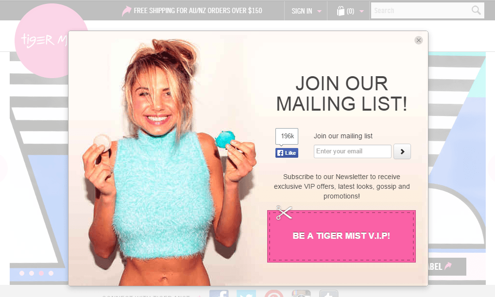
For example, look at how the pinks and blues of this pop up naturally fit with the theme of the website as a whole.
Now, to the point – you should always try to use an image in your pop up that will appeal to your buyer persona. This little addition to your pop up will make it infinitely more attractive to your target audience.
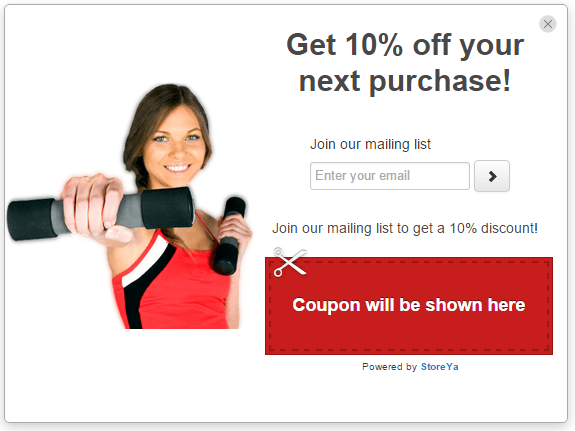
To continue our example of a sporting goods store from above, you could add in an image of sporting goods, or, better yet, an image of a person exercising! This will relate directly to the culture of your target audience.
(We have found that an image of a woman smiling and looking directly at the camera is very effective).
3) Write Your Copy According to Your Buyer Persona
To continue what we started above, just like you will customize the design of your opt in pop up to fit your buyer persona, you should compose text that will appeal to your persona as well. Think about it, relevant text will speak to your users much more than generic text would.
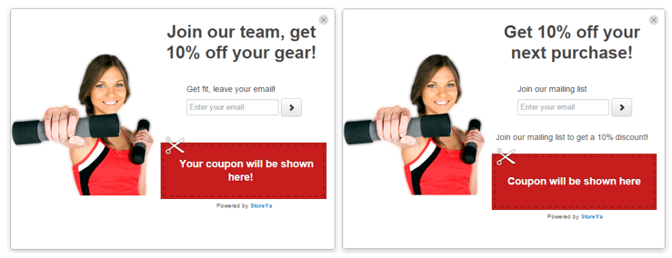
If you were visiting a sporting goods website, which opt in form would appeal to you more?
Clearly the two opt in pop ups are very similar, but there is a key difference – the one on the left appeals to the buyer persona of the store, whereas the one on the right does not. This small change will instantly boost the conversion rate of your pop up!
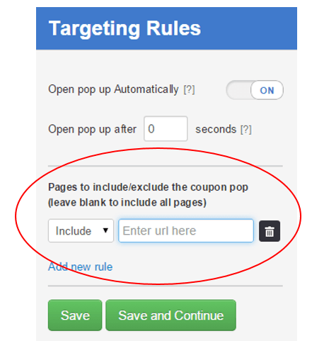
Pro tip: You can set your pop up to display on specific pages of your website. Although this will greatly limit the number of people seeing your opt in form, it can help you to target very specific users.
For example, by displaying one pop up on your men’s products and a different pop up on your women’s products you can create pop ups that are more specific to the appropriate audience.
To do this with Coupon Pop, simply enter the “Targeting Rules” in the manager and insert the page you do (or do not) want your opt in pop up to appear on.
4) Make Your Offer Relevant to Your Buyer Persona
Behind every effective opt in form, there is an effective offer. Surprisingly, not every offer is in fact effective. So, if you want to get the most out of your opt ins, you are going to need to ensure that you have a good offer.
What is considered a good offer?
Simple! Just like every other aspect of your opt in pop up, you have to come up with an offer that appeals to your buyer persona. If your site visitors are interested in your offer, they will leave their email addresses.
There are a few types of offers you can make in your opt in form:
Discounts and coupons are the most basic and most obvious offers that you can make. These are generally quite effective, and we would definitely suggest using them.
If you’re wondering how you can make a coupon any more relevant than it already is (after all, if you sell sporting goods, and you offer a discount on your sporting goods, that should already be a very relevant offer), the answer lies in your wording. Meaning that in your offer you should recall something that relates to your buyer persona.
Think about the text of the Coupon Pop above, “Join our team, get 10% off your gear.” This relates very directly to the buyer persona of a sporting goods store.
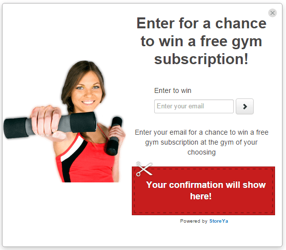
Run a sweepstakes with a prize that is relevant to your audience. For example, the sporting goods store could run a sweepstakes with the prize being a month subscription to a gym.
To run a sweepstakes with Coupon Pop, create a new pop up in your manager, and then simply add all of the emails you gain from the sweepstakes opt in to an Excel sheet, and choose your winner at random.
Now that we’ve gone over all of the tips related to personalizing your offer, it’s time to take a look at a few general opt in form tips that you should be aware of!
5) Keep it Short and to the Point
No one wants to sit and read a long description when they are being asked to leave their email address. Even if you have a lot of relevant information that you want to share, save it for your welcome email! The opt in form is all about getting straight to the point with the bare bones minimum text possible.
You can think of your opt in forms like a landing page – anything outside of the call to action and very relevant information is a distraction.
6) Explain the Benefit of Joining Your List
Even if you create an extremely personal opt in, you master the design, and everything is perfect, it’s possible that people will still be unwilling to leave their email addresses if they don’t know what the long term benefit is for them.
To avoid this problem, you should include a brief explanation of exactly what you will be doing with your visitors’ email addresses – Will you send them coupons in the future? Will you send them weekly tips? Tell them what they will get and they will be more likely to leave their address.
Another tact you can take is to simply write, “We promise not to spam you!” Even this short line should work to build up the trust necessary for your opt in form to convert.
7) Play with the Timing
Finally, there is the timing of your pop up. There are a few different approaches you can take for the timing, and each one has its advantages and disadvantages. In practice, this is something you will need to test in order to find which works the best for your specific site.
Here are the options available to you:
Display your opt in pop up immediately to your site visitors upon their entering your site. This way you will be sure that they do in fact see your offer. With this method you will have a higher percentage of people who will actually see your opt in (it should be around 100% of your site visitors).
The downside to this method is that you do not give your visitors any time to familiarize themselves with your site, and browse around a bit. That means that you might be catching them too early for them to be able to make a decision.
Still, if your opt in form is optimized for relevancy you should be able to catch a good percentage of your visitors with this type of pop up.
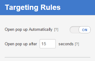
Delay the launch of your opt in pop up for a few seconds. This will give your site visitors a chance to see that your site is in fact for them (or not), before they are asked to leave their email address.
By doing this your pop up will be exposed to less people because some users may leave your site before the pop up appears. But, because of that you will probably reach a more targeted audience, because only people who are at least somewhat interested will still be on your site when the pop up appears.
With Coupon Pop you can set this targeting option up from the “Targeting Rules” tab in the manager.
Display your offer to exiting visitors with an Exit Pop. This tool tracks your site visitor’s cursor movements in order to detect the moment that they show intent to leave your site. People who are on their way out of your site have probably seen enough at this point to know if they like your site or not.
Go Collect Some Emails!
Take what you’ve learned and go get some new emails for your mailing list!
If you don’t already use it, check out the Coupon Pop here.
If you’re wondering how to use these emails to generate sales you should definitely check out our eBook on email marketing below!

Zack is a social media enthusiast who loves all things digital. He is the inbound marketing manager at StoreYa where he spends his days searching for the newest social marketing scoop. If you’d like to chat with him, feel free to connect with him on any social platform.
Recommended articles
 Facebook Ads for eCommerce: 16 Strategies, Examples & Tips
 How to Build a Winning eCommerce Ads Strategy
 Google Ads for eCommerce: Everything You Need to Know
 10X Your Traffic with PPC Management Software
Comments
Powered by Facebook Comments



Very helpful for this newbie. Thank you!