There’s another reason that YouTube is so great for merchants though, namely the call to action feature – and it is just that feature that YouTube has updated!
Until now, YouTube offered the option for “annotations” in videos. Annotations are those clickable banners, links, and images that pop up in videos (and often really clutter the screen).
These annotations enabled businesses to direct people back to their website, encourage viewers to purchase a product featured in the video, and more.
So why the need for something new if this is already working?
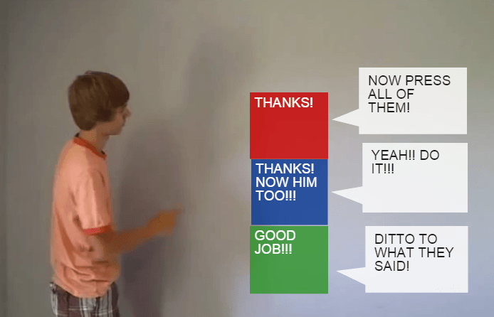
Well, first of all, I think that YouTube realized that annotations have been abused to the point that they no longer improve the user’s experience – as has been parodied a number of times:
Secondly, and more importantly for marketers, annotations do not show up on mobile!
In steps YouTube’s new solution – YouTube Cards.
Let’s go point by point.
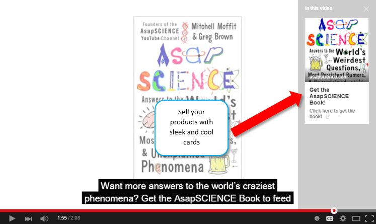
First, YouTube Cards are simple, sleek, and (most significantly) relegated to the right hand side of the screen. This creates a more pleasant viewing experience for the user.
Second, YouTube Cards work on mobile. According to YouTube a full half of all video views are on mobile. So that means you have now doubled the potential reach of your video’s call to action!
So how do cards work?
Currently there are six types of cards you can use in your videos: Merchandise, Fundraising, Video, Playlist, Associated Website, and Fan Funding. So there is basically a card for anything that you could want to link to.
Here’s the downside of cards though – they don’t show up automatically like annotations. Rather, there is a little “i” icon in the top right corner of the screen which a user can click on to see the cards.
Don’t get too down though, there are some positives that come from this system. First, the icon will be displayed throughout the entire video, meaning there is a longer potential time period for people click on it and see your cards.
Second, there is a few second teaser text that scrolls out of the icon as a call to action encouraging users to open your cards. The text of this CTA and the timing are both customizable.
The advantage of this call to action system is that although it’s unobtrusive, it is very noticeable, meaning that you can reach your audience without shoving the CTA in front of them.
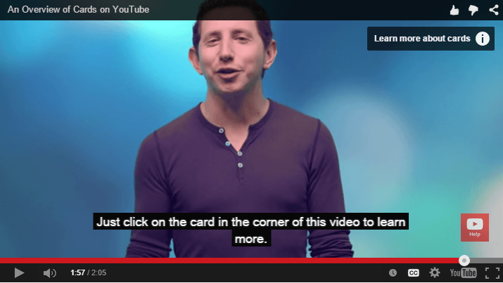
This also should lead to more targeted clicks, because only someone truly interested would click, for example, to “learn more about cards.”
Looking to the future, YouTube has said that it plans to replace annotations with cards, but it will only do this, “once they can do everything annotations can do today, and more,” so if you’re not yet satisfied with the functionality of cards, don’t you fret, there’s more in store!
For more on cards, watch the below video, or check out YouTube’s tutorial here.
P.S.To learn more about social media marketing, check out our complete guide below (it’s Free)!

Zack is a social media enthusiast who loves all things digital. He is the inbound marketing manager at StoreYa where he spends his days searching for the newest social marketing scoop. If you’d like to chat with him, feel free to connect with him on any social platform.
Recommended articles
 Facebook Ads for eCommerce: 16 Strategies, Examples & Tips
 How to Build a Winning eCommerce Ads Strategy
 Google Ads for eCommerce: Everything You Need to Know
 10X Your Traffic with PPC Management Software
Comments
Powered by Facebook Comments
