Winning at social media has had two sides: being social and sharing engaging types of digital media. Now is the time to welcome the third point: images. In fact, our brain can comprehend an image in 13 milliseconds (according to research from MIT). There is of course a right way to use images in social media.
As social media has advanced and become a better tool for marketers, it has also changed the way people take in news, information, and content in general. Say bye to the days of long text and hello to the days of visual media.
To kick-start your social media efforts into a new level of awesomeness, I’m going to go over with you how to use images in social media so that you can turn your social media effectiveness into something out of a Hollywood movie.
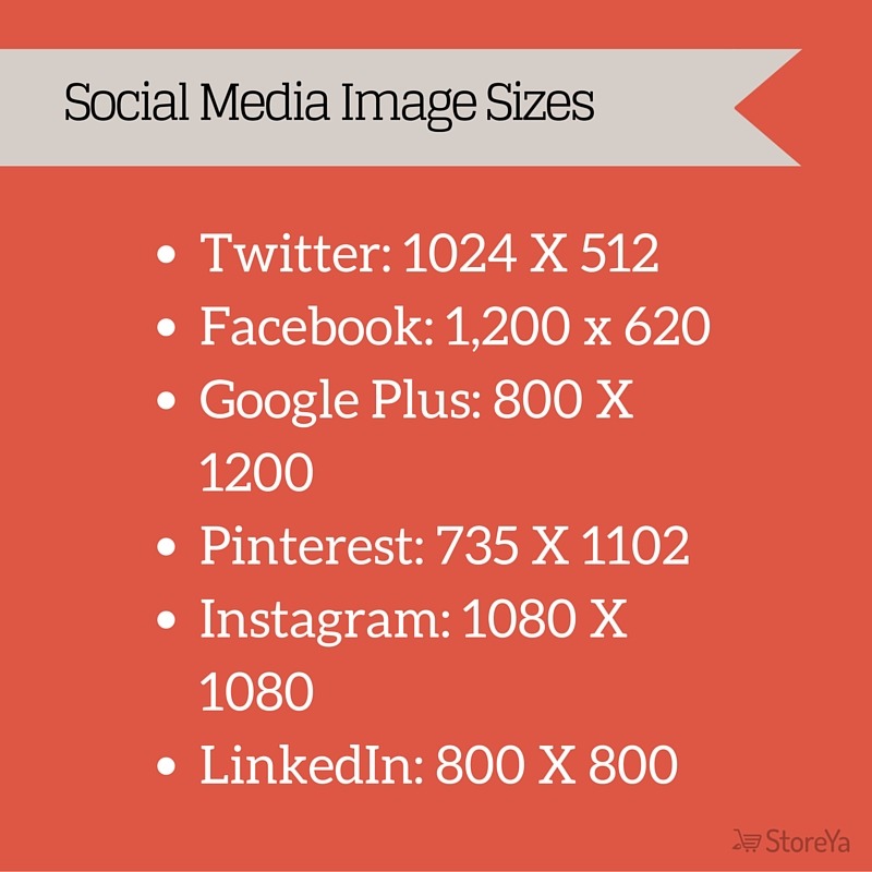
1. Get the Sizes Right
I have been driving this point home to readers for a while now, mentioning that using the right size is a must if you want to create a thriving social profile, and if you want your images to be a source for successful growth hacking. With the number of free tools available to help you resize and edit images, there really is no excuse not to use the correct image size for the respected social media platform.
2. Different Types of Images
Do you go to different types of events – meetups, conferences, daily meetings, classes – dressed the same way? You probably mix it up from event to event. Your social media images should not be the same either, as you should be using different images for different purposes.
Screenshots
This is a great way to generate awareness around the quality or proof of concept regarding your product/service. Social proof has quickly turned into one of the cornerstones of successful ecommerce business and screenshots of what you or others have already shared is one of the more efficient ways to create social proof around your brand.
Behind the Scenes
Creating images that shows fans what goes on behind the scenes is another underrated move that leads to success more often than not. Take “The Coolest Cooler” for example. The anticipation that led to the product’s release made sharing behind the scenes images not only engaging, but also a very smart way of creating trust with their growing number of fans.
Action Images
Still images work. They bring engagement. However, sometimes you need something to “spice” things up. That’s exactly where action images step in and take your page/profile’s engagement up a notch. I agree that this is an awesome picture, but don’t get carried away with the number of action images you use, or they could lose their powerful effect.
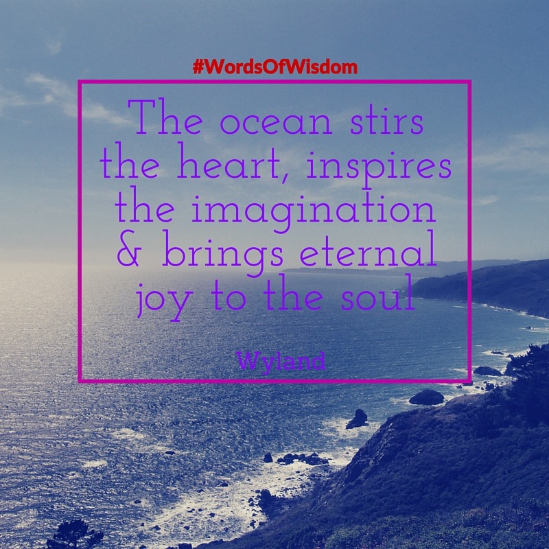
Text Images
Text images have become the talk of the town over the last year. Every successful and engaging social media profile – no matter whether on Instagram, Facebook, Twitter, or LinkedIn – knows the importance of using text images here and there. What can you do in text? Quotes from customers, famous quotes, statistics, slogans, tips, and much more.
3. Fonts Matter
You might be thinking to yourself that this is a minor detail. That would be a mistake. From this post you can hopefully interpret one thing in particular: emotion is what drives people to interact (and make purchases :)). An image can only have the potential to go viral when it is accompanied by emotion (and obviously relevance).
Fonts are another part of the equation that you need to add to make an image an emotion trigger for its viewers. The font you pick will either go along with the image like vanilla ice cream with warm apple pie, or it’ll go with it like bananas and potatoes (Imagine that!).
One of the more compelling questions is whether to use one font or to mix and match it with another one or two. If you are going to use another one (or two), make it noticeable but keep it fashionable. The two fonts should differ from each other and help emphasize the message. See what Canva has to say about the fonts.
Don’t forget to take these things into account:
- Does the image represent something normal or casual?
- Should the text be the main attraction (consider bold) or the side attraction (lighter)?
- How much space is there for text? Some fonts are better bigger, while other are better smaller.
- Does the font match the text? If you are writing a call to action, something simple will probably convert better than a cursive or stylish text.
This slideshare is absolutely fabulous if you need to get better with your fonts:
4. Use Slogans
You do not have to be Nike, McDonald’s, or Target to have a slogan. Hashtags are for everyone – small, personal, and big businesses. As the saying goes, a picture is worth a thousand words. To give your images that added boost that’ll enable them to be worth more than a thousand words, consider throwing in a small amount of text.
That is where the slogans step in. No one wants to read a lot on Instagram or Facebook. On Snapchat there is no text to go along with the posts. On Twitter you’ve got less than 140 characters if you use an image. Keep the text to a minimum.
The slogan is what represents your brand – from day one and forever (unless you choose to change it). You don’t want to remind people what you stand for with text on every image, however echoing the message with your slogan (that isn’t the focus of the image) once in awhile (no more than once a month) can do wonders for increasing engagements on your pages and profiles.
5. Images Must Stand Out
Who makes up the majority of your fans? This should not be a tough question. The reason I ask this, is that you need to use images that engage them and at the same time also stand out from the rest of the feed. You want the little things in life to remind people of your brand, and to do so, you need to create a persona. Here’s how to do that with your images.
Use Colors That Convert and Represent Your Brand
Your colors are part of you, and should be present in a majority of your images. There are colors that tend to convert better than others (red, pink, and purple according to Buffer), but that does not mean you must implement them. If your brand represent the environment, then keep using brown and green. You don’t have to conform.
If you want to try using red, pink, and/or purple, try adding a dash either as a border around the image, or by using images that have one of those colors in them.
Images Can Tell Stories
The images should be able to tell a story all on its own. Those images that get more likes, shares, and comments than others are those that are able to stand alone and express a point no matter if they’re on a Facebook page, in a Google search, or all around Snapchat.
Emotion Engages and Sells
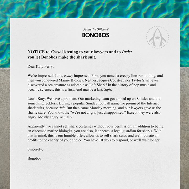
Resonate with your fans by engaging one of their emotions with your image. Humor is a good change-of-pace tactic to jump start the life back into your social profile.
Humor works for Bonobos…
Identity and empathy work for Macy’s…
Be Consistent
The message you are sending to fans should be consistent. That does not mean that there is only one way to express the message! Successful branding is all about being consistent with your message while being creative in expressing it. Know what you represent and then use images to share that.
The Font Matters
As I pointed out, don’t forget that fonts are part of the equation when it comes to creating images that go viral. If you make the font an afterthought, your images will more than likely be an afterthought for your fans.
The Recipe
- Image should be the right size
- Use different types of images for different purposes
- Choose fonts wisely
- Slogans work in moderation
- The image must stand out
These tips can be and should be used across all of your social platforms. Yes, you can use text images on LinkedIn. A screenshot here and there might work on Instagram. Know why your fans follow you on Instagram, Facebook, Twitter, LinkedIn, and Pinterest. Then give them the image that is most relevant to them on that network. LinkedIn is not Instagram, so know why people follow you on each one.
How are your images doing? Are you getting the same amount of clicks for all of the different types of images you are using? Please share with us in the comment section below what you have learned about visuals so we can all improve the way we use images in social media.

Ty is a digital marketing enthusiast that can't get enough social media marketing and content marketing. He is the inbound marketing manager at StoreYa where he spends his days searching for the newest social marketing scoop and creating amazingly awesome content. If you’d like to chat with him, feel free to connect with him on any social platform.
Recommended articles
 Facebook Ads for eCommerce: 16 Strategies, Examples & Tips
 How to Build a Winning eCommerce Ads Strategy
 Google Ads for eCommerce: Everything You Need to Know
 10X Your Traffic with PPC Management Software
Comments
Powered by Facebook Comments
