Think back to your last purchase. Why did you make it? We are drawn to complete a purchase when either the product, its price, or another element in the shopping experience successfully triggers an emotion suitable for that purchase.
We don’t make purchases just because we “like” something. The emotion is much stronger than simply liking something. In a study regarding the effect of emotion in eCommerce purchases, researches found that websites with a stronger emotional impact produced a greater intent to buy! Today we’ll get into how you can do the same for your eCommerce business.
Proven Example
The team at conversioner was able to increase the number of paying users for one of Asia’s biggest online dating sites by 340% with the use of emotional targeting. How did they achieve such optimal results?
The dating site got a new landing page that triggered a more relevant emotion: simplicity. In that specific case, a design that demonstrated the wide variety of people that could be met through the service made visitors feel wanted (see below).

As you’ll see in this post, the smiling faces (more than one type of person), combined with a very short catch-phrase is all that’s needed to increase conversion rates. That’s a dating site, but the same tactics work for eCommerce conversion rates too.
How to Use Emotion to Increase Conversion Rates
Emotion: a conscious mental reaction (as anger or fear) subjectively experienced as strong feeling usually directed toward a specific object and typically accompanied by physiological and behavioral changes in the body (Merriam-Webster Dictionary).
Step 1: Who’s the Customer? Define the Buyer Persona
We won’t get into the technical details of finding your customer persona in this post. Just as multitasking is not a great idea, covering two very different, although connected topics, in the same post is also not a great idea.
However, to make sure this post helps you use emotion to captivate your shoppers, we’ve got to cover the basics. The buyer persona should be comprised of four basics factors:
- Demographics – age, gender, location, employment, education, etc.
- Interests – what your target customer is interested in
- Purchasing motivation – why your target customer wants to buy from you and what they hope to accomplish
- Purchasing deterrents – things that will hold your customer back from purchasing from you
The goal is to discover exactly what type of person your ideal customer is. The more you know about who you are trying to sell to, the more efficient your business will be, and the easier it’ll be for your to trigger the right emotion. Who is your ideal customer?
For more on buyer persona, read “How to Create a Buyer Persona [Plus an eCommerce Example]”.
Step 2: Picking an Emotion to Trigger
What do you want to trigger? Is it a sense of trust? Maybe you want to trigger necessity? For each business, the answer can and will vary. One common trait found across the board to be true for businesses: positive emotion toward a brand has a deeper influence on customer loyalty than other triggerable emotions that are based on the traits of a brand.
Airbnb has more than one buyer persona, however there is one similarity across the board: the need for a cozy, good night’s sleep just like home, triggering trust, warmth, and belonging.
Emotions that work for every site:
- positivity
- belonging
- trust
- jealousy
- fear
- value
- instant gratification
What works for your site might be fear, while for someone else trust is the key emotion. You need to use the buyer persona to understand what makes the customer hit the gas full strength.
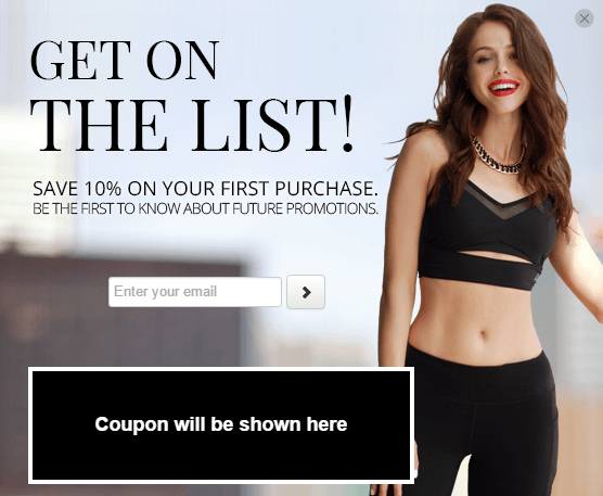
For Titika Active, it looks like jealousy or belonging (think of 20 something females) could be the emotion that they’re trying to trigger with the help of the lady on the right and the strong typography. Why jealousy? It’s on the female in the promotion, but not on the the female customer. If she’s jealous, and feels like she is part of the brand, then a purchase is inevitable.
Step 3: Using the Right Text (Copy)
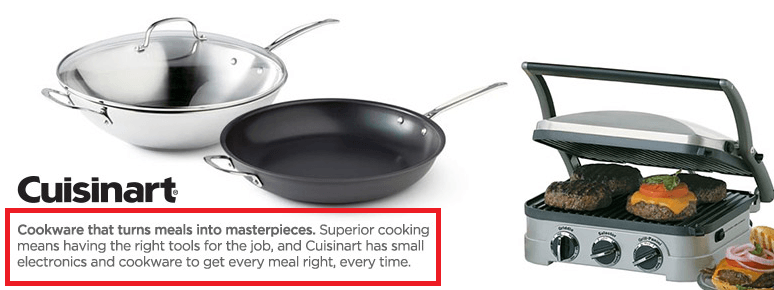
Were all words created equally? Maybe they were created equally, but not all words have the same power or influence – even when they may have nearly identical definitions.
When it comes to the copy that you are using – whether to describe a product or on a new site-wide promotion – less is more. Research from the Nielsen Norman Group shows that visitors read less than 28% of text on the page! The lesson is to keep the text to a minimum, make it easy to skim for speed readers, and use the best words that will be read.
The Right Adjectives
You know that not all words have the same effect and that too many words aren’t being read. The next step is to active the right words that will be read. Instead of using common adjectives that leave your customers debating your product, use adjectives that have a concrete meaning.
For example, perfect vs. great. Great can mean many thousands of different things, whereas perfect has a simplified and stronger meaning: it’s the right fit, and there is no better one.
Remove these adjectives from your vocabulary:
- great
- awesome
- amazing
- cool
- terrific
- unforgettable
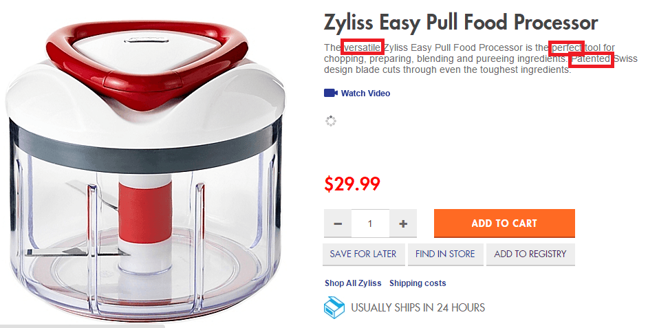
What Bed Bath & Beyond Gets Right: it’s clear that I am getting a product that can get the job done better than the rest. There’s no shortage of trust, value, or instant gratification.
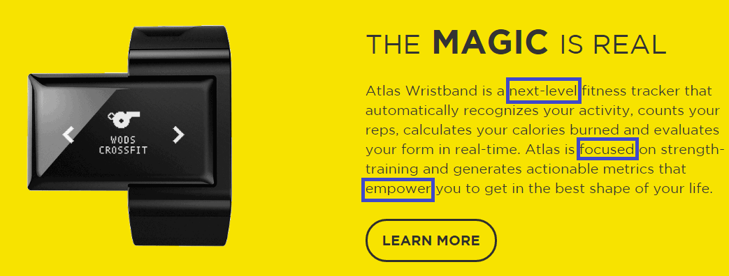
What Atlas Wearables Gets Right: it’s clear that this product will enable me to take my fitness to the next level. A sense of power and value are the first emotions that hit me.
This much is clear: using adjectives that provide a clear picture of what it will be like to use the product are the ones that lead to a noticeable improvement in your conversion rates.
Add these words to your vocabulary:
- perfect
- essential
- empower
- smooth
- clear
- versatile
Step 4: Images and Design
Your design needs to do the same thing as your text: bring to life an emotion that will make the customer complete the purchase. If the goal of your text is positivity, then the design should do the same. If your text is all about value, then the design should be that too.
According to web designer Paul Jarvis, in order to trigger emotion, your design needs to get four things right: visually appealing, enjoyable, memorable, and personal. You need to use those four cornerstones together to jolt the emotion to life.
Recommended: 8 eCommerce Design Trends for 2016 to Ignite the Selling Potential of Your Store
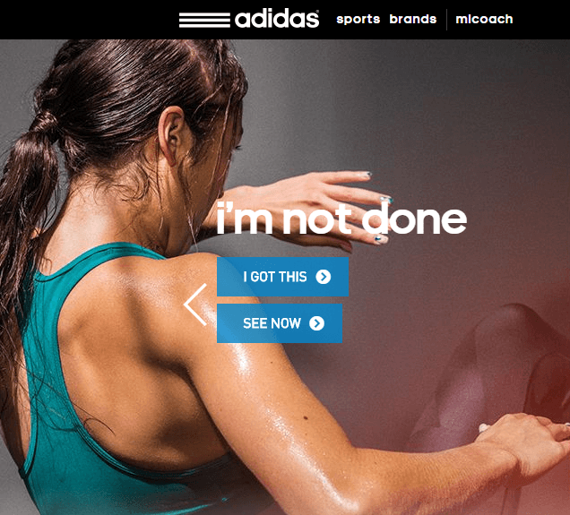
The following image from Adidas is spot on. Even if the words “I’m not done” were not in the image, we would all still be able to understand that the brand stands for work ethic and competition.
Does this meet all of Jarivs’ basic points? You be the judge.
The sweat, action, and frazzled hair all resonate for their potential buyers that take pride in their work-ethic. As a result, the customer is motivated and maybe a little jealous of the women in the picture.
The image is visually appealing, enjoyable (for their buyer persona), memorable (even more with the added text), and personal. The next step is completing the purchase.
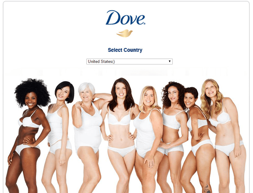
Over the last few years Dove has rebranded itself to be the brand for anyone and everyone – especially within the different types of females.
The first thing you see on their site is the following image. This design is as basic as it gets, yet it is still able to generate emotion within the customer. In this specific case, Dove is able to elicit a feeling of belonging for every customer that lands on their page.
Below is a Coupon Pop being used on the eCommerce site PYTHair. The design hits the nail on the head. Without paying any attention to the tax, the team uses the color blue and an image of a young lady – after using their product – to create a sense of both trust, happiness, and jealousy.
Step 5: Emphasize Benefits and Not Features
Notice that in the above Coupon Pop the brand did not mention their products or add an image of one of their products. They sell an experience that makes their customers happy; beautiful hair.
Now go ahead and visit the most successful eCommerce website you know of – whether it’s a giant brand or a small business. You will notice the same thing. The site, the pictures, and copywriting is all presented in a way that reflects the experience of using the product.
Why? Images and text that reflect the experience of using the product is much more emotionally engaging.
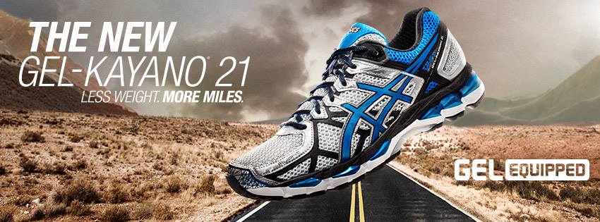
Notice the below image from Asics. For me it stands out because it makes absolutely no mention of any feature. All it does is tell me what I want to know – run more!
Here JCPenney does not mention one bit of information about the technology or about some flashy feature. They sell people the experience of using the products.
Both Asics and JCPenney pass on mentioning features because although they may be important, generating a strong sense of emotion is much more difficult with a feature, whereas with an experience the customer gets to know the result. Results are what matter to your business, and they are what matter to your customers. Great results means happy people. Happy people spend.
Pro Tip: Typography
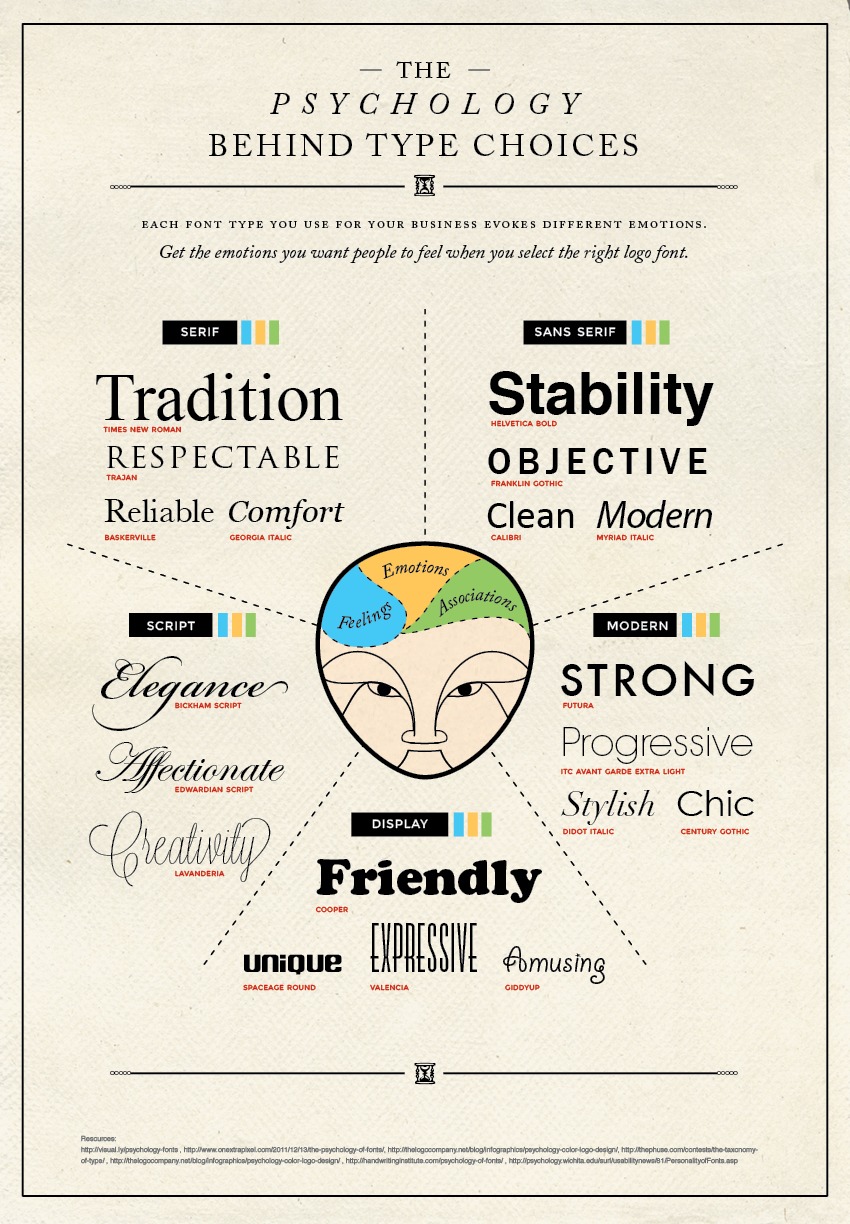
The font you use may matter more than you think. Although you might be limited to the type of fonts you can use in your themes, with the Coupon Pop you can use any Google font. This graphic breaks down just a few types of fonts and their psychological meanings in regards to the emotion they encourage.
Putting it All Together
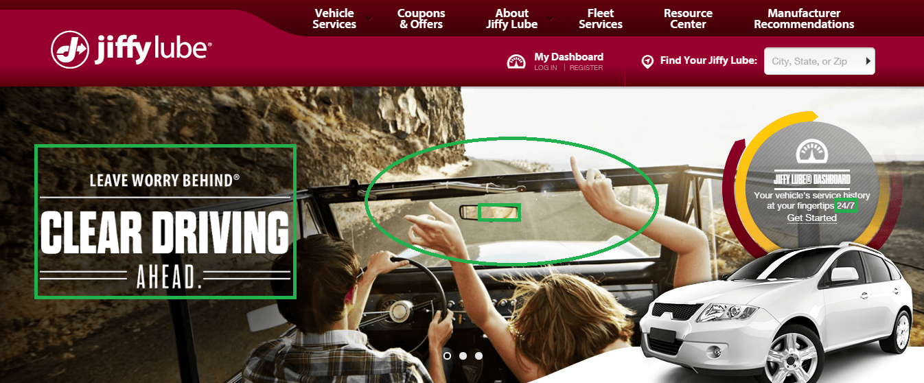
Jiffy Lube is not an exciting business, at least not as much as say Nike, Jaguar, Uber, and others. In their own words, “a chain of over 2,000 businesses in North America offering oil changes and other automotive services”.
With this homepage design however, they have become exciting to their visitors. How much text? Only six words. Not only is the quantity perfect, but so is the quality of the words used, such as “worry behind” and then “clear driving ahead”.
The image completes the text, by using what appears to be a happy couple, using an old-school car. In addition, whether you noticed or not, the mirror reflects the man’s smile, while the passenger waives her hands in the air. These actions serve as proof to the text.
Emotion Clouds the Mind
Emotion is what take the customer from step A (wanting the product) to step B (buying the product). The goal for your eCommerce business is to improve your conversion rates. At the end of the day, that goal is one factor (high vs. low conversion rates) that plays a major role in whether you turn into a relevant, growing brand or not. The means to achieving this goal is by triggering the right emotion.
Once you are able to trigger the right emotion, all the rest of the pieces fall into place.
Your Homework
What is the buyer persona of your site → What emotions will make completing the purchase an urgent process? → How can you bring that emotion to life in as few words as possible? → How will you describe the experience your product offers? → How will you bring the emotion to life with images and overall design (including fonts)? → Constantly run A/B testing until you have found the winning emotion.
Good luck! If you’ve got any questions or comments, we’d love for you to say something in the comment section below.

Ty is a digital marketing enthusiast that can't get enough social media marketing and content marketing. He is the inbound marketing manager at StoreYa where he spends his days searching for the newest social marketing scoop and creating amazingly awesome content. If you’d like to chat with him, feel free to connect with him on any social platform.
Recommended articles
 Facebook Ads for eCommerce: 16 Strategies, Examples & Tips
 How to Build a Winning eCommerce Ads Strategy
 Google Ads for eCommerce: Everything You Need to Know
 10X Your Traffic with PPC Management Software
Comments
Powered by Facebook Comments

