Your order confirmation email is often the very first email your customers will receive from you after completing a transaction, so you have to make it count! These emails have a very high open rate (in the area of 70%!). The most successful eCommerce businesses capitalize on this opportunity to solidify their brand image, start a relationship with their customers, build engagement, and increase sales.
Successful eCommerce businesses understand that it typically costs between 6 and 7 times more to acquire new customers. Unfortunately, some businesses treat the order confirmation email as nothing more than a necessary transactional email. Receiptful strives to change that, and to help you out, here’s a list of what makes a great order confirmation email.
Order Confirmation Emails for Business Growth
1. Beautiful
No matter what industry you’re in, your emails should look visually appealing. Never underestimate the power of beautiful things. Most online vendor emails are in plain text, unattractively designed, and don’t reflect their sender’s brand.
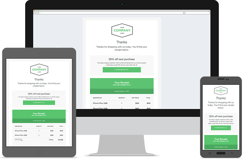
What you should try instead is a clean, minimalist design with a personalized thank-you note, a brief description of what the customer purchased, and what is normally expected from a receipt. The smartest business people capitalize on this opportunity to upsell and cross-sell tastefully, by showing products the customer may be interested in. Offering a discount coupon to encourage the next purchase is also a wise next move.
At the top, your logo should be displayed, and all throughout your receipt, colors, fonts, and the general language should reflect your brand powerfully.
Speaking of your brand…
2. Consistent Brand Look
Your order confirmation, just like any email your customers receive from you, should reflect your brand consistently. We trust and respect businesses that maintain a clean, consistent brand look, and assume they will handle our business better than their “messier looking” counterparts.
Picture this: Your staff uniform is black pants and blue t-shirts. It’s Monday, and one of your favorite employees arrives in a Hawaiian floral shirt over neon-green shorts. You wouldn’t get caught letting them talk to your customers, no matter how eloquent they are. So why wouldn’t you do the same with your order confirmation email?
To give you an example of how important this is, let’s think of the colors and font associated with the Coca Cola brand logo. Go ahead!
Have you guessed the colors? Do you recall the logo?
Now would you drink this?
Or buy this?
 [Image credits to Graham Smith]
Chances are, you wouldn’t trust these products or their sellers, if their brand images weren’t so consistent.
3. Mobile Friendly
This goes without a saying: with nearly 40% of receipt emails opened on a mobile device, it’s crucial that your emails are not only mobile friendly, but optimized to virtually any device.
You may ask: How exactly do I make my email mobile friendly?
A typical desktop title displays approximately 60 characters, while on mobile devices, only about 25-30 characters will show. So be brief, and make your first words the catchiest. You don’t have to rigidly restrict yourself to that number though, as most titles around 35-40 characters will do fine.
Make the content concise. Ask yourself: “How would I feel reading this on a small screen?” Is the information digestible? Is it in small paragraphs, or containing bullet points? Whenever possible, demonstrate your point with images as they tend to be easier to digest (and often more fun) than text.
Don’t make your email too crowded either, and be mindful of the links and clickable buttons, they too must lead to mobile friendly pages. Finally, be sure to test your emails on different mobile devices.
4. Speak like a Person
No business is excused from this rule, even if you are in a conservative industry such as finance or healthcare. Speaking like a human, or using non-technical terminology becomes even more important when you’re running an eCommerce store.
Avoid clichés and “big business” jargon, even if you are truly a big business. In fact, the bigger your store, the more you should strive to maintain a personal touch in your emails!
Here are some examples of overused phrases, and a better way to say them:
- “Your order is processed.” – How about thanking them first?: “Thank you for your purchase! Your order has been processed”.
- “We appreciate your business”: “Thanks so much for shopping with us today”
Similarly, if you’re going to break any bad news, such as delayed shipping due to some special circumstances, do not remove yourself from the situation.
- “We apologize for any inconvenience” sounds insincere. A better way to say it is: “We’re really sorry about this”.
- “We appreciate your valuable feedback.”: “We would love to hear your thoughts”.
If you have an interesting story, about what inspired you to start this shop, your team, your business hopes and aspirations, mention them in 2-3 lines. If you can immediately connect with your customer by giving your business brand a personality, all future communications will be that much easier.
Another great thing is to add your (friendlily smiling) picture and name or signature to the email. Putting a face to the company immediately makes it more personable and inspires trust. Would you rather get an email from a team member, such as Robert, or an email from the company?
5. Add Value
We mentioned above that you are more likely to generate sales from existing customers, and that it costs almost 7 times less to do so, than to acquire new ones, so why not start from the order confirmation? Just be careful not to overdo it. We recommend following the Pareto Principle, also known as the 80/20 rule. 80% of your order confirmation email should be transactional, and only 20% should be promotional content.
A simple discount coupon or product suggestions as products that complement their previous purchase, without being too pushy, can be highly effective.
Recommended >> 7+ Order Confirmation Emails to Skyrocket Sales
6. Don’t Use a “No Reply” Email Address
Gone are the days when marketers and business owners funneled information in a one-way direction. Today, email marketing is your opportunity to encourage feedback, and all types of interactions. That starts by allowing your customers to reply.
Enabling customers to reply to emails is especially important in preventing customer support issues getting out of control. An example scenario would be a customer who receives an incorrect tracking number. Your order confirmation says the product has been shipped, but when they check, it says that the product hasn’t left your facility. They send a reply to the email, but it comes back as a failed delivery. They try to reach out to you somewhere else, but it’s kind of difficult to find out which email to send their inquiry to. Next thing you know, your company name is hashtagged with an angry statement, or your wall has a negative comment warning other customers against shopping from you because “you are a dishonest business”.
Customers aren’t always going to be patient enough to know your intentions. Give them a chance to vent, and give yourself an opportunity to fix mistakes before they get out of hand.
7. Success Leaves Clues
To know the way, ask those coming back – Chinese proverb.
We analyzed for you different emails from the some of the best eCommerce merchants.
To start, all the emails that made it to our hall of fame are clean, short, and have a minimalist design. It’s important to remember that your email communication with customers should be fun and to the point. No one likes to read an essay when the purpose is to simply extract information. Let’s take a look at what makes some of these examples great.
Amazon: A clear and minimal email isn’t itself unless the call to action is also fitting. Amazon emails only contain a few links, and a big, visible call to action. If you’re going to insert a call to action in your order confirmation, make the purpose clear. Don’t let your customers guess what exactly you’re asking them to do.
Recommended >> 11 Tips for Creating the Perfect Call to Action
Another lesson we learned from Amazon is to use the right words. Avoid “pushy” sales terms, people are generally resistant when they feel like you’re forcing something on them. Amazon uses a smarter strategy: it gains intelligence about its customers, understanding what they want, and then offers the promotion in an appealing manner.
Eventbrite: Eventbrite emails give customers what they look for immediately. If your customers are expecting a tracking number, be sure to make it clearly visible in the order confirmation. Show the shipping status and estimated arrival dates, especially if your customer is in a rush to get their item. If the purchased product is digital, such as a ticket to a show, or a downloadable song, give it to them right away, or give them the confidence that it’s coming within a clear and reasonable time frame.
Creative Market: Aside from brevity and the aesthetically pleasing design, Creative Market used a personal message. Albeit nothing too fancy, the simple “Thank You John for your purchase” note, is better appreciated by your customer than the generic (and painfully impersonal) “Your order has been processed”. This also drives home the point we mentioned above, of speaking like a human.
And a final tip that is true for everything you do…
Test Everything
Once you have implemented your new, superpowered order confirmation email, send it to yourself and a couple of people you trust, and ask for their feedback. See what it looks like on different devices, and try to think of it from the customer’s perspective (one who has never done any business with you). A basic checklist to test the quality of the order confirmation email should include questions that cover all seven of the above elements:
- Is my order confirmation visually appealing? Does it portray my brand image?
- What will it look like on mobile and different devices?
- Is my information concise, clear, and easily located?
- Do I sound authentic?
- Does my email offer value, whether it be an important piece of information (shipping tracking number), an upsell (product recommendations), or at least a “Thank You, we really appreciate having you as a customer”?
- Can they reply to the email address in use?
- Is the email from a person on my team or from the company?
Like all things related to marketing and promotions, there is no hard science to follow. It is impossible to predict how your customers will react to your communication attempts. The key is to test, see what works and what doesn’t, and adjust along the way.
How’s your experience with order confirmation emails? Are you getting fantastic results, or is there tons of room for improvement? Are you going to use these tips? Let us know all that and more in the comments!

Aleana Bargaoui is a branding fanatic who loathes speaking in the third person, but enjoys giving branding and marketing advice to businesses. She joined Receiptful to support and empower users to become better store owners and marketers.
Recommended articles
 Facebook Ads for eCommerce: 16 Strategies, Examples & Tips
 How to Build a Winning eCommerce Ads Strategy
 Google Ads for eCommerce: Everything You Need to Know
 10X Your Traffic with PPC Management Software
Comments
Powered by Facebook Comments


You might want to update your topic as the company you incorrectly refer to is Eventbrite, not Everbrite.
Hi Jim,
Thanks for that, I’ve corrected the post to reflect the correct company.