Here’s the thing: a call-to-action can make or break even the most comprehensive eCommerce marketing strategy.
CTAs may seem like the cherry on the top of your PPC campaign, landing page, email, or on-site marketing campaign, but this marketing element affects your conversion rates directly and dramatically.
And when you consider just how much competition eCommerce retailers are facing right now, you can’t afford to be complacent.
By 2021, US retail eCommerce sales alone are expected to grow by 13.7%, reaching $908.73 billion. This means that more marketers are investing more budget into digital marketing, making marketing optimization crucial to the successful growth of your online store brand.
Yet despite CTAs playing such a vital role in your overall ROAS, they often fall short. That’s where this post comes in!
In this post, we’ll take you through:
- Why and how CTAs boost conversion potential
- 17+ call-to-action examples across a variety of eCommerce marketing channels
so you can adapt and test what works for your brand.
We have divided our examples into key eCommerce marketing channels, including:
eCommerce Call-to-Action Examples
- Google CTA examples
- YouTube CTA examples
- Facebook CTA examples
- Instagram CTA examples
- Email CTA examples
- On-site CTA examples
[Feel free to click and jump ahead to a relevant section.]
Let’s jump in!
What Is a Call-to-Action and Why Are CTAs Important?
CTAs – or calls-to-action – are the final prompt that push for a conversion on a marketing campaign. They are the “next step” a potential customer or targeted user should take after seeing your campaign, landing page, email, on-site promotion, or other marketing campaign.
More simply put, it’s the marketing message that encourages action (i.e., conversion) for off- and on-site marketing campaigns.
The CTA you use depends on the specific audience you are targeting, the marketing channel you’re using, and the object of your campaign.
Additionally, they don’t need to be complicated or “fancy.” The trick is combining the right CTA with everything else in your campaign (like other ad elements, your marketing channel, and your objective) to maximize ROAS.
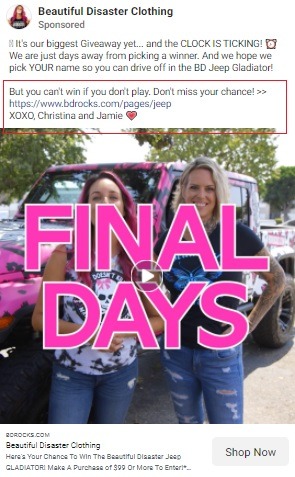
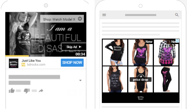
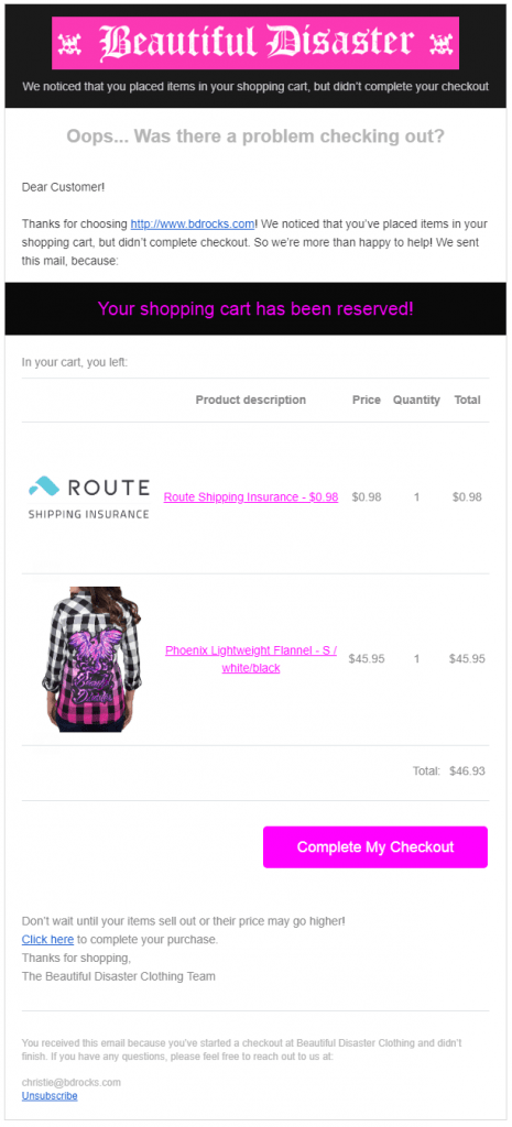
Let’s look at a few converting CTA examples from eCommerce fashion retail brand, Beautiful Disaster, which is currently getting up to 10x ROAS for Facebook and Google PPC campaigns.
Facebook CTA Example
YouTube CTA Example
Cart Abandonment Email CTA Example
As you can see above, CTAs differ for different channels because there are different marketing objectives for each channel.
Some are no-brainers, such as the checkout button CTA on a cart abandonment automatic email, while others require more creativity. But three things are certain for all CTAs. They:
- Should be clear, straightforward, and concise
- Require testing and tweaking to find the optimal ROAS for your specific store market
- Are vitally important
And why are CTAs so important? They effectively guide your potential shoppers through your sales funnel and shopping journey to conversion by grabbing their attention and directing them to the next step.
They may not move the needle by a dramatic amount, but they can make the difference between whether or not someone clicks. And as things get more and more competitive for eCommerce retailers, every single element and tweak counts.
Pro Tip: How to A/B Test On-Site Store CTAs
Even the most minor tweak to a CTA button can make a difference. The secret is changing one small thing at a time, like a button color or word, then testing variations of that change to find your optimal store conversion rates.
HubSpot suggests following these steps to successfully A/B test calls to action, whether it’s for a store button, eCommerce giveaway landing page, or your in-store promotions:
- Narrow down specific CTA factors you want to test
- Create a range of distinct CTAs for your page or channel
- Avoid testing multiple variables at once
- Align CTAs with your conversion goals and then fine-tune your tone
- Measure results closely
- Make minimal tweaks at a time and test to compare results
17+ Successful eCommerce Call-to-Action Examples
Now, let’s get into the nitty-gritty. Here are 17+ call-to-action examples you can use as inspiration to boost your marketing conversion rates.
To streamline this guide, we have divided the examples into different marketing channels, so feel free to click ahead to a relevant section here:
- Google CTA examples
- YouTube CTA examples
- Facebook CTA examples
- Instagram CTA examples
- Email CTA examples
- On-site CTA examples
Important Note: Remember, every store brand has a different audience, industry, niche, and brand identity. This means that although these examples are awesome in theory, they work for these specific brands, so you should only use them as inspiration.
You will also want to audit your store’s shopping experience to make sure you are not losing conversions after the click. You can head over to our guide, 17 Customer Experience Hacks & Innovations, for more information.
Google CTA Examples
1. Adidas Combines Authenticity and Urgency in Google Search CTAs
For established brands, combining authenticity and urgency in CTAs can be powerful, especially when a lot of other online stores sell your products. Adidas does this perfectly with their home site Search ad CTA.
[Source: Klientboost]
Main CTA: Shop the Official Site
Not only do they use the minimal space Search ads offer to elicit action, but they do it in a way that pushes brand equity and authenticity.
Bonus Content: Why Do I Need to Bid on Branded Keyword Terms?
And you don’t need to be as big as Adidas to test this. Another brand that uses this authenticity strategy in Search ad headlines is viral store One Kid.
[Source: StoreYa]
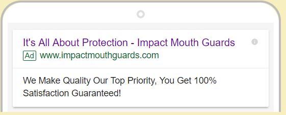
2. Impact Mouthguards Focuses on Satisfaction with Google Search CTAs
Impact Mouthguards, a 6-figure eCommerce business that dominates its niche, uses PPC CTAs to drive home product satisfaction. Here’s an example of one such Search ad:
[Source: StoreYa]
Main CTA: Get 100% Satisfaction Guaranteed
Here, the Google CTA is all about product quality and getting complete satisfaction. This is ideal for Google acquisition awareness ads which are designed to attract new shoppers to your store.
Pro Tip: Automatically Tweak Your Google CTAs
When it comes to Google ads, every element should be tested and optimized. This can be highly time-consuming, but it’s the key to getting the best ROAS. Ideally, you will want to automate this as much as possible. Mega-brand Military Hippie were able to do just that, and generated $1M in revenue in just one year.
Main Takeaway: Google Ad CTAs
As we know, marketers have little space and time to get their message across with Google ads, especially when it comes to Search. This makes honing down your key objective and focusing on one clear main message or CTA vital.
To do this, you should test the following Google ad CTA hacks:
- Determine your campaign goal first
- Put your primary Google CTA into your headline
- Focus on one clear product or brand benefit
- Add urgency, action, or authenticity
- Align the CTA’s tone with your brand and your objective
- Always test, tweak, and optimize your Google CTAs
YouTube CTA Examples
3. Feed Me More Nutrition Uses Every YouTube CTA Option Available to Content Creators
Sometimes, less may not be more when it comes to CTAs. From video descriptions to product and promotion overlays, there isn’t an opportunity that Ryback misses on his highly successful YouTube channel. He’s extended this practice to his YouTube video ads as well.
Let’s take a look at one of his videos.
Main CTA: Save 30% on Feed Me More Nutrition
As you can see, this YouTube video includes a variety of CTAs in an array of places, including:
- Video description CTA
- Video pinned comment CTA
- Text overlay CTAs
Pro Tip: With today’s competition heating up, it’s crucial for brands to take advantage of different advertising channels and combine them with automation and expert optimization. YouTube is just part of that powerful conversion-driving puzzle.
Feed Me More Nutrition has managed to generate their best-ever ROAS since using Traffic Booster. Their PPC marketing strategy includes:
- Facebook and Instagram retargeting and acquisition
- Google Shopping ads
- Dynamic remarketing ads
- Dynamic Search ads
- YouTube ads
- Customized Search ads
And they are not the only ones!
4. Curvy Kate Lets Products Do the Talking and Keeps YouTube CTAs Simple
On the other end of the YouTube CTA spectrum is popular eCommerce brand Curvy Kate, which is all about keeping it simple. Focusing on their product benfits, they concentrate on one simple CTA at a time.
Main CTA: Shop the collection
As you can see in the example above, most of that ‘talking’ is done by the products themselves. This is combined with a simple description CTA for the video itself (“Take a look at Curvy Kate’s SS21 Lingerie Video Lookbook!”) and a shopping CTA for the collection.
They also include other CTAs lower down in every description which are designed to drive potential shoppers to their store and grow their social following.
Let’s take a look at another YouTube video ad of theirs. Here, you will see their CTAs are strategically placed both as overlays and within the title of the video.
- Recycle your look
- Wear it your way
- Find out more
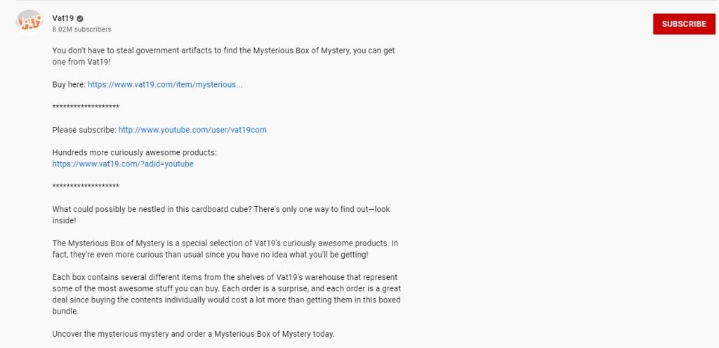
5. Vat19 Combines Bold Products with Clear YouTube CTAs
Another brand that lets the products do the talking is online gift store Vat19. They do this by creating highly engaging video content. In fact, these videos are used to sell products on-site as well!
Let’s take a look at a popular video selling their Mysterious Box of Mystery.
Main CTA: Buy Here
The whole video – and product – is designed to create intrigue, with their video CTAs adding to the promotion’s intensity. It also includes card CTAs at the end of the trailer, designed to keep potential customers on their channel for longer.
Main Takeaway: YouTube CTAs
YouTube CTAs mean very little if users don’t engage with your video content. First, your content needs to grab a potential customer’s attention. Once you have it, your YouTube ad or video CTA should be created to tie in with your objectives.
Do you want the viewer to:
- Visit a product page or your store?
- Sign up for a newsletter?
- Subscribe to your channel?
- View more YouTube video content?
Once you have your primary objective, you can then test where’s best to put your CTAs, beyond your in-video CTA. These include the following places:
- End screen of each video
- Video description of each video
- Cards
- YouTube channel description
Facebook CTA Examples
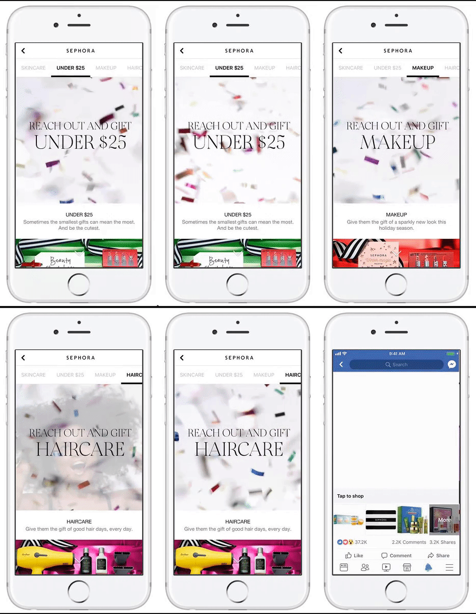
6. Sephora Turns Video Text Overlays into CTAs
We know that engagement rates for Facebook ads can be off the charts when used strategically and correctly. We also know that CTAs play a key role in getting that engagement (clicks). By combining the two, Sephora is onto a winner.
Sephora has been able to increase click-through rates by up to 41% by doing just that. Take a look at their Facebook video ad below, designed to promote gifting.
Main CTA: Reach Out and Gift
Here, they combine several gifting promotions (and CTAs) into one video.
This not only ensures the ad stands out to potential shoppers in the limited attention-grabbing time they have, but appeals to multiple potential customers looking for gifts in varying categories, including:
- Hair care gifts
- Makeup gifts
- Budget gifts under $25
Why do their CTAs work?
Not only do they tap into the intent of the potential customer (gift buying), but they also offer buying options for shoppers who may still be looking for gift ideas. They are concise, clear, and straightforward, but work in harmony with a highly engaging video ad.
Pro Tip: You don’t need to produce studio-quality videos to improve CTRs. Here are two guides that prove it’s about content and intent, not equipment:
7. Scalp Med Facebook CTAs Speak to Their Audience’s Key Pain Point
Despite limited CTA text options, Scalp Med can tap into their potential shopper’s most significant pain point by providing the answer to the problem their product solves in their CTA text.
Here’s an example of a current Facebook acquisition ad doing just that:
[Source: Traffic Booster]
Main CTA: Be hair-happy again / Learn More
And their Facebook remarketing ad CTAs? They focus on returning customers who are looking to keep up their hair “progress.”
They encourage new potential customers to learn more about the brand and products, while using remarketing ads to encourage existing shoppers (who know and love the products) to shop.
Why do their CTAs work?
Because their CTA text and Facebook buttons not only align with the products they are selling, but also with the audience they are trying to sell them to.
Furthermore, they focus on the benefits of their product (whether it’s being “hair-happy” for the first time or getting a big discount when restocking) and not just the products themselves.
This is something they do across their entire eCommerce marketing strategy, and their results prove it works.
Since using a robust cross-channel PPC strategy (with Traffic Booster), they have seen a 4-5x increase in ROAS across Facebook and Instagram retargeting and acquisition ads as well as their Google and Microsoft ads.
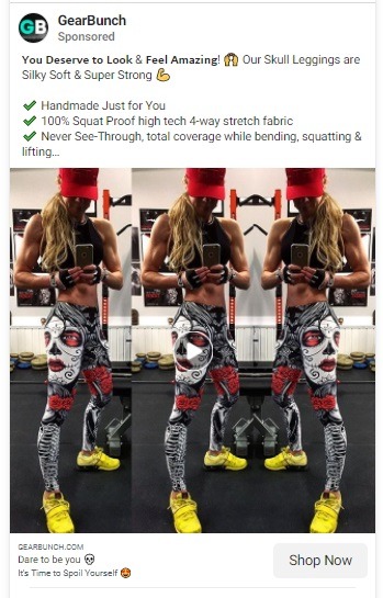
8. GearBunch Strategically Taps into Their Audience’s Emotions with Their Facebook CTAs
Just because CTAs should be clear and to the point, doesn’t mean you can’t pack them full of emotion. This is something GearBunch, a multimillion-dollar online store brand, does like a pro.
Take a look at two of their latest Facebook ads. Their campaign CTAs “dare to be you” and “it’s time to spoil yourself” both use emotion to elicit action from their ads.
Main CTA: Dare to be you
And this is not a new practice. If you look at other Facebook ad CTAs and copy, you start to notice a pattern.
- You deserve to look and feel amazing
- Love your legs
- The [type] leggings you need
These Facebook CTAs work because they speak the language of their audience; tapping into emotions is more likely to get them engaged and excited to take action.
This is not about urgency (although you shouldn’t discount it, especially with promotions), but about desire. Facebook ads can be hugely important for this.
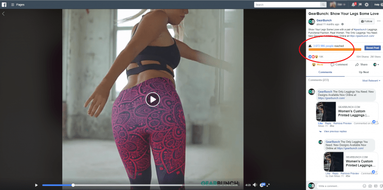
In fact, 85% of GearBunch’s new customers reach them via Facebook advertising, with Facebook video ads showing excellent results. It’s their “bread and butter,” so to speak.
Here’s an example of just some of the engagement they are getting on video ads, with this video just getting over three million views.
You can read more about this winning eCommerce brand in our success story post: The Secret to How This Online Legging Store Reached $5,000,000 in Its 1st Year.
Main Takeaway: Facebook Ad CTAs
For most Facebook campaign types for eCommerce, your CTA button options themselves are limited. That doesn’t mean you can’t be creative with your Facebook ad call to action. It’s all down to your ad text.
So how do you go about creating (and then testing) the best CTAs for your Facebook ads?
The trick is to think of your whole Facebook ad, and all its elements, as a CTA. Here are some tips to get you started:
- Highlight and focus on the benefits of your products, brand, or promotion, not the product itself
- Ask or answer essential questions your audience cares about
- Keep Facebook ad CTAs short and to the point
- Use action words or use words that elicit emotion
- Speak the language of your audience
- Adapt CTAs to the product, category, or promotion you are pushing
- Match CTAs to the Facebook targeting you are using for the campaign
Instagram CTA Examples
9. Reebok Stays On-Trend with Instagram CTAs
When it comes to clever copy, the Reebok marketing teams are savvy professionals. All across their shopping journey, you can see a finely tuned marketing strategy with clear, converting messaging.
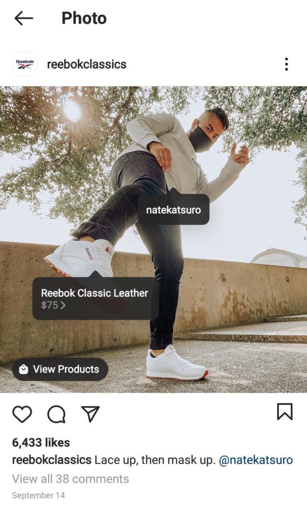
This is something they have been able to duplicate in their Instagram shopping ads as well. Take a look at their Instagram shopping ad CTA below: Lace-up, then mask up.
[Source: Adespresso]
Main CTA: Lace up, then mask up.
It’s simple, on-brand, and grabs attention by tapping into their audience’s current mood and desires. The whole ad is a masterclass in creating successful Instagram shopping ads that fit organically into feeds.
Here are another three Instagram CTA examples. While text varies, the message is the same, capitalizing on outdoor exercise trends.
Why do these CTAs work?
In a nutshell, Reebok doesn’t sell activewear. They sell a lifestyle. Their CTAs speak directly to their target shopper and their desires, while also showing how their products answer that desire.
10. Nordstrom’s Trunk Club Goes All-In with One Bold Instagram Ad CTA
Trunk Club is a personalized clothing service aimed at mid- and high-end customers. It works in a similar way to fashion subscription services like StichFix.
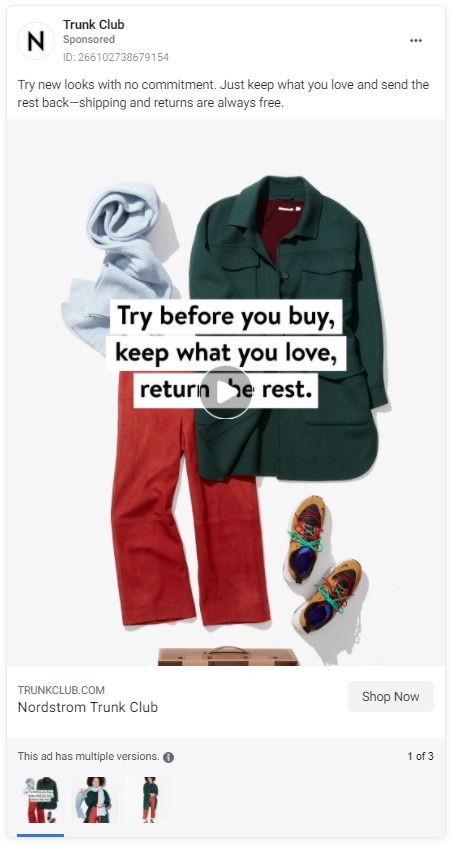
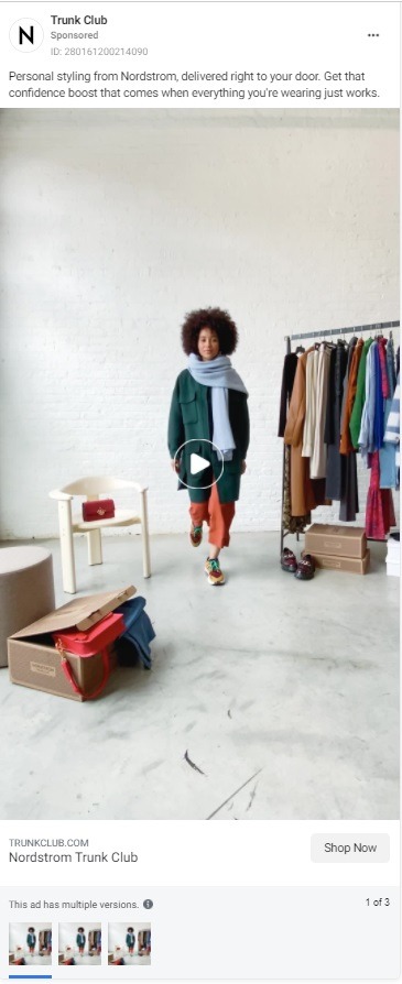
When it comes to Instagram ads, they offer fashion brands a lot of inspiration in terms of making a strong statement while keeping it simple. Here’s an example of one of their video Instagram story ads:
[Source: HubSpot]
Main CTA: Keep what you love, send the rest back
This fast-moving ad showed a variety of outfits and ended with a strong CTA.
But it’s not just stories where their CTAs are on point. Some of their current Instagram ads include CTAs such as:
- Try before you buy
- Shipping and returns always free
- Get that confidence boost that comes with everything you’re wearing
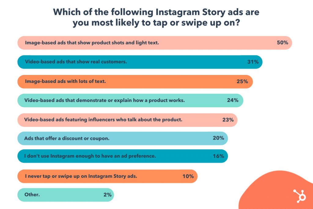
Pro Tip: According to Instagram, one third of all most-viewed stories come from businesses. And which types of Instagram stories do consumers prefer? According to HubSpot, image-based Instagram stories come out on top, followed by video-based ads.
[Source: HubSpot]
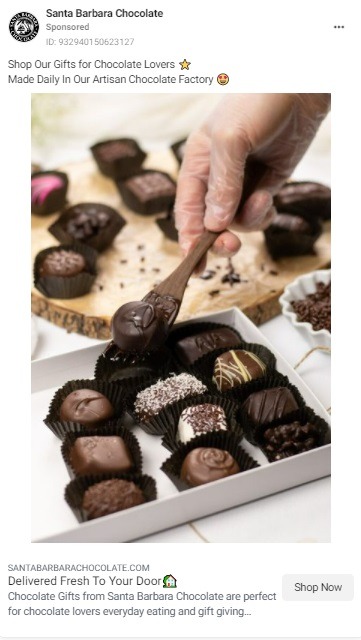
11. Santa Barbara Chocolate Matches Instagram CTAs to Objectives
Santa Barbara Chocolate Instagram ads are an excellent example of how CTAs should be tweaked from ad to ad depending on the type of content and the object of the campaign.
Here’s an example of their latest Instagram ad, targeting gift shoppers with the CTA “Shop our gifts for chocolate lovers.”
Main CTA: Shop our gifts
And the results?
Santa Barbara Chocolate is seeing a 4x increase in sales since using our PPC management software and automation to run their Instagram ads. This automation and optimization also applies to key PPC campaign types for eCommerce:
- Facebook and Instagram retargeting and acquisition ads
- Google Shopping ads
- Dynamic remarketing ads
- Dynamic Search ads
- Customized Search ads
Main Takeaway: Instagram CTAs
Yes, CTA buttons are an important part of the success of Instagram ads.
However, like Facebook, you want to ensure your whole ad is a call to action, driving potential shoppers to your product pages. This includes your captions and headline text, which should do these essential things:
- Push Instagram users to take action
- Add more context to your product images and videos
- Drive home your brand personality
- Align with your campaign objective
However, there is one ultimate must-do when creating Instagram CTAs, whether with your captions or overlays: Keep it simple. ‘
With Instagram ads, especially stories, you have seconds to not only grab a user’s attention but make an impression and get them to take action.
Email CTA Examples
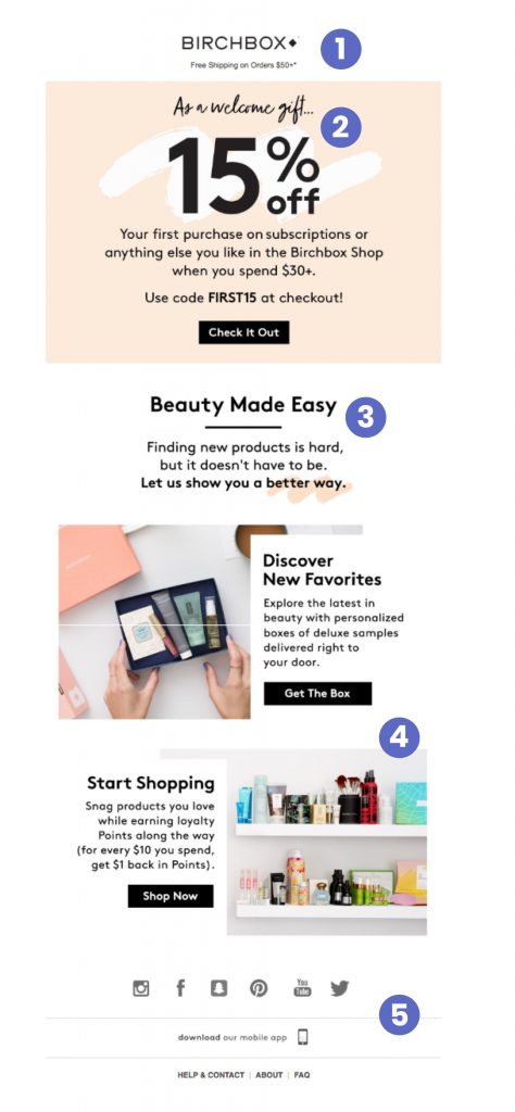
12. Birchbox Varies Email Marketing CTA Placement
When it comes to email marketing, eCommerce retail giants Birchbox are absolute pros. Email marketing plays a massive role in their subscription-based eCommerce business, and they have perfected email marketing CTAs.
Let’s look at a few examples, starting with their welcome email.
[Source: Shopify]
Main CTA: 15% off, check it out
As you can see, their welcome email includes three clear CTAs, each targeting a specific product action on their store.
- Check It Out
- Get the Box
- Shop Now
Why does this CTA combination work?
This email targets brand new subscribers – people who are new to knowing about and engaging with the brand. Therefore, by offering different content and CTAs, they give new subscribers a chance to get to know the brand through their welcome email.
They are also giving these new potential shoppers more product (action) choices to help narrow down exactly what interests them about Birchbox.
Here’s another email marketing example from the subscription cosmetics retailer. As you can see, this time, they opt for just one straightforward CTA placed at the very end of the email.
[Source: Campaign Monitor]
For this email, Birchbox re-introduces subscribers to their subscription box. As it requires a bit more explanation, they highlight exactly what a potential customer would get when they subscribe through their email content.
Once the user is informed (gets to the end of the email), they have a clear, straightforward CTA button to elicit action: Subscribe Now.
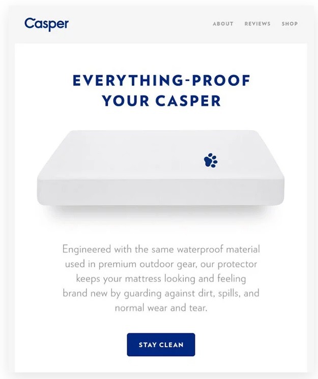
13. Casper Matches Email Marketing CTA Copy to Buying Intent
When it comes to shopping CTA copy in email campaigns, Casper proves that “Shop Now” isn’t always the winning option.
Instead, they capitalize on the buying intent of the potential shopper in that specific email. Here’s a great example of them doing just that.
As you can see, they tap into the buying intent of the potential customer by offering the exact action they are looking for and answering a key pain point. In this case, that pain point is keeping bed sheets clean.
Why does this CTA work?
It doesn’t line up with the primary copy message, but supports action in line with this message.
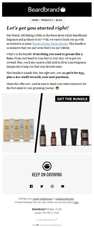
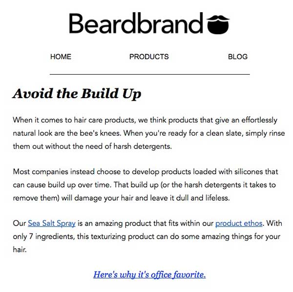
14. Beardbrand Goes Beyond the Traditional CTA Button
Beardbrand understands that creating the perfect email marketing CTA doesn’t necessarily mean buttons. Instead, they use a combination of linked text, CTA text, and buttons, ensuring placement is varied.
Take a look at their welcome email below.
Not only does the text introduce a new subscriber (and potential shopper) to the brand and its products, but uses CTAs to push new promotions and introduce their email marketing flow.
Here’s another email marketing example from Beardbrand where they opt for no buttons at all. Although there’s no button, their use of embedded commands ensures their core message and the next step customers should take are clear.
[Source: Sleeknote]
Main Takeaway: Email Marketing CTAs
To create the perfect CTA for your eCommerce email marketing campaigns, you will need to match CTAs to not only the content of the email but the buying intent of the shopper. This means:
- Keeping copy short and to the point, without sacrificing on creativity, relatability, and urgency.
- Testing different CTA buttons or text placements in your emails to find the option that offers the best ROAS.
- Finding (and testing) the right number of CTAs for your email. Too few or one non-standout CTA can decrease your conversion chances. Too many, and email subscribers will be confused about the critical action they need to take.
- Make sure you test color and spacing to ensure your CTAs are very noticeable.
- Test, test, test! Test every aspect of your CTA, whether it’s copy, placement, color, or design before going all-in with an email marketing campaign.
On-Site CTA Examples
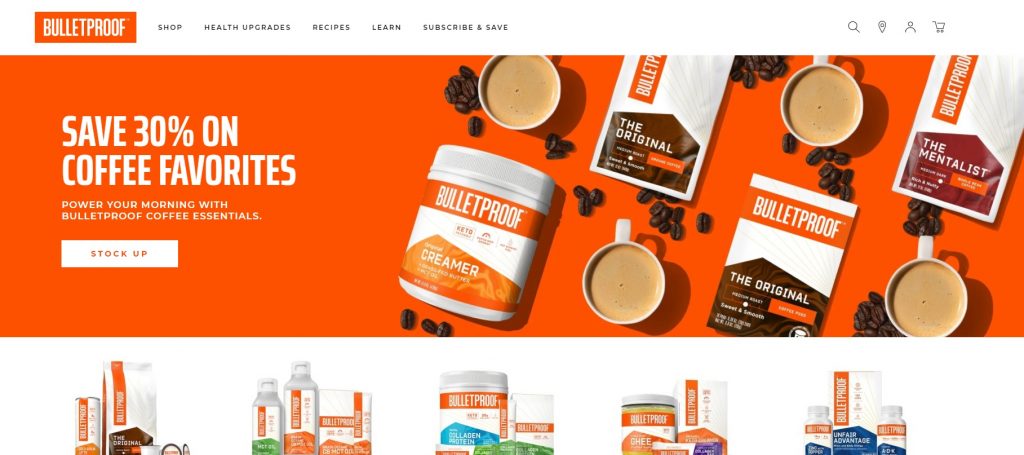
15. Bulletproof Keeps On-Site CTAs Simple
When it comes to the eCommerce customer shopping experience, Bulletproof are hard to beat.
Yes, their homepage is straightforward in terms of copy and CTA text. However, when combined with bold colors and a clean design, their CTAs do exactly what they should: move potential shoppers to product pages.
As you can see above, Bulletproof keep their home page CTAs simple and straightforward. However, that doesn’t mean they don’t stand out and get good clicks.
Yes, these CTAs are simple, giving clear commands on the action a potential shopper should take next. However, they don’t work in a vacuum. The way they are designed (color, size, and position) play a key role in their effectiveness.
Pro Tip: Here’s the thing, you can have the cleverest CTA button text around. But if your store UX sucks, potential shoppers may miss it or find navigating the action frustrating – both of which could cost you sales. Visit our shopping journey guide, Stay Ahead of the Competition with These 17 Customer Experience Hacks & Innovations, for more.
16. BIXBI Pet Uses Products Categories as On-Site CTAs
As we know, a good eCommerce store experience will include CTAs across all sections of a store.
This doesn’t mean they all have to be urgent CTAs.
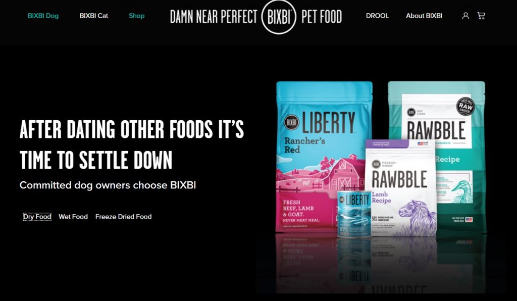
BIXBI Pet understands this well and uses clever copy headlines with product categories as CTAs to elicit action from potential customers.
Take a look at their dog food category page.
As you can see above, their hero image includes great headline copy in conjunction with simple food product types which send the potential shopper to the most relevant page section.
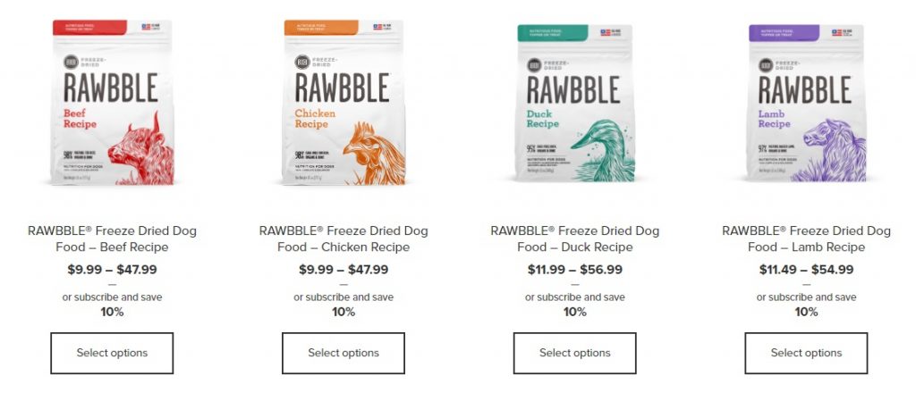
From there, potential shoppers are presented with product lists with simple shopping CTAs: Select options, which takes shoppers to the product page.
Why do these CTAs work?
These CTAs aren’t just selling. They are informing and taking potential shoppers on a purchasing journey!
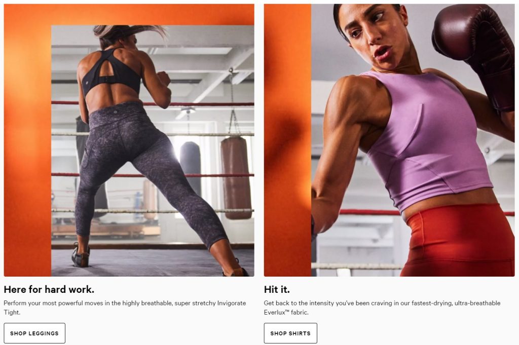
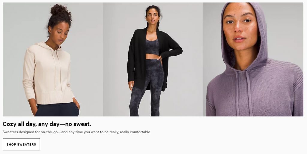
17. Lululemon Puts the “Shop” into On-Site Category CTAs
Lululemon understands the importance of category links on their home for shopping UX. However, instead of just listing the category, they have turned them into CTAs with just a simple addition of the word “shop.”
Why do these CTAs work?
They combine shopping experience flow with CTAs to guide potential buyers from the homepage to category pages where shoppers can easily find the size, color, and style to fit their preferences.
Main Takeaway: On-Site Promotional CTAs
When it comes to on-site CTAs, less is definitely more. However, they are part of a bigger picture: your overall site experience.
Even the slightest tweak matters.
Andreas Carter Sports’ marketing manager, for example, said that simply changing their CTA button from black to blue reduced their abandoned carts by as much as 50%.
Ultimately, you want to do the following for not only your CTAs, but your overall UX:
- Use CTAs sparingly and strategically
- Focus on your unique selling points
- Make a potential customer’s first five seconds on your store page impactful
- Strategically place CTA popups
- Declutter your pages to ensure CTAs pop
And how do you do that? Here are 20 Ways You Can Improve Conversion Rates for Your eCommerce Brand to get you started.
Conclusion
There you have it, 17+ call-to-action examples to use as inspiration across your eCommerce marketing channels.
Your call to action is a vital part of every marketing channel. Whether it’s a website banner, product promotion landing page, PPC campaign, or social media competition, it’s essential to make an effort to not only adapt the CTA to that specific objective, but the audience as well.
In other words, you don’t want to take one CTA and just blindly copy it across your site and marketing. Instead, you should be testing CTAs for each channel and optimizing them when needed to ensure they are getting the results you want: Actions!
Need help managing and optimizing your PPC marketing without additional costs or expensive agency fees? We’ve got you covered!

Nicole is a content writer with over sixteen years experience and flair for storytelling. She runs on a healthy dose of caffeine and enthusiasm. When she's not researching the next content trend or creating business content strategies, she's an avid beachgoer, coffee shop junkie and hangs out on LinkedIn.
Recommended articles
 Facebook Ads for eCommerce: 16 Strategies, Examples & Tips
 How to Build a Winning eCommerce Ads Strategy
 Google Ads for eCommerce: Everything You Need to Know
 10X Your Traffic with PPC Management Software
Comments
Powered by Facebook Comments
