There are two major components to optimizing you eCommerce store; first of all there is optimization for your actual site visitors (the user interface and the user experience), and then there is optimization for the search engines. Both factors are important, and, as was explained in the first post in this series, they do actually overlap a bit, because the ultimate goal of search engines is to rank websites higher based on what that they feel will be most useful for users. As a conclusion to our series on SEO, we’re going to leave you with a few good tips in both of these categories that you can apply to your eCommerce store today!
We’re going to start with some tips for your homepage, move on to product pages, and finish up with optimizing how your site appears in search results. In order to demonstrate all of the tips, we are going to be looking at WhippingPost.com, the 2013 winner of Shopify’s Design Award, and Zappos.com.
Design for your Homepage
Your homepage is usually the first thing that your website visitors will see. It is the face of your web store, and the impression that your visitors get is crucial for how they interact with your store. What that means for you is that your homepage better be awesome.
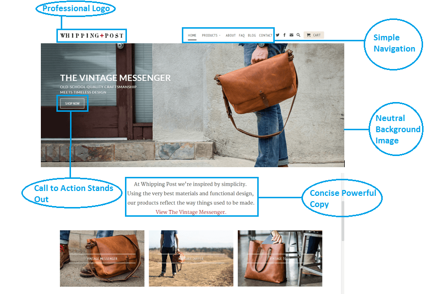
Keep it Simple
The first thing you want to keep in mind when building your homepage is to keep it simple. Think about it like a physical store. Which store would you rather shop in?

The same holds true for your web store. A simple homepage is the best kind of homepage.
- The background for your homepage should be a neutral color or simple image so that the text you put on the page will really stand out.
- There should not be too much text, but the text you do have should be compelling.
- You should only have a few images on the page.
The point is that you want there to be a nice amount of blank space so that your visitors don’t get overwhelmed when they enter your site.
Call to Action
Aside from making your website look nice, the other main goal of a simplistic design is to draw attention to your “Call to Action,” which should be nice and clear.
- Make sure the call to action is in the top half of the page in order to ensure that it is one of the first things that your website visitors will see.
- It should be bold, and stand out against the background.
- Do A/B testing on a few different CTA’s to determine the best design.
Easy to Navigate
Finally, you need to make sure that your website is intuitive. Your visitors should be able to access most pages of your website directly from the homepage.
- Have a simple toolbar on your home page giving navigation options. You can employ drop down menus as well if there are a lot of subcategories on your site.
- Include your brand’s logo on the top of the page as a quick link back to your homepage. This adds to the professional feel of your site, and makes it easier for your customers to find their way around.
Seeing it in Action
Let’s take a look at the WhippingPost home page to display these tips.
SEO for your Homepage
As mentioned before, your homepage is the face of your store, which means that it needs to be the center of your SEO efforts as well.
Name Everything
Every aspect of your homepage should be “named,” and it should be named in accordance with your keyword research. Choose the keyword or keywords that you want to use on your home page carefully as these are the words which you are relying on for the majority of your traffic. Therefore, you should pick words that describe your brand as a whole.
- The Title Tag that you use for the homepage is the title for your website. In the title you want to mention the keyword that you chose for the page and your brand name. You can also include a sale or deal in the title line.
Here you can see how Zappos used their keywords (shoes and clothing), they mentioned a deal (always shipped free), and then finished with the title with their brand name.
- Images require a title and an alt tag. You should also use descriptive keywords when naming the file of the image before you upload it to your website. The file name can be the same as the title and alt tag, but you should separate the words in your file name with dashes so that they can be read by the crawlers and turn up in image search results.
Search Engine Navigation
Once again, just like you want your site to be easy to navigate for your users, you want it to be the same way for the search engines. The reason for this is because the search engine crawlers only index what they can find. There are a few things which you can do in order to avoid this problem.
- Construct you site in such a way that every page can be accessed from the homepage within one or two clicks. That obviously goes back to your site design, but it’s important in terms of SEO as well.
- Another thing you can do is to build an XML Sitemap to send to the search engines. This basically guides the crawlers to all of the pages of your website so that they can index them. You can include additional information in your sitemap as well, such as information regarding images, videos, and your website as whole. This way you can be more confident that your website will be indexed appropriately. Check out how to create a Sitemap.
Design for your Product Page
Many of the rules mentioned about homepages apply to product pages as well, most importantly, your product pages should also be clutter free. The main difference lies in the details. Product pages are where you need to sell your visitors on specific merchandise, rather than on your brand as a whole.
Text
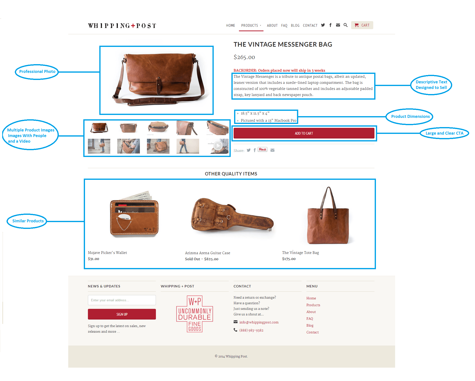
The text you use on the product page should be more detailed than what was used on the home page, but you do still need to keep it relatively short. In one paragraph you need to convince your customers to buy your products, but at the same time you need to explain as much as you can about the product. Every product page should include:
- A solid and unique paragraph description of the product. This is your sales pitch.
- The product’s exact dimensions.
Images
The biggest challenge faced by eCommerce stores is that the customers can’t physically see, feel, or hold the product which they are buying. It is your job to provide quality images so that your customers can receive an experience that is as close to seeing the actual product as possible.
- Hire a professional photographer to take pictures of all of your products. It may cost a bit at the time, but it is definitely worth it for you in the long run to provide top notch images to your customers.
- Use a number of pictures taken from a few different perspectives for every product in order to show your merchandise from every angle. Make sure that you use the same background and angles for all of your products. This conveys a higher level of professionalism.
- Try to make the product come to life by adding a video. Another option is to include a 360 image, which is surprisingly easy to do when you use a product like Rotary View.
- For every product, include at least one image of a person with the product in order to both make it more personal, and to show the products dimensions relative to a human.
Reviews
Reviews are possibly the most powerful weapon that you can use to convince a customer of your product’s reliability. After looking at the product pictures and the dimensions, every customer will want to be reassured that other people have purchased this product, were happy with it, and saw that it was exactly what it was advertised to be.
Some websites, like Zappos for example, even include reviews on their homepage, in order to start the process of creating a sense of safety and assurance for the customers from the very beginning.
Call to Action
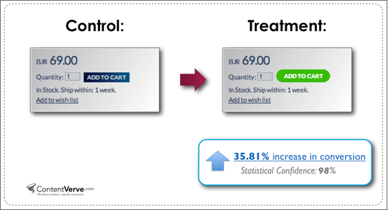
Obviously the call to action is crucial on the product page, because it is the ultimate goal of the page. The whole page is built in order to convince your customers to click on the “add to cart” button. The same rules apply to this CTA as to the one on the homepage. Make it clear and obvious, in the top portion of the page, and A/B test it to find the best combination of color, positioning, and text. You may think that there is really not too big a difference between one CTA and another, so take a look at this example and see how wrong you are.
Related Products
It is always a good idea to try to encourage your customers to keep browsing through your store, and one of the best ways to accomplish that is by adding related items to the bottom of every product page. Maybe the item they clicked on isn’t exactly what they want, so give them suggestions to keep them looking.
Seeing it in Action
SEO for your Product Page
Although your homepage may be the center of your optimization strategy, it is still very important to optimize your product pages as well. The more pages that you can get ranked highly by search engines the better.
Still Naming Everything
SEO for your product page is the same as for your homepage. Every aspect of the page needs to be named so that the search engines can read it and index it. There is a difference though in terms of your keyword strategy.
- Whereas on your homepage you wanted to use keywords related to your brand as a whole, on your product pages you want to use keywords that relate to the specific product. This way you can have many pages ranking for different keywords, rather than having all of your pages competing over the same ones.
- Since product pages may end up repeating themselves (for example, a clothing store will have more than one type of t-shirt) you should not just use the name of the item as the product’s title tag. Instead you should use a format like “Brand – Model – Product” in order to keep your product titles unique. Take a look at this example from a Zappos.Com product page.
Static vs. Dynamic URL’s
One more thing that you should be naming are your URL’s. Don’t use the standard, or dynamic, URL’s that look like some kind of long equation. Instead use static URL’s that include the keywords for the page. Meaning you want this: https://www.whippingpost.com/collections/all/products/the-vintage-messenger and not this: https://publib.boulder.ibm.com/infocenter/tivihelp/v2r1/index.jsp?topic=%2Fcom.ibm.itame.doc_6.0%2Fam60_webseal_admin236.htm.
- When writing the new URL, separate the words with dashes rather than underscores or slashes, because most search engines will only read the URL as separate words this way.
Text and Reviews
The text and reviews sections of your product pages give you opportunities to add quality long tail keywords.
- Try to add more unique text than standard text on your product pages. This is a way of showing the search engines what the focus of the page is.
- Use keywords in your product description.
- Having product reviews on the page does a number of good things for your pages — as users add new reviews it keeps the content fresh, it contributes more unique content, and it potentially adds more long tail keywords as well.
One thing you do need to keep in mind when writing the text of your product descriptions is to avoid duplicate content. It is important to always create unique descriptions for all of your products. Check out part 3 of our series on SEO for more information about duplicate content.
Social Share Buttons
The last thing you need to make sure to include in your product pages (and really on every page of your site: homepage, order confirmation, about us, etc.) are social share buttons. In addition to helping spread your brand name, social shares are also key in getting backlinks to your website. The more shares your pages get, the better it is for their ranking.
Optimizing for Search Results
In addition to what you do for your actual website, there are a few things you can do to improve the way your website will show up in search results. These methods won’t necessarily increase your search engine rankings, but they will encourage more people to click on your site when it does show up in the results.
Meta Description
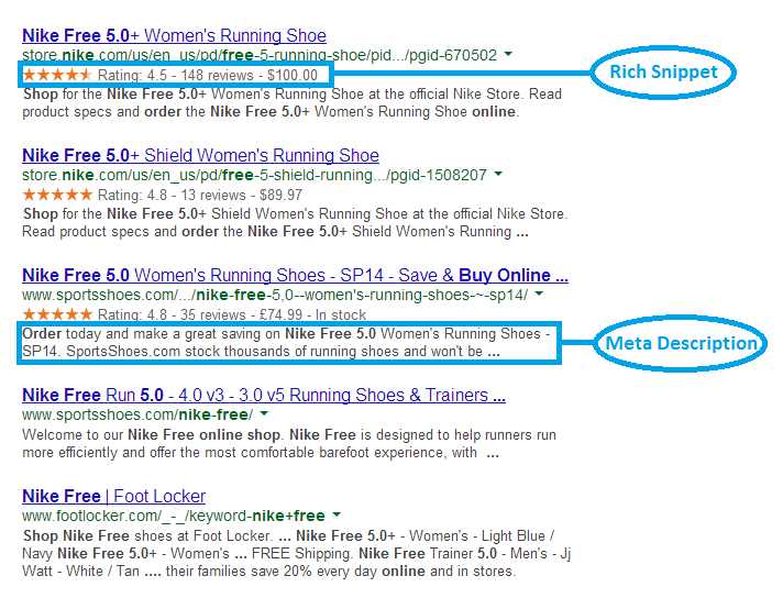
Include a Meta description for all of your pages. Although this doesn’t really affect SEO rankings (so stuffing this description with keywords probably won’t help you), this is very important for your potential customers, as this is the snippet of text which they will see when your website shows up in search results.
- Search engines generally display up to 160 characters, so that is what you should shoot for.
- Since this is what your potential site visitors will see first, make sure you compose excellent copy for this line.
Rich Snippets
Rich snippets are basically little pieces of information that you leave for the search engines to pick up and display separately from your Meta description. While search engines are very advanced in their methods, they still cannot pick out specific information from your site like location, reviews, or product availability without a little help. Through the use of specific markup you can show the search engines exactly what information you would like to display. For an eCommerce store the best things to include are:
- Product availability
- Prices
- Reviews or rankings
- Store location
All of these little pieces of information will not only make your store stand out from the other search results, it will also lead more informed visitors to your site, which could potentially lead to increased sales.
Take a look at this example from search results for a pair of sneakers
Summing up Search Engine Optimization
In this series we explored many different aspects of search engine optimization, starting with the basics of how search engines work, to some more complicated topics like keywords and backlinks, straight through to how to optimize your eCommerce store. We hope you gained some valuable insights, and are already putting this information to good use!
Let us know what you think. Do you have any other SEO or design tips to share with us? Please let us know in the comments below.
Image Credit: FreeDigitalPhotos.net, bplanet.

Zack is a social media enthusiast who loves all things digital. He is the inbound marketing manager at StoreYa where he spends his days searching for the newest social marketing scoop. If you’d like to chat with him, feel free to connect with him on any social platform.
Recommended articles
 Facebook Ads for eCommerce: 16 Strategies, Examples & Tips
 How to Build a Winning eCommerce Ads Strategy
 Google Ads for eCommerce: Everything You Need to Know
 10X Your Traffic with PPC Management Software
Comments
Powered by Facebook Comments

