A website that doesn’t look credible can lead to high bounce rates, low conversion rates, and a high rate of shopping cart abandonment.
There are a lot of small things that add up to a website that people trust. This post will go through the three main areas of your eCommerce website that you should work on in order to achieve this: your homepage and landing pages, your product pages, and your check out process.
By following this guide you will be able to make your website more trustworthy.
Build a Trustworthy Homepage to Decrease Bounce Rates
Your landing page is the first impression your site visitors will have of your website, which means it is the first place you need to focus on building trust. If your site doesn’t look good from the get go, you’re going to see a lot of people leaving right away, meaning a very high bounce rate.
Build up Your Reputation
You want to show your site visitors that your company is real, that it’s established, and that people know about it. There are a number of simple ways you can do this.
Show when your company was founded: This is a bit of a more “old school” way of thinking, but many people like to know that a company has been around the block. By adding a tag on your website that says something like “Producing Quality Goods Since 1987” or “Established in 1995” you can appeal to that feeling.
Obviously if you just started your company this year this tactic isn’t for you, but there are other ways to help your site, don’t you worry.
Show your social following: This tactic appeals more to the younger generation. Showing the number of followers you have on Twitter or likes you have on Facebook can provide social proof for your site.
For example, you could use StoreYa’s Like Box on your website like this:
Show how many other customers you have: Many businesses use this tactic to show site visitors that they’re not first to purchase from their website.
WooThemes does a great job of this on their WooCommerce homepage. Notice how they also put the number of users into perspective by giving a percentage.
Show Testimonials: The best way to show someone that your product is good is to have someone else tell them. By adding testimonials to your homepage you can give your site the “outsiders opinion” needed to show your quality.
Get Kudos is a cool tool which collects reviews from your social channels and gathers them together so that you can choose social reviews to add to your website:
Mention news coverage or companies using your products: Both of these things are essentially the same as customer testimonials, but from a business rather than from an individual. By doing this you gain some of the credibility associated with the business that you mention.
Here’s an example from Dollar Shave Club:
Be Personal
You should show your site visitors the human side of your business. People trust faces, stories, and videos much more than just blocks of text about a company.
Show your face: A fantastic method for showing the personal side of your business is including face shots of your employees in the “about us” section of your website. Many businesses actually add an abbreviated About Us section into their homepages and include pictures there.
Show your customers’ faces: You can also use pictures of your customers using your products on your home page. American Eagle does a good job of using “real people” as their models.
Tell your story: Share your company’s own personal story. Every business has some sort of story behind it and it can be shared with your site visitors in order to form a connection.
Your story can be inspiring, it can be something they can relate to, or it can be a plain and simple story, what’s important is that the story can show a different side of your company.
Show That You’re there to Help
Customers want to know that you are always available to answer any questions that they may have. A website that doesn’t provide sufficient customer service information is definitely a little fishy.
Clearly provide customer service info: You should always have your customer service number on your homepage. You can also include the hours your customer support is available.
Include a live chat option: Customer service phone numbers only get you so far. After all, most people despise calling customer service numbers because of the long waiting time. By providing a live chat option you can show your site visitors that you really are fully available to assist them.
Zopim is a good live chat tool that you can add to your website. Here you can see an example of a website providing customer service with phone and live chat options:
Build Trustworthy Product Pages to Increase Conversion Rates
Once your site visitors have looked over your home page, hopefully, they’ll move forward and look through your products. If you want them to buy something, you’re definitely going to set up your product pages in a way that encourages trust. A major cause of low conversion rates is poorly designed product pages. If you can make your product pages ooze trust, then you can boost your conversion rates too.
Build Trust in the Products
A big fear that people have when making online purchases is that in real life the product won’t look the way it does online. In order to break down that fear you should present your products as clearly as possible.
Use high quality images: Don’t just take a picture of your products on your phone and upload it to your website. That might work on eBay, but it doesn’t cut it for a real web shop. People trust professional looking sites, and if you want your site to be professional, then you should definitely invest in high quality pictures for your product pages.
Which one of these shirts would you be more likely to buy?
Provide images of your products from multiple angles: One high quality image isn’t enough. If you’re selling physical merchandise then your potential customers will want to see your products from every possible angle.
Both Shopify and Magento support this feature and for WooCommerce you can use the Multiple Images per Variation tool tool.
You can take this one step further by adding the option for a 360 degree video of your products, which is actually pretty easy to do with a tool called Rotary View.
Include all of the product’s specs: People like to know everything they can about the items they are buying online. By including all of the information that you can about your products you can give your site visitors what they are looking for, and also prevent them from leaving your site in order to search for information.
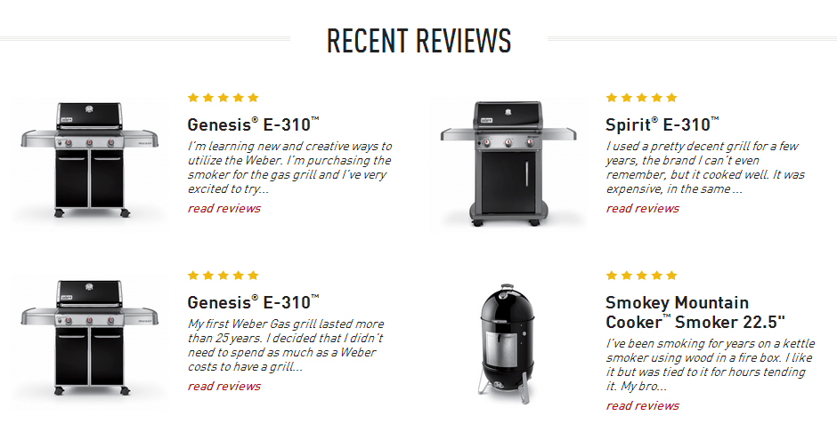
Have reviews and ratings for your products: In addition to hearing what you have to say about your product, your site visitors are going to want to know what other people have thought of your products and services. By including star ratings and written reviews on your product pages you can provide social proof of your products quality.
Clarify Your Policies
Each business has its own policies and no one likes getting caught in a bad position because they didn’t know what a policy was. It is very important that you make your policies easily accessible to your site visitors so that those who are interested can quickly find them.
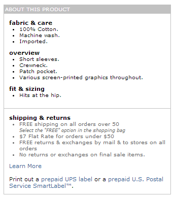
Display the shipping information and your return policy: People like to know how long it will take to get their products, how much it will cost them, and if they will be able to return it. By displaying this information already on the product page rather than waiting until the checkout page you can answer some of these questions before your site visitors have a chance to think of them.
Including the return policy will also make your site visitors understand both that they can return products and how they can return products (if necessary of course). This can be very reassuring information.
Build a Trustworthy Checkout Page in Order to Reduce Shopping Cart Abandonment
Finally your site visitors arrive at the checkout page. You can smell the sale. But did you know that shopping cart abandonment rates are around 68%? That means that about 7 of every 10 people who put something into their shopping cart will not make a purchase.
One of the leading causes of shopping cart abandonment is payment security and lack of trust in the website. If you can deal with those problems you can definitely cut your cart abandonment rates down.
Break Down Payment Security
Once your site visitors have decided to actually make a purchase, they still may not want to complete a transaction online for fear of giving away their credit card details.
Get an SSL certificate for your payment page: SSL (Secure Socket Layers system) is a standard security system that creates an encrypted link with your customers so that credit card information can be transferred securely. If your eCommerce website does not have an SSL certificate then, you should buy SSL certificate and secure your eCommerce website.
With an SSL certificate, your payment page’s URL will start with “https” and will have a padlock in the URL box as well.
Seeing that lock will really make your site visitors more comfortable
Prominently display your security system: Many people may not know to look at the lock, but they will recognize a security brand badge like MacAfee, VeriSign, or Norton. This essentially gives your website credibility based off of the reputation of these security companies.
Provide a PayPal payment option: Even with all the security measures that your site takes, some people may still not be convinced about the safety of their card information. For this kind of person (and for ease of payment) you should provide a PayPal option so that they won’t even need to provide you with their credit card details if they don’t want to.
Don’t Be Sketchy About the Order and Shipping Information
As has been mentioned, people like to have all of the information in front of them before making a decision. No one likes to be kept in the dark when making a purchase.
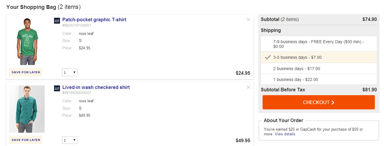
Clearly list all of the order information: People often get nervous that they accidentally added too many things to their cart, or didn’t add the right item.
The best way of avoiding this problem is to list the following information on your checkout page:
- A small image of each product in the shopping cart as well as the product name and all specifications like size and color
- The quantity of each product in the cart
- The price per product and the total price for the merchandise
- At the end there should be a clear adding up of all fees, including shipping fees, to present a total cost.
Include all relevant delivery information: There’s more to know about shipping aside from just how much it will cost. People want to know how long it will take, when their purchase will be leaving the warehouse, where the warehouse even is, and how they can track their order. Satisfy your site visitors’ by adding all of the relevant delivery details.
Be Available for Assistance
Most questions regarding online purchases come up at the time of making the actual purchase.
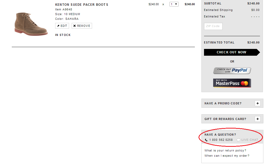
Display your contact info more prominently: By doing this you will clearly convey the message to your store visitors that you are there to help them with whatever questions they may have.
Make Your Website More Trustworthy
None of the tips mentioned in this post are too difficult or complicated. They are all small individually, but together they help form a trustworthy eCommerce site. So get to work now, do a little bit each day (or all of it in one shot!) and pretty soon you will have optimized your website for trust, and you will see your bounce rates decrease, conversion rates increase, and your shopping cart abandonment decrease!
P.S. If you have any tips for making a site more trustworthy we’d love to hear them! Please leave all questions and comments below.

Zack is a social media enthusiast who loves all things digital. He is the inbound marketing manager at StoreYa where he spends his days searching for the newest social marketing scoop. If you’d like to chat with him, feel free to connect with him on any social platform.
Recommended articles
 Facebook Ads for eCommerce: 16 Strategies, Examples & Tips
 How to Build a Winning eCommerce Ads Strategy
 Google Ads for eCommerce: Everything You Need to Know
 10X Your Traffic with PPC Management Software
Comments
Powered by Facebook Comments


Wow, what an intuitive outline. I think the most important thing you mentioned here is to be personal. People like working with people more than they like working with companies. By taking a personal approach, credibility is much easier to come by!
Thank you Joshua! You’re absolutely right. Being personal is super important in terms of breaking down the business to customer barrier.
I couldn’t agree more, thanks again!