Email marketing is a huge sales driver for eCommerce and it’s highly effective. I’m talking about $44 in sales for every $1 spent effective. That’s an ROI of 4400%!
Sounds good, right?
Get this, that’s just the average — meaning you could do much worse OR much better than that depending on how well you execute your email marketing!
Do you want to beat the average, and start bringing in the big bucks with your email marketing? I bet you do!
In this post we will explore 10 simple steps to take your eCommerce email marketing campaigns to the next level!
1. Optimize Your Subject Line and Preview Text
The first aspect of your email is the subject line.
This short, bolded piece of text is one of the biggest factors that determines whether or not your email will be opened, and also, once the email has been opened, whether or not your email will actually be read or not – which is obviously crucial for the success of your email marketing campaign.
Start by Writing a Killer Subject Line
A subject line that stands out is the one that will get clicked on. Here are a few effective styles of subject lines that you should consider:
- Be clever or funny: This shows your brand’s personality and creates a bond with your readers
- Ask questions: This peaks curiosity
- List your information: This makes it clear exactly what will be in the email
- Use teasers: This really peaks curiosity
- Include action words: This encourages action
- Create anxiety: This also encourages action
John Lee Dumas of Entrepreneur on Fire does a great job of using teasers in his subject lines. Check out this example below:
Take Advantage of the Preview Text
Preview text is the light grey text that you can see after the subject line. It is usually taken from the first line of your content.
Preview text is like an added bonus on top of your subject line that enables you elaborate on your subject line, clarify it, or to just add in another catchy phrase. This text can be used to get your readers to actually open your email, after their attention has been grabbed by your subject line.
Even if it’s only half a sentence, make sure you use the preview text to your advantage!
Match Your Subject Line and Content
You can be as creative as you want with your subject line, but there is one BIG rule, and that is — always make sure that your subject line and your email content correspond!
Under no circumstances should you write up a crazy subject line that has nothing to do with your actual email. The boost you see in open rates will definitely not make up for the number of people who will immediately leave your email when they see that it is not related to the subject line.
2. Establish Your Relevancy
People sign up for all kinds of lists and leave their email addresses in different places. What does that mean? Well, it means that even if you have someone’s email address, they may not necessarily recall when they gave it to you.
By giving a brief introduction as to how you are connected you can accomplish two things: 1st you show who you are and how you got the reader’s email address and 2nd you create a much more personal connection with your reader.
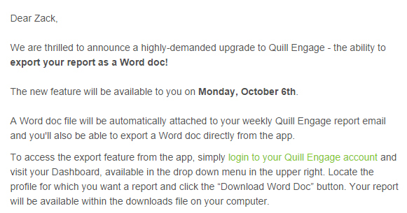
For example, you could start your email like this: “Hi Zack, You recently participated in our photo competition on Facebook, we thought you might be interested in another competition we’re running.”
This way your email sounds more natural and gives context to what you are sending.
Even if you have people who have been on your list for a while, you might want to consider adding a line of text in the footer explaining how you are connected. KissMetrics does a nice job of this:
3. Keep Your Content Simple by Focusing on One Topic
Too often eCommerce emails become over crowded due to lack of focus. People get tens or hundreds of emails a day. They don’t have time to wade through everything you have to say (no matter how important you think it is).
For that reason you have to make your emails simple to read and understand, and easy to scan quickly. The best way of accomplishing this is by having just one focus for your email.
In that regard, you can think of your email like a landing page – there is one focus, because you want to be sure that it is absolutely clear what you want from your users.
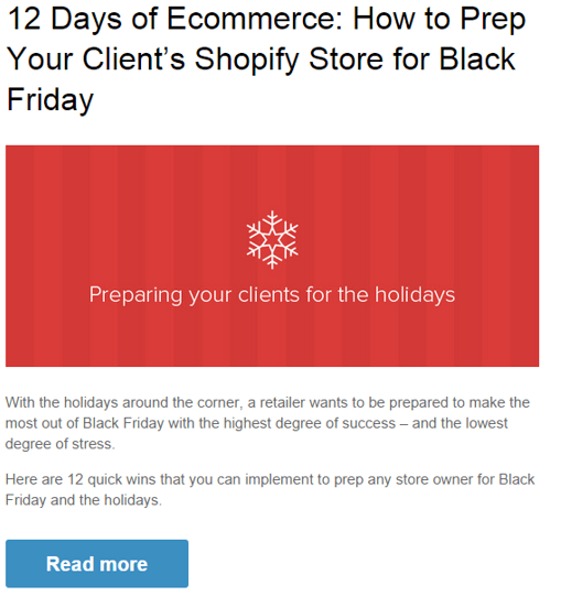
Here’s a great example from Shopify:
I’m sure that there were plenty of other things that Shopify could have put into this email – company announcements, new deals, special offers, etc., but the point is this email focuses on one specific goal and uses very clear and direct language.
This email can be read in 20 seconds, and within 22 seconds the reader will have made a decision as to whether or not they will click on the call to action.
This is the kind of simplicity you should employ in your marketing emails.
4. Know Your Audience
A major part of keeping your content short and to the point is knowing your audience, their level of knowledge about your field, and what they’re familiarity is with your products.
In addition to keeping your content concise, this will also make it more understandable and show your readers that you are on the same wave length as they are.
For example, this email from a company that runs conventions for start-ups uses common business jargon without explaining what it means, because anyone receiving this email would be someone who would use the same jargon:

5. Discuss Benefits, Not Features
We discussed this concept in our post on product launches, and it holds true for email marketing as well. When trying to convince someone to purchase your products or look at your content, the main thing that people are thinking about is WIFM (what’s in it for me).
So don’t waste time and space talking about all the cool new things that your products have, because that isn’t what people want to see. Rather, spend your time showing how your product can benefit your readers and what sets your product aside.
Essentially, you should try to come up with a unique selling proposition for each email that you send.
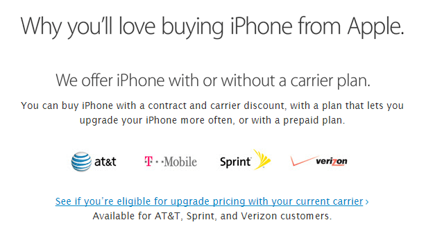
Take a look at this email I got from Apple after the new iPhone 6 came out:
Obviously the new iPhone has all kinds of crazy features that the folks at Apple are probably pretty excited about, but they know that everyone else is not necessarily as interested in that, so they went straight for how they can benefit the reader – “Why you’ll love buying an iPhone from Apple.” It’s perfect!
6. Personalize Your Emails
Even if the majority of people to choose to receive their opt-in marketing information via email, it doesn’t necessarily mean that they want to read everything they see. One great way of making your emails more appealing is by personalizing it.
There are two ways you can personalize an email – it can be personalized according to the time of year and current events, or it can be personalized to the readers themselves.
Be Timely
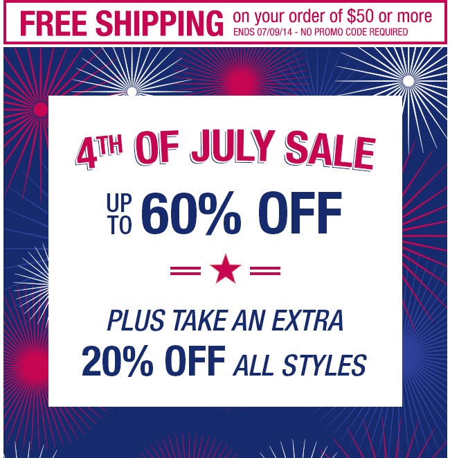
Use current events and approaching holidays to your advantage. As Christmas season approaches, you can start sending out emails related to buying gifts. This is an email I got as the 4th of July was coming up:
Personalize for your Readers
Just as importantly, if not more importantly than sending timely emails, is personalizing the content of your emails to your individual reader’s. Personalized content can really make your emails stand out in the crowd.
And by the way, there is a lot of room to stand out, as only 70% of marketers are using personalized emails!
What’s more, personalized emails have seen tremendous success with 29% higher open rates and 41% higher click through rates.
Here are a few great ways to personalize your emails:
Use your customer’s names: In this day and age there is absolutely no reason whatsoever that your emails should not include a name. Although it won’t seal the deal for you, adding in a name rather than using a generic greeting goes a long way in making your readers feel closer with your brand.
Segment your email lists: We’ve talked about email list segmentation before, and we will probably talk about it again. I can’t begin to stress how import segmenting your mailing list is! This is an easy (somewhat) way to really personalize the messages you are sending to your customers.
To give you a brief review, you can segment your list by geography, age, gender, purchasing history, engagement rates and more! By doing this, and layering your lists, you can create hyper-specific lists to send extremely personalized emails.
Retarget Your Customers Via Email: By tracking your customers browsing history, shopping carts, and purchase patterns you can get a very good idea of the kinds of things your customers like. This can help you to send much more personalized emails.
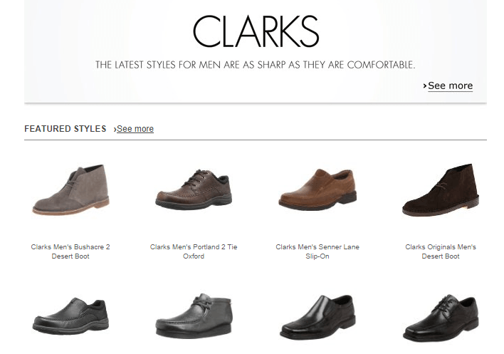
Amazon is by far my favorite example of this. After looking at a pair of Clarks shoes on Amazon I received this email from them:
They know that I looked at a pair of shoes, but didn’t purchase them, so they sent me an email just as a reminder. This tactic is great because it not only ensures that the content you send will be relevant to your readers, but it also helps you with shopping cart abandonment.
7. Create Well Designed Emails
A clear and well-designed email is just as important as the content itself.
The same way no one wants to look through pages upon pages of content, no one wants to be overwhelmed by millions of graphics jumping out at them. As you might expect, the key to email design, whether your email includes images or not, is simplicity.
That doesn’t mean you can’t add in color. This email from Crate and Barrel is both very colorful and very simple. As a general rule, more color means less text:
One thing you need to watch out for if you are using images, is how your email will look if the images don’t load. You have to make sure that the email will still make sense, and that the point will still be delivered clearly.
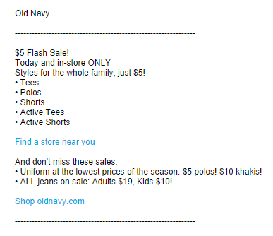
If you use text for your email design then be sure to keep your paragraphs short and to highlight important text in order to guide your readers.
8. Make a Great Call to Action
At the end of the day the emails that you send to your customers are not just to say hi. You’re sending them because you want your customers to take some sort of action. Now, even if you say “go visit my store” in your email, unless you make it ridiculously easy to do that, then most people probably won’t.
That is why call to actions (CTA) are so important in email marketing. The CTA in your email is the little nudge that people need in order to get them to actually do something. For that reason I’m sure you can understand why it is absolutely crucial that your call to actions are excellent!
How do you make a good call to action? There are three main rules to follow to be successful:
1) Make it stand out: You want your call to action to be nice and visible. It should be blatantly obvious that it is a call to action, it should be placed in a logical place in the email, and it should really stand out.
2) Make it clear what will happen: In addition to the copy of your email, you actually need to pay attention to the copy of your CTA as well. A call to action that just says click here is not a good call to action.
You want your CTA first to make it abundantly clear what will happen when people click on it, and second you want it to encourage action. Click here encourages action, but doesn’t explain where it will take the reader. Good examples of CTA text are “View Deals” or “Redeem Offer.”
3) Limit yourself to one CTA: The most effective way to get people to act is by providing one option. Think about it like a menu – the more choices there are, the harder it is to decide what you want.
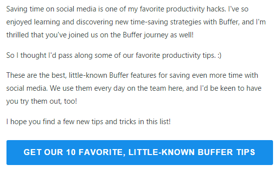
Check out this CTA in an email I received from Buffer:
It’s big and bright, it is very well placed, it clearly states what it will do, and it’s the only CTA on the page!
9. Match Your Email and Landing Page
In order to complete your email you should have an optimized landing page ready and waiting for your readers to arrive at. This little extra step of optimization can be a huge boost for your campaign.
The reason this is so effective is because it ties together the email and the website. It makes your landing page an obvious extension of your CTA, which in turn makes your customers more comfortable.
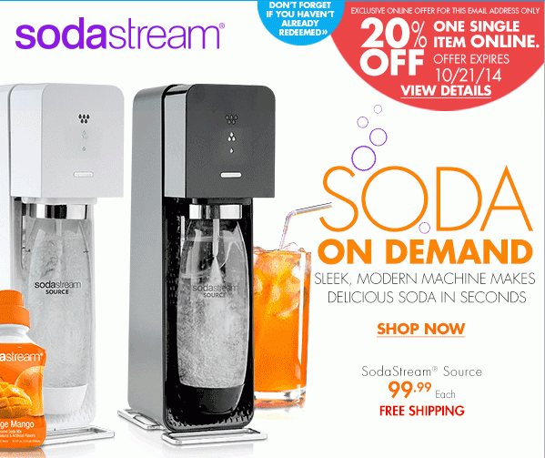
Check out this email from Bed Bath and Beyond:
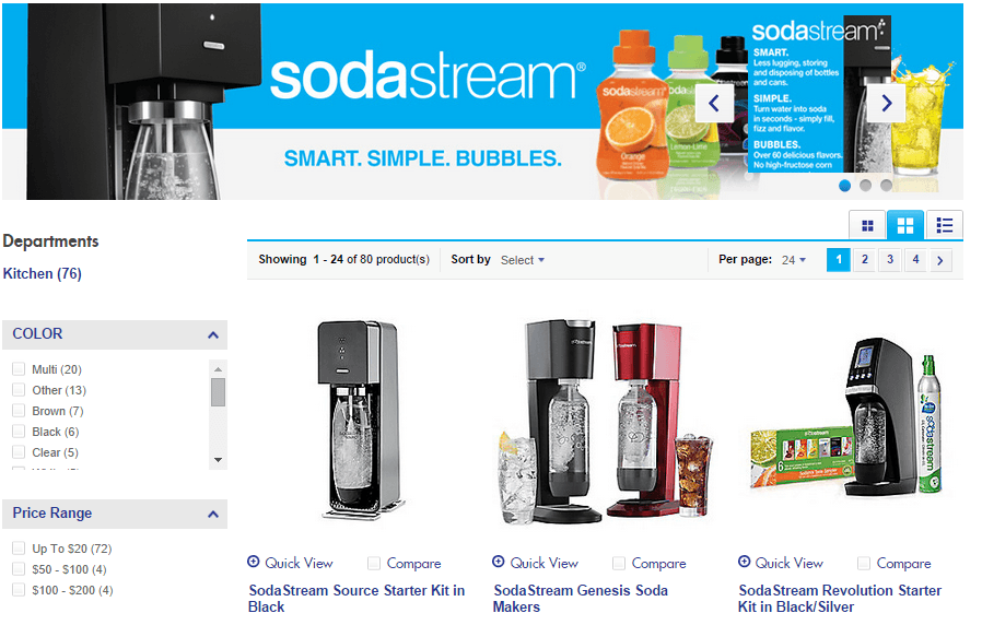
This email and CTA are clearly about Soda Stream. Take a look at the page I landed on when I clicked on the CTA:
It’s an optimized page dedicated to Soda Stream, complete with a full sized banner on top! A slightly subtler touch is that the orange (color and flavor) which was featured prominently in the email is also the flavor that is front and center on the banner.
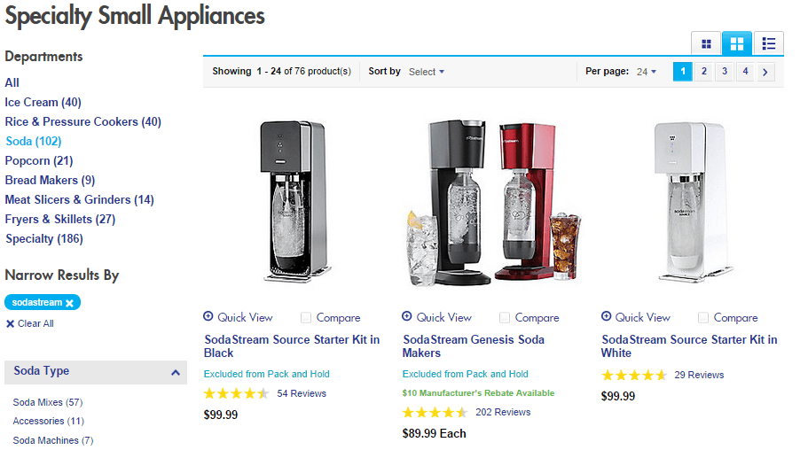
Now compare that page with the page that I found when searching the Bed Bath and Beyond website for Soda Stream products:
Very similar results and layout, but no Soda Stream banner on top.
All Bed Bath and Beyond did in order to create a landing page that matched their email perfectly was to add in a banner on top of the screen.
Other things you can do include referencing the email itself, creating a similar design to the design of your email, or maintaining a similar thematic reference in both your email and your landing page.
However you do it, just remember, it is always important for your landing page to match with your email.
10. Check How Your Email Looks on Mobile
Before you can call it a day on your email you definitely must check how your email looks on mobile.
Why you ask?
How about because 65% of all emails get opened first on mobile and only 6.3% of readers will actually read an email on their phone that is not optimized for mobile.
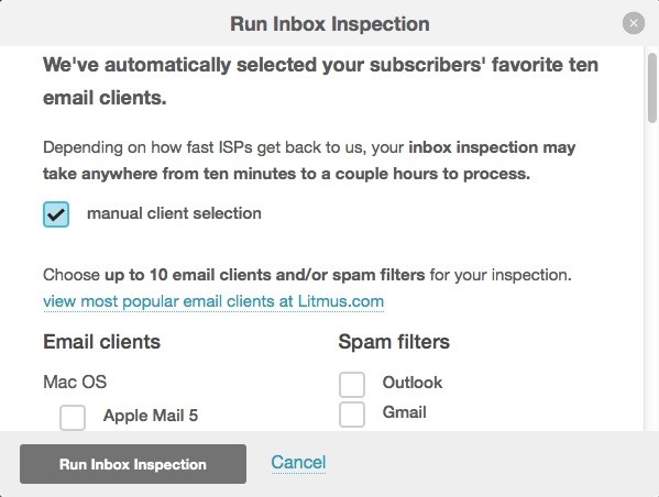
With any major email platform you should be able to check how your email will look on many different devices. For example, MailChimp provides the Inbox Inspector tool, powered by Litmus, which enables you to do this for free with a paid plan, or for a relatively low cost with the free plan.
Another option is to use Litmus’ services directly to optimize your emails. This route is a bit more expensive though, with plans starting at $79/month.
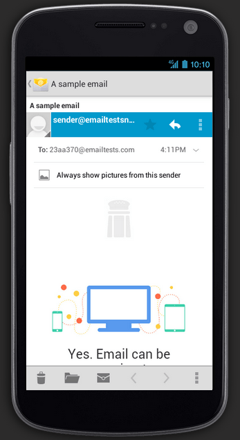
Here’s an example from the Litmus website of an Android preview:
Review and Start Sending Your Emails!
Now that you have finished optimizing all aspects of your email it’s time to take a good long look at what you did. You want to review everything to make sure it is all just right. You don’t want any typos or design errors to ruin all your work!
Once you’ve finished reviewing (review one more time for good measure) it’s time to start sending your emails!
As you send more and more emails you will begin to see which emails work the best for you – emails with images or without, emails with a hyperlink call to action or with a button. It’s a good idea to keep track of how well your emails have performed and A/B test everything in order to be able to improve and optimize your strategy.
Bonus: Need help building your email list? Check out our Coupon Pop and Exit Pop tools!

Zack is a social media enthusiast who loves all things digital. He is the inbound marketing manager at StoreYa where he spends his days searching for the newest social marketing scoop. If you’d like to chat with him, feel free to connect with him on any social platform.
Recommended articles
 Facebook Ads for eCommerce: 16 Strategies, Examples & Tips
 How to Build a Winning eCommerce Ads Strategy
 Google Ads for eCommerce: Everything You Need to Know
 10X Your Traffic with PPC Management Software
Comments
Powered by Facebook Comments





Pretty good tips Zack! For #10 I’ve seen a good jump because I made sure my emails worked for mobile and when I stick with plain text (which is pretty sad, because I like images! LOL)
Sharing this out shortly
Thanks again Dennis, and thanks for sharing your experiences! It’s great to hear that checking the way your email looks has gotten you some real results 🙂
[…] Beat the Average With 10 Email Marketing Tips for eCommerceSocial… – Email marketing is a huge sales driver for eCommerce and it’s highly effective. It’s a good idea to keep track of how well your emails have performed and A/B test everything in order to be able to improve and optimize your strategy. […]