When you’re starting out every new visitor or sale is like a gift of the Gods.
But as you grow that quickly gets old.
You get smarter about where you can find new customers and plug the gaping holes in your website. But how can you further improve your sales if there are no obvious wins?
As you get bigger the intangible stuff becomes more important: are you speaking to the right people, do people trust your site, do they see you as an expert? These are things that many people describe as the fluffy stuff.
In this article I’m going to make the fluff real and show you five mistakes that other stores make. I’m going to show you bad examples that will help you to avoid those mistakes and show you good examples that will take your sales to the next level.
Start Learning: 5 Mistakes Killing Your Online Sales
Mistake 1: Not Knowing Who You are Selling to
This one seems obvious; of course you know who you are selling to!
You sell to college students / women that are into yoga / anyone that needs garden furniture / your answer.
Most store owners get this far. Just a tiny bit specific but still vague enough to make sure you don’t exclude anyone that could possibly buy your products.
But digging down deeper into your target group might reveal more details. If you sell to women that are into yoga, ask yourself what a 23 year old woman has in common with someone of 64 years of age?
They both do some type of yoga but they will probably have different reasons for doing it. The younger woman might be doing it to get more toned, while the older one simply wants to stay active.
Tip: If you describe your audience as “Anyone that needs …” you don’t have a grasp on who you’re selling to.
Why is this important?
If you don’t have a clear idea of who you’re selling to, it will be hard to convince your visitors why they should buy from you instead of any other store.
The better you understand what they are really after, the more they will feel at home and the more likely they will buy.
Targeting a specific group of people goes beyond adding a tagline to your site that says: yoga gear for 18-32 year old women.
In some cases it could make sense to use a tagline, but if you really know your customer you can be a lot more sophisticated. You can tap into their goals and aspirations with your store’s name, your design, product images or your content.
Let’s take a look at some examples!
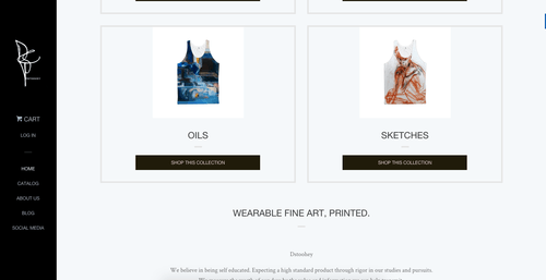
If you land on the homepage website below, it’s unclear you’re in an online store.
Scrolling down further they do explain what the site is about: Wearable fine art, printed. There are also some products so you understand what that looks like.
Putting that tagline on top of the page will make it more clear what this site is all about.

Putting that tagline on top of the page will make it more clear what this site is all about.
The reverse can also be true: a homepage that tells exactly why your store exists and what your products stand for. But if people get to your store via a product page instead, they don’t have any idea what makes your products different.
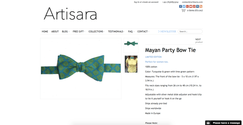
Here’s yet another example. Seems like a normal bow tie, right? But if you go to the homepage, you’ll discover a whole other angle.
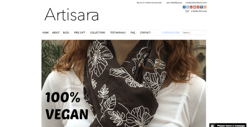
Here’s yet another example of a web store killing its own sales! It turns out that their whole site is about vegan, cruelty free clothing and accessories. This seems to be the main selling point of the store, so making sure it’s visible no matter where you are on the site is essential. You could pull this off with a site-wide banner or including it at least in your product description.
The next example is an approach I see a lot, especially with stores that are dropshipping. The site below works fine, there are plenty of products and each of them has got a product description. But something is missing.
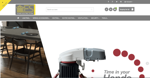
Who is this store for? Anyone that needs anything related to Electrics? What sets this store apart from others? At the end of the page there are a couple of their selling points:
Again these are pretty generic and don’t set this store apart from others.
If you know exactly who your customers are, you could specify more what kind of support they need.
Are your customers do-it-yourself type of people? Are you targeting the professional market? Or do you want to sell to people that want to improve their home, but have no technical skills and need other people to install it for them?
That’s only thinking about the way you can offer and frame the support you give. But you can see that if you apply this thinking to other parts of your business and it can really give you unique and creative ideas to set your store apart.
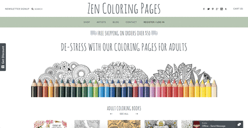
If you land on the Zen Coloring Pages’ homepage, it’s clear what they sell to whom:
Next is an example how your customers and products can influence the name. Mindzai is a site that sells a lot of anime and cartoon figurines. The store name sounds Japanese (-zai) and the logo also has something that resembles a Japanese character. A big part of their offering is around anime products. So the Japanese name connects to that.
![]()
You can also use your brand in little design elements on your page. Beauty Express has a lipstick-looking line below their titles.

If you’re running into some of the same issues as mentioned above, take a step back and really take a look at how you are approaching your customers.
Things to get your juices flowing:
- Get a better grasp on who you are selling to
- Try to define what sets your store apart
Mistake 2: Hiding Information From Your Visitor
People love surprises right? Whether that surprise be getting that extra 10% discount, adding a gift to their order or thanking them with a handwritten note.
If you manage to delight your customers, you start of the relationship well and set yourself up for repeat purchases or referrals.
That also works the other way around if you do things like hide shipping or additional costs in the checkout process.
Visitors will feel tricked; they won’t buy and will probably tell others about it.
Take a look at the extra insurance that was added to the cart below. Can you spot how to get rid of it?
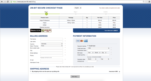
Even if you have the best of intentions, people might still feel tricked if you’re not straightforward about things like shipping costs.
A UK study on shopping cart abandonment showed that 26% of shoppers placed an item in their basket just to check delivery costs. So if your cart abandonment rate is too high, this could be one of the reasons for it.
Let’s take a look at some examples that handle this well.
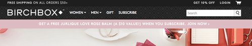
Birchbox offers free shipping on orders above $50.
Another eCommerce brand that has successfully found a way to let customers know about shipping costs before checkout is OZscopes. They have a shipping calculator in their sidebar that will show you exactly how much shipping will be. That’s one great way to improve the eCommerce shopping experience.
Free shipping and returns might not make sense for your business. But you can be as clear as possible about shipping, tax, returns and possible additional costs.
If you’re unsure if you’re doing things right, you could run a user test with people that haven’t been on your site before. Let them make an order and quiz them afterwards to see how obvious your shipping and return policies were.
Mistake 3: Making a Bad Impression With Your Product
There are two ways to make a bad impression with your products: sell a crappy product or present a good product in a bad way.
If you sell crappy products and visitors can tell from just looking at the pictures there is no hope for you. You might be able to trick some visitors into buying, but word will get out and your store will go nowhere.
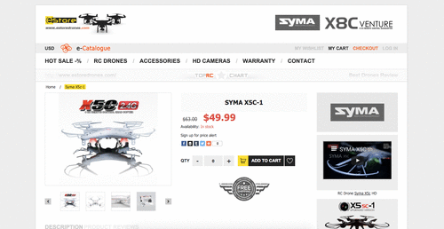
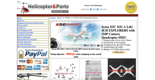
Even if your products are great (or just good), your presentation might stink. For example, when shopping for a specific type of quadcopter I found the following 3 sites that are selling the exact same product.
Site 1:
Site 2:
Site 3:
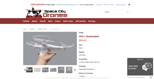
Personal design preferences aside, the product looks totally different on these three sites.
Product presentation matters. If all you do is put up all pictures and texts that the manufacturer or supplier has provided, you probably are not going to stand out from other sites.
But if you take the time to customize the content to your audience, you’ll see better results. The last store in the example above took some time to take new pictures, it gives you a feel for the size and adds a human element to it.
Don’t get me wrong, this is a lot of work. But this is where you add extra value.
Most store owners will try to do the least amount of work possible and use the pre-made content, making it more valuable if you do something else.
Boring products
But what if your products are good but just a bit boring?
In an effort to find the least sexy product I came across the Hacos HM, an industrial machine to produce chocolates. Their product pages look a bit dull, but in one of the product pictures the machine is working and you can see all the delicious chocolate!
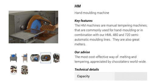 Product in Action
Adding that picture might seem like a small thing, but showing how the product can be used makes it more real to your visitor.
Great products
Let’s take a look at example from Betabrand. Many of their products are unique, fun and really visual like this Gold Disco Hoodie.
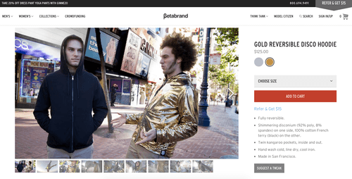
If your product is great, make sure you also show it with a good description, plenty of pictures or videos and good reviews!
Mistake 4: Only Going for the Direct Sale
Most visitors come to your site with no intention of buying. It’s more likely that they are there to read an article, browse around or consider some of your products for a future purchase.
Only a very small percentage of first-time visitors will be in buying mode.
That percentage goes up every time a visitor is brought back to your website. An ecommerce study that compared conversion rates for new vs repeat visitors found the following:
- New visitors: 1.55%
- Repeat visitors: 12.61%.
While there are things you can do to convert more of those first time visitors, it’s clear that the money is in bringing people back to your site.
Two ideal tools for this job are retargeting and email marketing.
Retargeting
This is a type of advertising that allows you to show banner ads to people that have visited your website.
The two big places you can use to setup retargeting campaigns are Google Adwords and Facebook ads. It’s easy to waste money when you start advertising, so make sure you get things right from the start.
You can get really specific and show them the exact products they were looking at. Or you can keep it simple and reinforce your store’s brand.
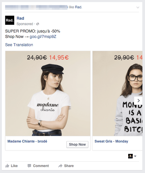
Check out this retargeting ad via Google that promotes a one product store.
Retargeting via Facebook also allows you to advertise a specific set of products.
Email marketing
Even if a visitor isn’t ready to buy on his first visit, you might be able to convince him to join your email list.
You can offer exclusive content, special deals or a discount if they join your list.
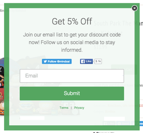
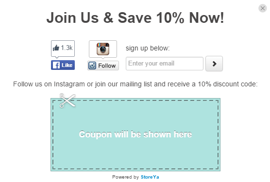
This popup offers a 5% discount if you join. If they’d remove the social media buttons it would increase focus and probably lead to more opt-ins.
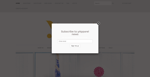
The below store invites a visitor to “Subscribe to news”. Unless visitors love your store, it’s unclear what’s in it for them if they sign up.
Now take a look at an eCommerce site that creates attractive popups that convert visitors into leads and customers. Autumn and Indigo have created a stellar popup that catches your attention, and of course, tells you what you get in return for signing up.
Once you’ve got the visitor’s email address, you’re in the driver’s seat. You have permission to get in touch as long as you’re providing them value.
This can range from a newsletter with the latest products to a series of emails educating them about how your product can make their life better.
Recommended: If you want to make the popups on your store really stand out, check our Popups for eCommerce ebook!
Mistake 5: Produce Content That Not Even Your Mum Wants to Read
If you’re relying on content marketing to bring people to your website your goal is basically to earn the attention of people.
To get that attention you need to provide value in exchange.
A keyword stuffed blog post might result in a small trickle of traffic to your site. But if it’s poorly written you’ll see those visitors going faster than you can show a popup. They will also not click through to your products or spread it on social media.
The bar for content that will attract and keep the attention of visitors is high. So take a step back from the 3 posts a week schedule that has been stressing you out.
Focus on your audience, what content are they looking for? Can you create something that can educate, inspire or entertain them?
Let’s take a look at some examples.
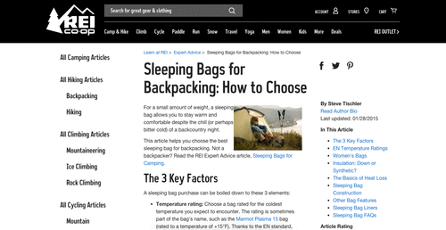
A sleeping bag buying guide from REI. This articles allows them to teach visitors before buying to get them the exact product they need.
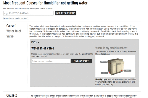
Below is a how to guide from Repair Clinic. This one is about what to do if your humidifier is not getting water.
These type of problem oriented searches work great in Google. Repair Clinic does this well: they offer valuable advice and perfectly tie in their products which are replacement parts.
Or you can make it more entertaining like Scotts, which sells men’s clothing and shoes. Their articles range from the best albums of 2015 to obscure movie references.
Most businesses will focus on getting the cornerstone content in place first: buyers guide, product reviews, etc. And if successful, they will move on beyond keyword research infused articles and really start thinking about branding. Creating high-quality content requires, above all, a great understanding what your audience is interested in.
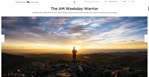
Content can also work to inspire your readers. This is also strongly tied to branding. What does your audience really like. A nice example from Huckberry, about exploring the outdoors in the morning.
A lot of these examples are very well executed pieces of content by bigger companies.
You might think that you don’t have the resources that they’ve got. But remember that in the end you are competing with them for the same attention of a potential customer.
Time to Fix Mistakes
That wraps up this article. Have you discovered you were making any of the 5 mistakes mentioned here? If you were I hope this article got your head buzzing with ideas on how to improve your store! After you’ve made these improvements and your conversion rate is shooting through the roof, head over to the Store Growers blog to get more inspiration on ecommerce marketing.

Dennis is Chief Ecommerce at Store Growers where he gives practical marketing advice to ambitious online store owners.
Recommended articles
 Facebook Ads for eCommerce: 16 Strategies, Examples & Tips
 How to Build a Winning eCommerce Ads Strategy
 Google Ads for eCommerce: Everything You Need to Know
 10X Your Traffic with PPC Management Software
Comments
Powered by Facebook Comments

For me, retargeting really is effective.It does help us with sales since we started using it.
Hi Faith,
Thanks for the comment, I agree, retargeting can be an amazing way to increase ROI!