When you look at the top reasons why shoppers are abandoning their carts and how to fix them, checkout optimization plays a crucial role. The secret to creating a seamless checkout experience for your shoppers is thinking of your sales funnel as a whole, and tapping into your unique target audience to ultimately get the conversion.
This means that when it comes to checkout optimization, you should be looking at ways to improve the design and layout of your cart and checkout process AND fine-tuning your shoppers’ journey on the way to a sale – thus improving your conversion stats long-term and building a winning eCommerce store brand.
So, how do you do just that?
We’ve compiled a list of our top checkout optimization hacks every online store owner should be testing to help bring more targeted eCommerce traffic to their checkout, boost sales chances and reduce cart abandonment.
But first, a big recommendation: when making any optimization changes, don’t make assumptions!
Dive into Google Analytics to Find Your Sales Funnel Gaps
Before you tackle checkout optimization, you need to look into your traffic data and shoppers’ behavior. The best way to do this is by accessing your Users Flow report to track your current conversion pathways and see which product pages are causing bottlenecks in conversions or are resulting traffic drops. Here are three Analytics posts every online seller should read to ensure they have access to the right data and are using that data to drive strategy:
- eCommerce Attribution Modeling Made Easy
- How to Use Google Analytics Intelligence to Ask the Right Questions
- A Complete Beginner’s Guide to Google Analytics
Design & Layout Checkout Optimization
1. Focus on Building a Visual, Simple Checkout Process
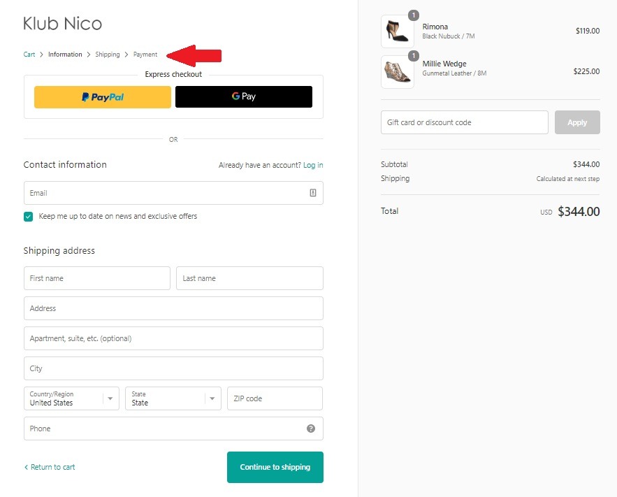
When it comes to optimized checkout design, less is more. This means you want to ensure the process is as streamlined as possible, with as few clicks as possible. Therefore, not only do you want to keep your UX user-friendly, your copy short and to the point, but also limit the number of fields.
And there is research to back this up. One study found that 23% of potential shoppers said they abandoned carts because the process was too long; therefore, by reducing the number of fields, you can increase conversion chances. The most common checkout flow is 1-2-3 checkout, which includes information, shipping and payment pages.
In short, you will want to consider the flow of questions and look at ways to keep the checkout process as short as possible – such as a tick box if shipping and billing addresses are the same, so that your shoppers aren’t having to fill in details twice. Here’s a great example of a highly visual checkout and a simple flow from Klub Nico.
As for what forms you should include, the next hacks will help you determine what’s best for you.
2. Capture Email Addresses as Early as Possible
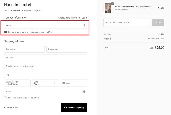
You can have the most optimized checkout process and store possible; you’re still going to have cart abandonment. Why? Because 34% of your eCommerce traffic is probably just window shopping. Therefore, by making email capturing a priority in the checkout journey, you ensure you are able to push remarketing and cart abandonment email campaigns to bring these shoppers back to your store.
A robust cart abandonment email remarketing strategy could result in +18% conversion rate for that returning traffic. And the foundation of that strategy is, of course, the email address. A good example of a winning eCommerce brand that is taking advantage of email capturing as a first step in the checkout process is Hand in Pocket.
Newbie Tip: New to the eCommerce game? You want to start with the following for cart abandonment emails, and then optimize and adjust to your unique brand and shoppers as you grow:
- First email – within 30 minutes after abandonment
- Second email – 24 hours after abandonment
- Third email – around four days after abandonment
- Fourth email – a week or two after abandonment
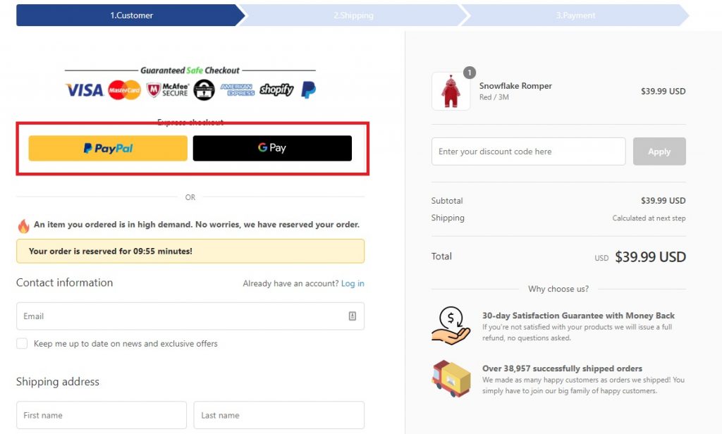
3. Put Your Checkout Security on Display
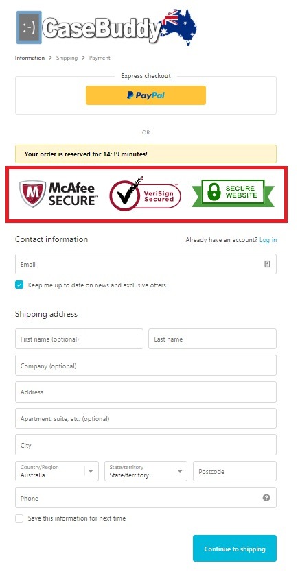
Even if you’ve done your due diligence in building trust throughout your eCommerce website, you should be carrying it through to the checkout process. More specifically, ensuring that your potential shoppers understand that their purchase will be 100% safe. A smart way to do this is with trust badges. These include:
- SSL certificate badges that show your store site is secure
- Security seal badges, such as McAfee, to ensure your store meets industry security requirements
- Payment gateway trust badges on your checkout pages to show payment methods are secure
The third is essential to giving potential shoppers the indication that your gateway can be trusted. For those of you using Shopify, here’s a video on how you can add trust badges to your checkout page.
Bonus Content: Your Quick Guide to Trust Badges
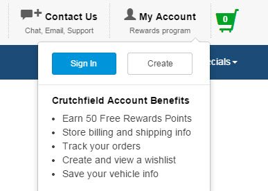
4. Include Guest Checkout Options
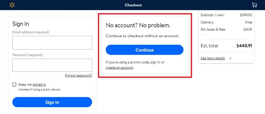
Here’s the thing: forcing account creation at the beginning of the checkout process is likely costing you sales. In fact, compulsory, forceful account creation is the second leading cause of cart abandonment.
In short, offering guest checkout options is an optimization must!
What if you want member signups? There are several ways you could do this, by still encouraging account creation without being too pushy. You could either give shoppers the option to create an account, sign into their account or continue as a guest – as Walmart does – or you can add account creation as a final step, once the sale has been completed.
Additionally, you may also want to test account signup incentives such as coupons, order tracking or reward programs.
That being said, we would suggest incentives for signup after the checkout is complete. Put yourself in the mind of your shopper: wouldn’t you be more willing to give contact information and create an account to track an order than to complete a transaction?
5. Include as Many Payment Options as Possible
When we highlighted the top reasons why your shoppers may be jumping ship from your checkout, payment gateways played a significant role – with as many as 8% of cart abandoners saying lack of preferred payment options leads to them giving up on a purchase.
Ultimately, you should be accepting major credit cards as well as popular wallets and platforms such as PayPal – which will differ regionally. This is not to say you should accept every new, untested platform that pops up; but there are some payment options worth adding, such as Google and Apple Pay – which also enables quicker payment options for your shoppers. Here’s an example from Eloise and Lolo:
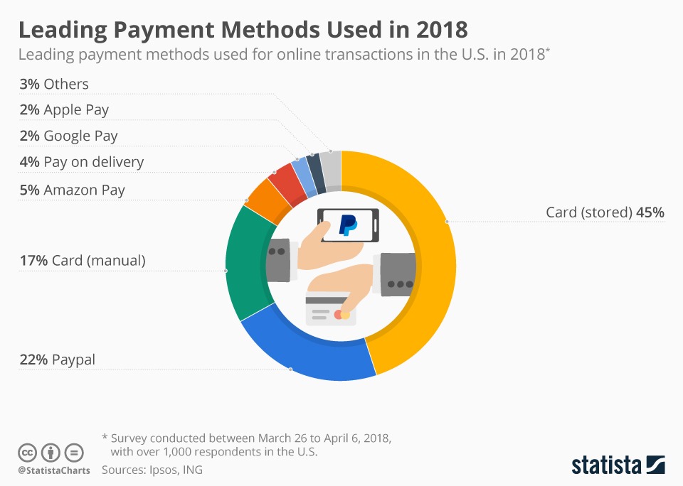
Here are last year’s leading payment methods used in the US, according to a Statista survey:
Choosing which ones to implement should be based on your unique target audience and location.
Newbie Tip: If you’re a brand new seller, you may want to start with cards and PayPal first, and then test other payment options one at a time.
6. Allow For Default Billing/Shipping Addresses
It’s the age of convenience, and online shoppers want as smooth a process as possible. Auto-fills for returning customers can save a lot of unnecessary repetition and make their purchase quicker. This includes information like billing and shipping addresses, name and email address.
But what about new shoppers?
By using checkout optimization tools that auto-detect both city and region based on the zip/postal code the user has typed, you can save potential shoppers 40% of typing during the checkout process. Plus, it helps eliminate shipping address typos. This can be done with code in most eCommerce platforms.
Newbie Tip: If you’re on Shopify and don’t have enough experience or budget for code design changes, you could start with an app such as Address Validator.
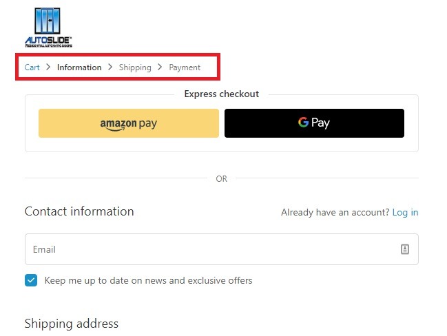
7. Show Checkout Progress
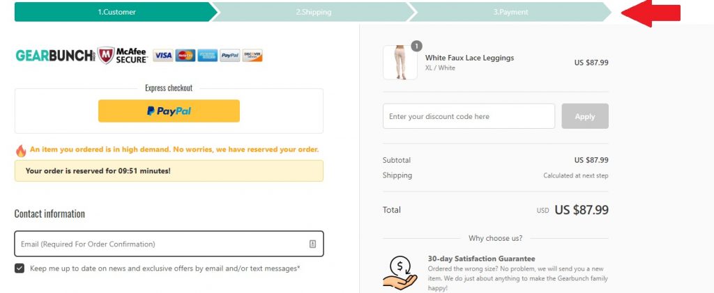
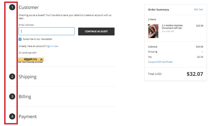
Let shoppers know how short your checkout process is and enable them to track their progress. This can be as simple as tweaking your checkout design to show the steps a shopper will take or the sections they will need to fill out. Here are some checkout UX designs from Autoslide, Gearbunch and Off the Rack.
8. Keep Customers On Your Store Domain as Long as Possible
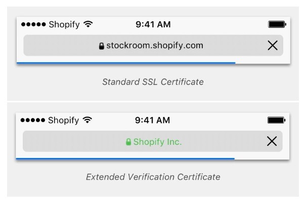
To keep your checkout process streamlined, you will want to try your best to keep your shoppers on your store domain instead of sending them to a third-party gateway URL. While this doesn’t affect security, it will give potential new shoppers doubts. This has been in practice on Shopify since 2017, while Shopify Plus stores have access to a free Extended Verification (EV) SSL certificate, increasing trust two-fold.
Bonus Content: Top Shopify Plus Store Examples and Why They Rock
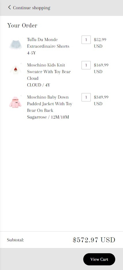
9. Have a ‘Continue Shopping’ Option
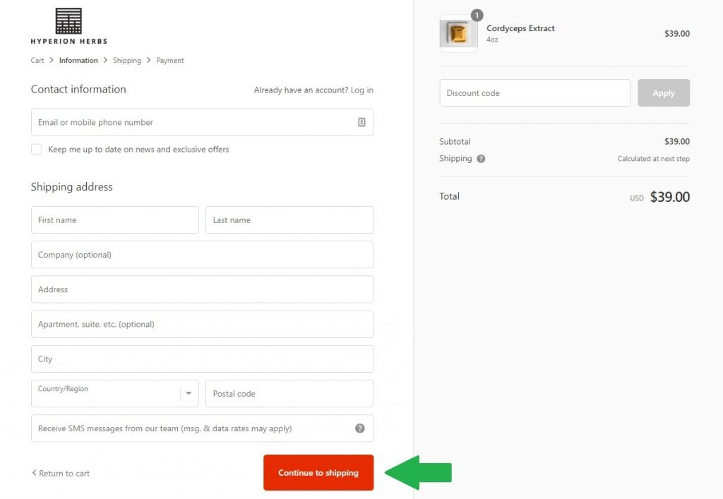
This may seem like a given checkout optimization trick, but having a ‘continue shopping’ button on checkout pages is often overlooked. A ‘back’ button isn’t convenient; instead, give your shoppers the chance to browse for other products or add a forgotten item more easily. Here’s an example from Hyperion Herbs:
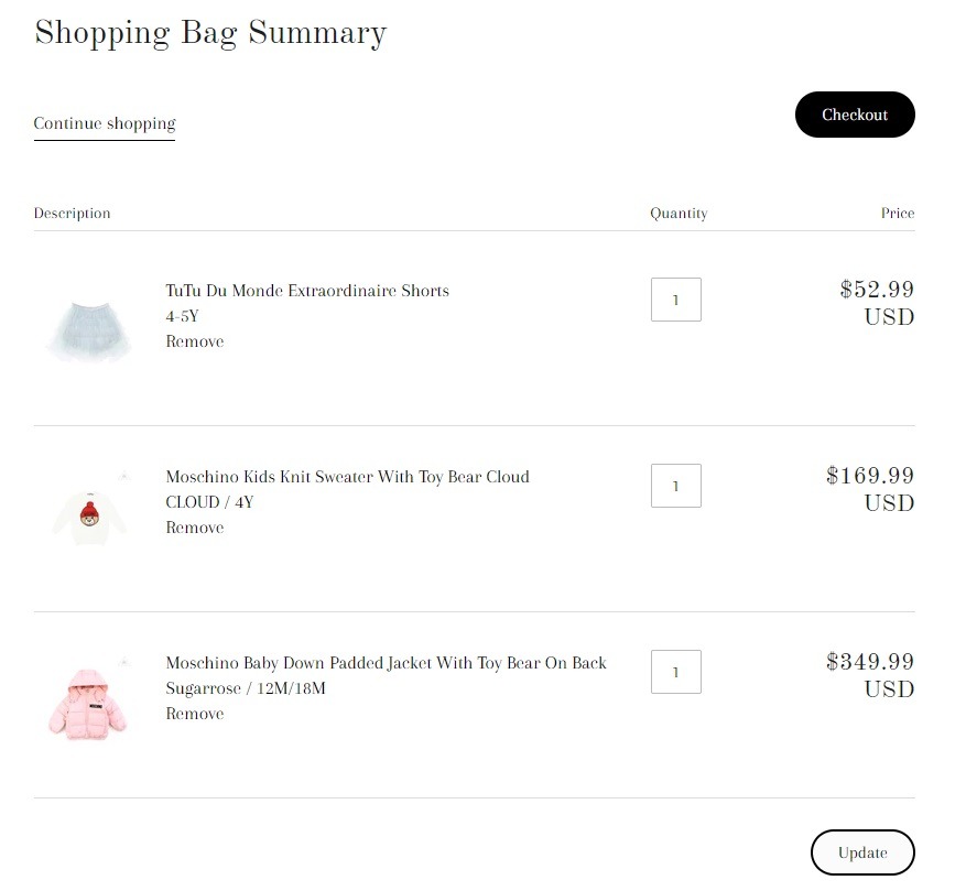
Additionally, consider adding a ‘continue shopping’ button to your shopping cart as well. However, if these two buttons (your ‘continue shopping’ and ‘checkout button) are side by side, you will want to differentiate them from each other using color or other design elements.
Newbie Tip: If you are about to launch a new store and haven’t chosen a template yet, an optimized cart and checkout design is something you will want to review first. The closer the template design is to what you want, the less coding or tweaking you will need – saving you time and hassle in your first couple of months. Launching a Shopify store? This How to Choose the Best Shopify Theme for Your Online Store post will help!
10. Don’t Forget Your Most Important Information Page Links
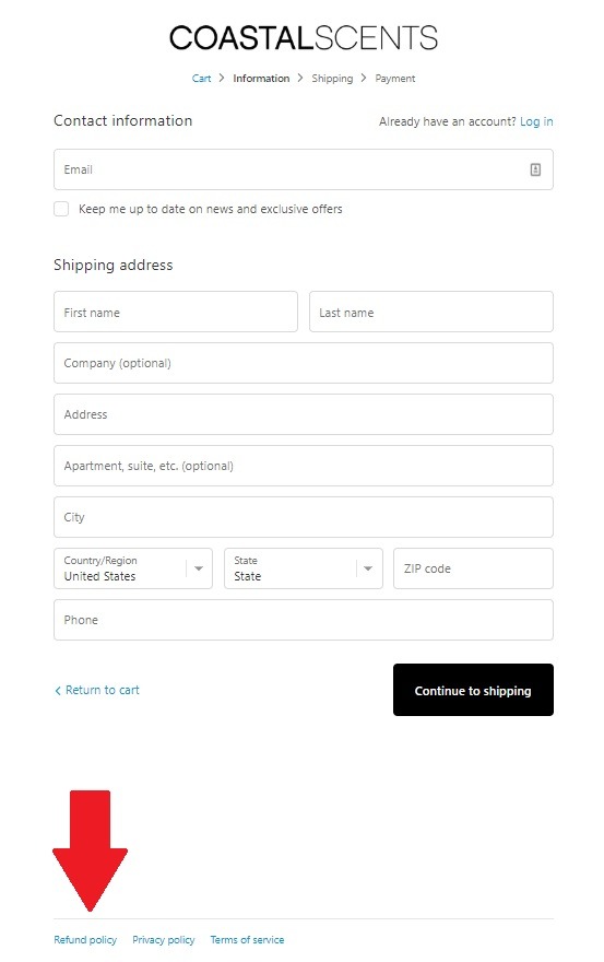
To get ahead of questions a potential shopper may ask, make sure you include your most important resource page links. This could include privacy, return and shipping policies, FAQs or terms and conditions links to ensure shoppers have all the information they need to finish the purchase.
Bonus Content: Must-Have Terms and Conditions Template for eCommerce
11. Use Data Validation
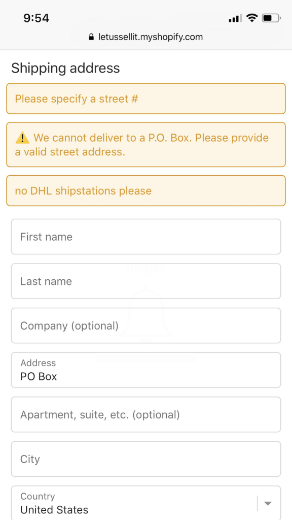
Speed up your checkout process by using address validation, while also preventing input errors that could lead to incorrect shipping addresses. As we discussed in our cart abandonment solutions post, services such as PCA Predict allow you to recognize IP addresses for live shipping rates and currency changes, while Shopify apps such as Address Validator will prevent incorrect address entries, and services like Loqate will validate shipping and email addresses.
Cart Hacks to Improve Checkout Optimization
An optimal checkout optimization strategy doesn’t start and end with your checkout design and flow. In fact, every part of your shopping experience can help funnel more shoppers with high intent to your checkout, which in turn can boost sales. Here are the top cart hacks that play a role in improving the checkout process and sales.
12. Use Product Images to Reinforce the Checkout Journey
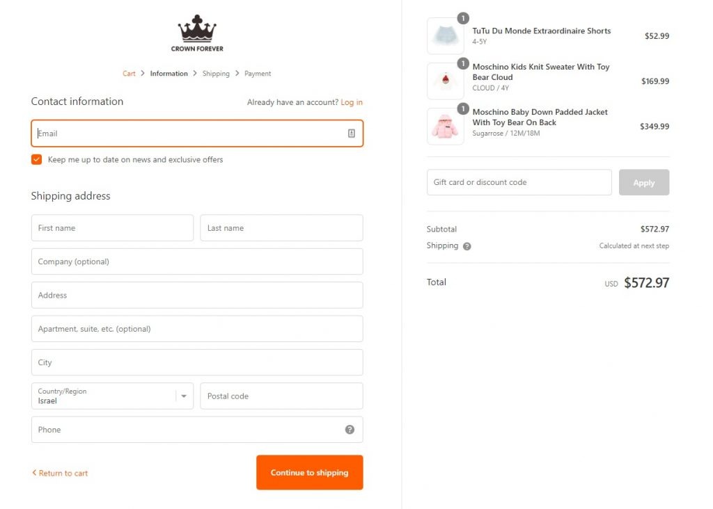
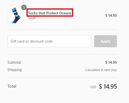
Reminding your customers what they are buying throughout the checkout journey can boost your conversion rates. As we know, product photos play a top role in motivating customers to buy a product. Therefore, harnessing that visual power in your checkout optimization can help get the transaction completed. Here’s an example from Crown Forever: showing product images throughout their checkout process in cart popups, shopping cart pages and checkout pages.
Shopify Newbie Tip: How to upgrade your online checkout
Over and above that, one more place to reinforce buying motivation with images is confirmation emails – which in turn improves the overall shopping experience.
13. Let Shoppers Know Shipping Costs as Early On as Possible
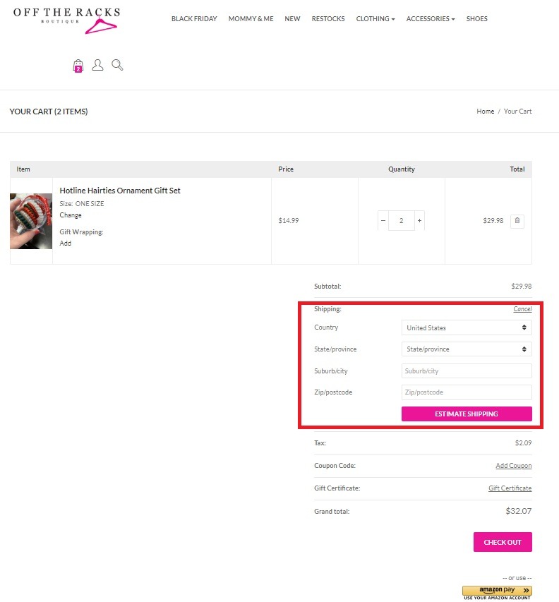
Unexpected costs are the number-one reason why potential shoppers bail on a transaction, with as much as 56% of all cart abandonments attributed to this reason. And the biggest hidden cost shoppers grapple with? Shipping! To counteract this, you want to be upfront with all the costs involved in a purchase at the cart level of your checkout process. Here are five ways to keep shoppers in the know of the full costs of a purchase:
- Include shipping rate estimates in your shopping cart
- Have a shipping rate calculator in your cart where shoppers can insert their zip code
- Use geotagging to be able to include complete shipping rates in shopping carts
- Offer free shipping promotions
- Have links to shipping rate tables in product pages, FAQs and carts
Pro Tip: Give your customers more choice with shipping rates and options. Ideally, you will want to keep base shipping rates low and then offer faster shipping upselling options. Alternatively, instead of asking your potential shoppers how much they want to spend on shipping, try asking when they would prefer their package to arrive.
14. Be Strategic With Upselling
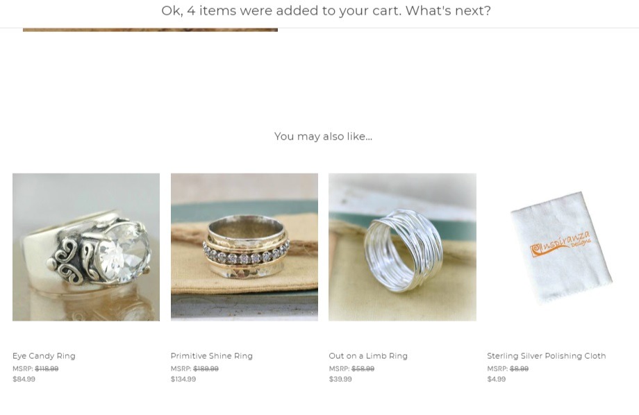
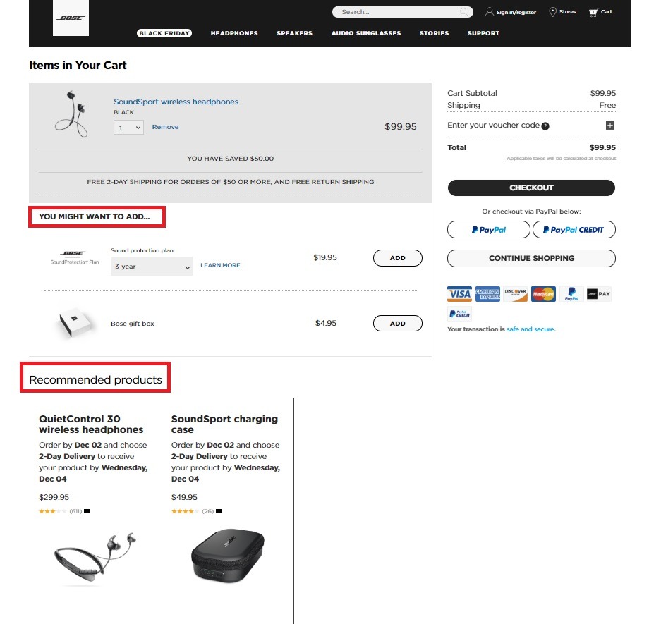
There is a fine line between encouraging higher order values and turning off potential shoppers before they complete your checkout. Aggressive upselling popups after someone has clicked ‘check out’ add an extra step to your checkout journey and can annoy your potential shoppers into abandoning their carts. Including related products or possible pairings in your shopping cart without the extra step is a softer, more effective approach. Something that one of our eCommerce merchants, Inspiranza Designs, has had a lot of success with.
In short, it’s a balancing act. Take a look at Bose – they have recommended products and accessory upselling suggestions in their cart:
Pro Tip: Cash in on last-minute Christmas revenue or other big seasonal days by upselling gift cards in your cart. Offering your shoppers the option to add a gift card, perhaps with a percentage promotion, can lead to increased order values as well as new customers.
15. Show Them How Much They are Saving
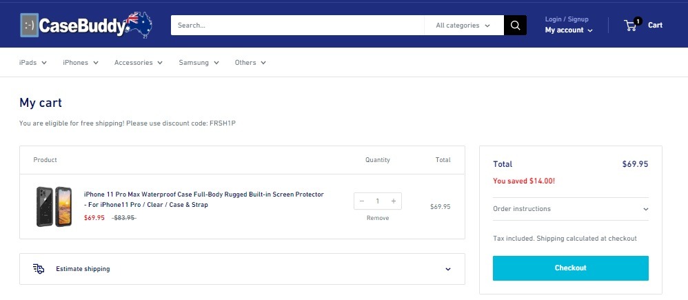
A good way to keep potential shoppers committed to their purchase in your cart and through your checkout process is to remind them how much they are saving with this purchase. Take a look at CaseBuddy’s cart page below; as you can see, they show the discounted rate as well as the total amount that the shopper is saving with their purchase.
We recommend testing both “was $X, is now $Y” and “you saved $X” strategies in your cart to find the best checkout optimization results for your store.
16. Bolster Product Benefits Throughout the Checkout Process
Do your shopping cart and checkout pages remind your shoppers what they are buying and why they are buying it? It’s not just price-related checkout optimization strategies – as reviewed above – that help bolster the reasons for the shopper’s purchase; product benefits can also help you keep shoppers motivated.
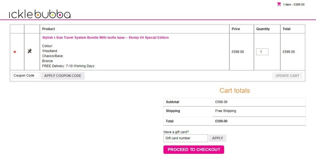
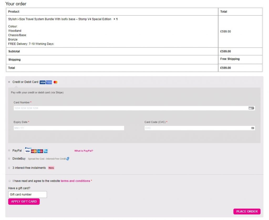
Take a look at ickle bubba. They include product and promotional (free shipping) benefits in their shopping cart and checkout pages.
Their Shopping Cart:
Their Checkout Page:
17. Enable Cart Content Sharing (B2B)
This cart and checkout optimization hack is particularly worth testing if you’re a B2B eCommerce seller. Let’s say you’re selling products to businesses, which your shopper may need to get permission for before completing a transaction. By enabling potential shoppers to either print or email the contents of their cart, with total showing, you will streamline the permission signoff of their purchasing guidelines.
Side Note: You will need to adjust your CSS or hire a developer to help you with creating an ‘email’/‘print’ button for your shopping cart.
18. Don’t Neglect Empty Cart Selling Opportunities
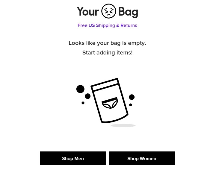
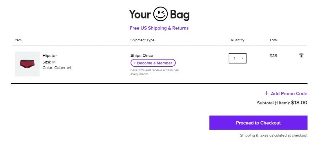
Let’s say a potential shopper is browsing your store and clicks the cart by accident; what will they find? If you haven’t tweaked your copy and CTA buttons to encourage shopping, you’re missing out. Let’s compare MeUndies’s empty cart UX to their shopping cart.
Empty Shopping Cart:
From their reminder about free shipping and returns to their easy ‘shop’ buttons and page copy, everything about this page encourages shopping and gives potential shoppers a good idea of the brand. Notice anything else that is different between the above and below bags? A clever little emoji change enforces the brand voice and tone and represents small UX changes that can make a big impact.
Shopping Cart:
19. Enable Cart Content Saving
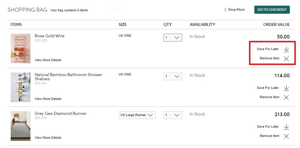
Another cart and checkout optimization hack to try is enabling your shoppers to save their cart or create wishlists. Just because a potential shopper isn’t ready to check out at the moment doesn’t mean they have no plans to do so in the near future. Also, what if they add a variety of products to their cart to compare or add things and the price is too high? By editing their cart and saving some of their products for later, you make it easier for them to buy now and come back for more products they love later. Plus, enabling cart and/or product saving will ensure purchasing is quicker when they come back.
An excellent example of this is from Next – their cart lets shoppers edit their items by either removing, or moving them to a ‘save for later’ list.
20. Include Contact Information
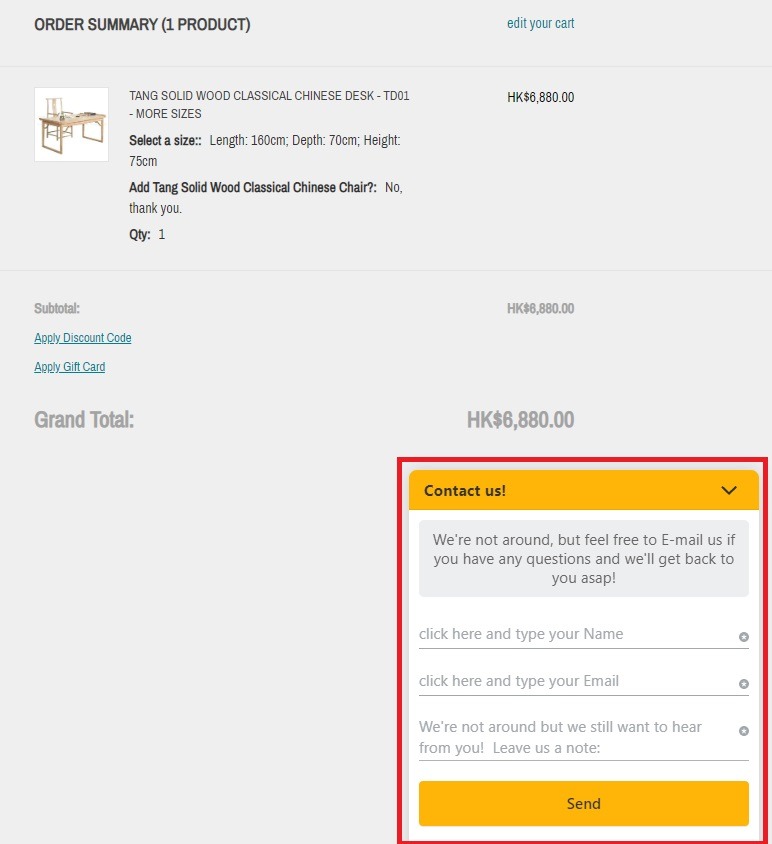
Looking for a quick checkout optimization hack that builds trust and makes it easier for your potential shoppers to get answers to their questions? Then adding contact information to your checkout process will be worth testing.
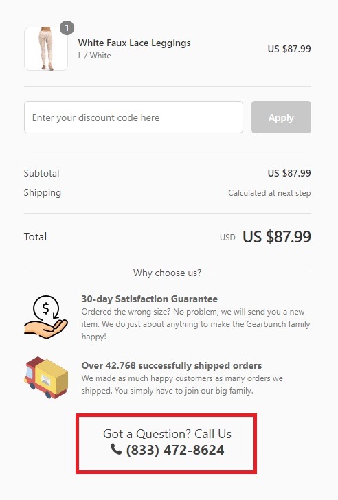
Whether it’s a user-friendly “contact us” tab like Decor8 (above) or a contact number in your cart and checkout pages like GearBunch (below), including contact information can boost checkout success.
Shopping Experience Hacks to Boost Checkout Potential
An optimal cart and checkout optimization strategy doesn’t start and end with your checkout design and flow and how you have optimized your cart. In fact, every part of your shopping experience can help funnel more intent shoppers to your checkout, which in turn can boost sales. Here are the top shopping experience hacks that play a role in improving checkout and sales.
21. Enable Live Chat
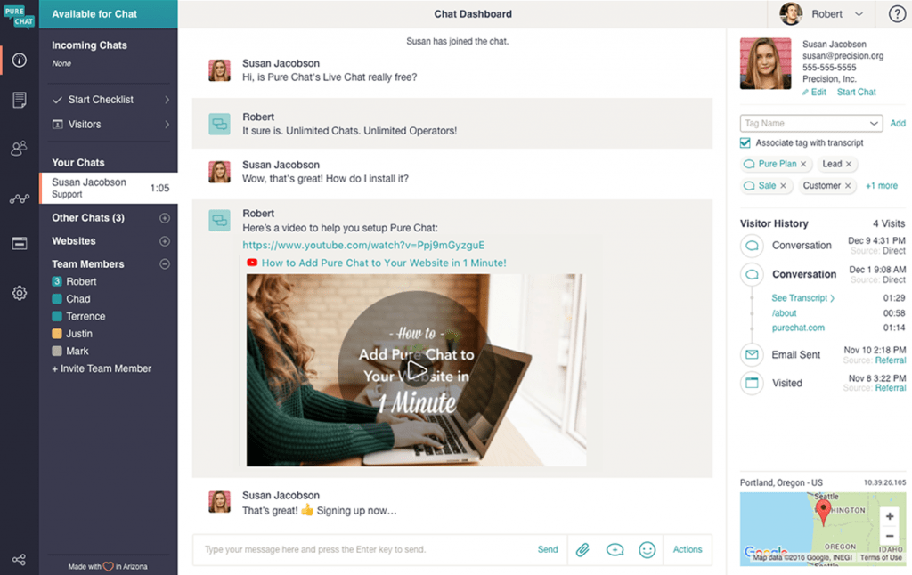
As we just reviewed, contact details can play a key role in your store, cart and checkout optimization. Take this even further by enabling top-notch support to answer questions right on your site in real-time – at any stage of the sales journey. Don’t take our word for it; here are some stats: 50% of shoppers prefer to chat online with someone in real-time, while 38% of consumers were found to be more likely to buy from a brand that offered live chat support.
No matter the eCommerce platform you’re using, there are a bunch of apps and services out there to help you implement real-time customer support to boost conversions, such as Zendesk customer support service or Shopify’s Pure Chat.
22. Enable Cart Viewing While Shopping
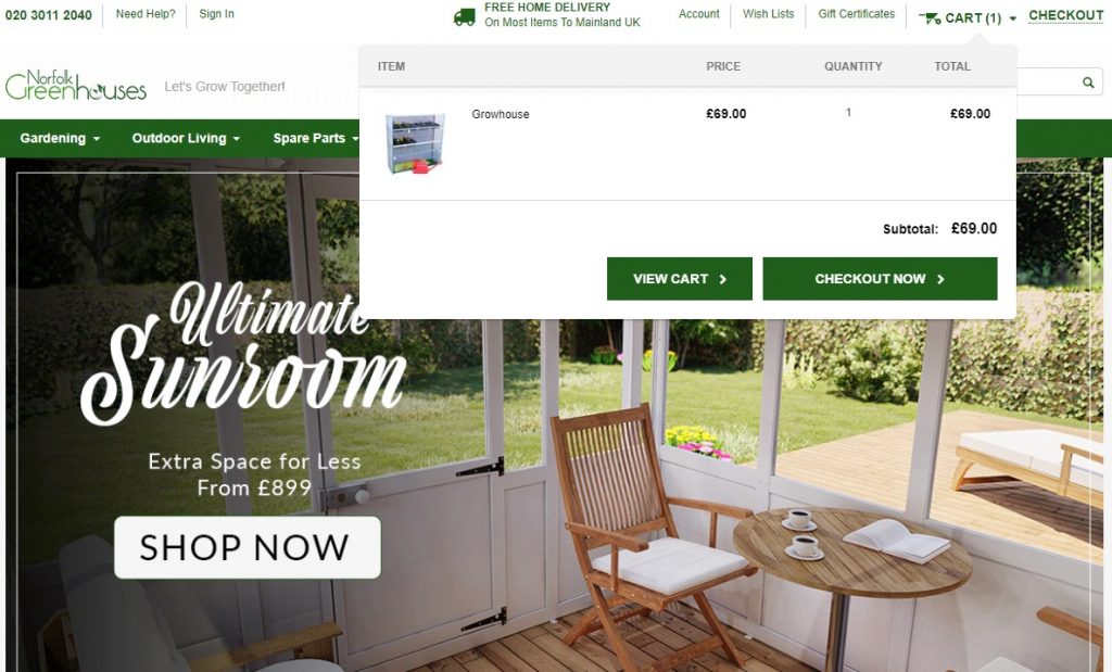
Being able to view their cart while browsing your other products helps shoppers keep track of their cart totals. This, in turn, helps prevent price shock when they are ready to check out; and price shock, as we know, is a leading reason for cart abandonment.
Shopify Tip: Here’s a how-to from Shopify on editing checkout and cart settings by altering theme codes, including adding more checkout buttons, a terms and conditions tick box, or a shipping calculator.
This is as simple as enabling quick-view cart from your store header so that shoppers can view their cart from whichever page they are browsing. Here’s an example from Norfolk Greenhouses:
23. Show Product Ratings and Reviews
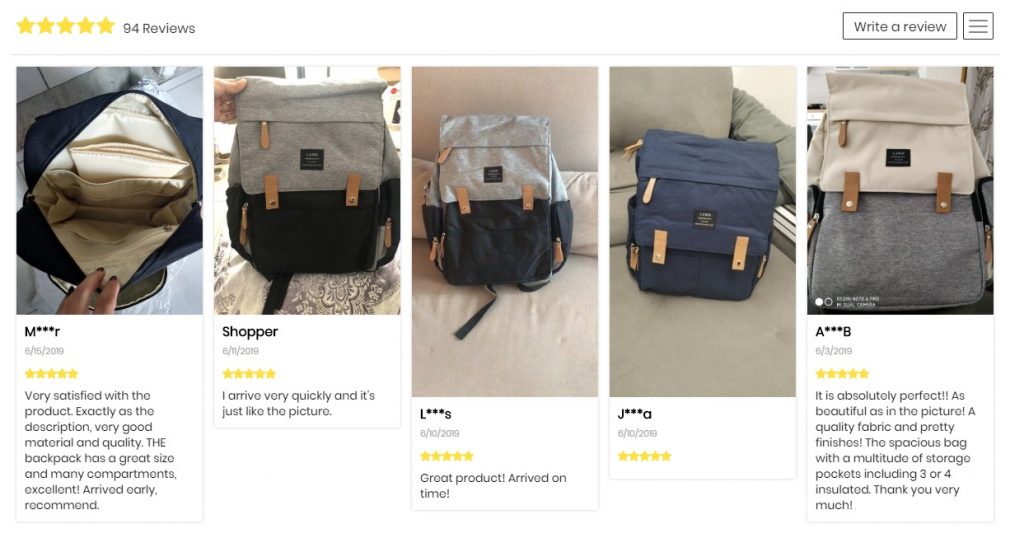
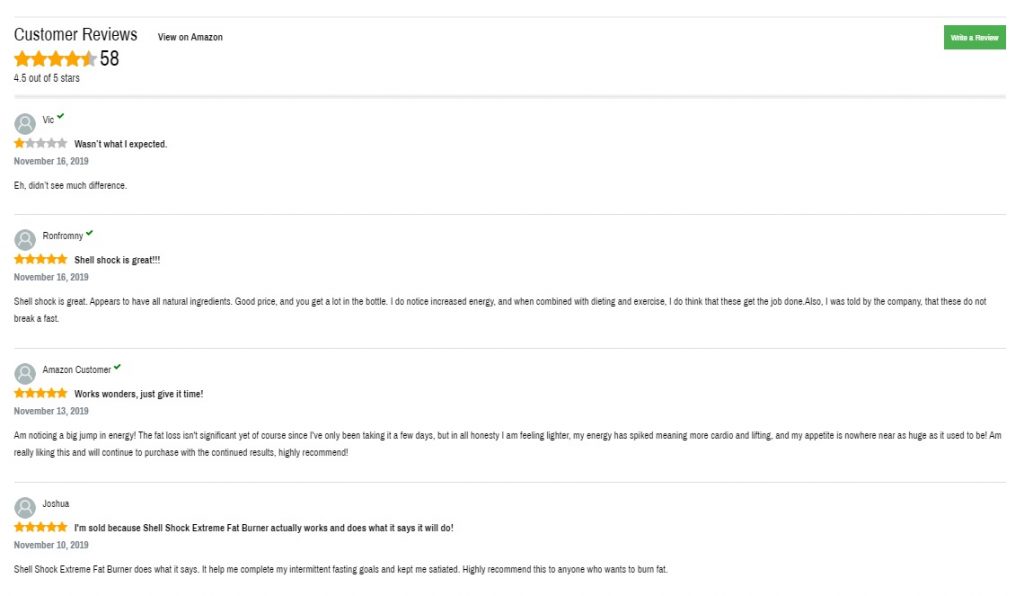
Product reviews, ratings and testimonials are an absolute must if you want to build brand and product trust. Trust that helps boost shoppers’ confidence and increases your chances of conversions. In a nutshell, product ratings and reviews are one of the must-haves when building product pages that convert.
Bonus Content: 5 Tools to Increase UGC, Pronto!
Here are a few of our top merchants who are using reviews to boost product pages and therefore increase checkout conversions.
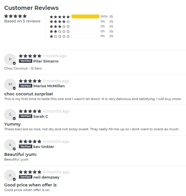
This eCommerce store displays UGC and reviews to visually show product testimonials.
This online store displays ratings and customer comments on each of their product pages.
This online store takes reviews even further by displaying ratings on home and category pages, as well as product pages.
24. Harness the Power of Video
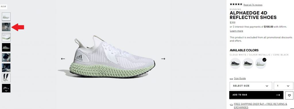
A big part of your checkout optimization strategy should include upgrading your shopping experience – and product pages should be at the top of your list. One way to up your product page optimization is by incorporating the power of video. Some studies have found that 60% of shoppers prefer to watch a product video rather than read a description; and product pages with video convert 80% better. But before you test product videos, here are some top tips to ensure they are effective in helping you lead shoppers to your cart and checkout pages:
- Make sure your shoppers can easily discover your product videos, by embedding them in your product image gallery and not other areas of your product page
- Mix videos into your normal image gallery thumbnails, while overlaying them with a “play” icon to make them more visible
A good example of perfectly integrating product videos that help sell products comes from the Adidas online store.
25. Focus on Your Store’s Top Benefits From Home to Checkout Page
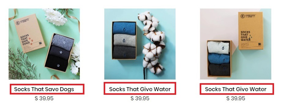
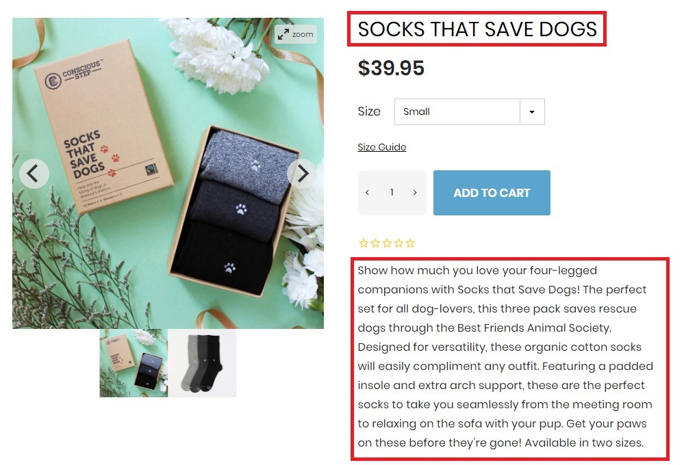
Another essential shopping experience step on your way to awesome checkout optimization is the product benefits. Now, we’ve mentioned highlighting these benefits on your product pages, in your cart and during the checkout journey. But this isn’t the only place you should be shining a spotlight on your benefits. Let’s take a look at Conscious Step. They highlight their unique brand and product benefits in their product names, homepage free shipping promotion banners, category pages, product pages and checkout.
Newbie Tip: Free shipping promotions, where customers get free delivery when they spend $X, can be very effective in increasing order values. But remember: the fewer requirements you set, the bigger the chances that shoppers will be encouraged to shop with your store.
Bonus Hacks for Post-Sale Traffic, Trust and Loyalty-Building
Your marketing doesn’t just stop once you have successfully lead your shoppers through your checkout process. So, without further ado, here is a post-checkout optimization strategy recommendation for after completed transactions.
26. Use Your Thank-You Pages Strategically
The first thing you would normally do after a successful sale is send your customer to a thank-you page. There are things you can try to use this page to instill more trust, continue the shopping experience for your shopper and promote your brand. Things that you can use to drive traffic and shoppers back to your store or turn one-time shoppers into loyal customers. Here are some strategy ideas to get you started. You can use your thank-you page to:
- Give customers coupons for their next purchase
- Gather valuable insights by linking to a survey
- Promote a referral program such as offering the shopper (and their friend) a discount on their next purchase
- Highlight your loyalty or VIP club options and give the shopper an incentive to join
- Upsell or cross-sell related products or accessories
- Ask for social shares or follows
Bonus Content: 6 Great Examples of eCommerce Thank-You Pages
Conclusion
There is no denying that any one of these tweaks could take your checkout optimization to pro-level and push your conversions through the roof.
But you should be thinking of checkout optimization as a marathon, not a sprint.
Before you go implementing every element mentioned in this post, you want to make sure it aligns with your unique niche, target audience and store brand. Also, don’t forget that all-important data we mentioned earlier. You should test and tweak each and every additional element individually, before you add it permanently to the store to optimize your checkout journey.

Nicole is a content writer with over sixteen years experience and flair for storytelling. She runs on a healthy dose of caffeine and enthusiasm. When she's not researching the next content trend or creating business content strategies, she's an avid beachgoer, coffee shop junkie and hangs out on LinkedIn.
Recommended articles
 Facebook Ads for eCommerce: 16 Strategies, Examples & Tips
 How to Build a Winning eCommerce Ads Strategy
 Google Ads for eCommerce: Everything You Need to Know
 10X Your Traffic with PPC Management Software
Comments
Powered by Facebook Comments
