Before you add more PPC campaigns to your marketing plan this year, it’s time to review your store to assess if it’s really making a stellar first impression.
After all, you can bring all the shoppers you want to your store, but if they click through to find clutter and chaos, they — in the case of first-time potential customers — will move on to a brand they deem more trustworthy.
So, how do you tell if your customers (and potential customers) think your store looks professional and trustworthy enough to check out? By reviewing and using key on-store digital touchpoints.
Here’s a foolproof checklist to follow:
Advanced Online Store Optimization Checklist
- A great first impression ✅
- Fast loading and secure browsing ✅
- Streamlined and optimized checkout process ✅
- Easy-to-find information pages that answer every question ✅
- Clear navigation that makes sense to your potential shoppers ✅
- Optimized product pages with trust signals ✅
- Strategically placed onsite promotions ✅
Let’s break down each point and review some advanced strategies you can use to ensure your eCommerce store looks professional and trustworthy — from top to bottom.
1. Is Your Store Set Up to Make a Great First Impression?
The first question to ask yourself is if your homepage and/or eCommerce landing pages make a great first impression. As we know, it’s your loyal customers who are far more forgiving of your store design — it’s those first-time store visitors you really need to impress.
If your PPC or social media campaign sends excited customers to a page that doesn’t load properly, is poorly laid out, or is too cluttered to navigate, the chances of them staying on that page (and moving further down the customer journey) are pretty small.
Bottom Line: No matter what page your ads are sending customers to (homepage, product page, or a promotion page), you need to make sure that it not only makes a good first impression in terms of design but clearly directs customers to the next step.
Bare Minimum
- Uncluttered homepage (and landing page) designs that are clean and easy-to-follow
- Error-free content and professional images and videos
- Easy-to-find navigation menus and prompts, and fast-loading pages
- No broken menu links and a well-designed banner video or image with strong CTA
Bells and Whistles
- Dynamic online store content based on a potential shopper’s location
- Advanced AI integrations to create product descriptions that actually convert
- Professionally designed and personalized by Theme designers
Metrics to Consider
- Bounce rates. The higher the bounce rate, the more likely your page is not making a good impression.
- Pageviews. A high pageview metric can either point to a show of interest as shoppers move from the initial landing page, or it could be that they are not finding what they are looking for at all — it depends on context.
- Sign-ups. For instance, if you want to see if your email sign-up page is making an excellent first impression, the number of sign-ups (or lack thereof) is a good indicator.
- Average session duration. This metric will tell you how long a person is engaging with your store page at a time.
2. Is Your Store Fast to Load and Secure to Browse?
This may seem like a no-brainer, but it’s easy to forget regular testing to ensure that your store has optimum load speeds.
The best way to measure your store’s page speed is with an audit tool. And it’s even better if that tool gives you additional rankings, such as shopping experience, trustworthiness, and marketing. And it’s even better than better if that tool is free!
Pro Tip: Introducing Benchmark Hero, the only free site audit app that automatically compares your web store to thousands of large stores to pinpoint exactly what you can easily do to improve your store today.
Bare Minimum
- Compressed images
- Moderate number of redirects
- Trust signals and badges displayed throughout your store
Bells and Whistles
- Unnecessary code removed
- Limited number of apps
- Theme help from experts such as Storecaster
Metrics to Consider
- Onload time. Onload time is the duration it takes for all your page content to fully load.
- FCP (first contentful paint). This metric calculates the amount of time it takes a shop browser to see the first element on any page.
- TTFB (time to first byte). TTFB tells you how long it takes for a store page to begin loading.
3. Is Your Store Checkout Process Streamlined and Optimized?
Cart and checkout optimization is an absolute must when assessing your overall professionalism and trustworthiness. Why? This will give you the opportunity to determine whether customers view your store transactions as transparent and easy.
This should be reserved for one page (say, your cart). However, you want to be sure that you build trust throughout the browsing and checkout process.
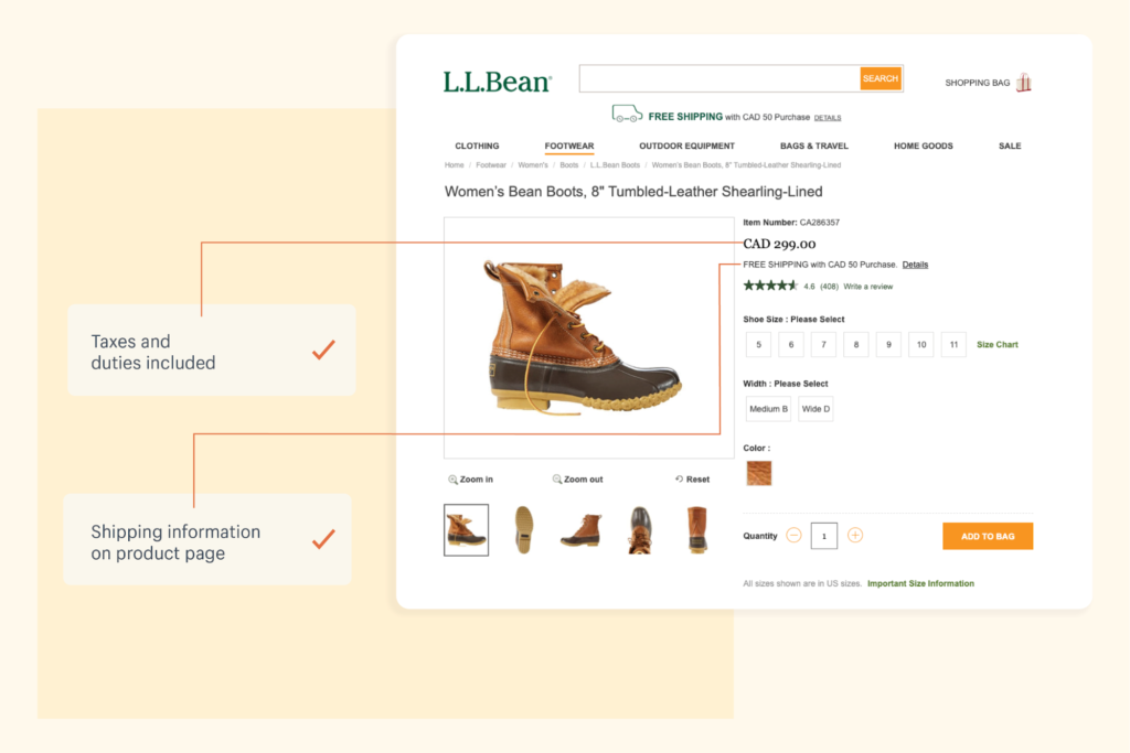
An example of this in practice is L.L. Bean. Known for their generous return policy, this store makes it a mission to be as transparent as possible to ensure it builds long-term trust and brand loyalty. This includes:
- Clearly highlighted total cost at the start of the checkout process
- Tax inclusions for shipping across borders
- Easy-to-find shipping information
[Source: Shopify]
Ultimately, this example also proves that cart and checkout optimization starts at the product pages, and that even the smallest element addition can make a huge difference in how professional and trustworthy your store seems.
Bare Minimum
- Transparent shipping and delivery information
- Clear calls to action
- Diverse payment options
Bells and Whistles
- AI-powered, 1:1 personalized cross- or upsell product recommendations
- Buy now, pay later options
- Data validation
Metrics to Consider
- Transaction path length. This metric shows you the number of sessions it takes a customer to check out and can point to areas of friction that send them away before they convert.
- Average checkout abandonment rate (over time). This metric will tell you exactly where you stand in terms of abandonment rates and can help measure the effectiveness of any changes you make to your checkout process.
- Device usage. This can help you identify devices with higher abandonment rates that point to device-specific issues that need optimization.
4. Does Your Store Have Easy-to-Find Information Pages That Answer Every Question?
Yes, the easier it is for a potential customer to find answers to the questions they have, the quicker they move through your buying journey. But speed is not the only driver. Transparent information in terms of product details, shipping costs, and pricing goes a long way into building real-time trust.
We know that product page layout and images help with this — as do the finer details such as sizing charts, FAQ pages, and eCommerce terms and conditions. Ideally, you want to find the best way to do this for both your brand and your customers.
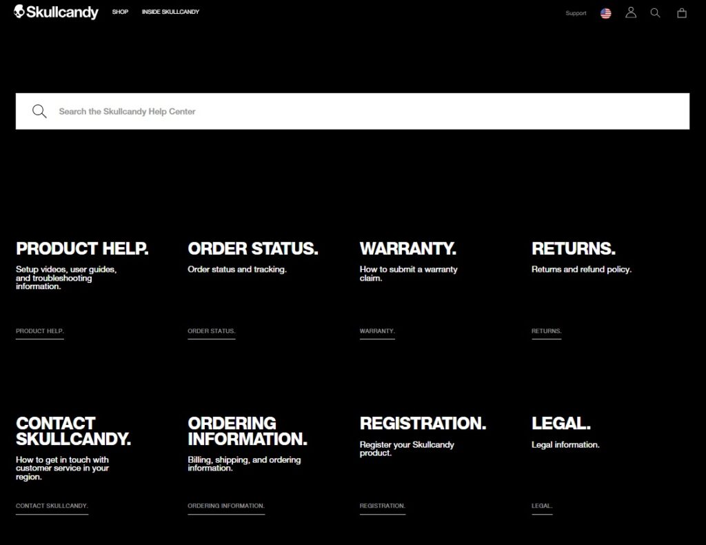
Here’s a great example of a brand doing just that. Skullcandy FAQ is clean and easy to navigate and search. It also fits their branding and speaks directly to their core audience.
[Source: Skullcandy]
Bare Minimum
- Clear return policy
- Terms and conditions
- Contact page
- Links to all your store’s social media accounts
Bells and Whistles
- Personalized AI-powered chatbot
- Advanced information search
- “Quick View” options for quickly scanning product information in category pages
Metrics to Consider
- Failed searches. Also known as zero-result searches, this data will give you insight into what information browsers are searching for — and not finding. This info you can use to upgrade content.
- Page visits. Tracking the unique visits to your FAQ, returns, and other important pages will tell you if customers are finding these pages.
- Contact rate versus visits. If customers are having to contact you after viewing information pages, you can assess what important information is still lacking.
5. Is Your Store Navigation Clear and Makes Sense to Your Potential Shoppers?
Having a sound eCommerce navigation strategy is vital. Not only does coherent store navigation make your brand seem more professional, but it will boost the overall shopping experience. Elements such as page layout, menu item organization, and readability will ensure that your navigation is straightforward and user-friendly.
The best approach here would be ensuring it is optimized for SEO and the shopping experience — intuitive to humans and maximized for bots. But also ensuring it aligns with your brand.
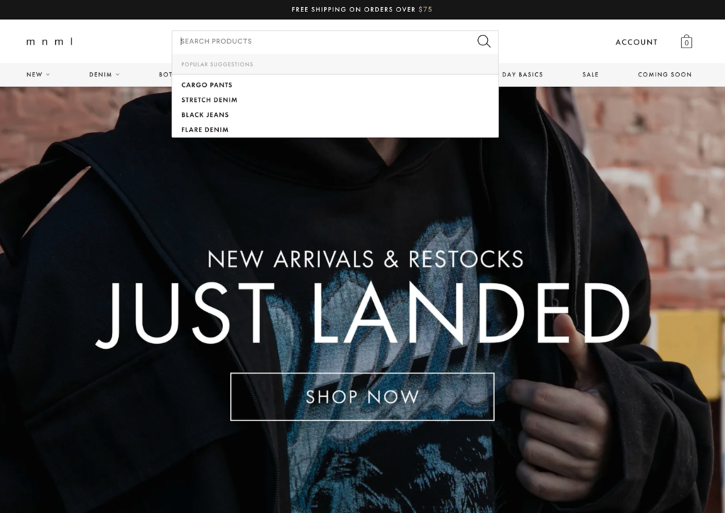
A good example of this in practice is mnml. Their key navigation wins include a search bar with autocomplete features that recommends popular items to shoppers.
[Source: Shopify]
Bare Minimum
- Labels that speak your shoppers’ language
- A sound store hierarchy with parent and subcategories
- Mega menus for when you have a lot of categories or group subcategory options in drop-down menus
Bells and Whistles
- AI-powered, on-store chatbots that act as shopping assistants, pointing shoppers to personalized suggestions
- Searchable navigation with autocomplete
- A “benefits bar” just below the header that acts as a trust anchor for visitors
[Source: Shopify]
Metrics to Consider
- Findability/completion rate. This rate is taken from navigation binary metrics and will show you how easy it is for shoppers to locate content on your store.
6. Does Your Store Have Well-Optimized Product Pages with Trust Signals?
Yes, a well-optimized product page will help bring you targeted traffic — but it will also ensure that your store and products look professional and trustworthy. And like with every aspect of your online store, it should be adapted specifically for what you are selling, and to whom.
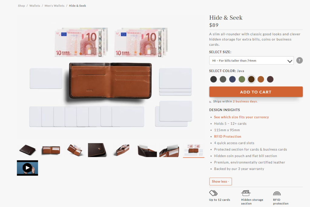
A good example of that in practice is the Bellroy Hide and Seek Wallet product page.
[Source: Bellroy]
From its clean product photos and professional product video, to its quick-to-view feature icons such as “hidden storage” and “RFID protection,” the page is clean and professional, yet informative. It also offers little extras — like its sizing charts, based on currency sizes — that builds a lot of trust in real-time.
Bare Minimum
- Reviews, ratings, or UGC to build trust
- A good product headline and product description (you can do this automatically with our free Product Description Wizard AI-powered app)
- Compelling CTA and on-page promotions
- Professional product photos
Bells and Whistles
- Professional product videos
- AR (augmented reality) product displays to try products virtually
- Visual stories highlighting product benefits
[Source: Perfect Keto]
Metrics to Consider
- Conversation rates. The most obvious tracking metric of a successful product page is the product conversion rate.
- Add-to-cart rate. This metric gives you the percentage of store browsers who have clicked the “Add to Cart” or “Buy” button from a product page.
- AOVs (average order values). AOVs can help assess if product page upsells and cross-sells are performing as they should.
Bonus Content: How to Create Perfect Product Pages for Conversions
7. Is Your Store Highlighting Strategically Placed Onsite Promotions?
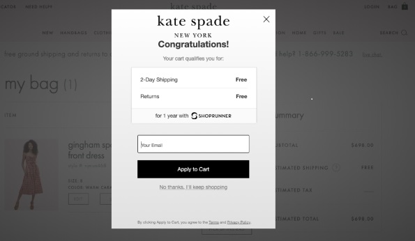
We all understand that onsite promotions are vital in turning on-store traffic into conversions. However, if you want to remain professional and trustworthy, you need the right promotion, in the right place, at the right time.
Bare Minimum
- Coupons
- Shipping thresholds
- Professional mail sign-up promotional pop-ups
Bells and Whistles
- 1:1 personalized product recommendations
- Loyalty points program
- Personalized, real-time cart promotions
[Source: Drip]
Metrics to Consider
- ROAS (return on ad spend). ROAS will tell you what your return on investment was on the amount you spent (or gave away) running your promotion.
- Conversion rates. Track how many conversions come from on-store promotions.
Bonus Content: 54 Top eCommerce KPIs to Monitor for Max Success
Wrap Up
Before you throw more money into underperforming ads — in terms of product conversions — it is vital to review the professionalism and trustworthiness of your brand. Even the smallest tweak can make a difference in performance and boost your marketing ROAS. But remember to always test and optimize to find those elements that work for your brand, product, and target audience.
Here’s a quick recap of the checklist for boosting your overall store brand impression.
Advanced Online Store Optimization Checklist
- A great first impression ✅
- Fast loading and secure browsing ✅
- Streamlined and optimized checkout process ✅
- Easy-to-find information pages that answer every question ✅
- Clear navigation that makes sense to your potential shoppers ✅
- Optimized product pages with trust signals ✅
- Strategically placed onsite promotions ✅
What a free site audit? Watch this video to find out how!
@storeya.com Want to become the next big thing? share your site’s URL in the comments and we’ll give you a free audit here on our page! #ecommerce #entrepreneur ♬ original sound – StoreYa.com

Nicole is a content writer with over sixteen years experience and flair for storytelling. She runs on a healthy dose of caffeine and enthusiasm. When she's not researching the next content trend or creating business content strategies, she's an avid beachgoer, coffee shop junkie and hangs out on LinkedIn.
Recommended articles
 Facebook Ads for eCommerce: 16 Strategies, Examples & Tips
 How to Build a Winning eCommerce Ads Strategy
 Google Ads for eCommerce: Everything You Need to Know
 10X Your Traffic with PPC Management Software
Comments
Powered by Facebook Comments
