0.05 seconds is all you have to make a solid impression on those who visit your website. In this time, a visiting online shopper will either stay longer to shop or leave your site to look for better options. Hence, the product page is the most important page of your website.
An attractive and persuasive product page has the power to drive conversions from the available traffic and boost revenue. Read on to learn a few valuable tips on creating impressive product pages, thereby leading your visitors down the sales funnel.
1. Include the Must-Haves
In order to create an awesome product page that drives conversions, you should know the anatomy of a product listing. Your eCommerce website should include the below-mentioned elements on every product page, thereby improving the chances of conversions from the traffic it receives.
Stunning Product Imagery
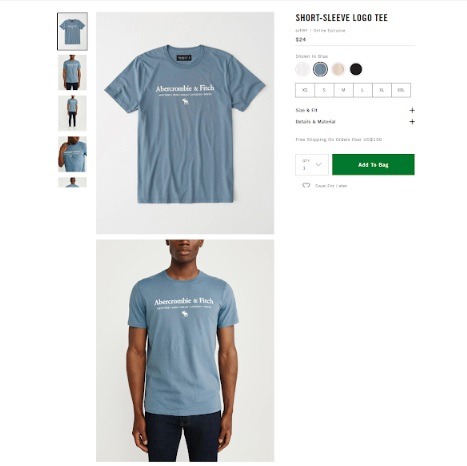
When it comes to including images, remember to use high-quality images with a 360-degree, zoomable, and quick view of the product. This will provide enough details to your prospective customers, addressing concerns and doubts if they have any. Further, if the product is available in a variety of colors, it’s advisable to include images of these variations, allowing the shopper to know exactly what they are getting.
Abercrombie & Fitch leaves nothing to chance. The American lifestyle retailer offers enough views of their products, averting the need for shoppers to go to a brick-and-mortar store and look at the physical product before making a purchase.
Awesome Product Descriptions
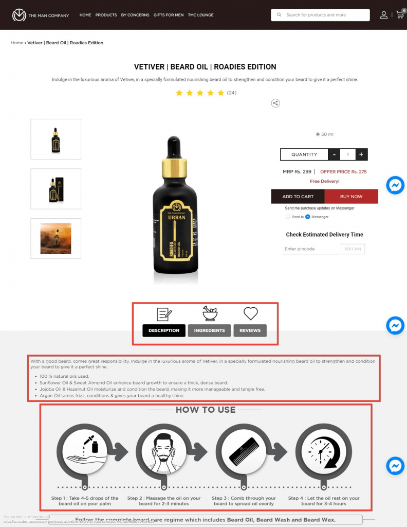
Include clear product descriptions that help customers, giving them a clear idea about the product. The description shouldn’t sound too promotional. So, avoid using cheesy clichés, technical jargon, and complex vocabulary, and keep the tone professional and readable.
Check out how The Man Company uses fantastic vocabulary to share the features and benefits of its products and has separate tabs for the product specifications, ingredients, and reviews. They go on to add a section that explains how the customer is supposed to use the product.
cameras, talking about the various shooting modes, such as Aperture Priority, Shutter Priority, and Manual will not mean anything to a prospective buyer. Instead, mention the benefits of having the Aperture Priority Mode – saying that this mode will cause the background elements to blur as you focus on your main subject – will make more sense to the average person.
Product Price
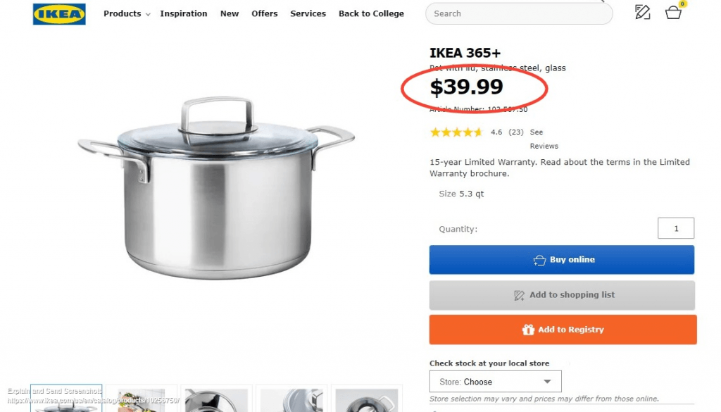
Make sure you use a large font size and a contrasting color to make the product price stand out. You can also place it near the call to action, enabling your shopper to make a quick purchase decision.
Notice how the large font size on Ikea’s product page stands out from the rest of the elements. The solid black font color contrasts with the vivid blue, gray, and orange call-to-action buttons.
Customer Reviews and Ratings
A recent survey revealed that online product reviews influence purchase decisions for 93% of customers. Hence, it’s extremely important to start collecting and displaying customer reviews on your product pages, enabling visitors to make a decision in your favor.
Add-To-Cart Button
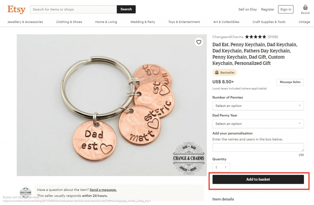
The prime purpose of a product page is to persuade shoppers to buy your product. Thus, the add-to-cart or add-to-basket button should be one of the most dominating elements on this page. Check out how Etsy, the online store for handmade items, uses a large add-to-basket button with a contrasting color, making it easy to locate.
Make Sure Your Content Addresses Customer Concerns
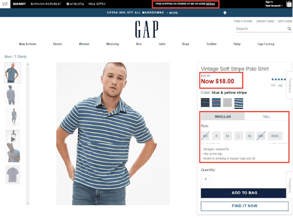
Customers have a variety of concerns. When will the product arrive? What are the return policies? What are the shipping costs? Is the website secure? Addressing these concerns will help you win the trust of your customers, convincing them to make a purchase. For instance, add credit card or e-wallet logos to help customers know that your site is secure for online transactions. Similarly, adding a size chart near the size options can help customers choose the most fitting option for themselves.
Notice how online fashion stores Forever 21 and GAP do a great job of addressing the most pressing concerns among customers, namely product size, shipping, and discounts.
2. KISS: Keep It Simple and Sweet!
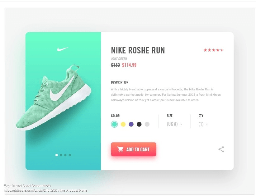
Most eCommerce stores end up cluttering product pages with text and ill-considered functionality that muddle with the core message and call to action. Yes, it is critical to include the product description, customer reviews, and images or videos. But do so while keeping the page clean and clutter-free, thereby creating a satisfactory browsing experience for your visitors.
Notice how Nike uses a minimalist design for its product pages while offering several options for customization.
3. Include a Product Video
Videos are a far better story-telling media than other forms of content. Wyzowl’s annual State of Video Marketing Survey reveals that 68% of people prefer learning about a product by watching a video. Further, short videos (less than 90 seconds) have a higher retention rate of 59% compared to long ones, which retain only 14% of viewers.
The best product pages include videos along with images and text, to draw interest and convert shoppers into buyers. Keep your product videos short and to-the-point. Incorporate your brand logo to strengthen brand image and make your videos recognizable. Finally, remember to include a call to action in the form of a title card, voice-over, or button at the end of the video to let viewers know what action you’d like them to take.
Check out how BlenderBottle has humanized the video by involving a sportsperson, thereby connecting to the theme of working hard and overcoming failure. The video is 17 seconds long and the upbeat music complements the energy involved in pursuing any form of sports. Notice how they have subtly incorporated their logo in the video to enhance their brand image.
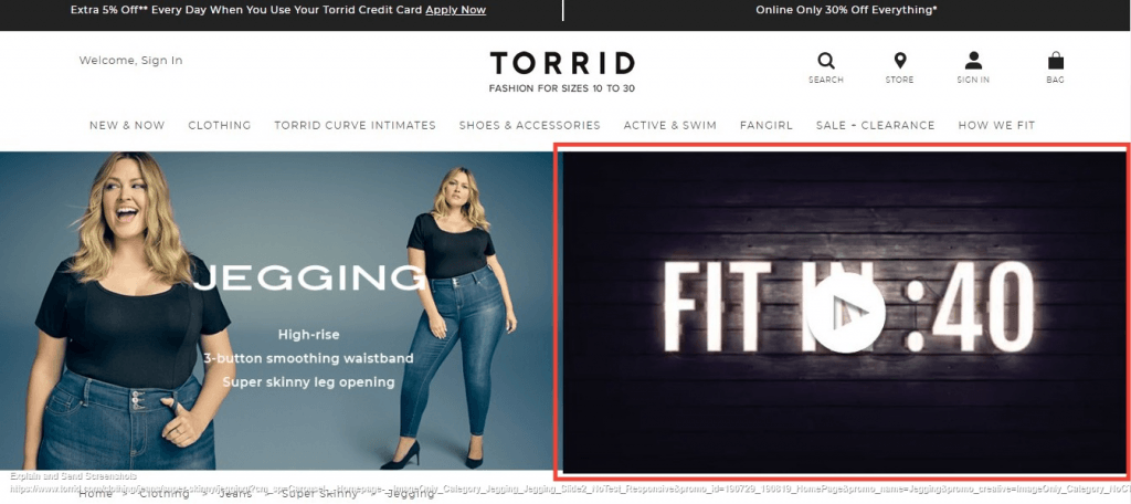
Torrid, a popular online store for plus-sized fashion, effortlessly uses videos on its product pages to wow its audience and drive conversions.
4. Display Recommended Products
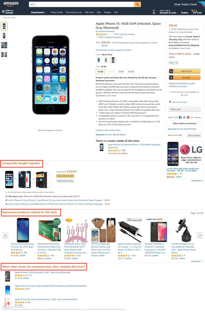
Displaying related or recommended products will not only help shoppers appreciate your collection but also persuade them to buy more, thereby increasing the average order value (AOV). In fact, you can use product recommendations to display related products, up-sell, and cross-sell.
Amazon, the giant eCommerce store, is an expert at using product recommendations to boost AOV.
Related Products
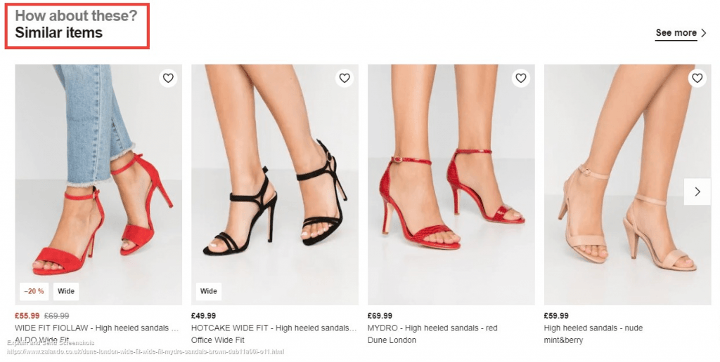
Related products are displayed with the objective of persuading customers to buy items in addition to the one they are currently viewing. Check out how Zalando, a European eCommerce company, uses the related products feature to flaunt their exquisite fashion collection and persuade customers to buy more.
Up-Sell Products
These are products that you would want the customer to purchase instead of the product they are presently viewing. The recommended up-sells are of higher value, better quality, and possess additional features. So, using this tactic you are encouraging the customer to spend more.
Here’s an example of up-sell created by Macy’s, an American department store.
Cross-Sell Products
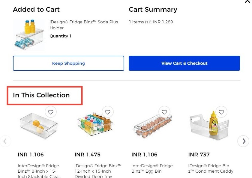
These product recommendations can be placed on the product page or in the shopping cart, encouraging impulsive shopping. See how Bed Bath & Beyond uses cross-selling to persuade customers to buy items they didn’t have in mind.
The recommended products carousel allows eCommerce sellers to offer their customers multiple choices so that they never run out of options. Thus, including this section on the product page will either lead them to buy the product or go through the recommended collection to purchase more.
When implementing recommended products on your website’s product page, remember to give a click-worthy product title with clear images and precise product information. Create a relationship between the product that the customers are viewing and the recommended product.
For instance, ASOS, a British online fashion retailer, recommends accessories and other clothes that can complement the product being viewed by the customer.
5. Leverage the Power of Social Media
42% of the global population actively uses social media to connect with others, express their opinions, and shop. Yes, you heard me right! Customers are increasingly treating social media as a platform to look for product recommendations and shop. In fact, 30% of online shoppers are influenced to make a buying decision through the top social media platforms.
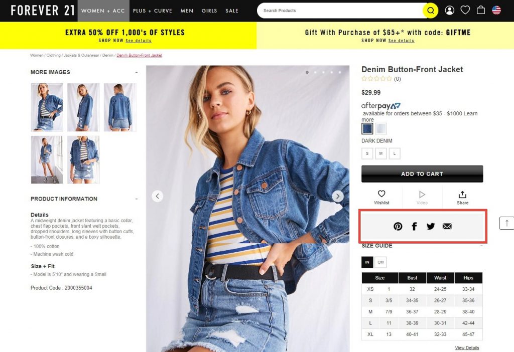
Thus, an impressive product page can aid in making your social media campaign successful. The product page should not only carry your brand’s social channels but also allow shoppers to share the product across various platforms. See above how Forever 21 encourages its audience to share and recommend products on social media.
Conclusion
An impressive eCommerce product page plays a pivotal role in persuading visitors to stay longer on the website and shop. Hence, it makes sense to run an onsite analysis and use the aforementioned information to revamp your product pages.
This simple exercise will help you offer relevant and useful product information to your target audience, allowing them to complete the buying process.

Gaurav Belani is a Senior SEO and Content Marketing Analyst at Growfusely , a SaaS content marketing agency specializing in content and data-driven SEO. He has more than seven years of experience in Digital Marketing and loves to write about social media, eCommerce, link building, and content strategy to help clients grow their search visibility. In his spare time, he enjoys watching movies and listening to music. Connect with him on Twitter @belanigaurav.
Recommended articles
 Facebook Ads for eCommerce: 16 Strategies, Examples & Tips
 How to Build a Winning eCommerce Ads Strategy
 Google Ads for eCommerce: Everything You Need to Know
 10X Your Traffic with PPC Management Software
Comments
Powered by Facebook Comments
