The countdown to Halloween has officially begun. As of this post, there are 16 days until the big day. There are those of you that might be saying to yourselves, “it’s not a big deal for my e-store.”, however using the excitement or spookiness of Halloween can help any eCommerce store increase its revenue, and not just those that sell candy.
In last year’s 4th quarter, eCommerce sales topped 79 billion dollars. This year it wouldn’t be a surprise to see that number eclipse 90 billion with the continued growth in online shopping. To help you become one of the merchants that is thriving in sales throughout the 4th quarter, here are some spooky-good tips to make sure you get a head start on your competition.
We want to give you treats and not tricks, so here is an awesome presentation that includes the entire post! Enjoy!
eCommerce Sales Trends
As we pointed out in our eCommerce holiday guide, an overwhelming amount of sales are made throughout the 4th quarter of the year, and that is a trend that is continuing to lead to more and more purchases for eCommerce merchants. 4th quarter sales growth is by no means slowing down.
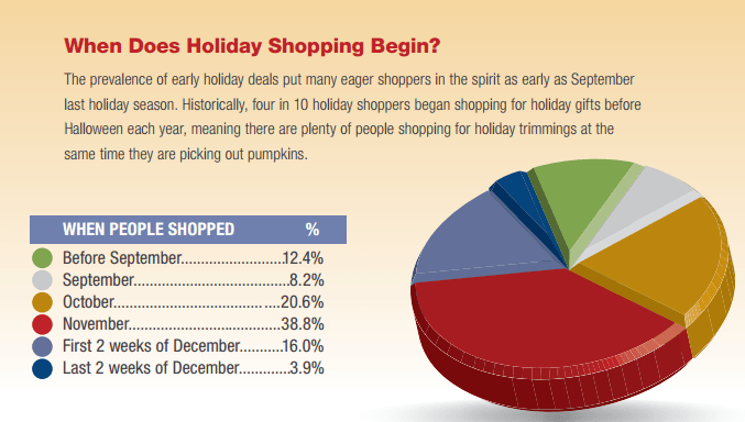
The rise in sales that is seen in the 4th quarter isn’t due just to consumers buying on Black Friday. To the contrary, customers are itching to start making purchases as soon as possible, and aren’t waiting until we’re one day away from Black Friday or the week before Christmas to find gifts. According to the NRF, 40% of holiday shopping is done by the end of October!
1. Social Media
Like the other 300 something days of the year that don’t focus on Halloween, your social media strategy should still focus on generating interactions between yourself and your fan base. A highly-engaged fan base is more likely to make purchases – that’s as straightforward as it gets.
How can you set yourself up to succeed?
I. Geographical Targeting
On Facebook, consider testing out geo-targeting by using the demographics settings in your Facebook statuses. The entire world is familiar with Halloween, and it’s common to find people celebrating it all over the world. However, those most connected to this spooky day are those in the United States.
II. Update Cover Images
In our guide, “22 To-Do’s for eCommerce Success This Holiday Season”, we pointed out that changing your social media cover images is a simple, yet effective tactic that can kick things off for you. Note, this tactic is especially effective in Facebook because the updated image can also go with text and a link, and because it shows up in the news feed.
III. Visuals
So you want to engage your thriving community more than usual? As mentioned in regards to email marketing, adding video and gifs is the right move here too (create a gif without coding).
To take engagements to the next level, you can also answer comments using a gif. Of course, adding regular images with a touch of Halloween spirit will also increase the number of interactions.
Here is a perfect example of the type of visuals you should and could be using to engage your audience in the days leading up to Halloween. Harry’s, a company that sells razors, got a few things right in this post: it fits the Halloween mold, it’s humorous (which is usually a good thing here and there in social media), and it’s user-generated content (#FromOurFriends):
Chris L. says these are the best razors even for the meanest, toughest mugs. What do you think? #FromOurFriends
Posted by Harry’s on Thursday, October 1, 2015
IV. Teasers
Creating buzz around a new product is something that can fit into your social media marketing strategy throughout the year. However, when you’ve got people lining up to make purchases – as is the case this time of year – then creating buzz with teasers becomes as simple as 1-2-3.
Consider adding a Halloween theme to the buzz you’re creating for these new (or old products) by using holiday related keywords and images.
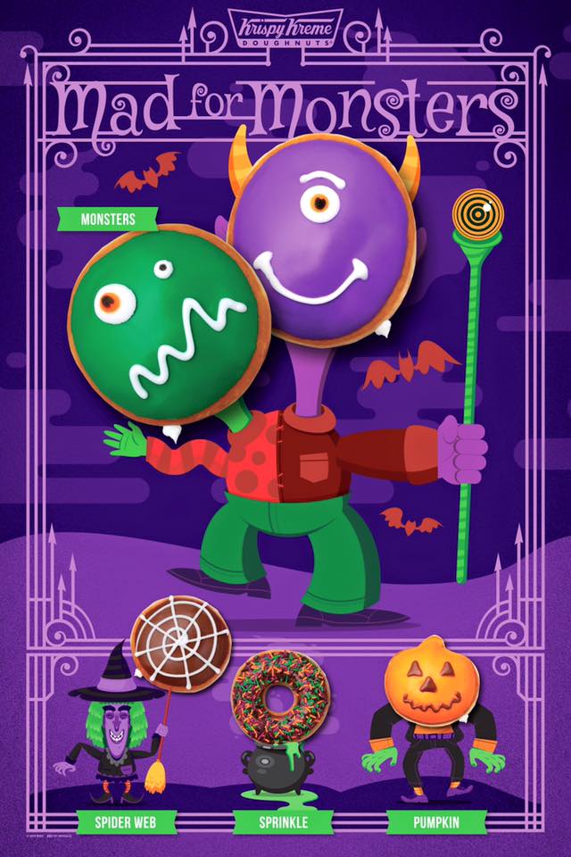
For instance, take note to what Krispy Kreme did with this infographic that they added to Facebook. From the headline “Mad for Monsters” to the actual doughnuts themselves, this is a very creative teaser to get people to come buy more.
V. Hashtags
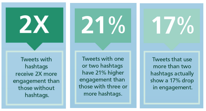
There are rules to using hashtags – and they’re different if you are on Instagram, Facebook, or Twitter. As you can see, on Twitter keep it to one to two hashtags (via Buffer).
When it comes to Facebook and Instagram, you cannot use the same hashtag strategy. Facebook engagement results decrease with hashtags whereas on Instagram, results are best with 11 hashtags!
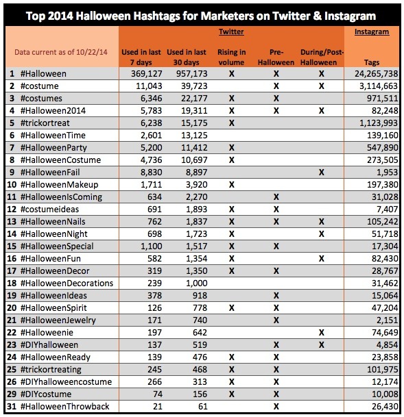
For your Halloween hashatagging, enjoy this (via Social Media Week).
2. Minor Site Redesign
Here’s a trick question. What’s the point in “decorating” your e-Commerce store for Halloween (or any other holiday)? It’s actually not a trick question.
Changing up your site – even just in the slightest manner – has an emotional effect on visitors that more often than not, leads to more purchases and at a higher value. That’s a double win.
What can you do? If you want to make a color change, then go with black and orange. Changing the colors is not mandatory and not always recommended (if it doesn’t match your branding). Instead you can either play with your fonts or add icons of skeletons, pumpkins, costumes, and more.
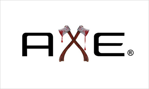
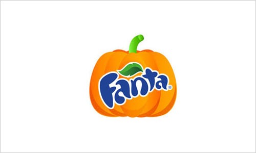
The e-Commerce sites that take the small steps to “click” with visitors are the ones that last forever (for a long time). Check out the clever redesigns by Axe and Fanta.
I. Logo & Favicon
Regardless of whether or not you’ve got someone on the team that can take this on, you should give this a shot. Why? This is the simplest change you can make to your actual site without having to add code. Your visitors will immediately notice the difference.
II. Banners
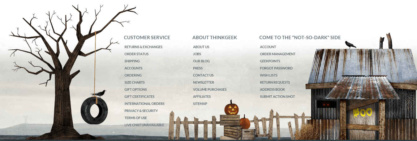
Another design tip that’ll hack your Halloween sales is adding themed banners to your pages or just to your homepage. For the purpose of creating banners, you can easily use our very own “Power Banner” to create banners that match Halloween and still contain the CTA (call to action) to create revenue.
ThinkGeek took it up a few notches, and the results are awesome! Do you have to take it that far? If you’ve got time and the know-how, then be our guest. If you make your site half as awesome as this, then that too will be a boost.
3. Launch a Scary (Good) Sale
Now that you know that up to 40% of holiday shopping is completed by Halloween, you know that having at least one flash sale before then is the right tactic for your business.
Running a successful sale is built upon a strong email and social media marketing campaign that pushes its launch, as well as on the right design for the site or pop up that notifies customers of the sale.
As you saw in the “site improvement” section above, you don’t have to create the most amazing Halloween costume on earth to be successful. However, having a flash sale that integrates design that is relevant to the time of year will bring better results, because it simply is more personal than not doing so.
I. Lead Generation Tools
If you don’t regularly use lead generation tools, such as our Coupon Pop or Exit Pop, then now is the time of year that using them becomes a must.
With the sudden increase of traffic that you’ve probably noticed this past month, or will start seeing over the next few weeks, not adding a tool to collect emails or add fans to your social media profiles, would be a huge mistake.
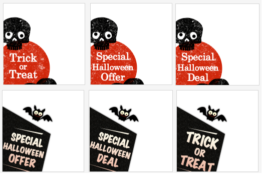
When it comes to the Coupon Pop, there is also a tab that site owners can place on the site so the shopper can open it at any given time. Luckily, we understand the value of customization for the holiday season and have already added, for your convenience, tab options that are perfect for Halloween.
Want one of these on your site? In literally two minutes you can get it on your site without adding even one line of code.
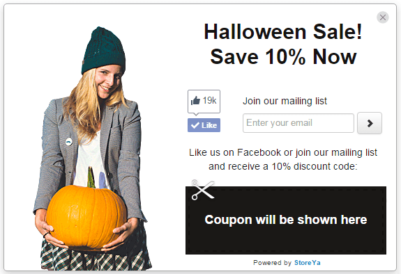
Here’s the phase that’ll influence the success or failure of your pop up: the design of the pop ups. The first rule of pop ups is making them simple, and an attractive part of your site. What you see here can be done in just a few minutes.
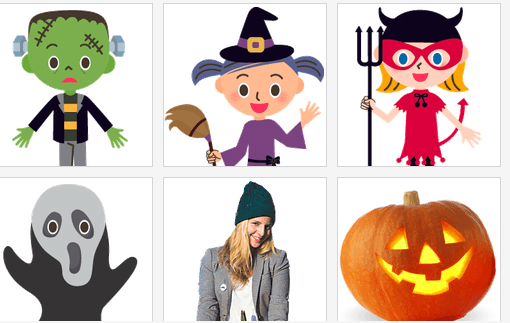
Why does it work? The text is short and sweet, as well as relevant for the holiday (“Halloween Sale”). We used black (associated with Halloween) instead of orange, because we felt that for us, orange stands out a bit too much on a white background. If Orange is one of the colors that represents your brand, then consider adding an orange-themed background that may or may not consist of pumpkins. Finally, by adding a simple holiday related stock image, the message is portrayed.
Here are a few titles you can use (please use them) if you run a flash sale:
- Spooky-Good Sale! Save X% Now
- Trick or Treat? Treats! Save X% Now
- The Scariest Halloween Sale! X% Off Now
- Don’t Be a Ghost! Get X% Off Now
- Sign up and Get X% off. Don’t Scream!
Pro tip: if you are running a very short sale (24 hours), consider increasing the sale to 30-40% off, or more. Raw Generation offered 60% with the Coupon Pop and Exit Pop: How Raw Generation Used Urgency to Get Instant Sales
So, you’ve got a great title to choose from our short list, you’ve got themed tabs, and you’ve got a small, yet inclusive selection of images to choose from in our library. Now just pick the action you want taken – email sign ups and/or social media followers.
II. Contests
Another awesome (and fun) way to generate more sales around Halloween is by running a contest. Contests energize people, and even more so when you are able to make it relevant to daily life. If you take a look at Facebook pages that run contests, you’ll immediately notice that the number of likes, shares, and comments are higher for these posts than others.
This Halloween you can run a contest centered around selfies (a hot trend) that not only creates interactions between your brand and customers, but also generates more content for you to use (user-generated content like Harry’s).
If selfies are not something you are interested in (it’s possible that it’s not a trend for your customers or part of your brand’s message), find another way to generate buzz around your store by using “trick or treat” or another themed keyword.
4. Customer Experience
Jeff Bezos, CEO of Amazon once said, “We see our customers as invited guests to a party, and we are the hosts. It’s our job to make the customer experience a little bit better”. You should take the same outlook and implement it into your business model.
Here are a few basic things that you can do to instantly reap the benefits of a better customer experience.
I. Packaging
Fantastic customer experience leads to a very positive result: it gets people talking about your business. That’s the truth.
In a packaging study by Dotcom Distribution, 49% of e-Commerce shoppers claimed that branded packaging increased the excitement of opening an item, while 44% said that branded packaging reinforces the feeling that the product was worth its cost.
If creating new packaging to match Halloween is too much of a hassle (do your own cost/benefit analysis), consider some of the following tips that can still help you generate more positive feelings with customers.
- Ribbons are simple to add, whether around the box being shipped or around the individual products.
- A personal note inside of orders during the week leading up can be the small touch that is needed to turn what might be a four-star experience into a five-star one.
- Do you use tissue paper? If so, why not go black & orange for a couple of weeks?
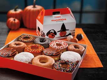
- Candy. It’s that simple…just add in a small treat to show your appreciation.
Let’s not forget that your site’s design is also one very big part of the customer experience.
II. Customer Support
As always, this is one aspect of your business that you should have your eye on. As a business that might be limited in its resources, having live chat on your site 24/7 (or 24/5) isn’t always a viable option.
During the next two weeks, and throughout November and December, adding live chat to your site is critical if you want to have a better revenue stream than ever before. With so many sites to choose from, you’ve got to make sure you are available to assist shoppers.
If you do add live chat, then you might want to let customers know that you are available to chat at those times. If there is a spike in traffic, wouldn’t you rather it be when you are available? According to Zendesk, 85% of visitors would be willing to pay 25% more to ensure a superior customer service experience.
For Halloween, make sure to integrate a little Halloween spirit into your answers. Of course, giving the right answer is the most important thing, but if you can do that in a positive, and personal way, then you deserve a bag full of candy!
5. Email Marketing
There could be a post just about email marketing and how to get better results with it over the next couple of weeks, but we’ll just summarize it.
I. Customize Templates
Customizing templates for Halloween is a type of personalization. If you had a pyramid for the different levels of personalization, this would be the most basic step, and one that has an ROI that’ll make a pumpkin come alive.
Here’s a very short story: EyeBuyDirect was able to increase email CTR (click-through rate) by over 170% by making their templates personalized.
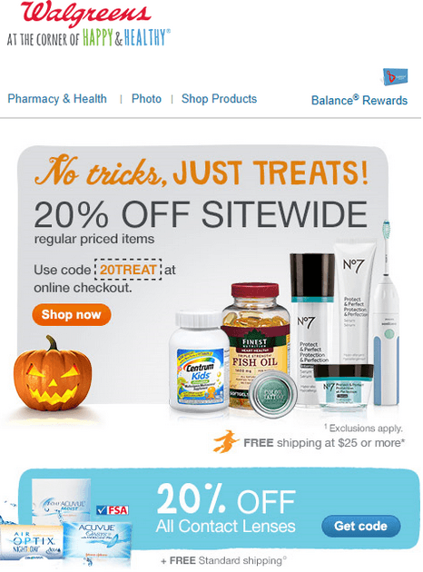
Here’s the takeaway from that short story: the holiday season is the best of time of the year to engage with people on your lists – but it’s also the best time for your competitors. Customizing your business for the season is a step in the right direction! Walgreens spiced up their email templated to get a higher ROI on their email efforts.
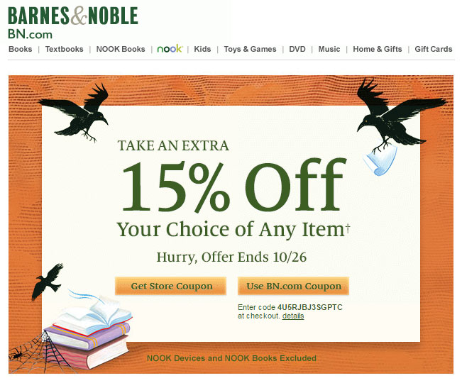
Barnes & Noble also created a simple design that made their marketing efforts more remarkable. Take a look if something these two companies did is something you can add to your own emails.
II. Subject Lines
You’ve got consumers that’ll open up all of your emails regardless of the subject line. However, you also have certain shoppers that are waiting for that special subject line to catch their attention. Now is the time to create the subject line that’ll ensure higher email open-rates. Here’s a cheat sheet of buzzwords and subject lines.
Buzzwords:
- Spooky/Scary
- Frankenstein
- Pumpkin
- Witch
- Ghost
- Black cat
- Bat
- Costume
- Candy
Subject Lines:
- The Ghosts are Dying For These Sales
- Trick or Treat? Treat, Treat, and more Treats
- Please Don’t Scream: Spooktacular Savings!
- No Tricks, Just Treats
- Frankenstein Woke Up From the Dead for These Deals
- 50% off! Is that a trick? No It’s a Treat 🙂
- Monster Sales for the Next X Hours
- X% Off Now: the Wicked Witch is in Awe
- Savings So Good You’ll Scream!
- It’s so Bootiful it’s UnBoolievable
- A Frightfully Chilling Offer: X% Off
- Halloween isn’t Just for the Kids
- The Ghost of Sales Has a Treat
III. Video and GIF Time
Video is something that you should always consider adding to your email campaigns. The return on adding video isn’t different during Halloween compared to the rest of the year, but at this time of the year creating or finding a video is so much easier. You’ve got a clear theme to use: Halloween.
If you don’t have time to create your own video, then check these out.
Halloween…It’s for everyone 🙂
Want more like this? Visit Giphy
Halloween can be tiring 🙂
Instead of a gif, try adding a short Vine
It’s Your Turn
To generate an impressive revenue stream that’ll make a positive difference in your pocket, you’ve got to find ways to energize and generate more emotion with online shoppers. These five tasks all have the potential to do exactly that.
Understandingly, you’ve got limited resources and a limited amount of time to work on these things, so prioritize all five, and start working on them from top to bottom. We’d love to hear what you’ll be starting with, and if there is anything else you’ll be doing to spook your visitors into making more purchases.

Ty is a digital marketing enthusiast that can't get enough social media marketing and content marketing. He is the inbound marketing manager at StoreYa where he spends his days searching for the newest social marketing scoop and creating amazingly awesome content. If you’d like to chat with him, feel free to connect with him on any social platform.
Recommended articles
 Facebook Ads for eCommerce: 16 Strategies, Examples & Tips
 How to Build a Winning eCommerce Ads Strategy
 Google Ads for eCommerce: Everything You Need to Know
 10X Your Traffic with PPC Management Software
Comments
Powered by Facebook Comments
