Since hitting the World Wide Web back in 1993 banner ads and other web banners have been an integral part of online advertising. Although they started out mostly as PPC ads and display ads, banners are now used in many other ways as well.
You can see banners everywhere, from Facebook banners and Facebook ads to PPC ads and email marketing. They are even used by eCommerce sites to promote sales, products, and more on their own sites.
No matter which type of banner ad you’re creating though, if you want it to be effective, you are going to need to design it in a way that encourages trust and convinces people to click.
In this post you will learn some basic design tricks that will help you create more trustworthy and clickworthy banner ads that will convert more!
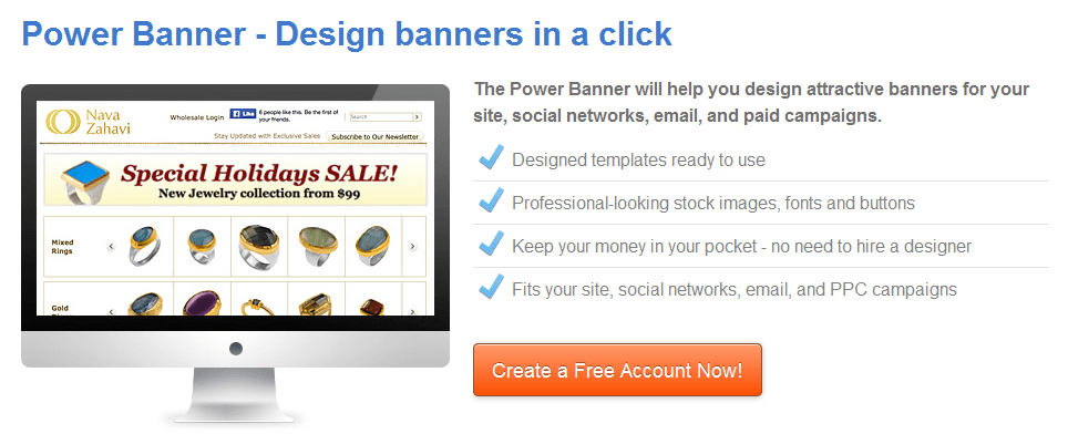
You can take these tips and try them out on our brand new banner creator tool the Power Banner!
Wait, What do I Need to Have in My Web Banner?
Before we start talking about the design of your banner ad, let’s discuss the three main things that you must make sure to include in every single ad – your logo, a value preposition, and a call to action (CTA).
Logo: This is pretty straight forward; you have to include your logo so that people will know who is advertising to them. It is also very important for branding purposes.
Value preposition: This is the meat of your ad. It is not just what you are offering to the readers of your ad, but how your product or service can help them. For more on writing a value preposition check out this post on How to Launch a Product.
Call to Action (CTA): This is the end goal of your ad. This is what you have to get your readers to click on in order for the ad to be successful.
While wording is a crucial part of advertising, in this post we will focus less on the copy and more on the importance of design for your web banners.
1) Focus on Readability
One of the best ways of making an ad more clickworthy is by making it more readable. There are many different ways of doing this, but the main thing that you should have in mind is that you don’t want to over crowd your banner.
The cleaner the ad is, the better it is. Here are a few ways you can ensure that your ad will be nice and clean.
White Space Speaks Volumes
White space is any negative or unused space in a design (fun fact – it doesn’t need to actually be white). For example, look at Columbia Sportswear’s Facebook banner image.

All of the unused background space is white space (or blank space).
Now what’s so great about white space? Take a look at the banner above, now think about what your eye focused on when looking at it. I’d be willing to bet you started with the words “TurboDown” then went right to the jacket.
The white space in this ad forces you to focus on one thing and one thing only! Think about the Google home page:
 There is literally nothing on the page except for the search bar. No distractions, no extras, just the one thing that is important!
That is exactly what white space can do for your ad. By leaving blank space you can draw focus to what is important – your message, your product, and your call to action!
J. Crew does a great job of utilizing the white space in this banner ad to take the reader’s eye from left to right – first the company logo, next the value preposition, and finally the call to action.

When designing your ad, think about what you want the focus to be and be sure to surround it with white space in order to draw attention to it.
Keep Order with Lines
When you’re leaving a lot of space blank you will need to do something in order to maintain a structure in your banner. Using solid lines is a great way of accomplishing this.
First of all, especially if you are creating a white or lightly color ad, you should create a solid color border in order to clearly define your ad.
The second thing you can do is to use lines within your ad to divide it into sections, or simply to add symmetry for floating text.
Let’s take another look J. Crew’s ad:
Notice how the lines create three distinct sections and maintains the symmetry of the ad itself by creating one large centered box and two equal sized boxes on the sides.
Use Fonts to Your Advantage
Fonts could be your worst enemy, but they could also be your best friend – it all depends on how well you use them.
Even with all the white space in the world, using too many fonts, or mismatched fonts can create a crowded and confused look to your ad.
A good way to use fonts to your advantage is by using font families like “Eras Bold, Eras Demi, Eras Light, and Eras Medium,” this way all of your fonts will be related. You can also play around with bold, italics, and size.
2) Color and Images are Important!
I know we just spoke about white space, but that doesn’t mean you shouldn’t be using colors and images in your banners. Of course you should – you just need to know how to do it right!
Contrast is the Key to Color
Color can be a fantastic way to get your point across and to draw attention to certain aspects of your ad. For example, check out this ad from Old Navy:

The theme of the ad is blue which makes the orange color of the wording and call to action stand out really well. It’s always a good idea to try to contrast light colors with dark colors.
You can use two different colors like Old Navy did, or you can actually use the same color as your background but in a lighter hue for your text and CTA, like in this email banner:

Another great option is using a solid color and writing your text in white like Social Media Today did in this ad banner they created for their own site:

For more on which colors go well together, and how to use color to evoke emotions check out How to Use Color in Marketing.
Images Add Depth to Your Ads
With just color your banners can end up being a bit one dimensional. Especially for eCommerce stores, it’s often important to include product images and other sensory imagery to get people to want to click on the ad.
Remember though that when you do include a product image you should still try to make it as sleek as possible by utilizing white space and appropriate color contrast. These ads below show how you can do just that:

Both of these also do a fantastic job of using color to pull the ad together and to draw attention to the call to action.
If you’re looking for a different way to use images, you can also think of something that is related to your brand culture and use that as a background image for your banner. The North Face uses a very dramatic picture in this ad, but still manages to use it only as a background and keeps the focus on their message.

When choosing your background image make sure that you will be able to keep your ad at the center of attention, and avoid allowing the picture to take over the ad.
Download the Power Banner and Make Some Ads!
Now that you know how to design a beautiful ad the next step is to download the Power Banner now and start making ads!

Zack is a social media enthusiast who loves all things digital. He is the inbound marketing manager at StoreYa where he spends his days searching for the newest social marketing scoop. If you’d like to chat with him, feel free to connect with him on any social platform.
Recommended articles
 Facebook Ads for eCommerce: 16 Strategies, Examples & Tips
 How to Build a Winning eCommerce Ads Strategy
 Google Ads for eCommerce: Everything You Need to Know
 10X Your Traffic with PPC Management Software
Comments
Powered by Facebook Comments