Bounce rates represent the percentage of your website visitors who land on one of your home and product pages and leave your website without taking any action or moving to a different page.
Sites with high bounce rates struggle to retain their visitors’ attention with relevant, engaging content. These sites may also be difficult to interact with, or take ages to load.
Regardless of the reason, visitors who leave a website prematurely can’t become leads, and leads who leave a website without engaging with it can’t be nurtured and converted into customers.
In this article, you will find the four top ways you can reduce your store and page bounce rates, including:
- Improving Speeds
- Making Your Store and Pages Responsive
- Including the Right Information on the Right Pages
- Reviewing Your Top Channels
But first, let’s take a deeper look at what bounce rates are and why they’re important for online stores.
eCommerce Bounce Rates 101
Before we get into specific tips on how to reduce it, let’s start by figuring out what classifies as a high bounce rate and why it matters.
First of all, what constitutes a high bounce rate?
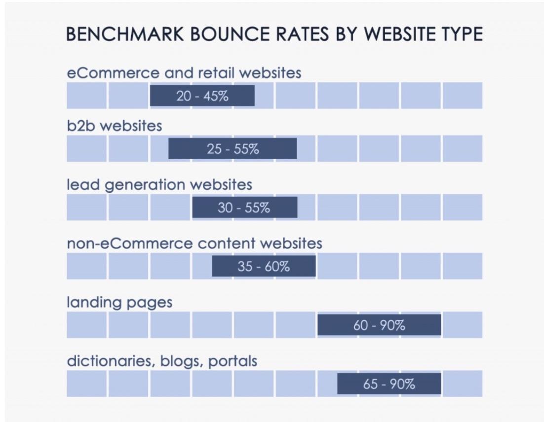
This depends on the type of content that dominates your website (the purpose of your website). Blogs and news websites have the highest bounce rates at around 65–90%. This is perfectly understandable as people search for some information, find it, and leave.
eCommerce and retail websites, on the other hand, average the lowest bounce rates (20–45%), at least according to (somewhat dated) data from Customedialabs.
The folks from CXL have turned this data into this nifty graphic:
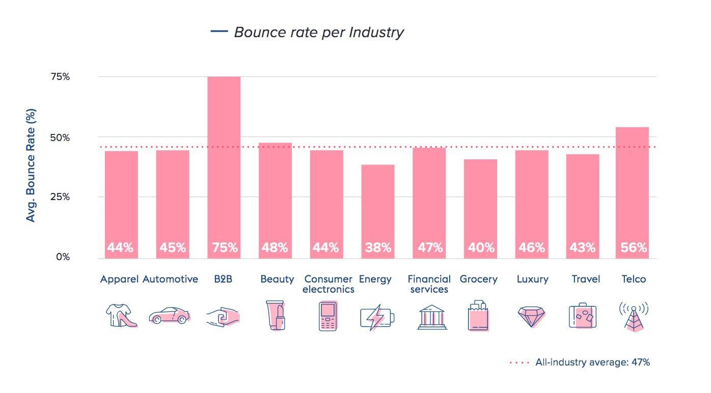
Of course, bounce rate averages will vary depending on the niche you sell in. The people from Contentsquare show this in their amazing 2021 Digital Experience Benchmark Report:
In other words:
- If your eCommerce website’s bounce rate is above 45%, it requires your attention
- If it’s under 20%, you’re golden
- If it’s somewhere in between, that’s fine, but there might be room for improvement
A high bounce rate is bad for a number of reasons. Most importantly, visitors who bounce don’t buy anything (although there is a chance they will in the future), so you lose a potential sale.
It may also indicate that you are doing something wrong (on-site or off-site). Finally, bounce rates influence your website’s SEO performance, according to SEMRush’s Ranking Factors Study.
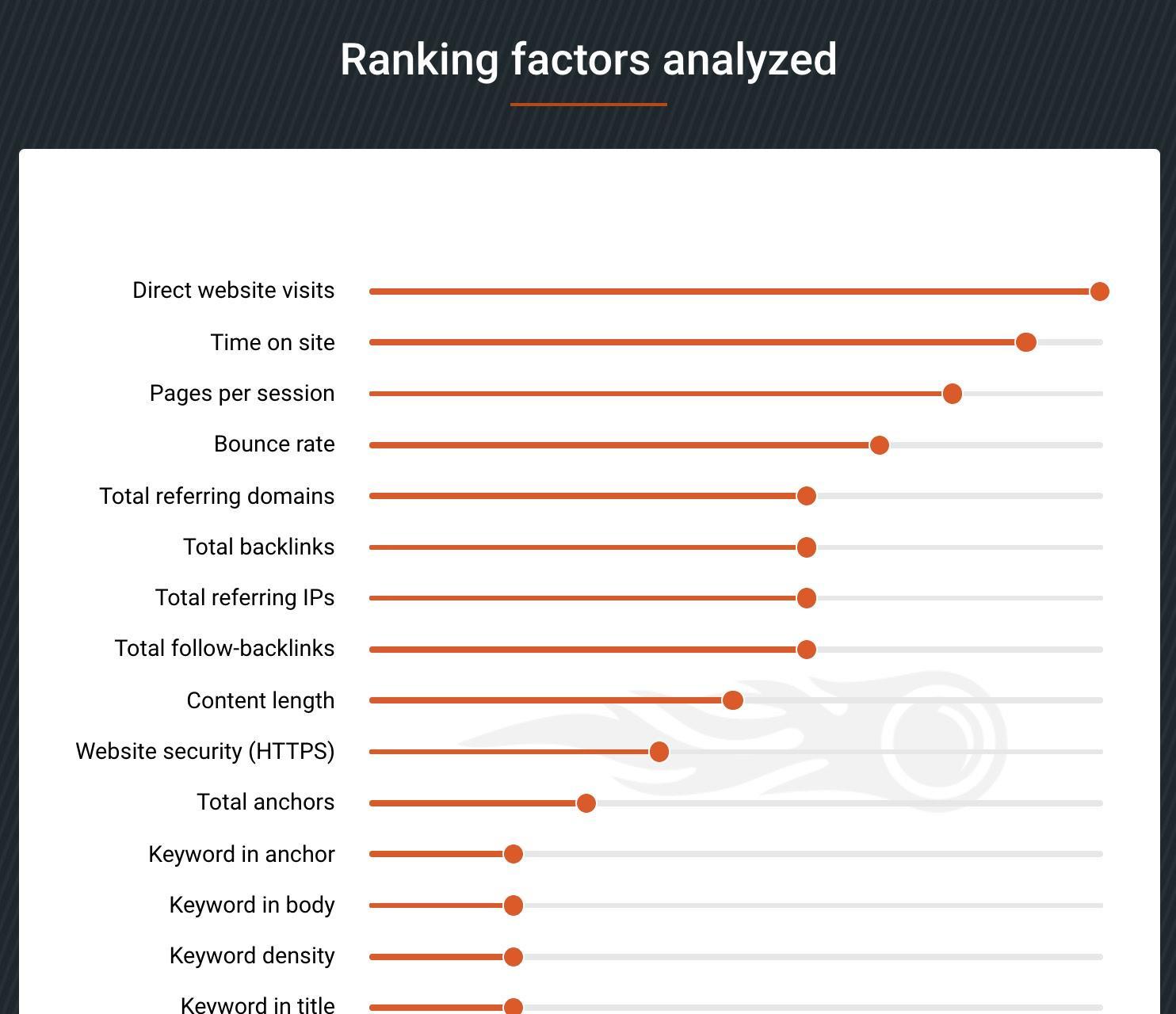
Note: Time on site and pages per session factors are closely tied to bounce rates. There are additional factors that contribute to bounce rates, such as:
- Type of page: Contact/checkout/form submission pages naturally have higher bounce rates.
- Device: Mobile users usually have a higher bounce rate.
- Traffic source: Where your visitors come from affects bounce rates (e.g. organic, referral, paid).
- New/returning visitors: Returning visitors usually have a lower bounce rate.
Now that we’ve covered the basics of bounce rates, it’s time to learn how to reduce them.
1. Speed Things Up
1. Speed Things Up
The correlation between page loading times and conversion rates is well-documented and has been for years. It often feels like webmasters and business owners ignore that loading times directly affect their bottom lines.
As it turns out, page loading times have a huge effect on bounce rates as well.
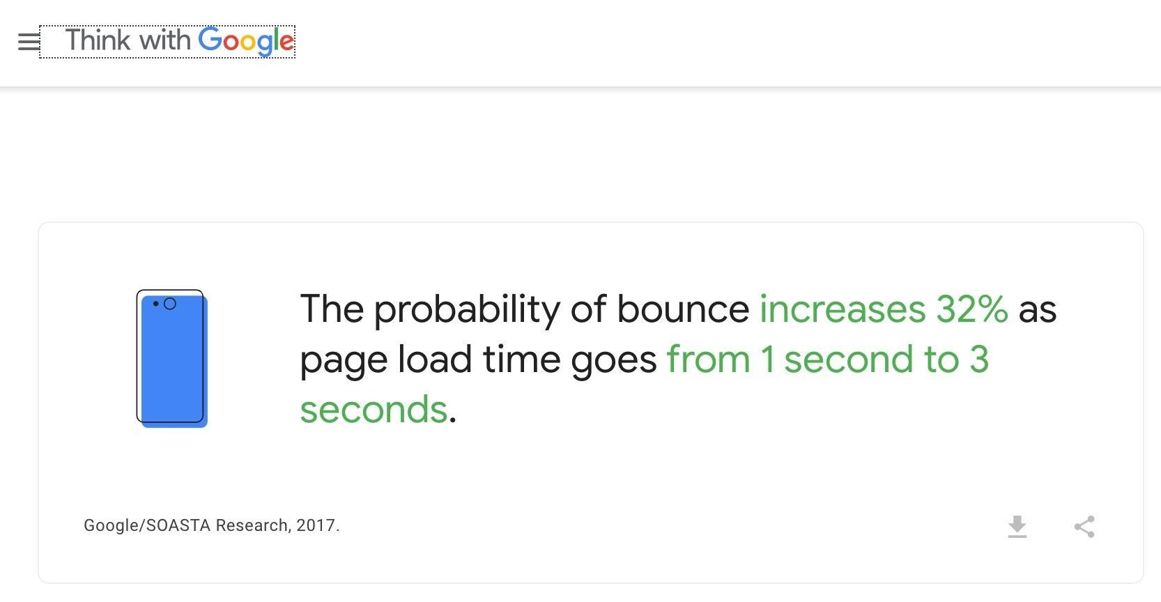
[Source: Think with Google]
If you look in the top left corner of the screenshot above, you’ll see that this is coming from the horse’s mouth itself, so to speak. Additionally, this stat is from 2017, and there’s very little chance that users have become more patient over the years. Google also collaborated with Deloitte on a report with plenty more detail on loading speeds and sales.
Boosting your site’s loading speeds is a balancing act between making your pages attractive and useful while keeping them quick. The good news is that there is no shortage of ways in which you can reduce your page loading speeds.
Pro Tip: Want to quickly test your store speed, as well as how your brand compares to other seven- and eight-figure stores in your niche? You can do this in minutes with Benchmark Hero, a free site audit app. Benchmark Hero allows you to compare your web store to thousands of large stores and pinpoint what you can easily do to improve your store, like checking speed, trustworthiness, marketing shopping experience, and more.
Moreover, there’s no shortage of guides on how to do this. Guides from Crazy Egg and Shopify come to mind first (although Shopify’s does include quite a lot of Shopify-only tips).
2. Make Your Store and Pages Responsive
It’s no secret that mobile users make up the majority of eCommerce website visitors. According to SaleCycle’s 2019 study, while they might be less inclined to actually make a purchase on their phone, people still predominantly use their mobile devices to access websites.

There are many reasons why mobile users are less likely to buy than desktop users. For example, they may research on their phones and purchase on a desktop later.
However, the fact remains that your eCommerce website will get mobile visitors, and you need to ensure they have the same experience as your desktop visitors.
This is something that has been talked about extensively for at least a decade, yet you still come across eCommerce sites with issues like inaccessible page sections, unclickable buttons, and photos that don’t load or cover other parts of the page on mobile.
Luckily, there are eCommerce brands that really know how to deliver a good experience for mobile users who you can learn from.
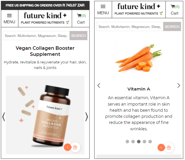
Take, for example, the vegan collagen page from Future Kind.
You get everything from the desktop version of their website on mobile, too, including comparison tables and expandable sections. All the information is there, but it never feels cluttered or difficult to read as it is broken into easy-to-distinguish sections.
3. Include the Right Information on the Right Pages
Between the dwindling attention span of your average eCommerce website visitor and their understandable wish not to have their time wasted, it is absolutely crucial that you put the right information in the right place.
While this may seem like nothing more than common sense, there’s actually quite a bit of work involved in figuring out what visitors want to see and where they want to see it. There are also plenty of blind spots that may cause your bounce rate to increase for seemingly no reason.
Product Pages
Take product pages, for example. As is usual these days, most product pages feature a few essential bullets about the product in question (Amazon-style) or present information in a less-elegant way, like Walmart:
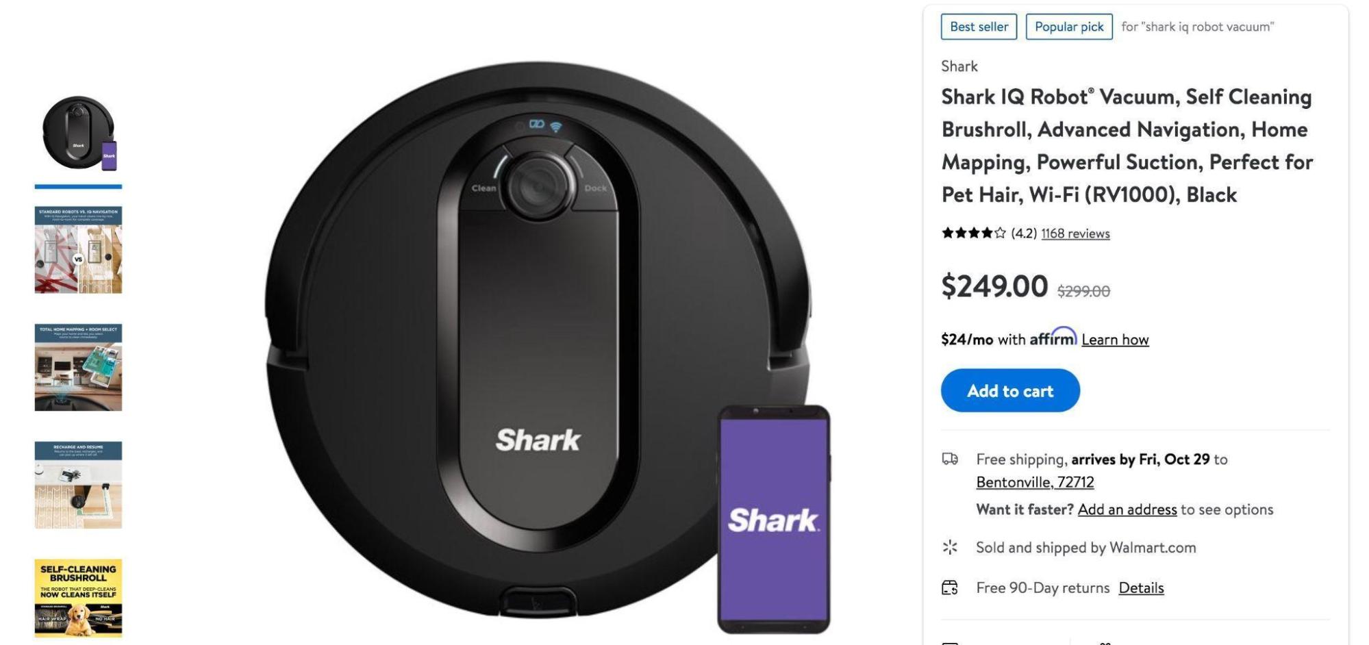
They know what’s important to their customers, and they put it front and center – self-cleaning, advanced navigation, home mapping. They even give us a hint about the target audience – pet owners.
Clothing product pages are sometimes different. They understand that pictures and color/size options are more important than information, so they lead with that. Here’s an example from Lululemon doing just that with their metal vent tech shirt page.

Sure, they feature plenty of information lower down the page, but they understand that people first want to see the t-shirt and which colors and sizes are available. Notice also the size guide (a perfect example of a potential blindspot).
Another interesting (and completely different) approach to product page essentials can be seen at Pippin Vintage Jewelry:

They understand that they need more than just a few bullets to sell their vintage jewelry. They need a story, and an experience that’s closer to talking to a live salesperson. It reads like an auctioneer describing the item at Sotheby’s, making the customer feel like they’re buying elegant, historic pieces of jewelry.
Some products/services come with so many options that you have to provide your customers with precise quotes. It’s best to include these on the product page straight away. You should do everything in your power to make this quote system easy to use (on mobile devices, too), clear, and, if possible, interesting or even fun.
Mixam does a great job of this on their booklets page:
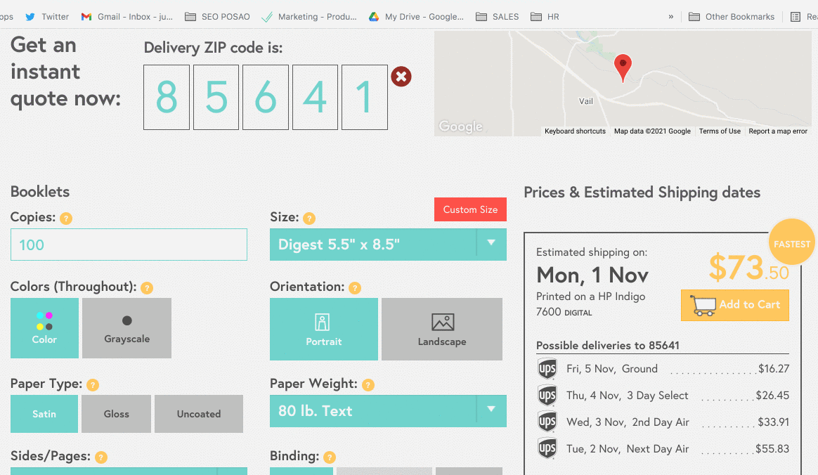
You can see your quote refresh instantly as you choose different printing options. If you check out the rest of the page, you can see that they first explain the different options, so you know what you’re dealing with when you use their quote feature.
Product pages are all about understanding your product and how your target audience approaches buying such products. First, give them the most important information in the simplest way, and then provide more details on the rest of your page.
Homepage
Things get even more complicated with homepage information.
- What do you put there?
- Where do you put it?
- How much do you include without making your potential customers bounce due to information overload?
Once again, you start with what you would expect to see on an eCommerce website such as yours.
If you are selling something like medical equipment, trust is paramount. In that case, show off awards you’ve received from experts in the field, as Starkey does.
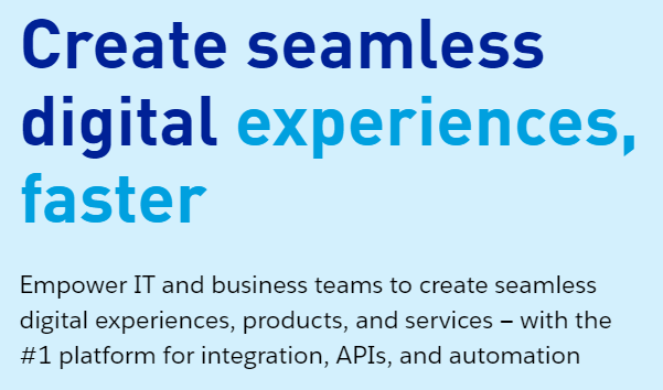
If you’re selling a service or product that is quite complex, explain it in as few words as possible (with pictures) and consider a short explainer video, like MuleSoft does.
Maybe you have a product with a truly strong unique selling point; a novelty in the market. Make your homepage all about your USP, prove why you’re unique, and remove anything non-essential, like Bee’s Wrap does.
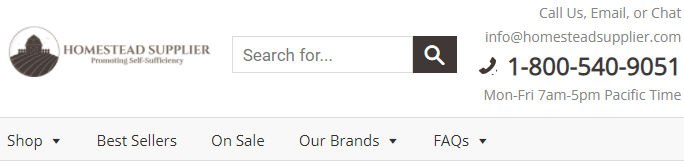
If you’re in a more traditional industry, where people may have questions and are likely to appreciate customer service, show them that you understand, be friendly, and offer an abundance of contact options, like Homestead Supplier does.
There are too many industries and niches to cover here, but you get the gist. You have to know your industry, know your audience, and know what matters to them.
Guides, Best of, and Comparison Pages
Many eCommerce websites feature additional landing pages. For example, guides and comparison pages may include product comparison keywords that perform particularly well for organic traffic. They’ve become favorites with SEO-focused content teams.
The golf simulators page from Rain or Shine Golf is a great example.
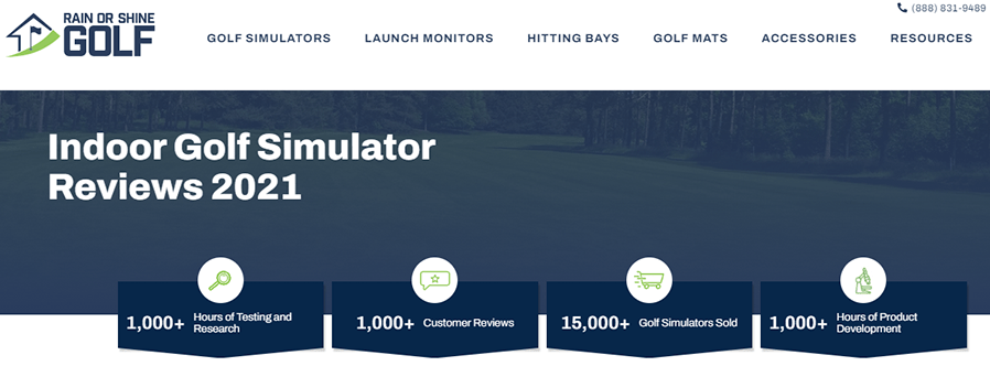
- They rank at #3 on Google for indoor golf simulators, a keyword that has a monthly volume of almost 15K searches
- They rank #4 for golf simulators, a keyword with a volume of nearly 100K monthly searches.
Now imagine how much more volume additional long-tail keywords could bring in.
Bonus Content: Grow Organic Traffic in 8 Steps [DIY SEO Tips and Hacks]
However, good performance in SERPs means nothing if a lack of engagement potential results in a high bounce rate. You need to be careful how you craft your pages, so you can entice visitors to read on and visit other pages on your website (or make purchases).
The aforementioned example does this well, too.
For one, they lead with a huge headline that assures visitors that they’re in the right place for their inquiry: Indoor Golf Simulator Reviews 2021. (A little SEO trick while we’re here – you’ll probably find they change the years in the title.)
They then provide four great reasons that you should trust their reviews and keep reading. The reasons are reflected in numbers in their research:
- Hours spent testing
- Customer reviews
- Simulators sold
- Hours of product development
This builds credibility, so visitors are encouraged to read on, thinking, “Wow, these people must know what they’re talking about!”
They do the rest of the page equally well by dividing it into clear sections, giving the reader plenty of opportunities to check out other pages on their website, learn more, and make purchases. It’s nearly impossible to bounce from this page without clicking on something else.

Their reviews are truly in-depth and further display the competence of the team behind this guide (which also offers an opportunity for further action every now and then).
4. Reviewing Your Top Channels
Your eCommerce website’s bounce rate will also depend on where your visitors are coming from.
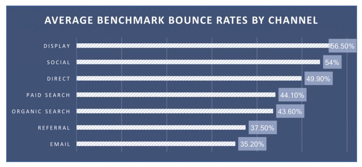
For example, while (on average) 56% of visitors who come from display ads will bounce, the percentage drops to 35% with email marketing according to CXL Bounce Rate Benchmarks.
There’s a lot to learn from these statistics. Some things are expected, such as email performing well (returning visitors/already interested). Others are less intuitive, such as the minor difference between paid search and organic search, for example.
In any case, these stats can be a great benchmark for your website. You’ll certainly want to tackle different channels that might be performing particularly poorly. This How to Build a Winning eCommerce Ads Strategy guide is a good place to start.
The bad(ish) news is that addressing these issues often requires quite a bit of marketing knowledge. You’ll need market segmentation and targeting, copywriting, advanced SEO know-how, and more.
The good news is that there are plenty of agencies that can help you with this, such as StoreYa, for example. They know how to optimize your ad spend and ensure that your ads are reaching the right people in the right situation.
Pro Tip: Check out these guides on top eCommerce channels and how to optimize them for conversions.
Final Thoughts
As you can see, reducing your eCommerce bounce rates is by no means an easy task. It requires a lot of research and more than a few tweaks.
Given the enormously positive effect that a low bounce rate can have on your site’s nurturing and conversion potential, it’s definitely worth the effort.
Speeding up your site’s load times, catering for mobile users, ensuring that your content is relevant, and paying attention to all your traffic channels’ performance are great starting points for improving your bounce rate.

Travis Jamison is an entrepreneur turned investor. After selling a couple of businesses, he shifted his focus toward investing. But he was disappointed by the lack of options for entrepreneurial-type investments - like buying websites & investing in small, bootstrapped businesses. So he started Investing.io to provide a home for other entrepreneurs turned investors.
Recommended articles
 Facebook Ads for eCommerce: 16 Strategies, Examples & Tips
 How to Build a Winning eCommerce Ads Strategy
 Google Ads for eCommerce: Everything You Need to Know
 10X Your Traffic with PPC Management Software
Comments
Powered by Facebook Comments