eCommerce Guide to the Perfect FAQ Page
Your eCommerce FAQ (Frequently Asked Questions) page or section is one of the most important elements of your online store.
Why? Because it is your first point of contact with your potential shoppers, answering any questions they may have quickly and efficiently. This, in turn, helps establish trust and can turn a looker into a buyer by easing their mind. And, if done correctly, can serve potential customers and shoppers at any stage of their purchasing journey.
An FAQ page can be used to answer those repetitive questions your potential shoppers have about your products, brand or eCommerce fulfillment in a simple, straightforward way. However, it’s essential to set it up correctly to ensure it’s an asset, not a distraction.
The perfect FAQ page for eCommerce should be well-thought-out, not slapped together as an afterthought. This will ensure it is able to build trust in your brand and products and free up time spent dealing with repetitive questions from potential customers – all while giving your SEO a boost.
How FAQs Boost SEO
Besides being useful to your potential shoppers and customers, FAQs are a vital part of your DIY SEO strategy. This is because your FAQ pages and sections help with incorporating long-tail keywords and questions that potential searchers may use, can point to possible blog topics your customers would value or are looking for, and provide inbound link opportunities. For more on how to boost eCommerce organic reach and other SEO hacks, visit our DIY SEO and Backlinks for eCommerce guides.
Now that we know why your store needs a winning FAQ, let’s look at how to create a perfect one. Whether you’re a new online entrepreneur or want to revamp your FAQ for 8-figure success, here’s a complete step-by-step guide to creating the best FAQ page for your store.
Step 1: Decide Where to Put Your FAQ Page & Navigation
The first thing you need to do is decide where you’re going to put your FAQs. It is tempting in the beginning to have a section, but as your business grows, so will the number of questions your customers may have. Therefore you want to plan for enough space.
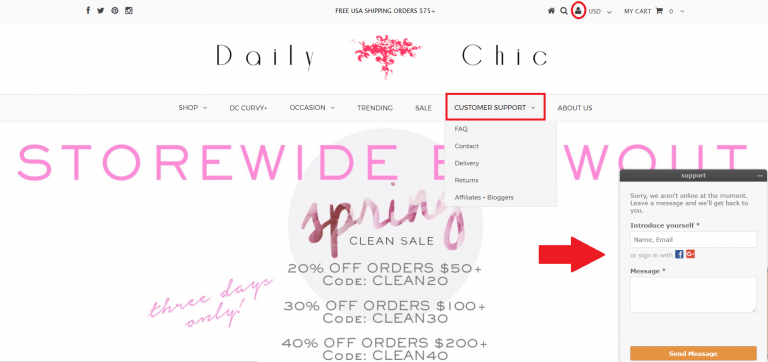
Additionally, you also want to think about where on your homepage you want your FAQ navigation link to be displayed. Think about this strategically as there are a lot of options open to you. As we discussed in our Online Store Feedback post, your FAQs should be easy to find and accessible. So you either want it in your primary navigation menu like this:
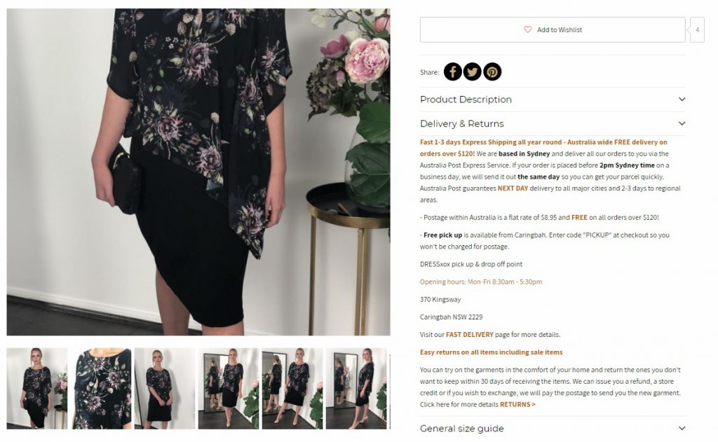
Or if your menu bar is already cluttered, in a logical dropdown like this:
But that’s not the only consideration! You can add and integrate FAQ links in your product pages, for example.
Step 2: How to Format Your FAQ for Max Success
To create a well-crafted FAQ page, you want to ensure that it not only matches your brand and site but is easy to navigate. If you are selling straightforward products where minimal explaining is needed, you could have a simple list of questions. If you have complicated products that will result in a lot of questions, you may want to consider structuring your FAQ with tabs, drop-down headings, or links to more detailed questions. Let’s look at some options from our favorite StoreYa merchants.
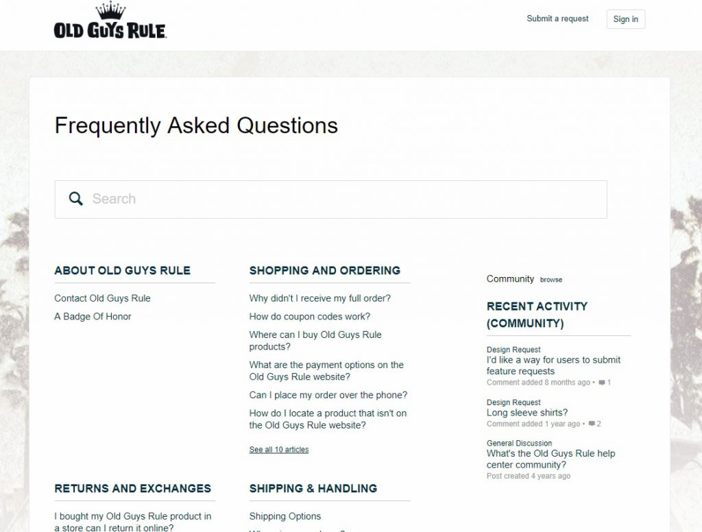
1. Main FAQ Page with Links to Various Questions
As you can see, Old Guys Rule’s FAQ page links to various headlines neatly displayed under headings that are easy to navigate.
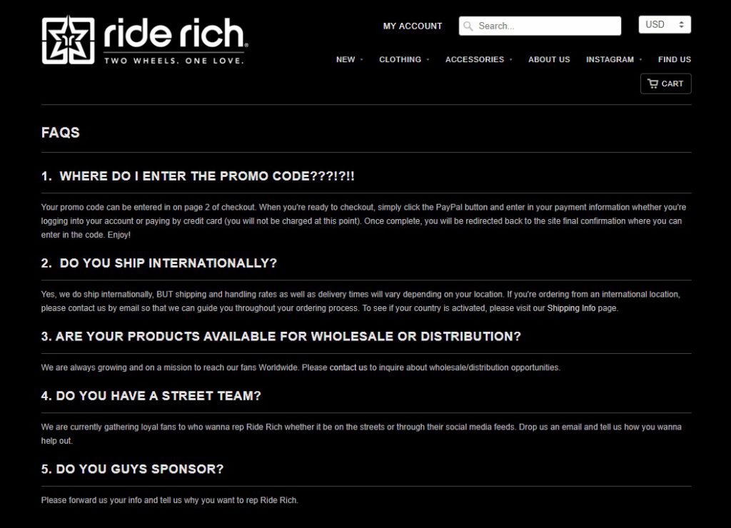
2. One-Page FAQs
Here, Ride Rich uses a simple one-page display for their frequently asked questions.
3. Drop Arrow One-Page FAQ Page
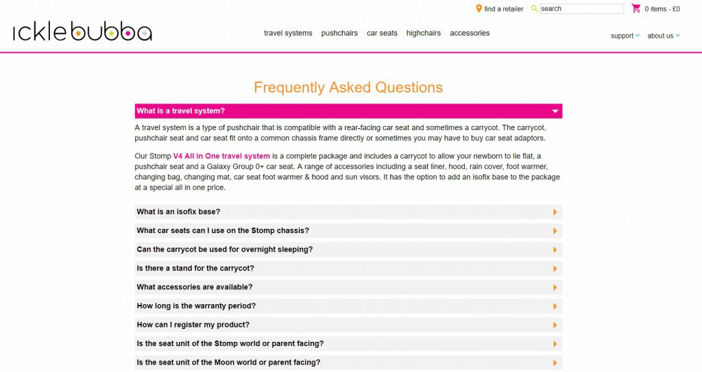
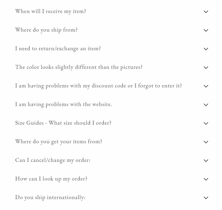
Ickle Bubba is a good example of using dropdown questions to keep your FAQ easy to read.
Pro Tip: If you want to improve SEO with question keywords and elaborate for those most-asked questions, consider creating landing pages for your top questions. This will also help you send page links within your customer service support and streamline answering the most frequent questions. For more on how to find the best keywords for your brand, visit our eCommerce Keyword Research Full Guide.
4. Combination FAQ Pages for High-Volume Product Stores
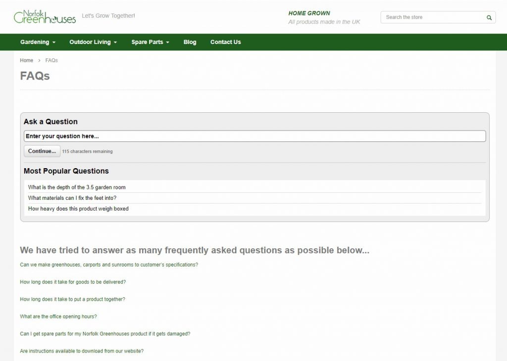
Norfolk Greenhouses used menu links and search to make navigating all their questions about all their products easier.
Step 3: Treat Your FAQs as Part of the Journey
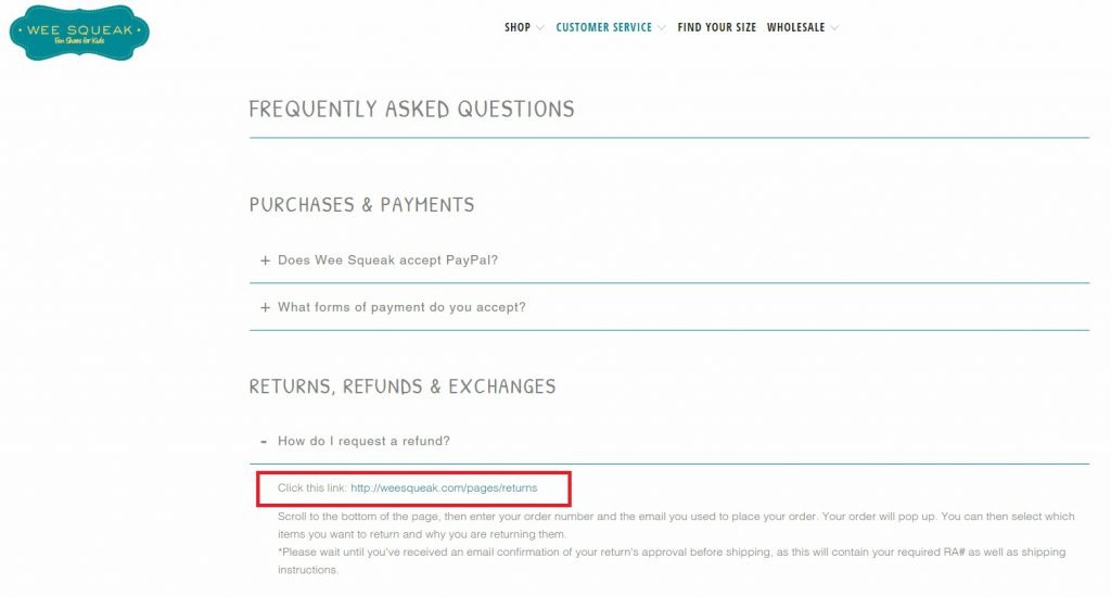
No matter what formatting you choose, you want to make sure that your FAQs lead somewhere. If you are answering a question about returns, make sure you link to your returns page; if you mention shipping, link through to your shipping pages – and so forth. Like with every part of your website, get into the minds of your potential shoppers to create a logical journey and keep the traffic on your site for longer.
In short, you want to treat your FAQ as part of your sales funnel. If people are looking for answers to their questions, make sure your FAQs answer them and send these potential shoppers to the next stage: converting!
Shopify Tip: For those of you who have Shopify templates that don’t allow for tabs for your FAQ pages to be built in, here’s a how-to guide on adding “accordion” effect (tabs) to your Shopify store.
Step 4: Make Your FAQs Searchable
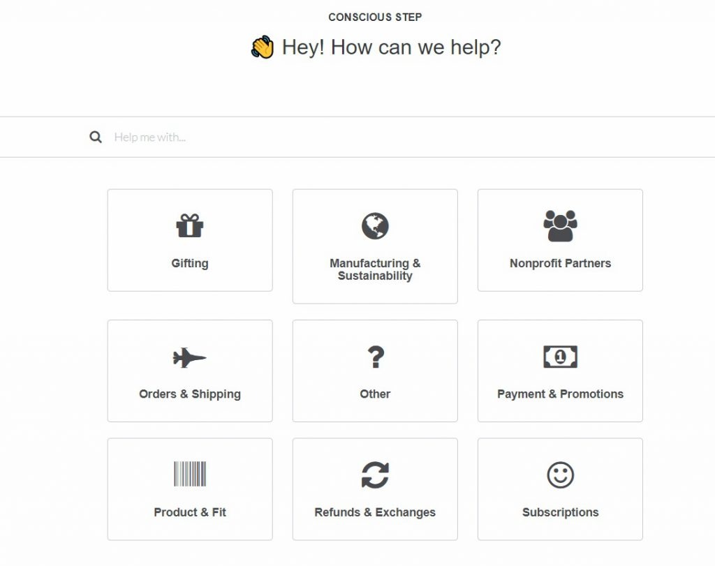
Want to make your FAQs super user-friendly? Then you want to make them searchable, especially if you have a lot of questions.
If you have Shopify, you can do this by adjusting your code or adding Shopify apps such as Product FAQ – which also lets you easily add FAQs to your product pages, or the popular free app Help Center which was used to make the example above.
Step 5: Research the Right Questions and Place Them Strategically
Once you have addressed the technical side, it’s time to plan what questions your FAQ will answer. For this, you need to really know what your potential customers are asking, so you want to take ideas from customer support, social and store comments, and surveys. If you are a brand-new store, take a look at your market research and target shoppers, as well as your biggest competitors.
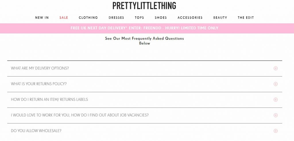
And what order should you display them in? The most logical way you can. You can do this by grouping together questions from the same or similar topics and making sure questions follow on from each other logically. You may also consider starting with the most asked questions first, like Pretty Little Thing:
The secret is finding an order that suits your sales funnel and your specific shoppers’ needs. As the saying goes, one size doesn’t fit all and you’ll need to test an order and questions that serve your potential shoppers.
A good example of logical ordering for your FAQs comes from eCommerce gurus Military Hippie. See how their questions follow the natural progression for their specific audience, while remaining simple and to the point?
And don’t forget to end your FAQs with a call to action! It’s a simple way to push potential shoppers further along your sales funnels but is so often overlooked. Here’s a rough FAQ page template to get you started:
DIY FAQ Template
- What is your return policy?
- Do you ship internationally?
- What are your shipping options?
- What are the shipping costs?
- How long until I get my delivery?
- Can I change or cancel my order?
- How can I track my order?
- Are my payment details/data secure?
- How is [Product] made?
Want some FAQ writing tips?
Remember to…
- Clearly answer the question
- Avoid hard-sell talk as this will diminish, not build, trust
- Include links to other pages
- Order them by importance and group similar topics
- Create questions, not statements
- Don’t waste time with infrequent questions
- Make sure the list only includes must-have questions
- Keep your FAQs up-to-date
Step 6: Consider Visuals to Add Value
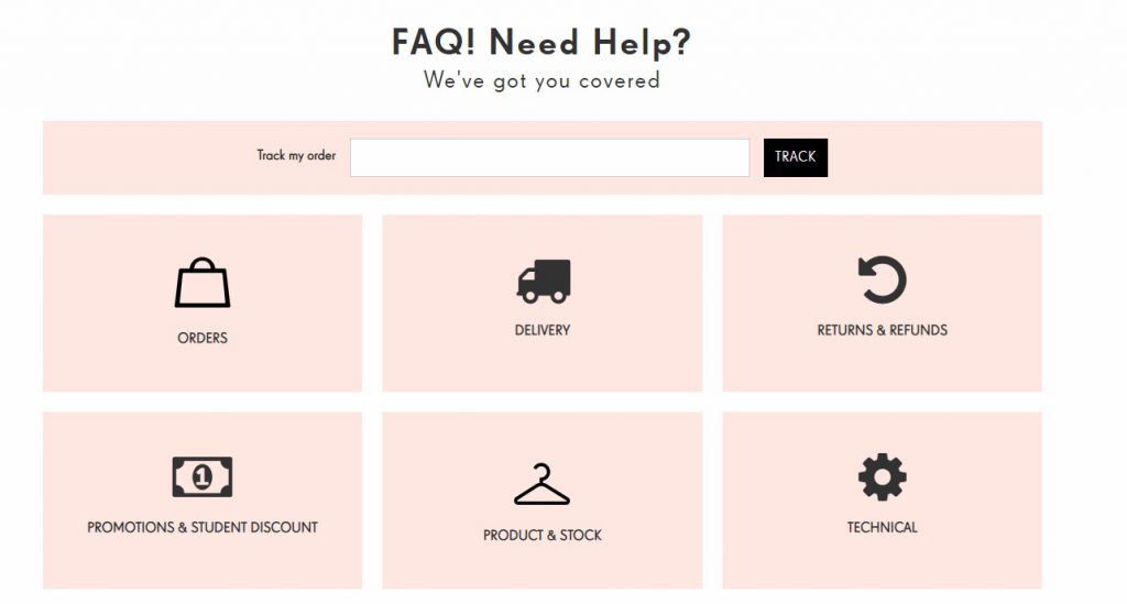
If you want to one-up your competitors and upgrade your FAQs to the pro level, think about adding visuals or icons to your FAQ page for easy navigation.
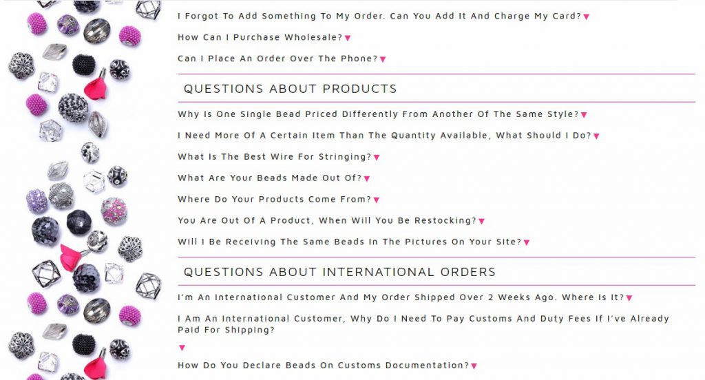
Or simply add some product visuals to help make your page – and products – stand out from the crowd, like this example from Jesse James Beads.
Step 7: Stay On-Brand and On-Point
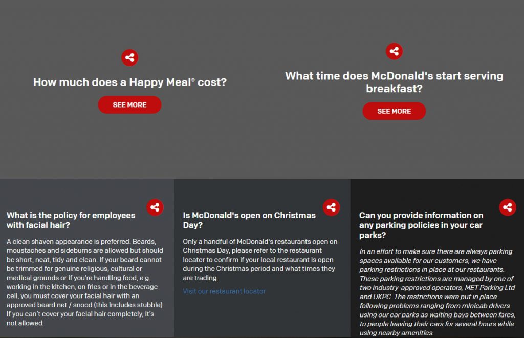
Voice matters! Yes, it’s vitally important that your questions are asked simply and answered straightforwardly. However, you also want to make sure they’re in line with your brand voice and tone. Your FAQ language needs to match other areas of your online store, in the tone or voice you have developed specifically for your ideal potential shopper. A good example of keeping it informal, in line with their brand and customers, is McDonald’s.
Conclusion
To create the perfect FAQ page or upgrade your existing FAQ page to expert level, you want to ensure you adhere to these three rules:
- Make your FAQ page easy to find and navigate
- Ensure your questions are straightforward and match your shoppers’ needs
- Take advantage of inbound link opportunities and remember your CTAs
Have questions? Post them in the comments below. And if you’re an eCommerce newbie, check out this Terms and Conditions template and how-to guide.
Pro eCommerce PPC and Social Media Marketing Tip: It is time to automate your digital marketing including TikTok ads, Facebook ads for eCommerce, and Google Ads campaigns from one place! Traffic Booster is the only eCommerce-focussed full PPC management software that will create, manage and optimize your campaigns in real-time to peak performance. It is far more than just an alternative to WordStream, offering machine-learning campaign optimization and marketing expert assistance. You can find out more about choosing the right plan to suit your budget and business needs, here.

Nicole is a content writer with over sixteen years experience and flair for storytelling. She runs on a healthy dose of caffeine and enthusiasm. When she's not researching the next content trend or creating business content strategies, she's an avid beachgoer, coffee shop junkie and hangs out on LinkedIn.
Recommended articles
 Facebook Ads for eCommerce: 16 Strategies, Examples & Tips
 How to Build a Winning eCommerce Ads Strategy
 Google Ads for eCommerce: Everything You Need to Know
 10X Your Traffic with PPC Management Software
Comments
Powered by Facebook Comments

