There is a lot more to winning designs and the best eCommerce websites than homepage layouts. Yes, your homepage is an integral part of building a successful online store, but so are your product page designs, your overall customer experience, the way you present your products, and your overall branding.
In a nutshell, it’s not just about aesthetics, but the overall way your brand and products are positioned and how easy your site is to navigate. It is also about the finer details, such as aftersale copy and original messaging – small things that set your brand apart from your biggest competitors.
In this post, I have put together a list of the best eCommerce website examples in each of the leading niches and offer their favorite apps to inspire your own eCommerce entrepreneur journey to millions in revenue.
To skip to a specific niche, click one of the below links:
- Apparel Website Examples
- Baby Accessory Website Examples
- Beauty & Health Website Examples
- Fitness & Sport Website Examples
- Food & Snack Website Examples
- Home Decor Website Examples
- Jewelry Website Examples
- Stationery & Office Website Examples
- Tech Accessory Website Examples
But first, what makes a great eCommerce store?
The best eCommerce websites ensure that they:
- Focus on keeping web stores clean and readable.
- Remain consistent with branding, messaging, and brand voice across their entire online store.
- Streamline their customer journey by making it super obvious where a shopper needs to click ‘Next.’
- Prioritize their mobile store browsers while optimizing for other screen sizes.
- Use elements such as storytelling, social proof, video, product photos, and unique design to draw in shoppers from their homepages.
- Create an original and streamlined customer experience all through a shopper’s buying journey.
Best eCommerce Apparel Website Examples 2020
1. Conscious Step
eCommerce Niche: Sock and Accessory Apparel
eCommerce Platform: Shopify
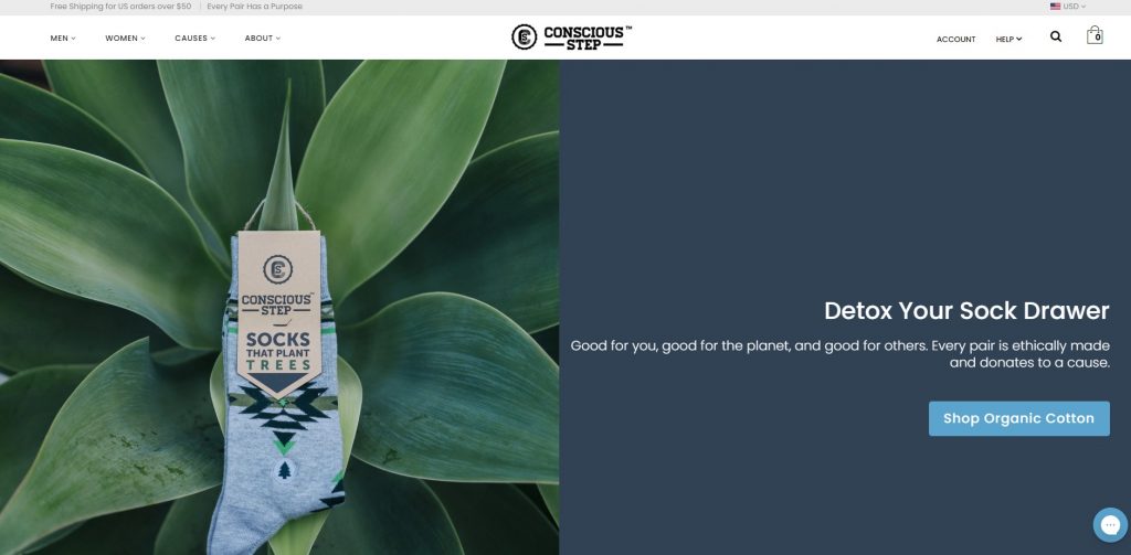
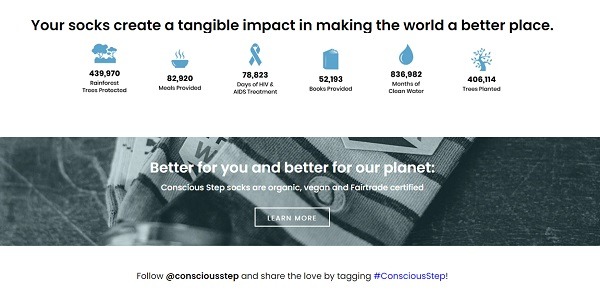
When you’re selling in a highly competitive niche like Conscious Step is, you need to ensure your store design quickly shows shoppers what makes your brand and products different from the rest. This doesn’t just mean having a kickass, streamlined above-the-fold design like theirs, putting their brand positioning front and center. Every part of their site is perfectly designed for their brand and product benefits and talks directly to their target audience.
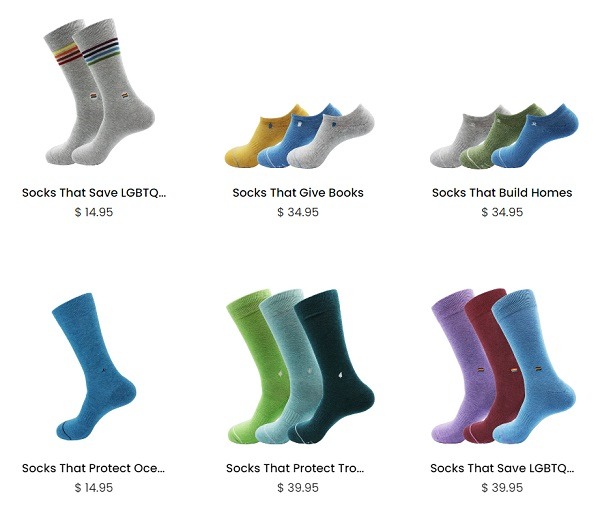
Although this brand is a prime example of a winning eCommerce website, there are specific features worth highlighting. This includes their category descriptions, which link certain types of socks to their supported causes.
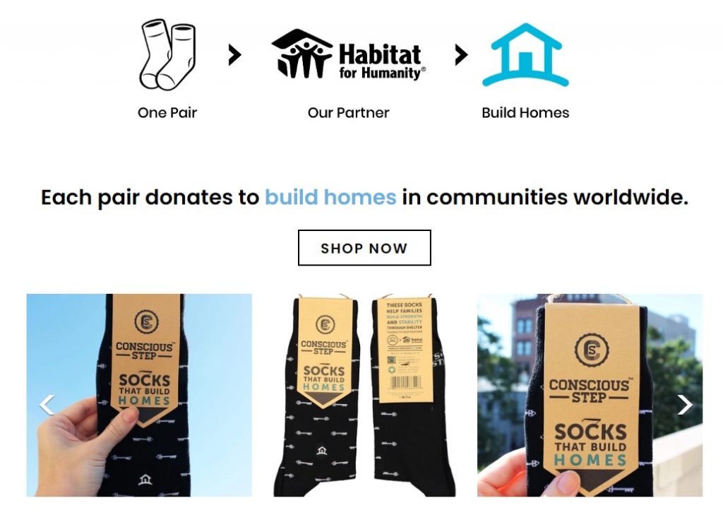
In fact, their causes are front and center throughout their whole site – from menu options to their blog.
Popular Apps and Tools Conscious Step Are Using
- Bold Commerce app suite for an improved shopping experience to boost sales.
- Yotpo for review display and management.
- Font Awesome for a large icon set and toolkit.
- Code Black Belt for store and product page optimization.
- Traffic Booster for getting targeted traffic to your site with Google and Facebook ads.
2. Q for Quinn
eCommerce Niche: Socks
eCommerce Platform: Shopify
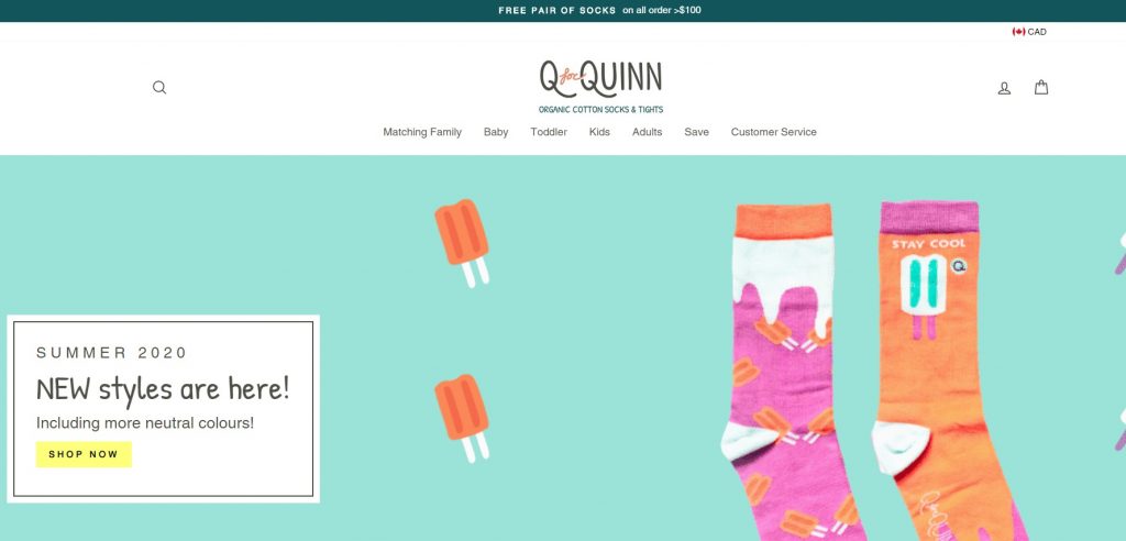
I am loving Q for Quinn’s header GIF, bright colors, and overall vibe. When it comes to creating a winning store design, it should start and end with your overall brand voice and target audience. In fact, this brand’s story is quite an inspiration to any eCommerce entrepreneur – you can listen to Melita Cyril’s story and winning strategies on this Unofficial Shopify Podcast episode.
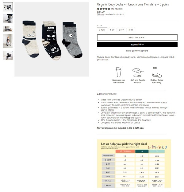
Some of my favorite shopping experience elements on this store are their product pages with a variety of lifestyle photos, easy-to-read product icons, and creative size guide.
Some other notable design and shopping experience tricks of theirs are their matching sock bundles for families, gift cards, and social responsibility causes.
Popular eCommerce Apps and Tools Q for Quinn Are Using
- Font Awesome for a large icon set and toolkit.
- MLVeda apps, which include auto currency switching, pricing tools, and trending product display for a more streamlined user experience.
3. Envy Stylz Boutique
eCommerce Niche: Southern Chic apparel
eCommerce Platform: Shopify Plus
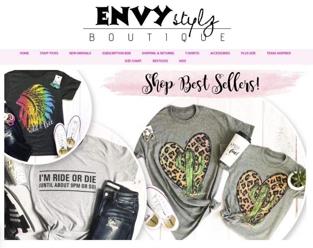
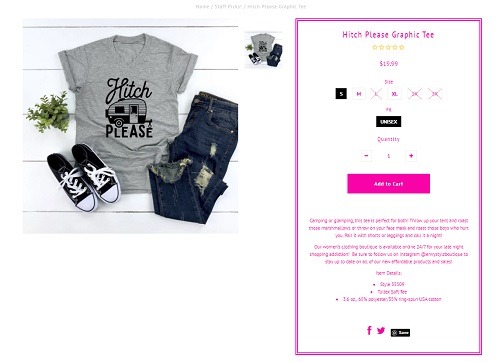
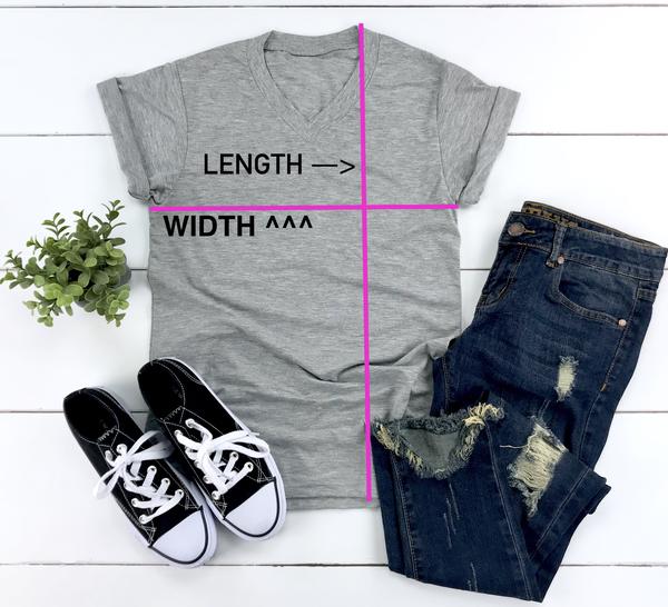
When it comes to proving that some brands win by keeping things simple, Envy Stylz Boutique is it. As I mentioned above, when you are selling in a trending eCommerce niche, you need to find original ways to stand out from the crowd. Capitalizing on flat lay product displays that appeal directly to their audience, easy size selection, and quick view, they keep things simple while still grabbing attention.
Bonus Content: How This Apparel Brand Increased Their Sales by 470%
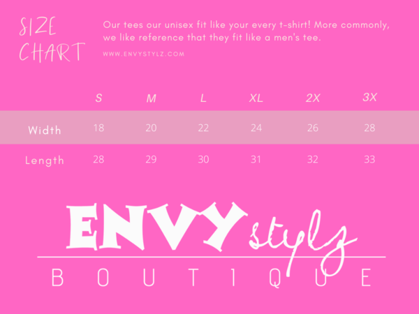
Another way they stand out from their competitors is with the creative, branded size chart they have included on their site.
Popular eCommerce Apps and Tools Envy Stylz Are Using
- Push Owl for remarketing push notifications.
- Font Awesome for a large icon set and toolkit.
- StilyoApps for shopping policy, calling, and cross- and up-sell store displays.
- Traffic Booster for getting targeted traffic to your site with Google and Facebook ads.
4. TRUE
eCommerce Niche: Golf Shoes and Apparel
eCommerce Platform: BigCommerce
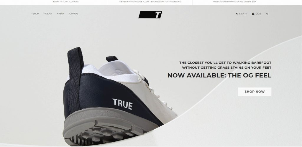
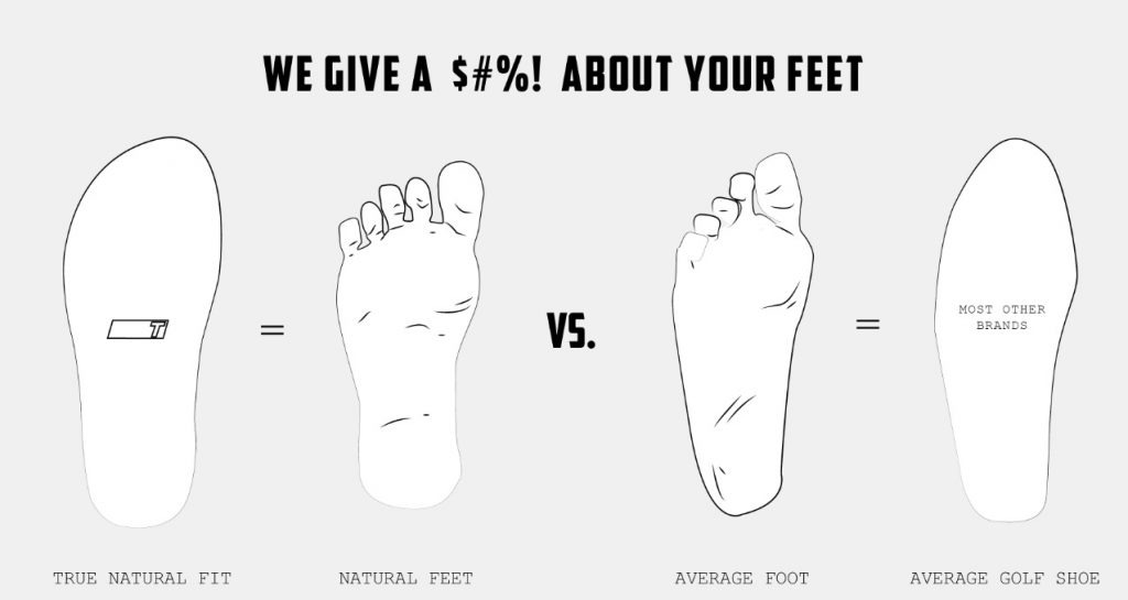
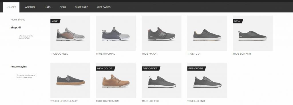
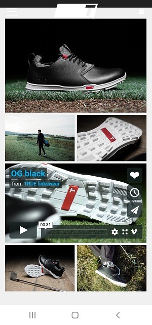
The TRUE online store is total eye candy – clean lines, gorgeous lifestyle photos, easy navigation, and a lot of style! They also back it up with perfect copy that talks directly to their target audience.
Inspired initially to create comfortable golf shoes designed for (and by) the walking golfer, TRUE has grown into a full golfing apparel brand with a site that creates a seamless shopping experience. One of the best design elements on their store are clear, easy-to-navigate menus.
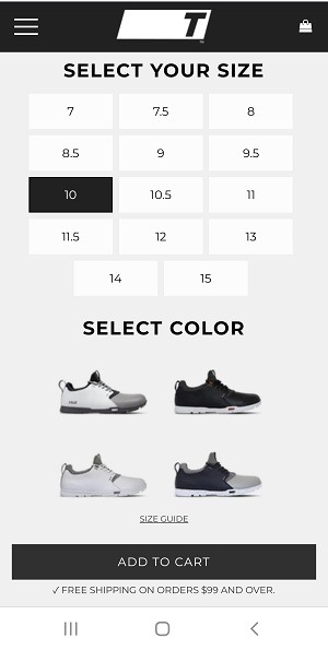
But if you want to get a good dose of eCommerce web design inspiration, take a look at their product pages, which exude quality though their product images, videos, and overall layout, while offering easy product selection.
Popular eCommerce Apps and Tools TRUE Are Using
- HappyFox live chat app to communicate directly with shoppers.
5. Gearbunch
eCommerce Niche: Yoga Leggings and Athleisure
eCommerce Platform: Shopify Plus
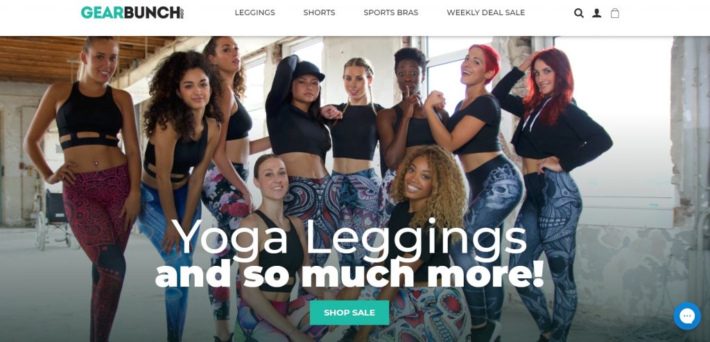
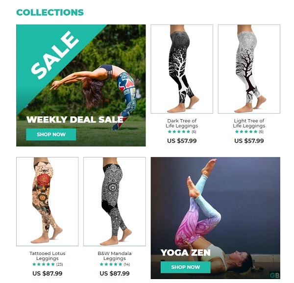
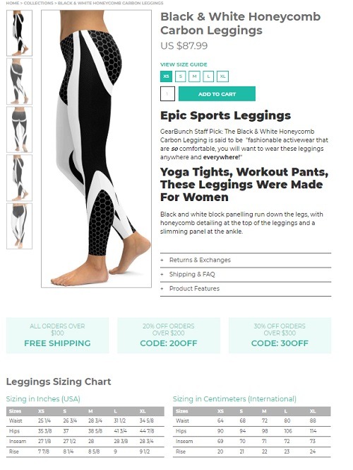
Gearbunch is a perfect eCommerce website example that shows how to use crisp, clean lines and let your products do the talking. Not only do they adhere to all the best design practices such as consistency and simplicity, but use a combination of white background photography and lifestyle photos to create a strong brand voice.
Another noteworthy eCommerce UX trick they show us is including all the product-relevant information that is easy to digest and follow! Plus, their strategic coupon and sales placement to help boost sales is an easy but effective hack to duplicate.
You can learn more about their store, product design, and how they reached $5,000,000 in revenue in their first year, here.
Popular Apps and Tools Gearbunch Are Using
- Shogun for building custom product pages, blog posts, FAQ pages, and funnels.
- Traffic Booster for getting targeted traffic to your site with Google and Facebook ads.
- StilyoApps for shopping policy, calling, and cross- and up-sell store displays.
- NexusMedia apps for site design and shopping experience optimization, such as easy search and responsive video and maps.
- Fancybox, which offers a JavaScript lightbox library for presenting various types of media.
6. Protest
eCommerce Niche: Apparel
eCommerce Platform: WooCommerce
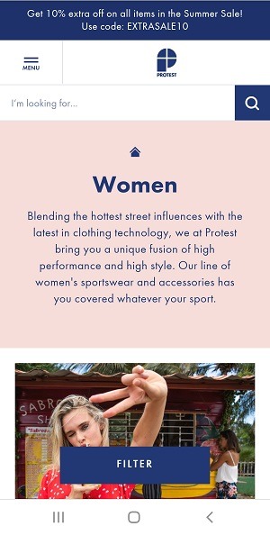
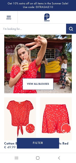
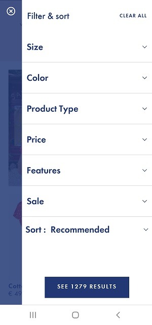
With clickable banners, easy navigation, and sleek design, Protest is another eCommerce website example worth ogling over. In a nutshell, this online store is the epitome of a well-designed and -optimized website. However, there are a few elements that really put them ahead of their competition. These include their fun category page layout, comprehensive and easy-to-use filtering, and close-ups of fabric in product photos.
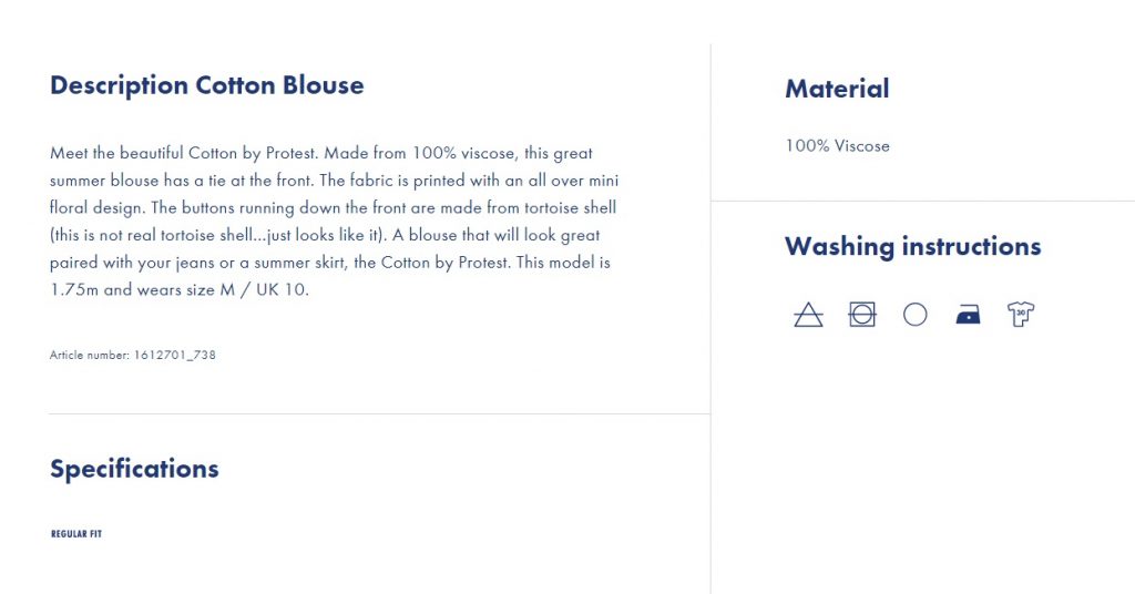
Another of their winning eCommerce UX features are their product pages, with icons, clean layouts for easy navigation and reading, and their ‘complete the look’ section for upselling pairing products.
Popular eCommerce Apps and Tools Protest Are Using
- Yoast WP for SEO and site optimization.
- Vimeo for product and homepage videos.
- Fancybox, which offers a JavaScript lightbox library for presenting various types of media.
7. GRRRL
eCommerce Niche: Athleisure and Sports Apparel
eCommerce Platform: WooCommerce
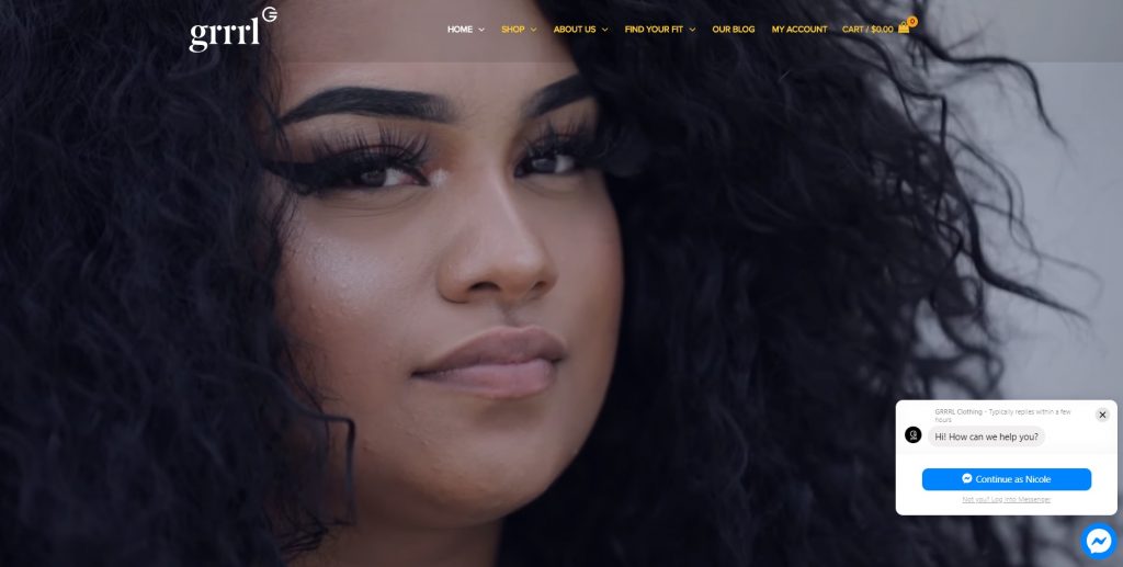
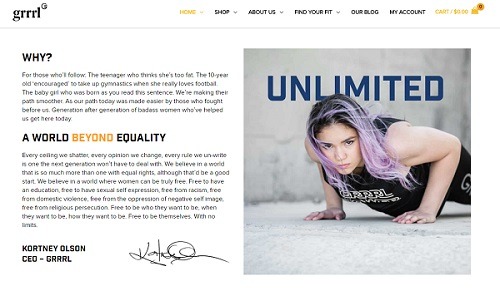
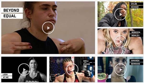
If you’re looking for a good example of an online store that uses their homepage to tell a story perfectly, look no further than GRRRL.
Using the power of video and their brand story, they are able to connect to their target shopper immediately.
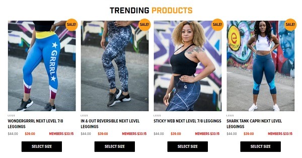
From clean, consistent product displays to well-placed copy that perfectly highlights their brand voice, GRRRL is winning in a big way in terms of store design and shopping experience. And of course, they have all the elements a well-optimized online store should – from clear menus to easy chat, kick-ass blog, membership discounts, and more.
Bonus Content: The Online Store Feedback You’ve Been Waiting For
Popular eCommerce Apps and Tools GRRRL Are Using
- YITH WooCommerce Wishlist to create and enable on-site wish lists that are shareable.
- Font Awesome for a large icon set and toolkit.
- Traffic Booster for getting targeted traffic to your site with Google and Facebook ads.
- a3 Lazy Load for better WordPress page speeds and image optimization.
- Elementor for page and site design.
8. Hebe
eCommerce Niche: Women’s Fashion Boutique
eCommerce Platform: Shopify
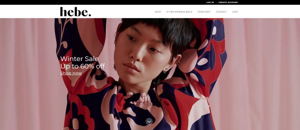
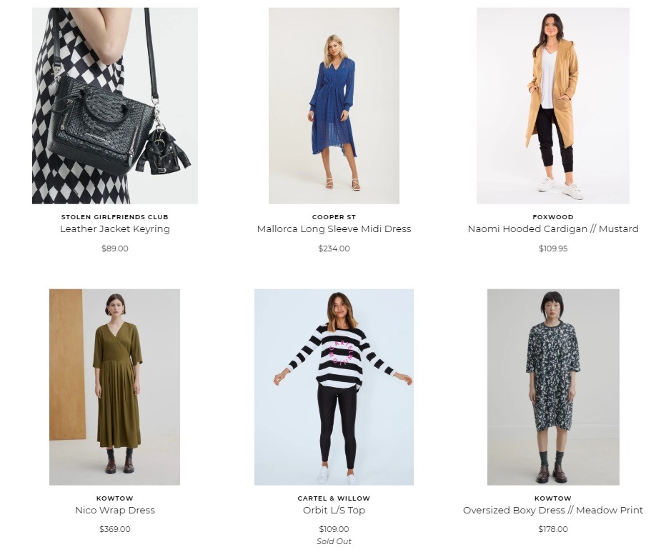
Hebe’s online store finds the right design balance between standing out and keeping it super simple. In short, it’s a beautifully-designed store that takes advantage of clean fonts and open space between product displays.
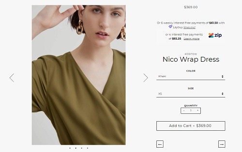
A key design element worth highlighting here is their product page design. Above the fold, it’s clean, simple, and includes the most important information to make sure their checkout button pops. Yes, they have longer descriptions and more details further down the page, but they make sure the first things the shopper sees are the most important points – such as color and size selection and payment options.
Popular eCommerce Apps and Tools Hebe Are Using
- FastClick Polyfill to remove click delays on browsers with touch UIs.
9. Mulawear
eCommerce Niche: Athleisure
eCommerce Platform: Shopify
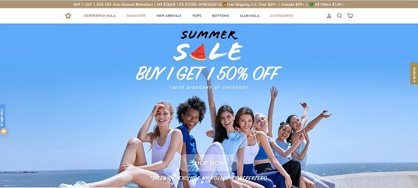
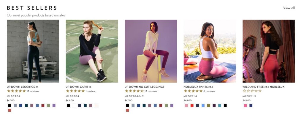
Mulawear is a winning online store brand that prides itself on doing continuous research and development for satisfactory quality, and designing with comfort and sensibility. All of which is translated to their store and why it’s on my best eCommerce website examples list for 2020. From its classy, clean color schemes to homepage product category displays with easy color selection – their site is a good example of the ultimate shopping experience.
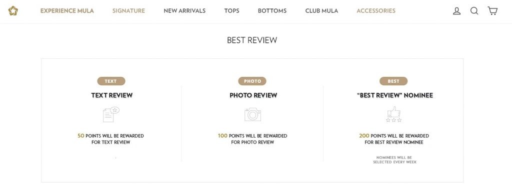
In short, if you are looking for an athleisure eCommerce brand design to aspire to, Mulawear has it all. Including a fabulous ‘About’ page that incorporates video to tell their product story and a membership rewards page that makes taking part in their club easy to understand and simple to do.
Newbie Tip: If you’re still at the beginning of your eCommerce entrepreneur journey and newish to UGC (user-generated content), head over to my 5 Tools to Quickly Increase UGC post.
Popular eCommerce Apps and Tools Mulawear Are Using
- Bold Commerce app suite for an improved shopping experience to boost sales.
- Smile.io to improve customer experience with rewards and loyalty programs.
- Traffic Booster for getting targeted traffic to your site with Google and Facebook ads.
- Push Owl, which offers remarketing push notifications.
- Fontify allows you to use any font for web store and landing pages.
10. Unbound Merino
eCommerce Niche: Apparel
eCommerce Platform: Shopify
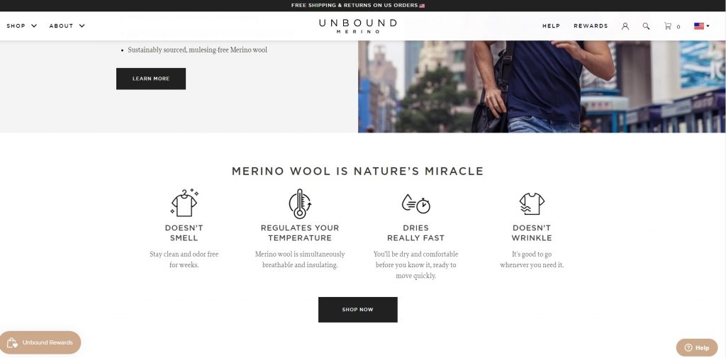
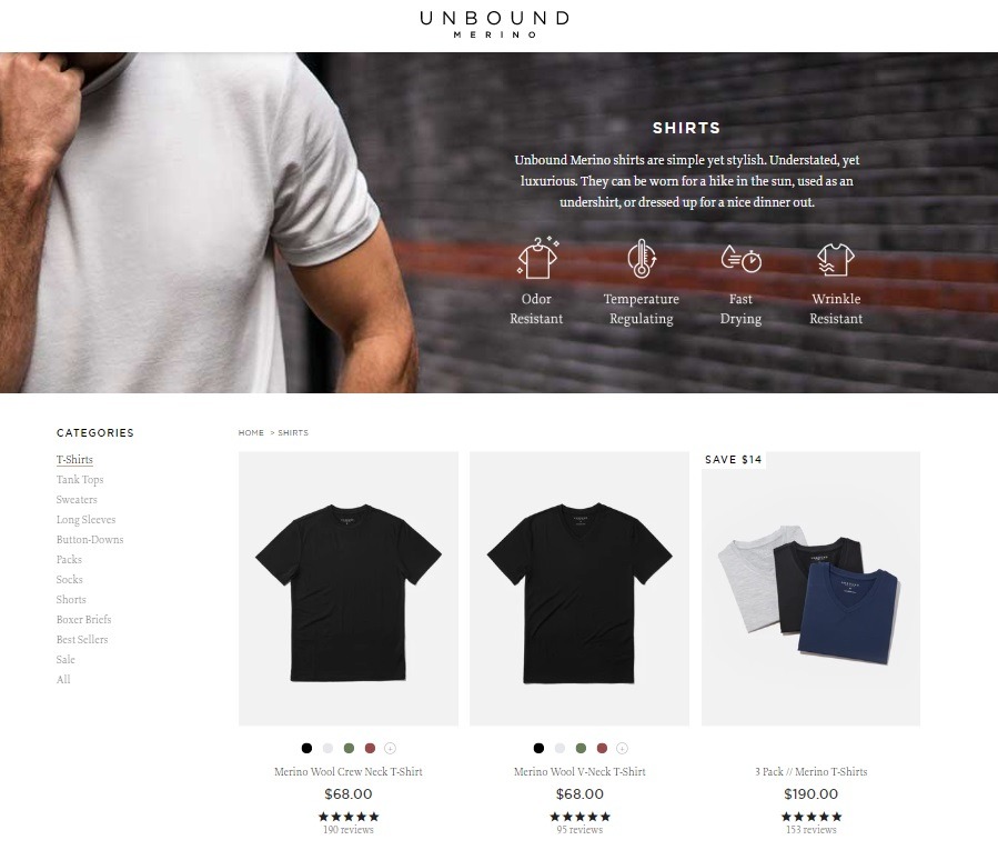
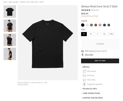
Unbound Merino’s overall goal – to create simple, high-performance clothing that is versatile enough for any occasion – is represented in every aspect of their eCommerce website. Their online store is perfectly optimized for a smooth shopping experience, including good-quality lifestyle product images, easy navigation, streamlined category sections, and product pages created to convert.
Popular eCommerce Apps and Tools Unbound Merino Are Using
- Smile.io to improve customer experience with rewards and loyalty programs.
- Grizzly Currency Converter to show prices in customers’ local currency and make shopping easier.
- Fancybox, which offers a JavaScript lightbox library for presenting various types of media.
Best eCommerce Baby Accessory Website Examples 2020
11. Ickle Bubba
eCommerce Niche: Baby Gear and Accessories
eCommerce Platform: WooCommerce
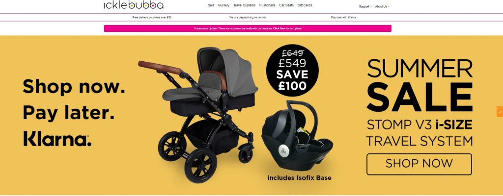
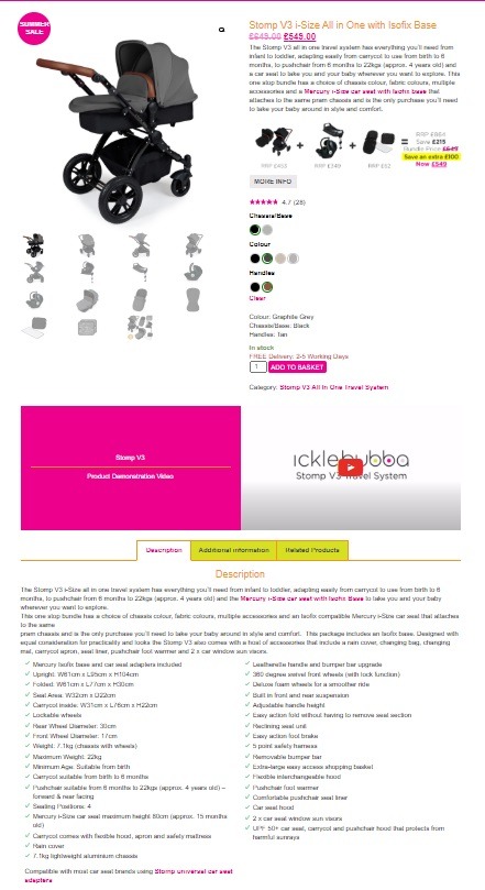
From easy navigation to clever, stand-out colors, Ickle Bubba has everything a store needs to make the best eCommerce website example lists! Despite offering a wide variety of categories from travel systems to nursery sets, their website is not cluttered and products are easy to find.
Given the nature of their products, their product pages require them to display a lot of information. They have done this perfectly by combining easy color/product pickers, a full array of product photos from every angle, embedded product videos, and full product specs.
Popular eCommerce Apps and Tools Ickle Bubba Are Using
- Bazaarvoice for collecting and displaying many types of UGC – including ratings and reviews, shopper questions and answers, and curated social content.
- Traffic Booster for getting targeted traffic to your site with Google and Facebook ads.
Best eCommerce Beauty & Health Website Examples 2020
12. 100% Pure
eCommerce Niche: Beauty
eCommerce Platform: Shopify Plus
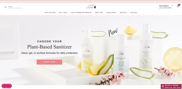
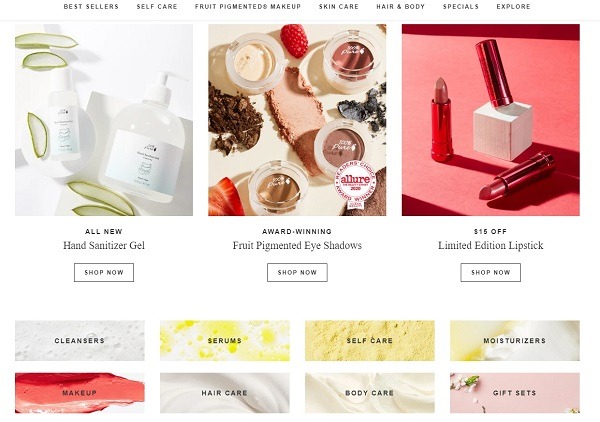
At first glance, 100% Pure doesn’t have any fancy bells and whistles; what they have created is even better. A simple, clean customer experience that extends from their home to their ‘About’ page, and a combination of clear messaging, smart copy, and fantastic product photography.
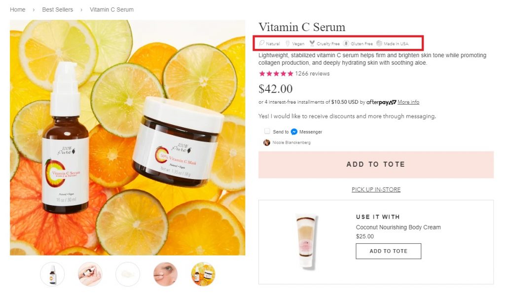
In short, there is a lot to love about this winning store. However, it’s their product pages that should really excite you! Some of the top elements of their product pages are:
- Product icons that help shoppers get a lot of information about products with very little text.
- Reviews and ratings, which help reinforce product trust.
- AfterPay, to make products more affordable to their target audience.
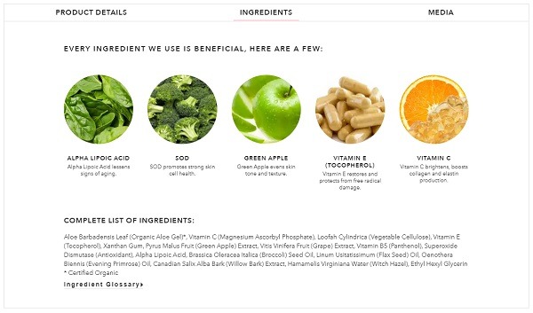
And that’s just what’s above the fold. Below the fold, 100% Pure include full descriptions of products and ingredients, and links to media where the product has been mentioned or reviewed.
Newbie Tip: If you are still in the beginning stages of your eCommerce journey, visit the Build Awesome Product Pages That Convert blog post for getting you up to speed on the basic essentials.
Popular eCommerce Apps and Tools 100% Pure Are Using
- Bootstrap Heroes for customer experience.
- Shopify Product Reviews for product star ratings on product pages.
- Returnly Shopify for a winning return experience for shoppers.
- Talkable for building referral programs and remarketing lists.
13. AHAVA
eCommerce Niche: Beauty
eCommerce Platform: Magento Enterprise
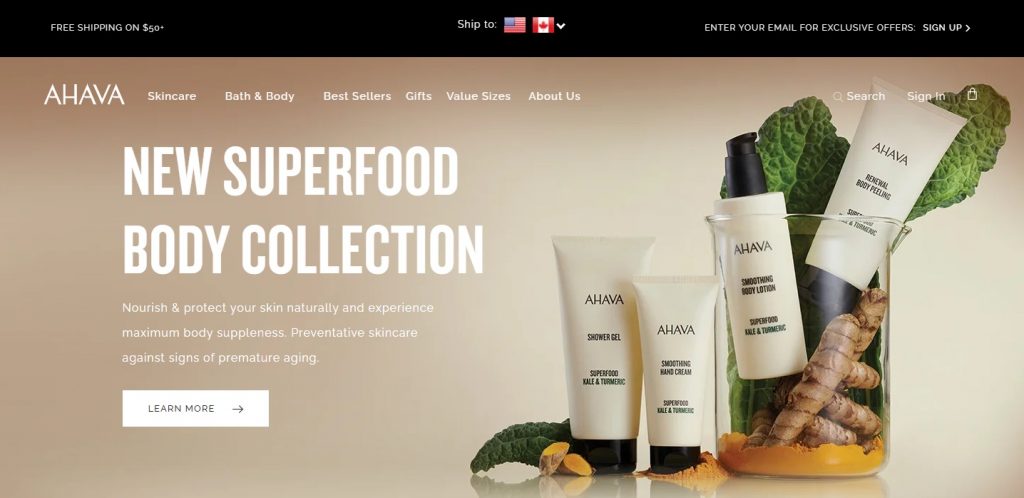
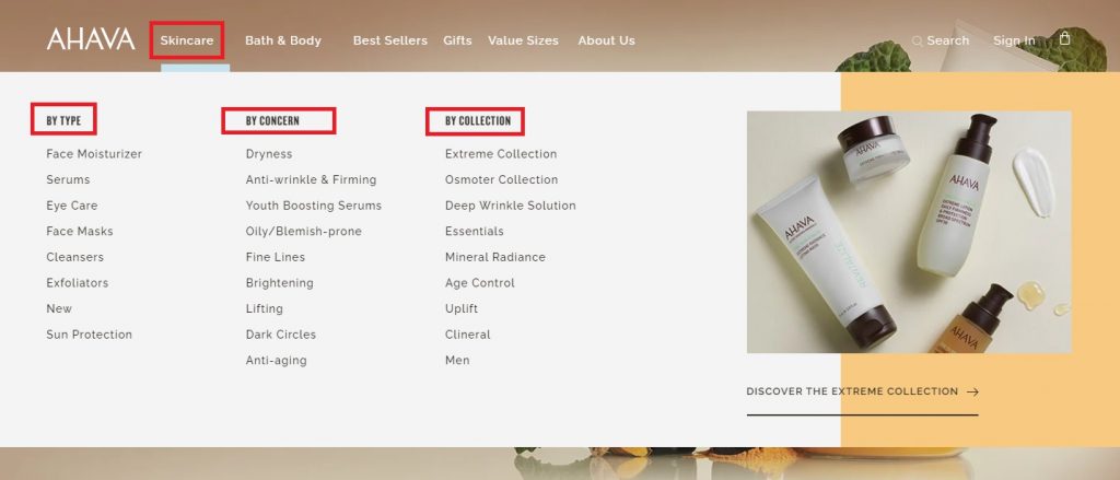
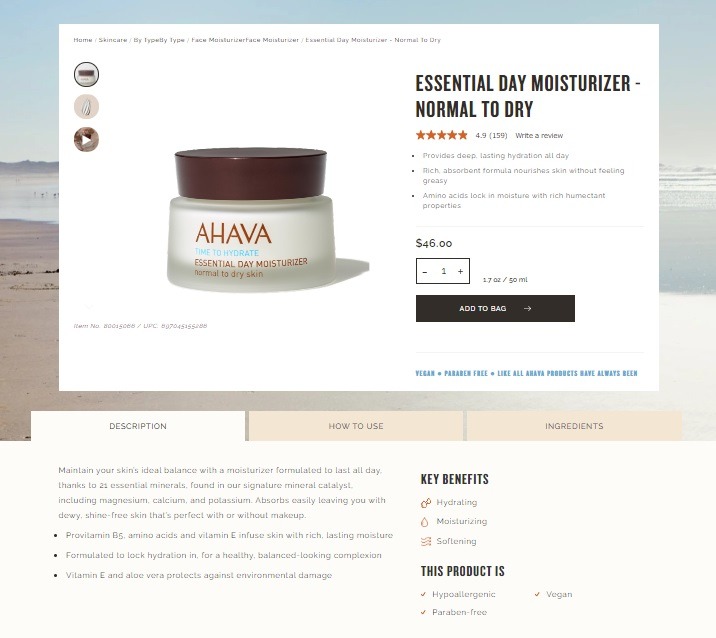
Another winning beauty product store example that shows design simplicity is key, is one of my favorite merchants, AHAVA. From their simple, easy-to-follow menu options that speak directly to the needs of their shoppers, to clever use of icons and color, they have a lot to offer in terms of design inspiration.
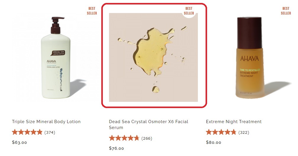
AHAVA has a lot going for them, but what I am totally in love with are their unique category and product images that use product texture. It’s a great way to highlight their products in a very unique way that separates them from other stores.
Some other design elements definitely worth mentioning here are their user-friendly, well-designed FAQ section that is easy to navigate, and overall product pages that are packed full of relevant information without being crowded.
Popular eCommerce Apps and Tools AHAVA Are Using
- Font Awesome for a large icon set and toolkit.
- Video.js and Vimeo for product and homepage videos.
- Traffic Booster for getting targeted traffic to your site with Google and Facebook ads.
15. Asutra
eCommerce Niche: Beauty
eCommerce Platform: Shopify
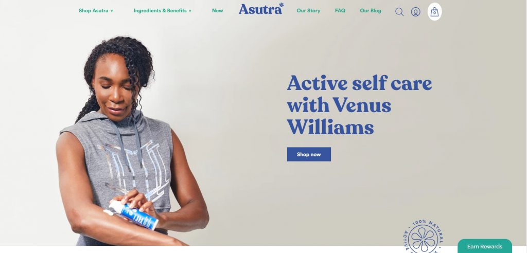
Asutra quickly set themselves apart from other beauty brands with their distinctive branding and colors. They also just went through a big design change with the help of expert eCommerce consultant Kurt Gelster, that includes a new Mega Menu to help their customers find relevant products faster and increase cart rate.
Pro Tip: If you run a Shopify store, I highly recommend you join Kurt’s Unofficial Shopify Podcast Insiders Facebook group. It’s packed full of value, including design and user-experience examples, and links to Keith’s tips for winning eCommerce strategies. You can visit my 32+ Must-Join eCommerce Facebook Groups [2020 Edition] post for more info on this and other top Facebook groups.
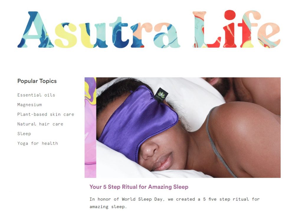
The most important lesson we can learn from this best eCommerce website example is that creating a unique store can be as simple as coming up with an original design and branding feel through colors and fonts. This is something they reinforce throughout their website pages, user experience, and eCommerce blog.
Bonus Content: If you want to learn how powerful a blog can be for shopping experience and, more importantly, driving traffic to your online store, visit my The 5 Best Ways to Increase eCommerce Traffic post.
Popular eCommerce Apps and Tools Asutra Are Using
- Bold Commerce app suite for an improved shopping experience to boost sales.
- Back in Stock Shopify app, which offers automatic product notifications for added customer experience.
- Yotpo for review display and management.
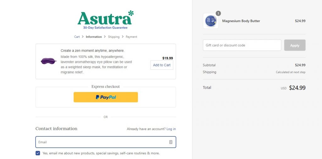
- In Cart Upsell for optimized checkout.
15. Bite Toothpaste
eCommerce Niche: Toothpaste and Brushes
eCommerce Platform: Shopify
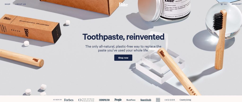
When it comes to creating an online store design and feel that grab a shopper’s attention from the first second, Bite Toothpaste is one of the best. Between the lifestyle product photos and clever copy, their above-the-fold header very clearly shows what a prospective shopper can expect from this store, brand, and products. In short, they are able to effectively use the first seconds to answer all the important questions a site visitor may have.
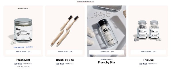
When you add this to the clever use of product GIFs with promotional text and color pallets that match their brand voice and ethos, you have a winning eCommerce website matched with a winning product.
And if they don’t convince a shopper in the first fold, their homepage is the design gift that keeps on giving – with marketing GIFs, product how-tos, and banners that reinforce the brand’s promises.
Popular eCommerce Apps and Tools Bit Toothpaste Are Using
- Okendo for boosting store shopping experience through product ratings, reviews, photos/videos, UGC, Q&A, and feedback tools.
- Intercom for conversational, messenger-based experiences across the customer journey.
- Font Awesome for a large icon set and toolkit.
- Vimeo for product and homepage videos.
16. Bliss
eCommerce Niche: Skincare
eCommerce Platform: BigCommerce
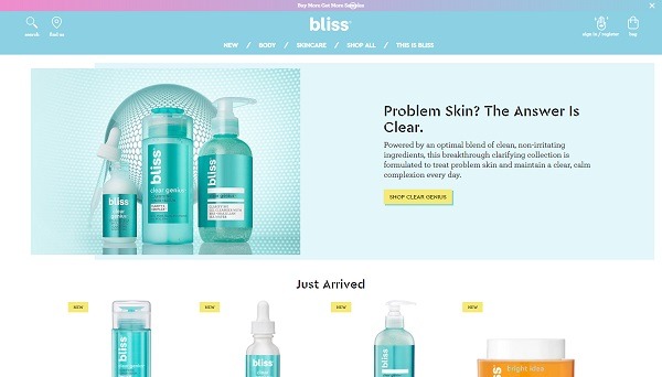
Another eCommerce website example using color to separate them from the pack is Bliss. Their products pop out from their homepage from the first glance, matching their online store design to their fun and youthful brand.
Using their layout and design to give the same energizing spa feel their products do, there’s a lot to love about their store design. However, there are a few stand-out elements that need a special mention. The first of which are their multimedia dropdown menus and interactive skincare quiz!
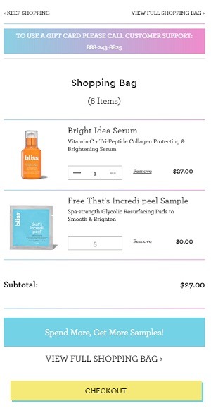
Add this to their gorgeous product photos, perfectly designed product pages, and a surprise free product in checkout – and you have a winning eCommerce formula that’s hard to beat.
Popular eCommerce Apps and Tools Bliss Are Using
- Visual Website Optimizer, an A/B testing tool featuring point-and-click test designer and WYSIWYG editor for creating website design variations.
- Smile.io to improve customer experience with rewards and loyalty programs.
17. Esqido
eCommerce Niche: Eye Makeup
eCommerce Platform: Shopify
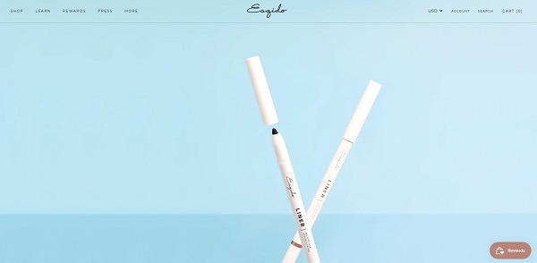
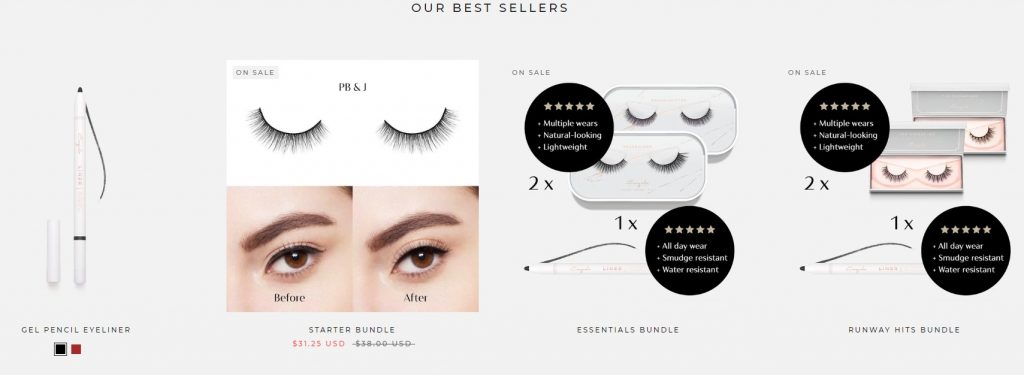
Esqido is a makeup brand all about the eyes. A leading brand of mink and other false eyelashes, Esqido sells in a very niche category that includes lashes, lash kits, eyeliners, and glue. With such a small category list, their website design is as refined and elegant as their products. Their homepage starts with a striking yet simple above-the-fold product banner, and continues on to clean displays of best-sellers, lash categories, and lash application how-to guides and videos.
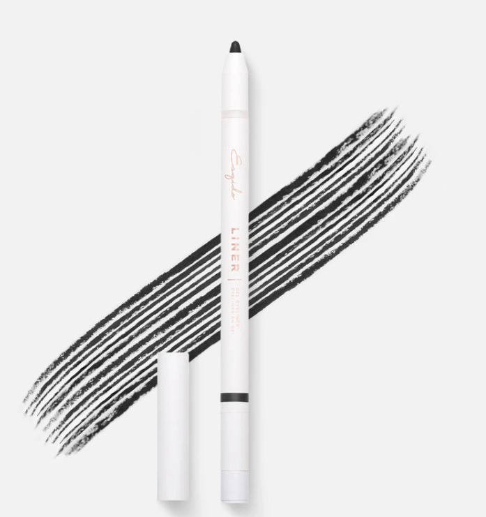
But if you really want a crash course on creating a winning eCommerce website, take a look at their product pages and images. They have come up with creative ways to showcase their products’ features, such as eye pencil thickness.
Popular eCommerce Apps and Tools Esqido Are Using
- Visual Website Optimizer, an A/B testing tool featuring point-and-click test designer and WYSIWYG editor for creating website design variations.
- Smile.io to improve customer experience with rewards and loyalty programs.
- Font Awesome for a large icon set and toolkit.
- HulkApps Form Builder for creating their on-site beauty surveys.
- StilyoApps to optimize different aspects of their Shopify store.
18. Welly
eCommerce Niche: First Aid Kits
eCommerce Platform: Shopify
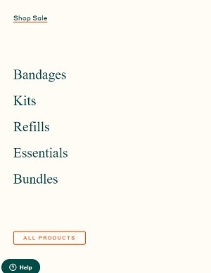
The last health brand on my best eCommerce website examples list is Welly. Like the previous example, they concentrate on selling in a very niche eCommerce space, and they do it well.
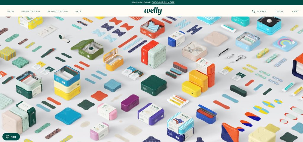
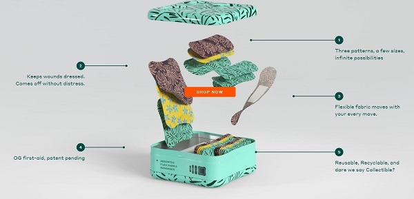
Their animated website header is the perfect example of a brand that knows how to draw in a potential shopper from the first second. Besides the usual eCommerce design must-haves, they have elevated their shopping experience in intelligent ways. They have also managed to take a somewhat traditionally boring product niche and make it super cool. Here’s just a taste of how they creatively present and name their products.
When it comes to eCommerce websites, they are one of my new favorites. From streamlined product pages, awesome product animations, and fun accent colors that fit their brand to a T, they have eCommerce inspiration in spades. But if there is one main design takeaway you get from Welly – it’s how important it is to find ways to be original. Just take a look at their scroll product animations in their ‘Inside the Tin’ section, here.
Popular eCommerce Apps and Tools Esqido Are Using
- Shogun for building custom product pages, blog posts, FAQ pages, and funnels.
- Vimeo for product and homepage videos.
- Zendesk Chat for live chat and messaging from your store.
Best eCommerce Fitness & Sport Website Examples 2020
19. Crossrope
eCommerce Niche: Specialized Jump Ropes
eCommerce Platform: BigCommerce & Shopify
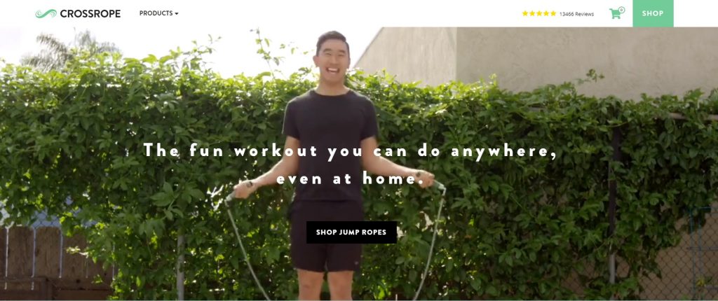
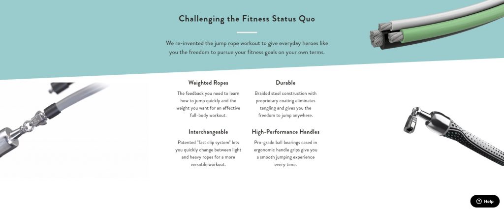
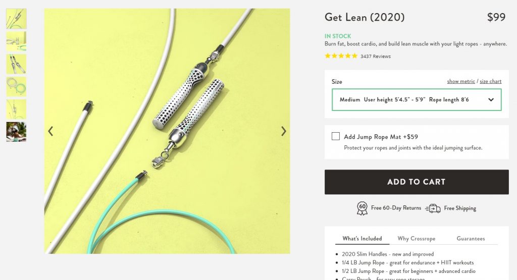
Another store on my list of best eCommerce website examples – that uses video above the fold to instantaneously draw attention – is Crossrope. You will also notice that even though they, too, sell in a highly segmented niche, they make a bold impression. They have managed to integrate top-quality product photos, product GIFs, videos, and animations into their site to highlight key product details while keeping their design crisp and clear.
Some other very noteworthy eCommerce website design elements worth ogling over include their super simple product navigation menu, integrated fitness app, and product page description layout.
Popular eCommerce Apps and Tools Crossrope Are Using
- Vimeo for product and homepage videos.
- Justuno for cart and checkout abandonment offers and email popups.
- Font Awesome for a large icon set and toolkit.
- Yotpo for review display and management.
- Bootstrap Heroes for customer experience.
20. Rusty Surfboards
eCommerce Niche: Surfboards
eCommerce Platform: Shopify
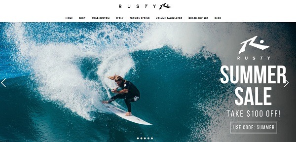
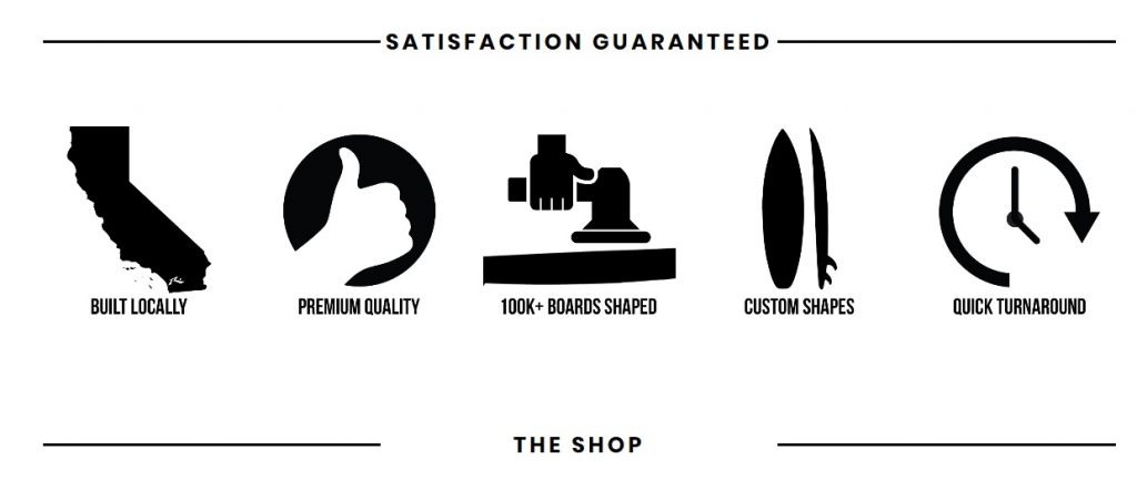
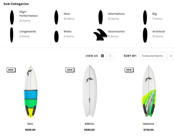
When it comes to shopping experience, Rusty is tough to beat. With their clean lines, bold icons, and clutter-free product displays, they have everything needed to create a winning online store. I am particularly fond of their branding and custom sub-category filter icons!
Popular eCommerce Apps and Tools Crossrope Are Using
- Modernizr to tailor store experience to the user through browser detection.
Best eCommerce Food & Snack Website Examples 2020
21. Bon Bon Bon
eCommerce Niche: Food
eCommerce Platform: BigCommerce
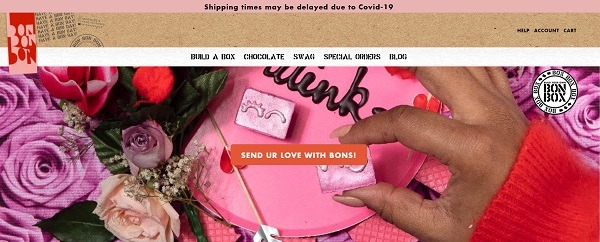
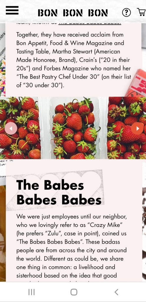
When it comes to customer experience and creativity, Bon Bon Bon artisan chocolate company is hard to beat. They may have started as a brick-and-mortar store in November 2017, but their online store has grown and has serious game. Bon Bon Bon proves that simple isn’t always better if your target audience, brand, and product need some spunk and splash.
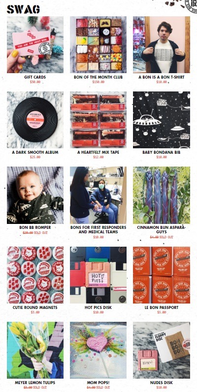
Another vital lesson we can learn from their unique store design is how important it is to back up products with good page design. In this case, the design is fun and loud to reinforce their creative products and fun brand. Take a look at their ‘Swag’ product section. It includes gift cards, branded apparel, subscription chocolate boxes, Bons that can be ordered and delivered to first responders, magnets, flowers, and retro chocolate designs – just to name a few!
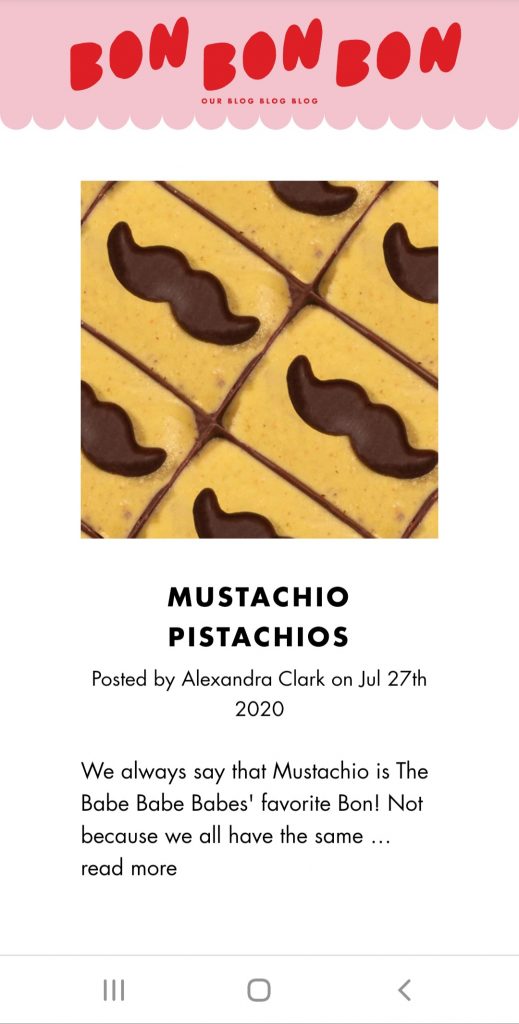
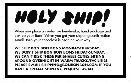
Some other design elements that make them stand out include their Build-a-Box product options, an awesome blog that gives me all the feels by speaking their customers’ language, quirky shipping policy copy, and an awesome ‘About’ page.
Popular eCommerce Apps and Tools Bon Bon Bon Are Using
- Modernizr to tailor store experience to the user through browser detection.
22. Battle Snacks
eCommerce Niche: Food
eCommerce Platform: Shopify
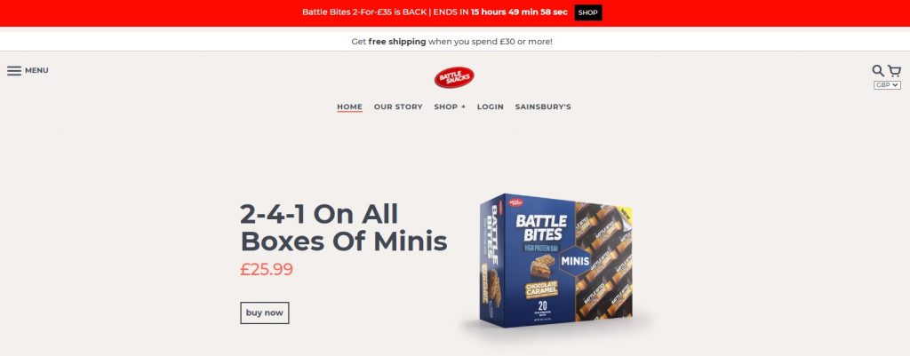
Battle Snacks has a no-nonsense store design that gets straight to business with their best-selling products front and center. Add that to color schemes that make their products pop and cute new product displays, you have yourself a clean, crisp website despite the nature of the products being bulky and normally unphotogenic.
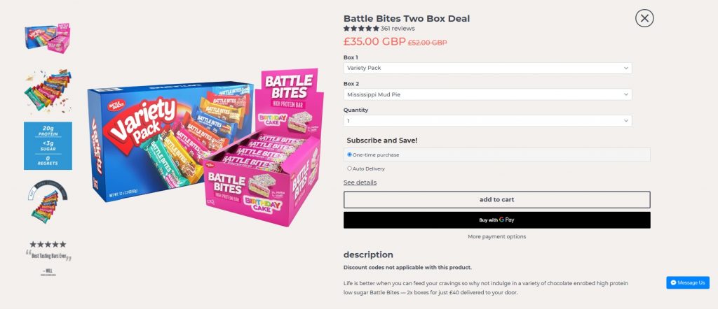
Another design element that really pops for this online health snack brand is how the nutrition info is displayed in their product pages, along with customer comments and a link to online messaging in case further questions come up.
Popular eCommerce Apps and Tools Battle Snacks Are Using
- Traffic Booster for getting targeted traffic to your site with Google and Facebook ads.
- Privy website conversion, email marketing, and text messaging tools.
- Font Awesome for a large icon set and toolkit.
- Push Owl, which offers remarketing push notifications.
- Bold Upsell for onsite cross- and up-selling.
23. Neuro
eCommerce Niche: Gum and Mints
eCommerce Platform: Shopify
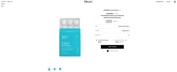
One of my current favorite online stores right now, in terms of color and font, is Neuro. Neuro is a niche store that sells “functional gum and mints to energize, calm and focus you in the moment.” They quite literally sell just two products – gum and mints – each in two sizes and flavors, and available on subscription.
With eye-catching animations, strategic use of empty homepage space, and straightforward copy, their site makes a big impression in very little time. But the element that really jumps out is their ‘About the Science’ page, which is easy to follow and gives you a real sense of their brand and products.
Popular eCommerce Apps and Tools Neuro Are Using
- Smile.io to improve customer experience with rewards and loyalty programs.
- Privy website conversion, email marketing, and text messaging tools.
- Bold Commerce app suite for an improved shopping experience to boost sales.
- Font Awesome for a large icon set and toolkit.
24. Vegan Essentials
eCommerce Niche: Apparel
eCommerce Platform: Custom-made with WordPress
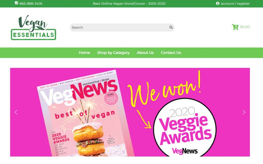
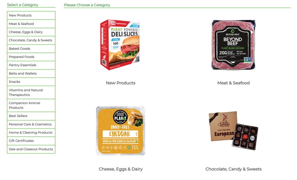
Bright, fresh, and in line with their audience and shopper, the Vegan Essentials store offers a great example of how your shopping experience should be. What stands out are their category and search filters, both of which cater to almost every dietary need or desire.
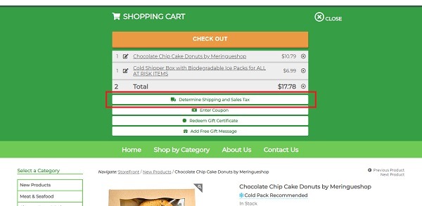
Another impressive element for customer experience is their popup shopping cart that enables shoppers to get shipping costs before they check out. Something I, as an online shopping addict, wish a lot more stores would do!
Popular eCommerce Apps and Tools Vegan Essentials Are Using
- New Relic, which is a dashboard for keeping an eye on application health and availability while monitoring real user experience.
- Font Awesome for a large icon set and toolkit.
- Modernizr to tailor store experience to the user through browser detection.
Best eCommerce Home Decor Website Examples 2020
25. Bathroom Sales Direct
Apparel Niche: Apparel
eCommerce Platform: WooCommerce
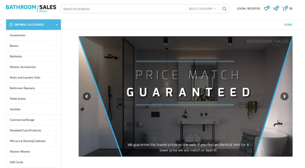
Let’s be honest: hardware and room-specific building product stores are not a sexy niche. It also almost always comes with a huge category that can make streamlining tricky. But that doesn’t mean you can’t keep things clean, simple, and easy to navigate. This is something that Bathroom Sales Direct has a deep understanding of. Despite the nature of their niche and volume of their categories, their homepage is clean and super easy to navigate, proving for the millionth time that less is truly more.
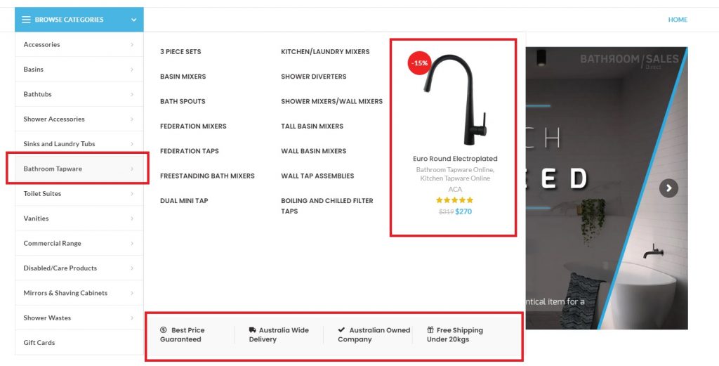
Their most awesome web store features are floating menus that don’t just include product sub-categories but a best-selling product and their brand promises.
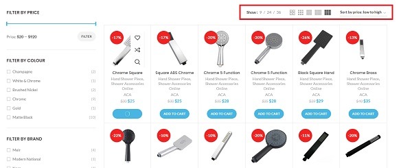
Add that to their extended viewing display options in category and sub-category pages, quick compare, and wish list selection options and filters – which speak directly to their target audience’s needs – and you have yourself a winner!
Popular eCommerce Apps and Tools Bathroom Sales Direct Are Using
- WPBakery and Visual Composer for optimized store and landing page design.
- Font Awesome and WP SVG Icons for a large icon set and toolkit.
- Traffic Booster for getting targeted traffic to your site with Google and Facebook ads.
26. Helbak
eCommerce Niche: Homeware
eCommerce Platform: Shopify
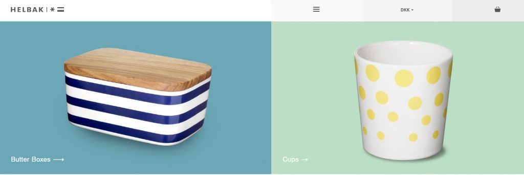
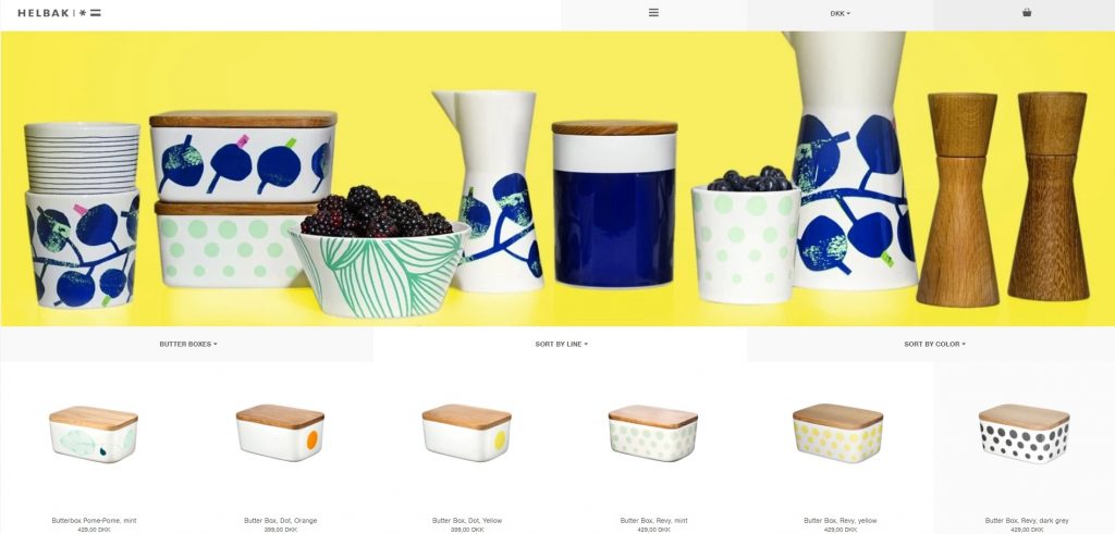
Another excellent eCommerce website that is the definition of simplicity, is Helbak. With their pastel pallets, super clean font, and even simpler headings, they show us that you don’t have to go over the top to stand out.
Matching the artistic feel of their products, their home and product pages let their product designs do the talking. While their super easy navigation makes browsing and shopping a breeze.
Popular eCommerce Apps and Tools Helbak Are Using
- Modernizr to tailor store experience to the user through browser detection.
27. Thing Industries
eCommerce Niche: Home Gadgets and Accessories
eCommerce Platform: Shopify
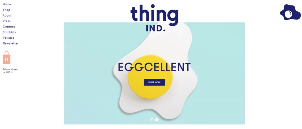
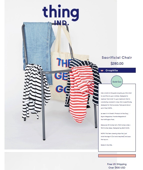
I am totally in love with Thing IND – and why wouldn’t I be? Anyone who knows me knows I love brands with a sense of humor, and this brand has humor in spades. When it comes to eCommerce website design, they are simple, fun, and aren’t afraid to use white space to make their products pop.
Add that to their website product GIFs, geometric shapes, and witty copy, and it is hard not to shop from them.
Popular eCommerce Apps and Tools Thing IND Are Using
- Owl Carousel, which is a jQuery plugin that lets you create a beautiful responsive carousel slider.
29. Poketo
eCommerce Niche: Design Homeware and Office Accessories
eCommerce Platform: Shopify
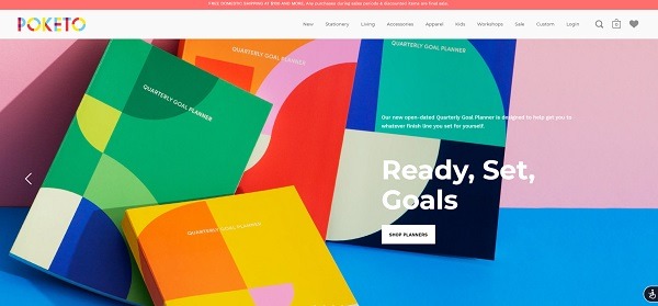
Eye candy is an understatement when it comes to Poketo, which offers online shoppers a carefully curated collection of design-conscious goods meant to cultivate a creative lifestyle. It helps that their products are vibrant, but they back this up with their easy-to-navigate eCommerce website and simple fonts.
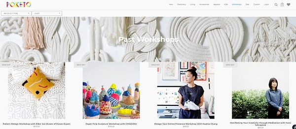
Pro Tip: Poketo is the perfect example of how an online store can build their brand and engage with their target audience locally. They offer location-based workshops on everything from online marketing to paper pulp sculpture and pattern-making. In short, they have found a way to offer heaps of value to their target shoppers locally, something to consider for your own eCommerce brand.
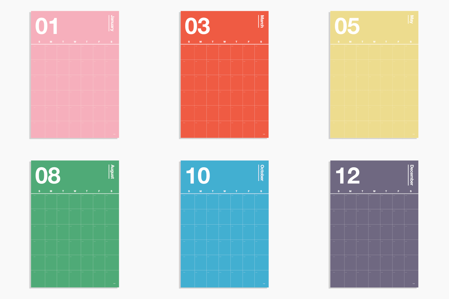
Some of their stand-out design elements include lifestyle product photo overlays, custom product section, and GIF calendar product images.
Popular eCommerce Apps and Tools Poketo Are Using
- Swim for a full-featured web store wish list.
- SuppleApps for integrating wholesale content, discounts, and sales from your online store.
- Code Black Belt for optimization tools such as ‘also bought’ and ‘frequently bought together’ sections.
Best eCommerce Jewelry Website Examples 2020
29. Avena Birthstones
Apparel Niche: Jewelry
eCommerce Platform: Shopify
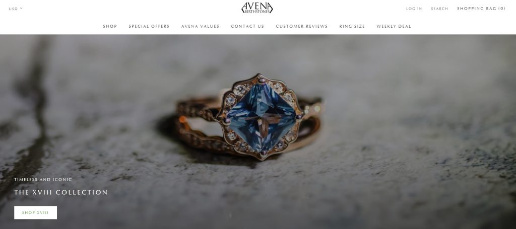
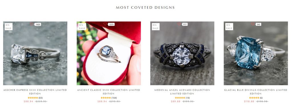
Sometimes, creating a winning eCommerce website design isn’t about doing anything fancy other than taking your lifestyle product photography to pro level. This is something that Avena Birthstones master well. Yes, they have light-colored background shots ideal for Google Shopping and other product ads, but their homepage focuses on lifestyle – letting their product photos tell a story. Additionally, their product like overlays build trust in a very clean-cut way, enabling them to be louder with product photos.
Some other noteworthy elements that put this store in the best eCommerce website examples are its user-friendly ring size help pages, easy-to-find contact information, and values bar in the footer of their pages.
Popular eCommerce Apps and Tools Avena Birthstones Are Using
- Growave for onsite reviews, wish lists, social sharing, Instagram integration, and other site experience tools.
- Traffic Booster for getting targeted traffic to your site with Google and Facebook ads.
- StilyoApps to optimize different aspects of their Shopify store.
- Sticky Add To Cart for easier shopping.
Best eCommerce Tech Accessory Website Examples 2020
30. Bacca
eCommerce Niche: Hand-made Wooden Stands for Laptops & Instruments
eCommerce Platform: Custom
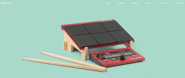
Bacca sells one product in three variants and their online store is a prime example of keeping things simple. With clean lines, elegant fonts, and enough copy to explain their products while keeping it very short and to the point, they show us how to declutter web stores to let the products shine. What really stands out as different is their ultra-simple product pages that automatically change photos – letting their lifestyle images do the selling.
Popular eCommerce Apps and Tools Bacca Are Using
- Font Awesome for a large icon set and toolkit.
- Skrollr stand-alone parallax scrolling library for mobile (Android + iOS) and desktop.
—
There you have it, the best eCommerce website examples for 2020 and some key online store optimization tools. Keep following my blog for new eCommerce store inspiration!
Got questions? Post them in the comments section below!

Nicole is a content writer with over sixteen years experience and flair for storytelling. She runs on a healthy dose of caffeine and enthusiasm. When she's not researching the next content trend or creating business content strategies, she's an avid beachgoer, coffee shop junkie and hangs out on LinkedIn.
Recommended articles
 Facebook Ads for eCommerce: 16 Strategies, Examples & Tips
 How to Build a Winning eCommerce Ads Strategy
 Google Ads for eCommerce: Everything You Need to Know
 10X Your Traffic with PPC Management Software
Comments
Powered by Facebook Comments
