We all want to improve conversion rates, right? Here’s the cold, hard truth: even with the most professional PPC strategies that are bringing tons of targeted traffic to your online store, if your website, brand, and messaging don’t measure up to potential shoppers’ expectations, your conversion rates could be suffering.
The average conversion rate for online stores is around 1-2%. In fact, even if you’ve mastered conversion rate optimization (CRO) to pro level, you should expect to win the sale around 2% of the time as a benchmark and then aim for 2%+ as your conversion rate baseline goal.
Bonus Content: eCommerce Conversion Rates Per Niche [2021 Benchmarks]
Conversion rates are about far more than just the number of online sales. Conversions are determined by the eCommerce KPIs you’ve set. Therefore, there are more metrics than total sales to consider if you want to improve conversion rates for your eCommerce brand. This could include the number of shoppers adding products to carts, email signups, social media reviews, wishlist adds, or upsells, depending on what your goal is at different stages of the buying journey.
In short, conversion rates are impacted at every single touchpoint of your shoppers’ buying experience. It means that CRO should be done on elements like product, landing, and checkout pages, as well as across your whole eCommerce site.
Before we go through the best ways to improve conversion rates for eCommerce, you should have a distinct understanding of where your metrics stand.
Most Important Metrics You Should Be Tracking Before Implementing Hacks to Improve Conversion Rates
Besides total sales, here are some additional metrics you can find in your Google Analytics account under ‘Behavior > Overview,’ which can help you assess your conversion status.
- New Visitor Conversion Rate: This will help you assess how first-time store visitors behave compared to returning visitors. If this rate is low, you will want to improve their overall experience of browsing your store and make sure they are getting a good first impression.
- Return Visitor Conversion Rate: This metric will help you compare what products or messaging brought shoppers to your store initially (why they didn’t convert the first time around) to what eventually converted them.
- Cost Per Conversion: You also want to assess how much each conversion is costing you. If shoppers pass many points before finally making a purchase, your cost per conversion will be higher.
- Average Session: Your average session duration will tell you how long potential shoppers are hanging around, browsing your store before they leave. If they are only there for seconds, it will be hard to convert them.
- Pages Per Session: If shoppers are spending sufficient time on your store but still leaving, knowing which pages they view before they go can be very useful for improving CROs on those specific pages. In other words, it points to a gap in your conversion funnel.
- Exit Rates: An eCommerce exit rate is the percentage of shoppers who leave your site after viewing a specific page. Pages with high exit rates point to optimization issues and messaging flaws.
- Bounce Rates: Bounce rates are the percentage of potential shoppers who leave your online store after only viewing the one page they clicked through to to find your store. Poor store bounce rates can point to mixed messaging, where shoppers come to your store through an ad or search, don’t find what they are looking for on that page, and click right off again.
- CTRs: Click-through rates are the number of people who click through to your store from a search, email, social post, or PPC campaign. If you have a high CTR but low conversions, high bounce rates, or reduced exit rates for those landing pages, then it’s time to make some changes.
- Interactions Per Visit: This will show you how many times a customer interacts with your store pages before they finally buy something from you.
- Traffic Sources: Last but not least, you should have an excellent idea of where your shoppers – as well as those who don’t buy – are coming from. Suppose one source is resulting in more conversions than others. In that case, this will help you not only determine your marketing strategy and spend but point to platforms or targeting issues for sources not resulting in traffic and conversions. This should include direct, search, and referral visitors.
Google Analytics Intelligence can help you ask the right questions and get the correct data to see which areas of your store you need to optimize to improve conversion rates. You can find out more about how to do that here.
Newbie Tip: Still struggling to get a handle on your eCommerce analytics? Make sure to review our full Google Analytics For eCommerce guide.
Now comes the juicy part: helping you get your conversion rates to match your goals!
20 Ways You Can Improve Conversion Rates for Your eCommerce Brand
1. Put Your Unique Selling Position Front and Center
The very first thing a potential buyer should be able to ascertain from any page they find themselves on is why they should buy from you. As you know, you have just seconds to make your first impression on shoppers, and putting your unique selling position (the one thing that sets you apart from your competitors) front and center is the key to doing that.
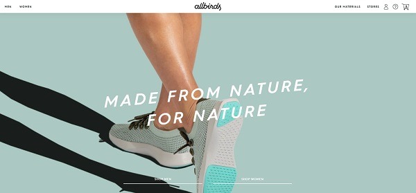
Let’s take a look at the top Shopify Plus store brand Allbirds’ homepage from last year and this year. With clever copy, good-quality lifestyle product photography, and a beautifully clutter-free site, their selling position is crystal clear from their store’s headlines: comfortable, environmentally-friendly shoes for the outdoors.
A strong USP (unique selling position) should be assertive and highly focused on the value your products bring your customers. It’s more than a slogan; it’s messaging that should be used as a benchmark for all pages, site copy, and policies.
2. Do A Full Technical Audit for Your Store
Another important step when improving your conversion rates is ensuring your store is technically sound. You can streamline messaging to your heart’s content, upgrade photos and copy to million-dollar brand status, and be selling the ultimate product, but if your site doesn’t function properly or loads too slowly, it’s meaningless.
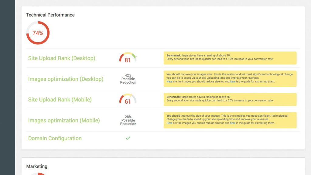
This means ensuring that your product and site images are optimized for both desktop and mobile and that your store upload time meets your customers’ and Google’s requirements. The quickest way to check this is by using the free Benchmark Hero tool. This will not only assess your eCommerce site’s technical performance but also offer guides on how to improve it.
As a huge plus, this tool also will compare your brand to other 7- and 8-figure stores to point out shopping experience, trustworthiness, and marketing issues and offer improvement suggestions – all of which will help your conversion rates. If you’re using Shopify, you can download Benchmark Hero here.
3. Ensure Your Product Videos and Images are Top Class
The next things you will want to optimize are your product images and videos. This may seem like a no-brainer, but it’s something that even successful online stores struggle with. Here’s the thing: yes, you need good, high-quality white background product photos. Still, you have to find a way to make your product displays unique and on-brand – especially when it comes to creating lifestyle images in a highly competitive niche.
Bonus Content: Ultimate Guide to Product Photography for eCommerce
An excellent example of this comes from the top eCommerce website Envy Stylz, where they not only use creative light backgrounds but also flat lay displays for their products. Or, you can draw inspiration from 100% Pure’s refreshing lifestyle photos or Bite Toothpaste’s product and lifestyle GIFs.
You can see the full details of these examples – and more – in our Best eCommerce Website Examples [+ eCommerce Apps They Use] post.
4. Make the First 5 Seconds, and the Above-the-Fold Area, Count
The first five seconds a potential customer spends on your site are the most crucial for making a good impression. When you combine site speed, good-quality lifestyle images, and unique positioning, what do you have? An optimum, persuasive above-the-fold design.
Yes, your whole home, landing, or product page should be visually appealing and persuasive, but the top of the page is where the magic really starts. After you have gotten their attention, you can then follow through to keep potential customers engaged.
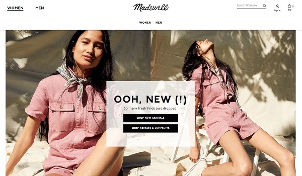
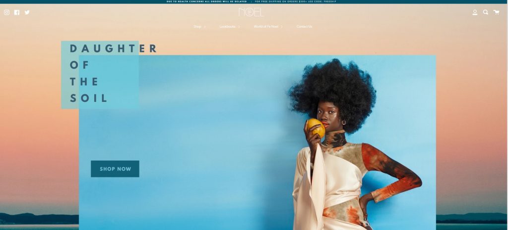
This means you need to get creative with your main image (or video) and the text overlay, and ensure you follow through with a strong CTA. It’s important to note here that although some sites have similar layouts, you should be testing designs for your specific brand and target market. Here are some examples from leading online fashion stores ReLove, Madewell, and Fe Noel.
5. Upgrade Your Popup
Popups are often put last on the eCommerce to-do list, but they are still very effective when optimized correctly!
Bonus Content: Finding the Discount Sweet Spot
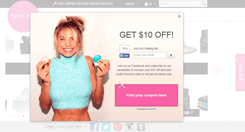
When you pair a well-tested and -optimized popup with a winning remarketing strategy, you will boost sales. In one popup case study, eCommerce brand Tiger Mist was able to increase their email list by a whopping 40% by using strategic discount coupon deals. This strategy can also be used to grow your social media platforms.
A good popup will have context, straightforward copy that matches your brand voice, a good design, and an offer to help you seal the deal. Additionally, like with most optimization tactics, you will want to test a variety of elements including your headline, text, and discount amounts, to find the best combination for your store. You will also want to test the technical aspects of your popup, such as time delays and the number of views per visit.
Here are some tips to help you upgrade your popup to increase signup conversions and, ultimately, sales.
- Use targeting to tailor popups to specific pages, locations, or referral sources so that popup messaging is highly relevant and more likely to convert.
- Find a balance between being too intrusive or pushy and making use of the limited attention time you have. Test different delays to find your optimum conversion rate.
- Include an offer your potential customer can’t refuse. Test a variety of generous ‘gifts’ such as coupons, exclusive VIP sales, a free gift, or high-value information.
- Make sure you set up popups so that they don’t show to customers already on your mailing or social follow lists.
Pro Tip: Use Coupon Pop (available on all eCommerce platforms) to offer visitors coupon rewards. This will help you increase sales by an average of 33%; and email subscribers, fans, and followers by an average of 25%. If you’re using Shopify, you can download the app here.
6. Rethink Live Chat
If you aren’t already using live chat, you could be missing out on opportunities to make sales. Why? Because being able to answer potential shoppers’ questions in real-time can help seal the deal in the moment, as opposed to them having to search your FAQ or wait for an email reply.
This doesn’t mean you need to have your support team at the ready twenty-four hours a day. By incorporating a mix of live support, and the machine learning and natural language that chatbots offer, you can provide better customer service, engage directly with your target shopper, provide automatic product recommendations, and of course, boost sales.
Bonus Content: 9 Merchant Chatbots on Facebook Messenger to Inspire You
If you’re looking for a good, robust tool that integrates live chat with all your other support platforms, then Zendesk is a popular choice.
7. Don’t Hide Your Contact Details
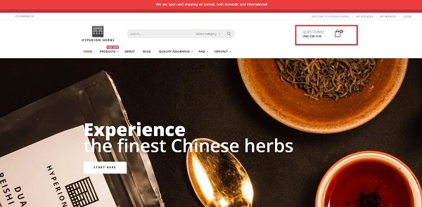
Just because you’re selling online doesn’t mean you should be hiding your contact details. They do a lot more than ensure undecided shoppers can get their questions answered, thus boosting the chances they will buy from you. By including contact details, enforce overall trust of your brand, and trustworthiness plays a big part in improving your conversion rates. This is something a lot of our top merchants, including Hyperion Herbs, put into practice.
Keep all your support online? Then the help of online chat, a well-displayed email, or at the very least a contact section is a must.
8. Marie Kondo Your Store (AKA Declutter)
It is tempting to try and fill your homepage as much as possible, casting a very wide net in terms of products, offers, and elements. But a cluttered website will actually harm rather than improve your conversion rates. Instead, you want to limit the number of distractions, focusing on your key selling point, best-selling products, and overall branding in a clear, concise way.
This means highlighting benefits and features, keeping copy short, being strategic with products you display on your store’s home page, and using visuals to get your message across quickly and seamlessly. This isn’t just about design and content; you want to make sure you have simplified and streamlined your navigation and do a regular spring clean of the technical back end of your store.
Here’s an eCommerce store decluttering checklist to get you started:
- Review your product descriptions. Are they optimized for both humans and bots? Do you have too little or too much information?
- Audit your page to see which content is doing better than others.
- Review your SEO strategy. Most of our DIY SEO hacks will help ensure your store is functioning optimally for both bots and humans.
- Check for and fix broken links.
- A/B test your home and promotion landing pages.
- Review your store’s navigation. Are your menus not only easy to find but also make logical sense? Have you got too many categories in your menus, distracting and overwhelming potential customers? (More on this below!)
Bonus Content: How to Create Perfect Product Pages for Conversions
9. Review Your Store Navigation
Your site’s navigation plays a crucial role in your conversion potential. You can bring lots of valuable, targeted traffic to your store, but if they can’t find what they are looking for, they will move on quite quickly. Even if you’re using Shopify and have invested in a well-designed theme, there are optimization choices and tweaks to be made in terms of user experience patterns, traffic behavior, and branding – specific to your brand.
Bonus Content: Shopify vs. Shopify Plus: The main differences
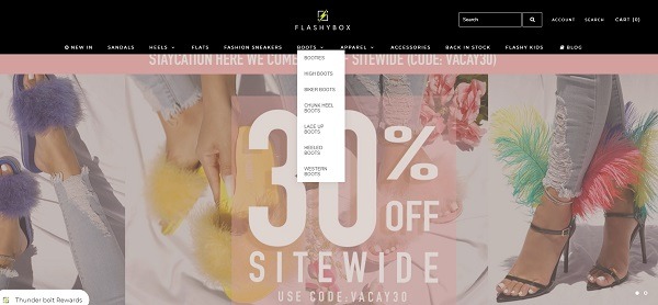
Your navigation should highlight your store’s vibe but also be intuitive to your target shopper. Here are some optimum navigation tactics used by Flashybox you can test and adapt to boost your store’s performance.
- Keep navigation product categories simple and in line with your brand voice. Less is more here – potential shoppers should be able to scan your navigation bar quickly.
- Include an easy-to-find search feature in your navigation bar.
- Use hover mega menus for categories with a wide variety of subcategories.
- Don’t overlook design basics such as making sure you account for left-to-right reading (for English sites), putting the most popular categories first.
Beginner Tip: Don’t forget those category page filters! Enabling search filters in your category pages will help potential shoppers find precisely what they are looking for. Once you are growing steady traffic and making sales, you will want to review your filters and assess what your traffic is using or not using, and optimize accordingly. As your store grows, get insights from customers through surveys and social media post engagement to find out exactly how your potential customers are searching.
10. Supplement Products With High-Value Content
By providing high-value content, you not only establish your brand as an authority in your niche but build trust – trust in your brand and your products, both of which will help increase your chances of making sales. There are several ways you can ooze value on your store; here is some high-value content you could include to boost authority:
- Gift categories to help your audience shop for others
- Easy-to-find, comprehensive size guides
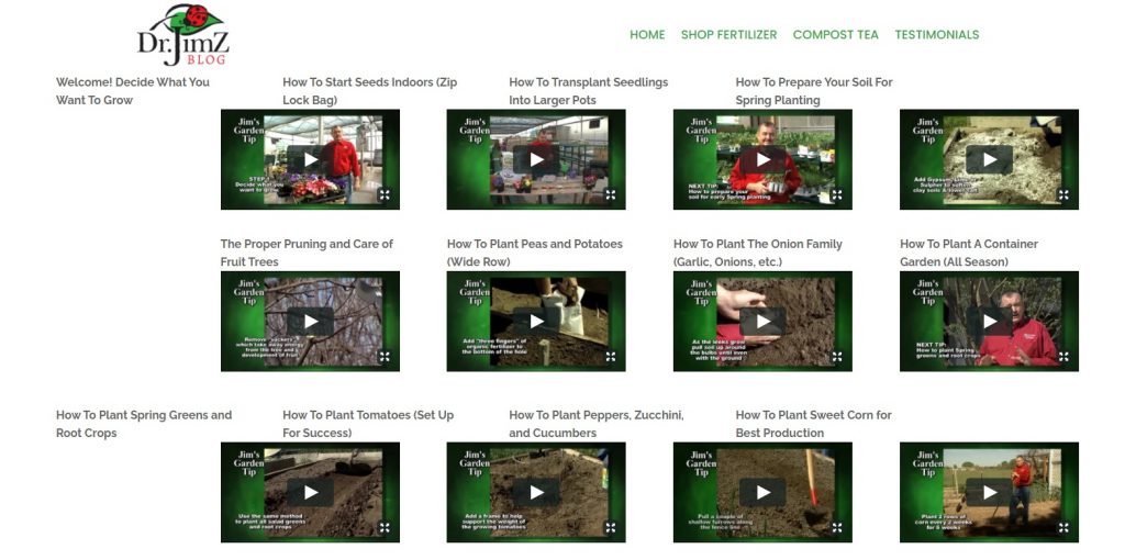
- Niche-related blog content and how-to guides
- Embedded video guides and tips
And as an added bonus, providing valuable content will help boost your SEO – which brings us to our next point.
11. Understand the Link Between CRO and SEO
A winning eCommerce store finds the balance between SEO (optimization for search engines and relevance) and CRO (making your store user-friendly), speaking to both shoppers and bots in perfect harmony to boost sales. As you probably already know, this isn’t always as easy as it sounds! This means you should be working on attracting the right traffic to your store (quality), then using SEO and PPC to boost this traffic (quantity), and pushing home with relevancy (CRO).
Here are just a few ways you should be integrating your CRO and SEO strategies:
- Create highly relevant content and landing pages that use keyword strategies but are written for your potential shoppers.
- Keep things simple. The more clutter there is on your site or destination pages, the less likely your content will seem relevant to your potential customer.
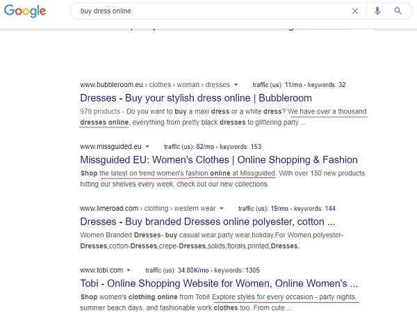
- Put effort into your meta titles and descriptions and never forget you are also writing for humans. Yes, it’s important to include eCommerce keywords to get eyes on your listings, but you also want those browsers to click through.
Take a look at the below search results of how you need to combine CRO and SEO to not only improve conversion rates but boost traffic. Each of these online stores caters to their own target audience’s unique pain points or wants: variety, trends, or shopping for specific occasions.
12. Take Reviews and Social Proof to Winning Level
Reviews are a powerful conversion tool. As part of a robust word-of-mouth marketing strategy, collecting and highlighting customer reviews, ratings, and social UGC goes a long way toward building brand and product trustworthiness, which helps boost sales.
To use reviews to improve conversion rates, you should be:
- Highlighting reviews on your homepage and above the fold on product pages.
- Testing rating and review feedback features.
- Displaying relative averages where relevant, excluding products with zero averages.
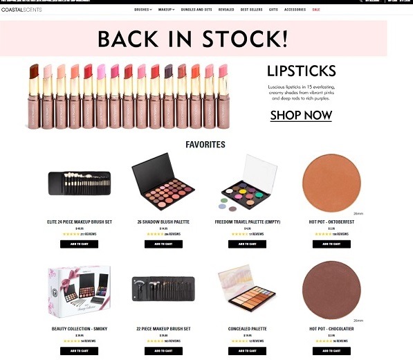
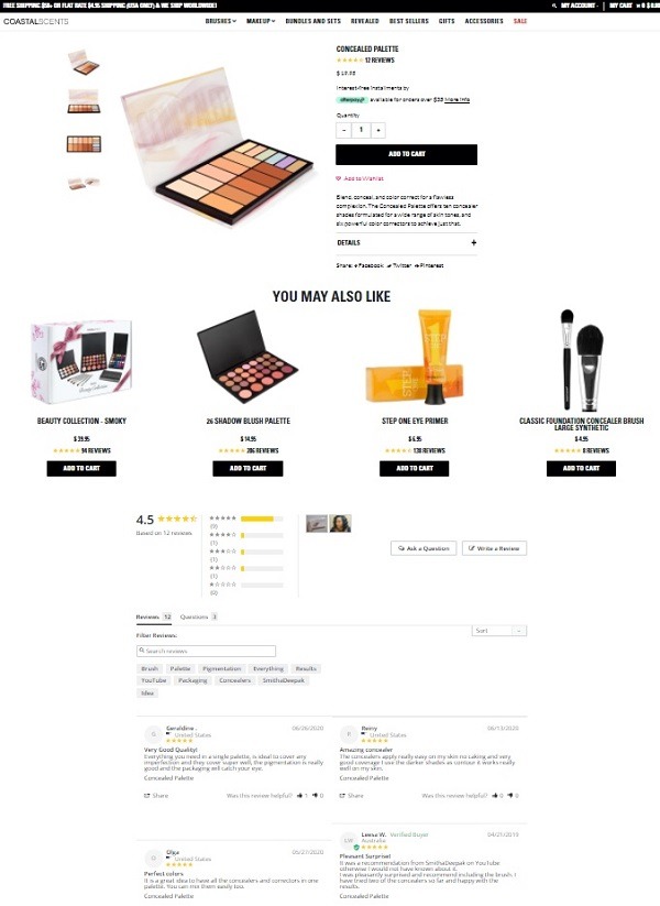
You also shouldn’t be afraid of negative reviews or ratings. Shoppers are more likely to believe your reviews if you display them honestly, than if you show five stars only without any transparency on who is reviewing. A great example of a brand putting reviews front and center is Coastal Scents.
Not only do they include reviews in their ‘Favorite Products’ section above the fold, but they offer full transparency on product feedback on their product pages.
When it comes to social proof, you can feature specific customer testimonials and display UGC on shoppable Instagram feeds on your store.
Bonus Content: 5 Tools to Increase UGC, Pronto
13. Review and Optimize Your Information Pages
Next on our checklist of ways to improve conversion rates for your online store are your information pages. Your FAQ, Return Policy, and Terms and Conditions pages shouldn’t just be easy to find but optimized to include all the information a potential customer may need to make their buying decision. These should also be easy to digest, but comprehensive. Here are some guides to help you review and optimize your information pages:
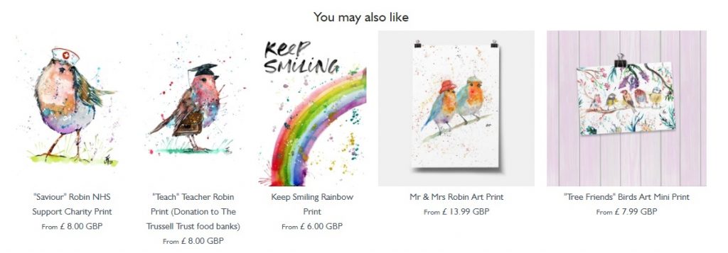
14. Up Your Cross- and Up-sell Game
Another way you can improve conversion rates is by using cross- and up-selling. Obviously, this is an excellent tool for increasing your order values, but it can also help increase your overall conversion rates. Let’s say you have a lukewarm shopper browsing your store, and they click through to a product page. They are browsing and not necessarily interested in buying then and there. However, if you are showing related products, they may see a product they are far more interested in, that they may not have otherwise thought of. This is particularly useful if you’re selling online art or posters, where a shopper could see a design they really love.
15. Revamp Your Product Descriptions
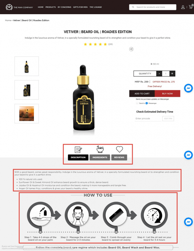
Another element of your product pages worth reviewing and testing to improve conversion rates is product descriptions. As we outlined in our Creating Product Pages That Convert post, product descriptions have a major influence on whether a product page is set up for conversions. You want to be clear and concise while also ensuring you include all the relevant information a potential shopper may need before pushing that ‘Add to Cart’ button. A good way to do that is to use icons and graphics to highlight essential points in an easy-to-digest way. This also ensures that your product page CTAs stand out.
Pro Tip: Make sure you are A/B testing different colors, fonts, and/or styles for your checkout and ‘Add to Cart’ buttons. You want to find the best combination that makes these important buttons stand out from the surrounding text on your product pages.
Which brings us to the next important point: CTAs.
16. Use CTAs Strategically and Sparingly
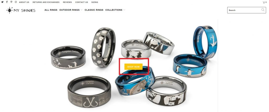
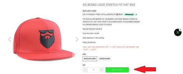
Yes, CTAs are vitally important to getting potential customers to engage with your store. Whether it’s a category button on your homepage; ‘Wishlist,’ ‘Share,’ or ‘Add to Cart’ buttons on product pages; or ‘Read/show more’ buttons on blog and landing pages – you want to use them strategically and sparingly. Too many buttons and your potential customer won’t know what to click. However, use only one without making it stand out, and you’ve lost their attention.
This can be as simple as testing a stand-out color like our merchants My Shinies or No Shave Life have done.
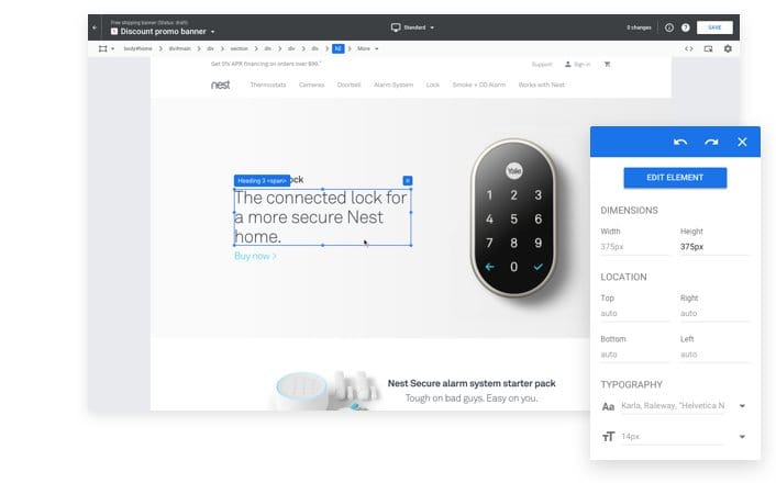
17. Use Google Optimize and Other Tools to Personalize Shopping Experience
The more personalization you give your customers’ journey, the better your chance of converting. A useful tool for this is Google Optimize, which will help you use your Google Analytics data to efficiently run page and website tests to find the most conversion-driving setup. It will also enable you to then use this data to customize your website experience to suit each type of audience and create custom landing pages for your Google ads to help improve conversions through providing highly personalized and relevant content.
Another way to personalize potential shoppers’ experience on your store site is by using tools that trigger personalized welcome bars or popups based on a variety of triggers including URL, demographics, or on-site behavior parameters. Or to offer related or upsell products based on shopper’s behavior and actions on your store.
18. Use Exclusivity and Urgency to Get Potential Customers Engaged
Another way you can improve conversion rates for your eCommerce brand is with urgency. There are several standard ways you can implement this, such as including ‘stock left’ information on your product pages or a ‘Hurry, only X left’ popup. You can also use this by displaying limited-time promotions or including VIP-only benefits that only members get.
However, getting creative with urgency in other areas of your store in a way that suits your brand can have a positive effect on your conversion rate. A good example of this comes from our Top Online Fashion Brands post: Frankies Bikinis. This store has been able to generate as much as $150,000 in sales in just an hour, with a countdown to new products. Proving that exclusivity and urgency don’t need to be just about dropping your prices, but creating branding that positions your product has a must-have.
19. Show Trust
Yes, everything we have mentioned so far will help set you up as an authority in your niche and build the overall trust of your store. However, this can be reinforced by implementing trust signals in strategic places of your eCommerce site such as home, checkout, and product pages and can include payment icons and secure payment badges.
This can be tricky if you’re using an eCommerce platform that doesn’t include trust badges; but there are ways around this! You can read everything you need to know about trust signals in our Quick Guide to Trust Badges post.
20. Optimize Your Cart and Checkout Process
When it comes to improving eCommerce conversion rates, cart and checkout optimization are your last – but not least important – port of call. Your cart and checkout are the last touch points you have on a shoppers’ journey before they decide whether they are going to buy from you, therefore it’s one of the most significant steps in your sales funnel. A well-optimized cart and checkout are tweaked in terms of design and layout, cart functionality, and overall shopping experience.
A well-optimized cart and checkout:
- Include default billing/shipping addresses
- Enable guest checkout options
- Show shoppers how far they are in the checkout process
- Provide a variety of payment and delivery options
- Are simple and easy to navigate
- Show trust signals
- Include links to your information pages
- Have a ‘Continue Shopping’ option
- Are transparent about all costs involved
That’s just the tip of the iceberg! For a full breakdown of what a successful cart and checkout strategy looks like, visit our comprehensive 26 Cart and Checkout Optimization Hacks to Boost eCommerce Sales guide.
In a Nutshell: Test Everything – Continuously!
Here’s the thing: as with all eCommerce business building and marketing, there is no one-size-fits-all strategy. In fact, when it comes to improving conversion rates and optimizing your online store, each and every store will need to come up with the best combination of functionality and optimization to match their brand, products, and target audience. To do that, you will want to A/B test everything from your CTA buttons on your product pages to your above-the-fold lifestyle image on your homepage. Add to that that there is always room for improvement; it’s not enough to test once. You want to keep a close eye on those metrics and continuously test and optimize as your business grows.
It is a slow, long slog, but the payoffs are worth it: more sales, more profit, more growth! To get you started, take advantage of our free Benchmark Hero tool to get a full site audit in minutes!
Happy selling!

Nicole is a content writer with over sixteen years experience and flair for storytelling. She runs on a healthy dose of caffeine and enthusiasm. When she's not researching the next content trend or creating business content strategies, she's an avid beachgoer, coffee shop junkie and hangs out on LinkedIn.
Recommended articles
 Facebook Ads for eCommerce: 16 Strategies, Examples & Tips
 How to Build a Winning eCommerce Ads Strategy
 Google Ads for eCommerce: Everything You Need to Know
 10X Your Traffic with PPC Management Software
Comments
Powered by Facebook Comments
